Excel
Excel Chart Types
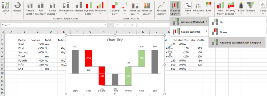
PINE BI: Ultimate Excel Charting Add-in: Insert custom charts with a simple click & other charting tools!
Excel provides almost 50 ready-to-use chart types. Excel also allows almost unlimited chart customization, by which you can create many other common chart types.
The list below links out to our chart tutorials on Excel’s built-in charts as well as advanced custom charts.

Excel Chart FAQs
How many chart types does Excel offer?
Excel offers almost 50 chart types. Including bar charts, pie charts, and much more. Excel also allows virtually limitless customization options allowing you to create advanced charts.
How to change chart style in Excel?
To change the chart style in Excel, select your chart, go to Chart Design > Chart Styles, and select an alternate chart style.
How to change chart type in Excel?
To change the chart type in Excel, select your chart, go to Chart Design > Change Chart Type, and select an alternate chart type.
