How to Create and Display a Chart in a cell
Written by
Reviewed by
This is a simple tutorial on how to create and display a bar chart in a cell; a technique that works very well when creating management reports.
Steps:
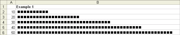
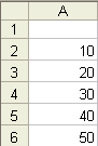
1. In column A enter the values you want to display i.e. in cell A1 enter the value 10, in cell A2 20 etc.
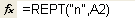
2. In column B1 enter the following formula: =REPT (“n”, A1). This formula simply tells Excel to repeat the value stored in between “ “ by the number in cell A1.
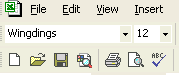
3. Change the font to “Wingdings”.
4. Please refer to example 1 in the attached Excel file.
5. Should you wish to decrease the length of the bar chart simply divide “A1” in the above formula by 10 or by whatever number makes the most sense. By way of example, the formula would look like this =REPT (“n”,A1/10). See example 2 in the attached Excel file.
It should be noted that by changing the “n” in the above mentioned formula you can display different images. For example, capital “J” will display a smiling face while a capital “L” will display a sad face. See example 3 in the attached Excel file.

Dealing with Negative Values
The above formulas work well when you are dealing with positive values. However, if the value in column A is negative the graph in column B will change to a string made up of a number of different symbols thereby loosing the desired effect (See example 4 in the attached spreadsheet).

One way to overcome this limitation is by way of an IF statement like:
=IF(A21<0,REPT(“n”,ABS(A21/10)),REPT(“n”,A21/10))
Explanation of the above formula:
1. Assume the value you are trying to show in a bar graph is located in cell A21. This value is also negative.
2. The formula begins by saying if the value in A21 is less than 0 i.e. negative, then repeat “n” by the absolute value (ABS) contained in cell A21 and then divide this number by 10. By using the absolute value you are tell Excel to ignore the negative sign and treat the number as a positive value.
3. The next part of the formula tells Excel what to do if the value is greater than 0.
4. Please refer to example 4 in the attached file.

Interesting additions to the above would be to use conditional formatting to change the color of the graph to say red for negative values and to blue for positive values. Let your imagination guide you!
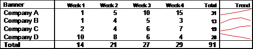
The following tutorial will describe how to create a chart in a cell like the one displayed in the table above under the “Trend” column.
The chart is created using a function called “CellChart”. You would enter it in Excel like any other standard function i.e. SUM, AVERAGE or VLOOKUP etc. This function is called a “User Defined Function” and is not a standard function available within Microsoft Excel. It must be created by the user using VBA.
When entered into Excel, the CellChart function looks like this:
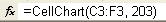
Taking a closer look at the CellChart function, the range for the chart is defined in the first part of the function, C3:F3 in the example above. Next the color of the chart is defined, 203 using the example above.
Now for the VBA stuff
1. Enter the VBA project window by right clicking on a sheet name and selecting “View Code” or by selecting “ALT, F11”.
2. On the right hand side, right click on your project name and select inset “module”.
3. Copy and paste the following code into the new module you just created:
'Creates a new function called Cell Chart

Function CellChart(Plots As Range, Color As Long) As String


'Defines the variables that will be used later on in the code

Const cMargin = 2

Dim rng As Range, arr() As Variant, i As Long, j As Long, k As Long

Dim dblMin As Double, dblMax As Double, shp As Shape


'The following calculates the plots to be used for the chart

Set rng = Application.Caller

    ShapeDelete rng

    For i = 1 To Plots.Count

        If j = 0 Then

            j = i

        ElseIf Plots(, j) > Plots(, i) Then

            j = i

        End If

        If k = 0 Then

            k = i

        ElseIf Plots(, k) < Plots(, i) Then

            k = i

        End If

    Next

    dblMin = Plots(, j)

    dblMax = Plots(, k)


 'The next piece of code determines the shape and position of the chart

     With rng.Worksheet.Shapes

        For i = 0 To Plots.Count - 2

            Set shp = .AddLine( _

                cMargin + rng.Left + (i * (rng.Width - (cMargin * 2)) / (Plots.Count - 1)), _

                cMargin + rng.Top + (dblMax - Plots(, i + 1)) * (rng.Height - (cMargin * 2)) / (dblMax - dblMin), _

                cMargin + rng.Left + ((i + 1) * (rng.Width - (cMargin * 2)) / (Plots.Count - 1)), _

                cMargin + rng.Top + (dblMax - Plots(, i + 2)) * (rng.Height - (cMargin * 2)) / (dblMax - dblMin))


 'Difines what happens if there is an error

            On Error Resume Next

            j = 0: j = UBound(arr) + 1

            On Error GoTo 0

            ReDim Preserve arr(j)

            arr(j) = shp.Name

        Next


        With rng.Worksheet.Shapes.Range(arr)

            .Group


            If Color > 0 Then .Line.ForeColor.RGB = Color Else .Line.ForeColor.SchemeColor = -Color

        End With


    End With


    CellChart = ""

End Function


Sub ShapeDelete(rngSelect As Range)


'Defines the variables that will be used later on in the code

    Dim rng As Range, shp As Shape, blnDelete As Boolean


      For Each shp In rngSelect.Worksheet.Shapes

        blnDelete = False

        Set rng = Intersect(Range(shp.TopLeftCell, shp.BottomRightCell), rngSelect)

        If Not rng Is Nothing Then

            If rng.Address = Range(shp.TopLeftCell, shp.BottomRightCell).Address Then blnDelete = True

        End If


        If blnDelete Then shp.Delete

    Next

End Sub
4. Click on the save button.
5. Click on the little Excel icon on the top right under the “File” menu to exit the VBA project window and to return to Excel

6. Enter the CellChart function into any cell as displayed above.
7. See the attached workbook for a working example of the above.
For further information on this type of in cell charting, please visit:
