Add a Data Series to Chart – Excel & Google Sheets
Written by
Reviewed by
Last updated on October 30, 2023
This tutorial will demonstrate how to add series to graphs in Excel & Google Sheets.
Adding Series to a Graph in Excel
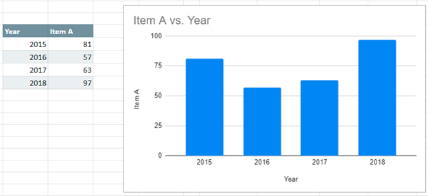
Starting with your Data
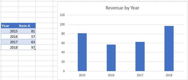
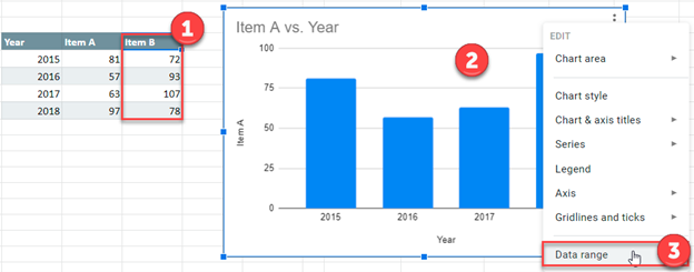
We’ll start with the below data that shows Item A Revenue by Year. In this tutorial, we’ll show how to add new series to an existing graph.
Adding Data
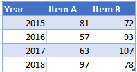
In this example, we’ll add another dataset to add to the graph.
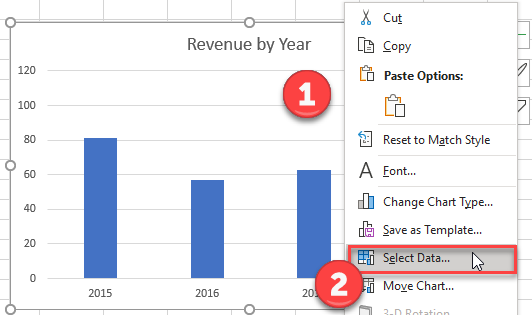
- Right click Graph
- Click Select Data
3. Select Add under Legend Entries (Series)
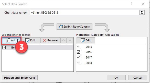
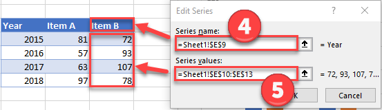
4. Update Series Name with New Series Header
5. Update Series Values with New Series Values
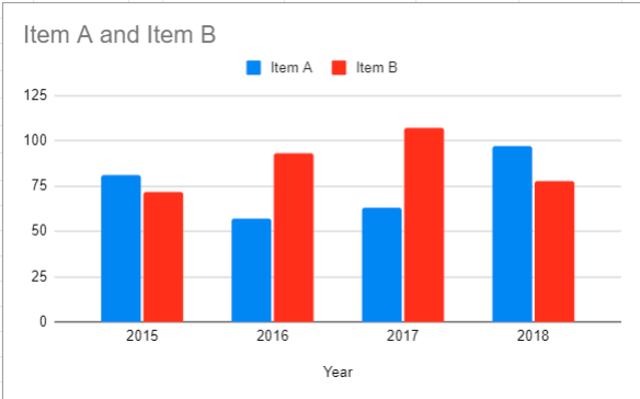
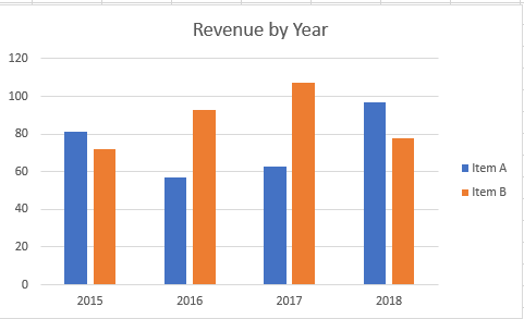
Final Graph with Additional Series
Below you can see the final graph with the additional series.
Adding Series to a Graph in Google Sheets
Starting with your Data
Below, we’ll use the same data used above.
Add a Data Series
- Add the additional series to the table
- Right click on graph
- Select Data Range
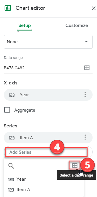
4. Select Add Series
5. Click box to Select a Data Range
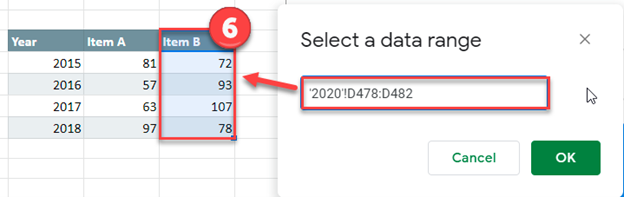
6. Highlight the new Series Dataset and click OK.
Format Graph
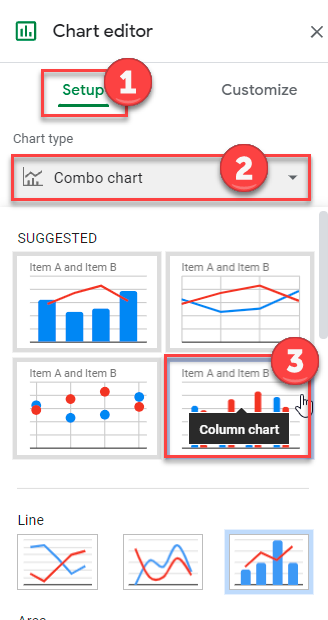
- Select Setup under Chart editor
- Click on box under Chart Type
- Change to Bar Graph
Final Graph with Additional Series
The below graph shows the additional data series.