Excel Area Charts – Standard, Stacked – Free Template Download
Written by
Reviewed by
This tutorial will demonstrate how to create and edit Area Charts in Excel.
Area Charts
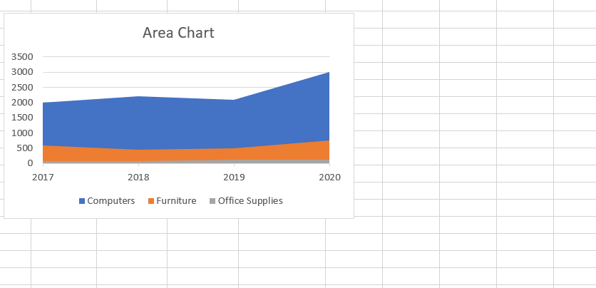
Area charts are typically used to show time series information. It’s similar to a line chart, but highlights data in a more pronounced way.
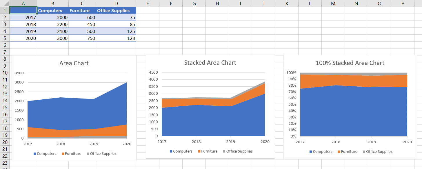
Like many Excel chart types, the area chart has three variations:
- Area Chart
- Stacked Area Chart
- 100% Stacked Area Chart.
The Area Chart compares magnitudes between series, while the stacked and 100% stacked area charts compare contributions to a total.
Preparing the Data
Data preparation is very important with Area Charts. The data with the largest values should be first in the series. Otherwise, the other items will get lost behind the data item with the largest values. Look at this example:
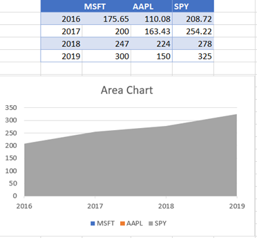
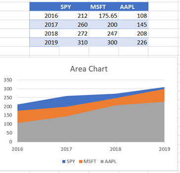
The SPY chart component dominates as it contains the highest values and will cover the other items. Instead, let’s organize our data like this:
Creating an Area Chart

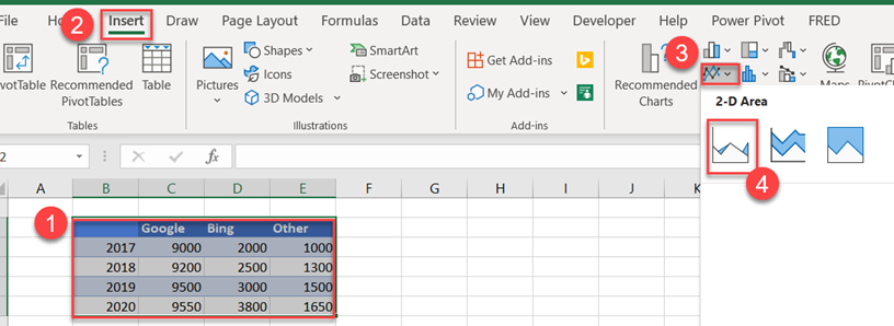
To create an area chart, follow these steps:
- Select the data to include for your chart.
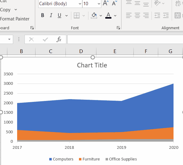
- Select the Insert menu option.
- Click the “Insert Line or Area Chart” icon.
- Choose “2-D Area.”
Note: These steps may vary slightly depending on your Excel version. This may be the case for each section in this tutorial.
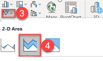
Creating Stacked Area Charts
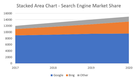
To create a stacked area chart, click on this option instead:
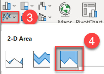
Creating 100% Stacked Area Charts
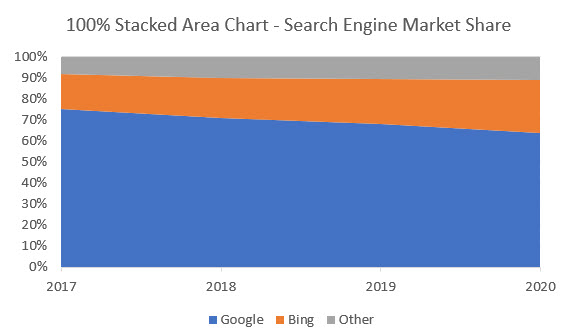
The 100% Stacked Area Chart presents the overall contribution of a category of data. Each item in the data series shows the contribution in relation to the total. The numeric information is depicted as percentages and the addition of all components should equal 100%.
To create a 100% Stacked Area Chart, click on this option instead:
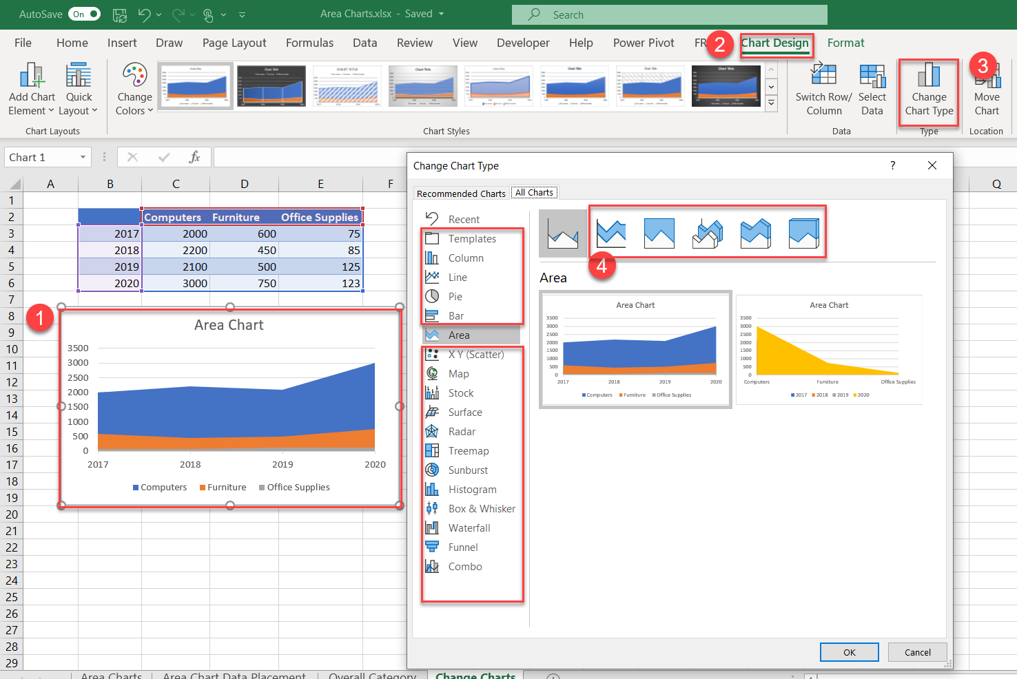
Changing Chart Types
Excel’s charting options make it easy to change types:
- Select the chart you want to change.
- The Chart Design menu option will appear. Click on the option.
- Click on Change Chart Type.
- The current style that you initially chose will be selected. Click on any of the other options.
Swap Rows and Columns
Sometimes, the charting wizard in Excel will interpret the data incorrectly and will place the rows where the columns should be. Excel offers a quick fix by swapping rows and columns.
If you want to swap the rows and columns, follow these steps:
- Select the chart (if it isn’t already selected).
- Choose the “Chart Design” menu option.
- Click on the Switch Row/Column.
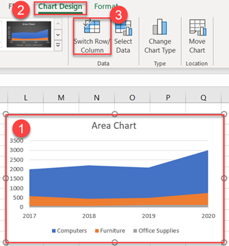
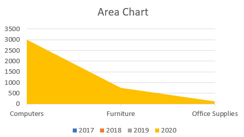
Now the graphed data is swapped:
To switch back, simply hit the Change Row/Column option again.
Editing Options for Area Charts
Excel allows you to customize basically every aspect of area charts. Below, we’ll walk through a few customization options.
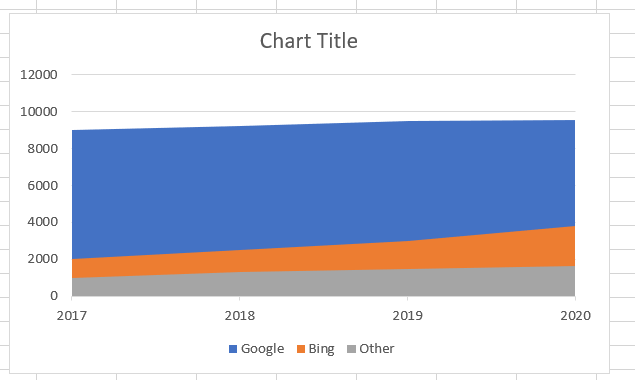
Edit Chart Title
The title should always be changed to something descriptive, as follows:
- Click on the Chart Title
- Highlight the text
- Change the text to “Search Engine Market Share” – or whatever you like.
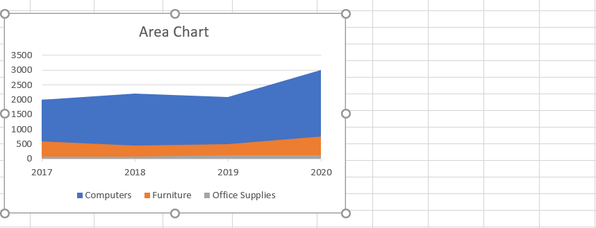
Editing and Moving Individual Chart Objects
Each chart is composed of several objects that can be selected and modified. They can be moved, resized, and the standard text options (font sizes, colors) can be applied:
Customize Chart Elements
Chart Elements allow you to change the settings for your charts in one convenient location. To access:
- Click on the Chart
- Select the Green Plus (+) option
As shown, changes are made in real time, and the options will depend on the type of chart you have selected. The animation shows the types available for area charts.
More options are available by selecting the black arrow:
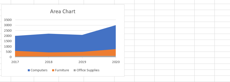
Chart Elements – Advanced
For the data series, you have the option of changing all the items in the series or individual items.
Let’s add data labels to the data series for Bing (orange items).
- Select the Data Series (Orange)
- Click on the Green Plus (+)
- Click the Data Labels option and select the check box

To apply the data labels to all the series, make sure no individual label is selected (unselect) and use the Data Label option:
Considerations with Area Charts
With the standard options for area charts, if some of the items in the data are getting covered by the dominant data items (larger numbers), consider using an alternative charting option. Your charting functions shouldn’t require you to make changes to your data to make the chart work properly. Showing one item when there are three in a data series is likely to confuse the consumers of these charts.
Alternatives include line charts, stacked area or 100% stacked area. For the 100% stacked area, you could also consider a pie chart. The options in Excel make it easy to switch, so experimenting with the different options is encouraged.
Area charts will become cluttered when you include too many items in a data series. The number of items that constitute too many is a judgment call. The golden rule of charting is your audience should be able to interpret the message without much explanation. They should be able to do this within seconds of seeing the chart.
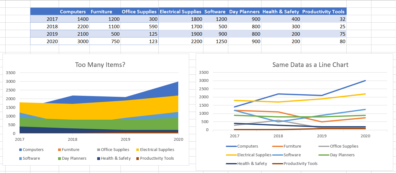
As you can see, the area chart with the title, “Too Many Items?” does not show all of the data points in the series. The line chart may be a better option, in this case.
You may decide that even the line chart shown above is too busy. Sometimes, you can solve the problems of busy charts by charting aggregations of your data. For instance, if your data contains daily frequencies, try rolling it up to monthly or quarterly. The charts will have far fewer data points to work with and the information will be streamlined.
