Add Average Line to Chart – Excel & Google Sheets
Written by
Reviewed by
This graph will demonstrate how to add an average line to a graph in Excel.
Add Average Line to Graph in Excel
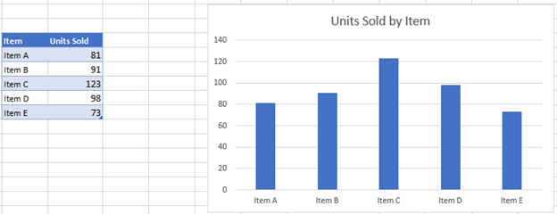
Starting with your Data
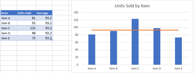
We’ll start with the below bar graph. The goal of this tutorial is to add an average line to help show how each bar compares to the average.
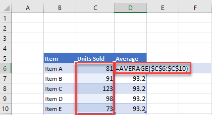
Adding Average
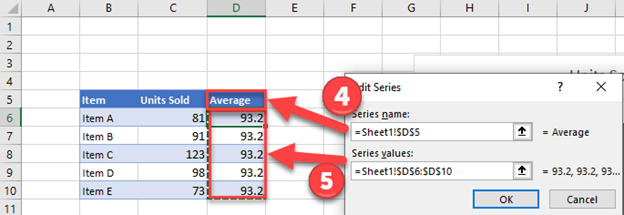
In the next column, create an average formula by typing in =AVERAGE(Range), in this case =AVERAGE($C$6:$C:$10). The average should be the same number for each X Axis. (Note: use $s to lock the cell references so they don’t change when the formula is copied down).
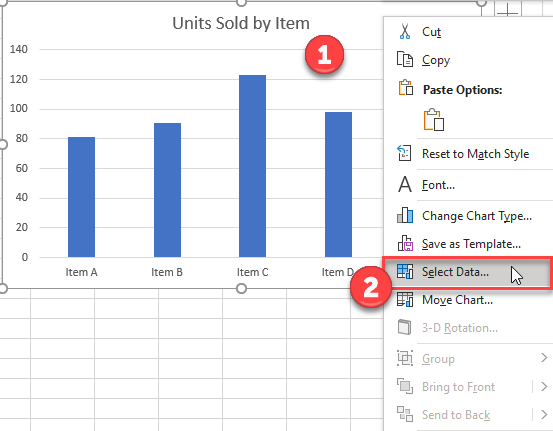
Adding Average Dataset to Graph
- Right click graph
- Click Select data
3. Click Add Series
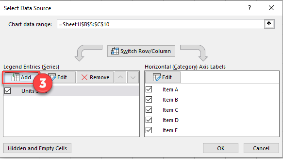
4. Select Header under Series Name
5. Select Range of Values for Series Values and click OK.
Change Average to Line Graph
- Right click on graph
- Select Change Chart Graph
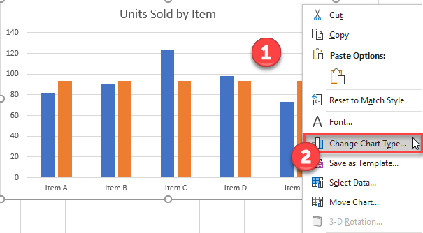
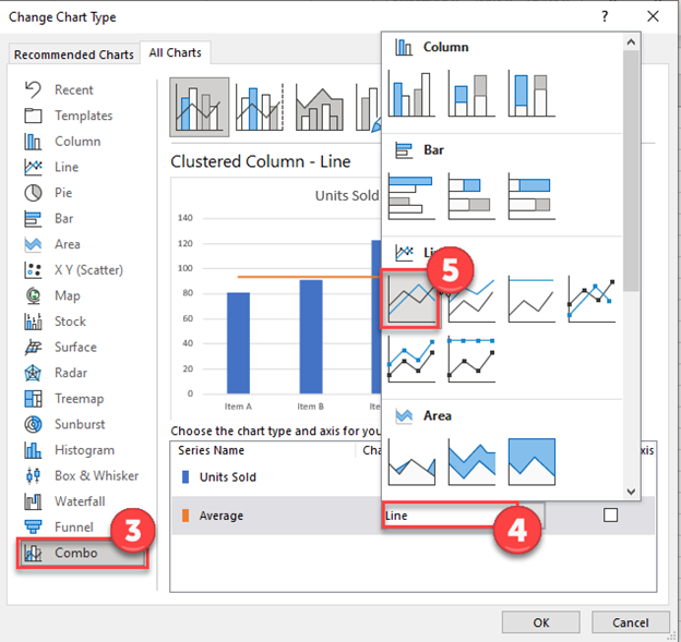
3. Select Combo
4. Click Graph next to Average
5. Select Line
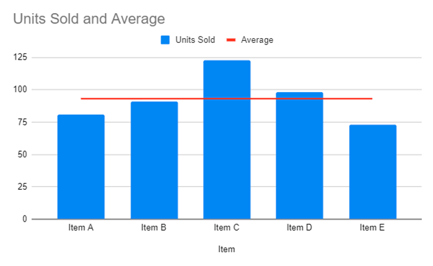
Final Graph with Average Line
As you can see, the final product is a bar graph of the items with an average line to show comparisons between the items.
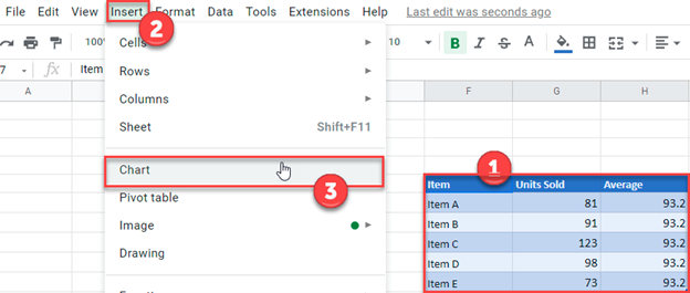
Add Average Line to Graph in Google Sheets
- Select Data that was put together in Excel
- Click Insert
- Click Chart
Final Graph with Average Line