How to add Axis Labels (X & Y) in Excel & Google Sheets
Written by
Reviewed by
This tutorial will explain how to add Axis Labels on the X & Y Axis in Excel and Google Sheets
How to Add Axis Labels (X&Y) in Excel
Graphs and charts in Excel are a great way to visualize a dataset in a way that is easy to understand. The user should be able to understand every aspect about what the visualization is trying to show right away. As a result, including labels to the X and Y axis is essential so that the user can see what is being measured in the graph.
Excel offers several different charts and graphs to show your data. In this example, we are going to show a line graph that shows revenue for a company over a five-year period. In the below example, you can see how essential labels are because in this below graph, the user would have trouble understanding the amount of revenue over this period. Is the revenue in 2016 $15, $15,000, etc.? This is a common example that shows why labeling the axis is necessary in creating graphs.

Adding Axis Labels
To add labels:
- Click on the Graph
- Click the + Sign
- Check Axis Titles

You will then see “Axis Title” next to both axes.

Edit Chart Axis Labels
- Click the Axis Title
- Highlight the old axis labels
- Type in your new axis name

Make sure the Axis Labels are clear, concise, and easy to understand.
Dynamic Axis Titles
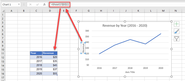
To make your Axis titles dynamic, enter a formula for your chart title
- Click on the Axis Title you want to change
- In the Formula Bar, put in the formula for the cell you want to reference (In this case, we want the axis title “Revenue” in Cell C2”). Click Enter.
How to Add Axis Labels (X&Y) in Google Sheets
Adding Axis Labels
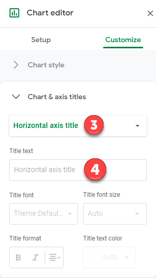
- Double Click on your Axis
- Select Charts & Axis Titles

3. Click on the Axis Title you want to Change (Horizontal or Vertical Axis)
4. Type in your Title Name
Axis Labels Provide Clarity
Once you change the title for both axes, the user will now better understand the graph. For example, there is no longer confusion as to whether the revenue is showing in thousands, millions, billions, etc. The axis label has now made it clear that the total revenue is in millions. This is a common example as it helps to make the graph look cleaner.
As you can see, axis labels are easy and important to add so that the information that is being visualized is clear at first glance. When presenting graphs to a user, first impressions are key in order to help the visualizations stand out and be easily understood in a short period of time.
