Excel Bar Charts – Clustered, Stacked – Template
Written by
Reviewed by
This tutorial will demonstrate how to create and edit Bar Charts in Excel.
A bar chart is essentially a column chart turned on its side. Like column charts, bar charts are great for comparisons. However, bar charts tend to be a better choice when there are several data points.

People often use the term bar chart when they actually are referring to column charts. They function in a similar manner but getting the terms straight will set you apart from your peers. A bar chart refers to the horizontal display of data. The column chart is a vertical display. If you aren’t sure of the difference, Excel will guide you when you select the charts. The types of charts are given in the selection wizard.
An advantage of bar charts over column charts is data items and series can continue downward on a page and the user can scroll to see them. However, even with this scrolling ability, chart creators should use discretion when applying. Bar charts also have the advantage of using lengthier labels than column charts.
The main types of bar charts available in Excel are Clustered Bar, Stacked Bar, and 100% Stacked Bar charts. You’ll be shown how to create each type in this tutorial.
Preparing the Data
Data for use bar charts is typically in row/column format. Charts can contain headers for both the rows and the columns and may or may not contain the totals. The chart wizard will use the data to determine the composition of the chart. The charts will often use whatever formatting has been applied to the data, but this can be changed easily.
When preparing your data, try to keep the information consistent. For instance, in the spreadsheet below, the months are interspersed with full spellings and abbreviations.
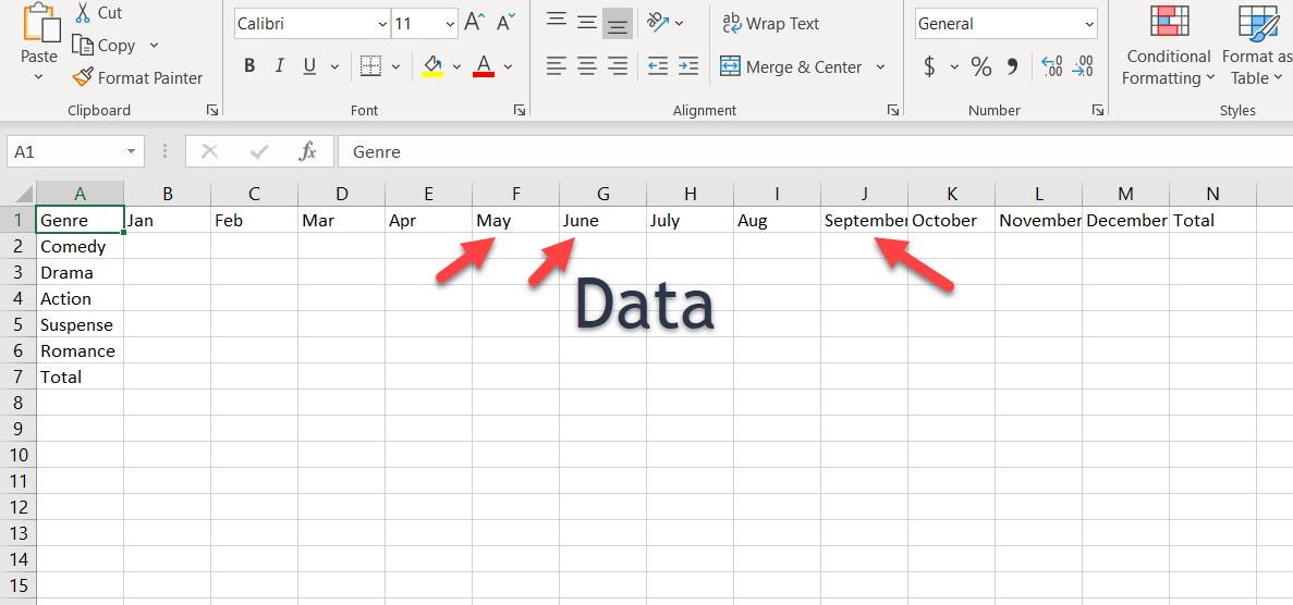
Consistency in the data will reduce the amount of editing after the chart is created.
Creating a Clustered Bar Chart
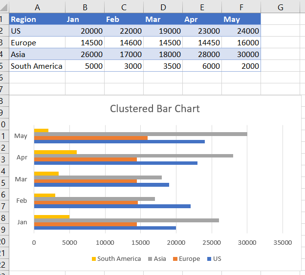
Clustered charts are used to show the comparisons of grouped, or categorized data. For instance, if you wanted to see which divisions are making the most sales per month, the clustered bar chart is a good choice for this data.
To create a clustered column chart, follow these steps:
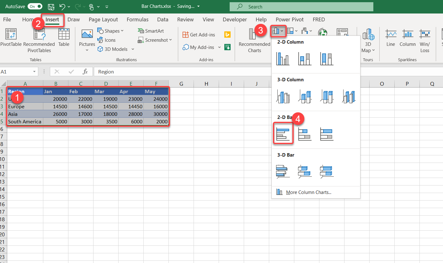
- Select the data to include for your chart.
- Select the Insert menu option.
- Click the “Insert Column or Bar Chart” icon.
- Choose “Clustered Bar.”
Note: These steps may vary slightly depending on your Excel version. This may be the case for each section in this tutorial.
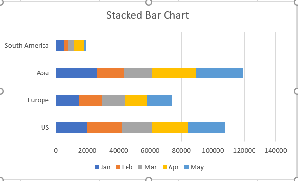
Creating Stacked Bar Charts

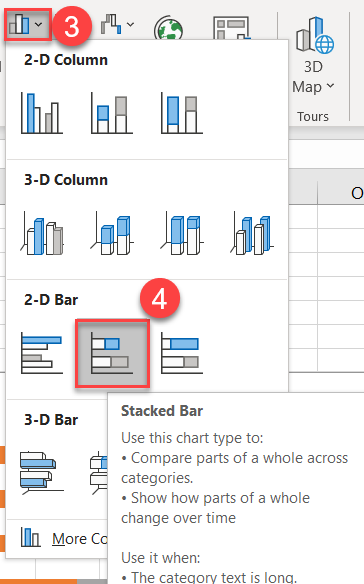
To create a stacked bar chart, click on this option instead:
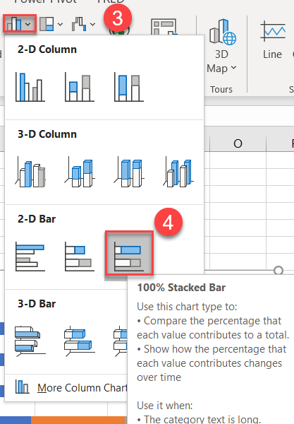
Creating 100% Stacked Bar Charts
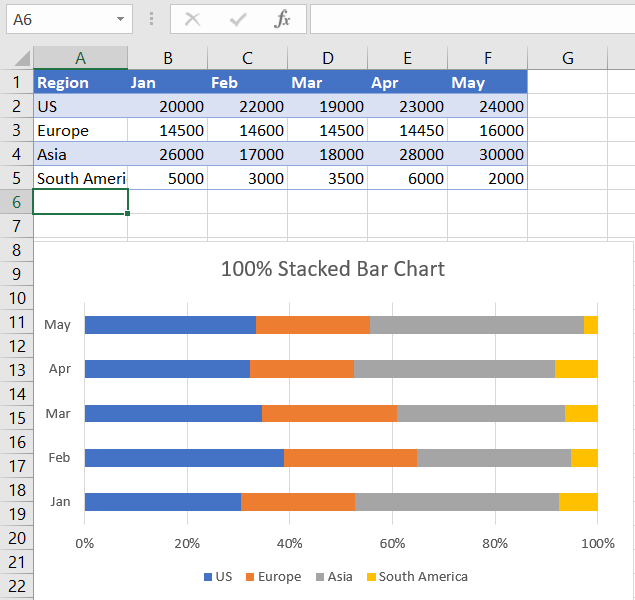
The 100% Stacked Bar Chart presents the overall contribution of a category of data. The chart type portrays similar information as a pie chart but can display multiple instances of the data, unlike the pie chart, which only displays one. To create a 100% Stacked Bar Chart, click on this option instead:
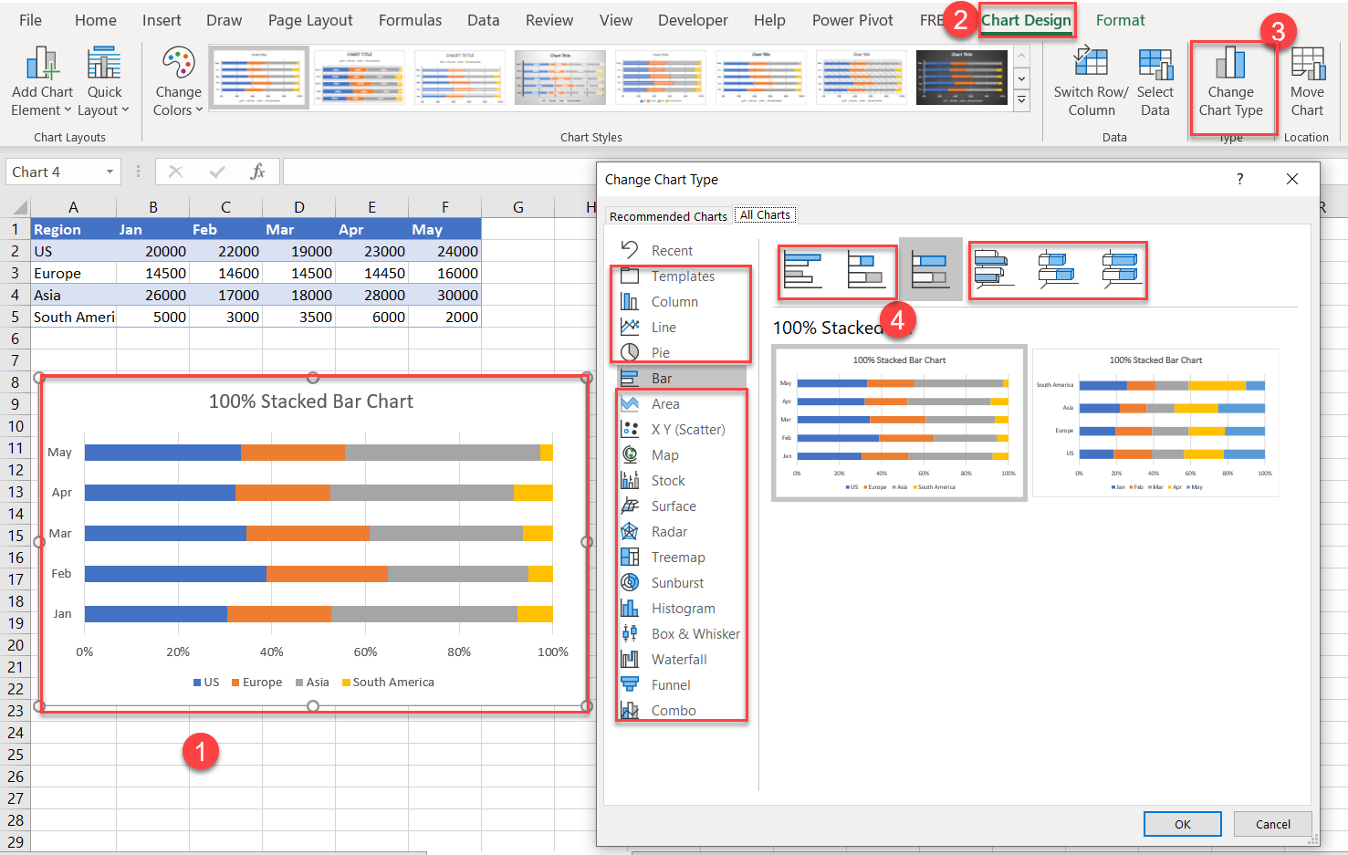
Changing Chart Types
Chart types can be changed easily in Excel:
- Select the chart you want to change.
- The Chart Design menu option will appear. Click on the option.
- Click on Change Chart Type.
- The current style that you initially chose will be selected. Click on any of the other options.
Swap Rows and Columns
If you want to swap the rows and columns, that is easy to do in Excel, as well:
- Select the chart (if it isn’t already selected).
- Choose the “Chart Design” menu option.
- Click on the Switch Row/Column option.
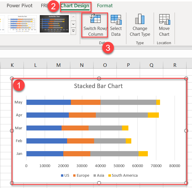
Now the graphed data is swapped:
To switch back, simply hit the Change Row/Column option again.
Editing Options for Bar Charts
Excel allows you to customize basically every aspect of bar charts. Below, we’ll walk through a few customization options.
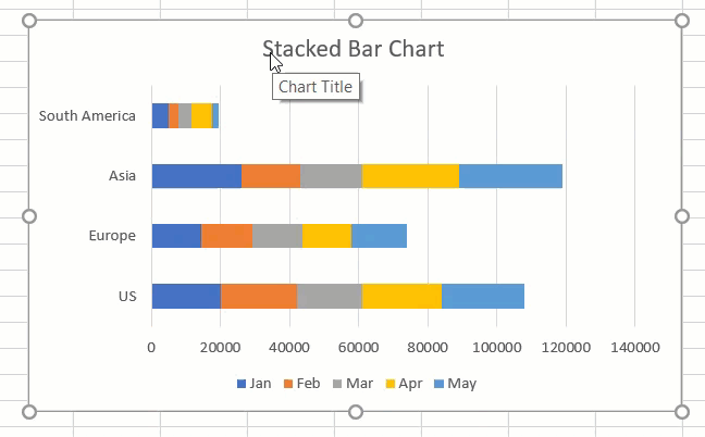
Edit Chart Title
The title should always be changed to something descriptive, as follows:
- Click on the Chart Title
- Highlight the text
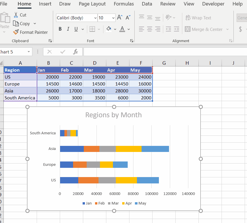
- Change the text to “Regions by Month” – or whatever you like.
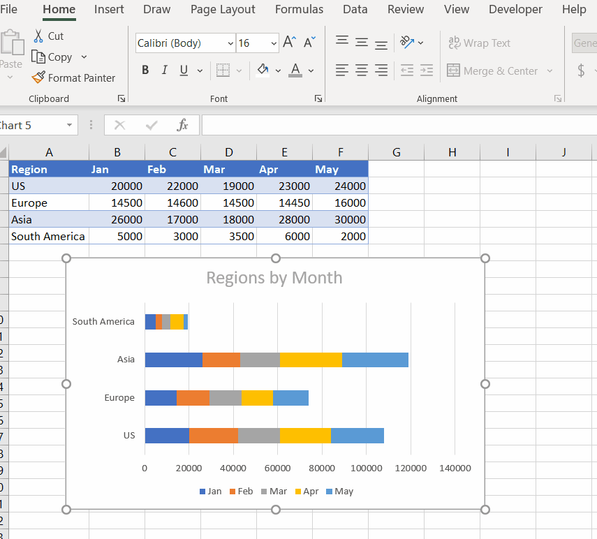
Editing and Moving Individual Chart Objects
Each chart is composed of several objects that can be selected and modified. They can be moved and resized:
You can use the standard editing tools, such as increasing font sizes and colors:
Customize Chart Elements
Chart Elements allow you to change the settings for your charts in one convenient location. To access:
- Click on the Chart
- Select the Green Plus option

As shown, changes are made in real time, and the options will depend on the type of chart you have selected. Since we are working with bar charts, these options are specific to this chart type.
More options are available by selecting the black arrow:
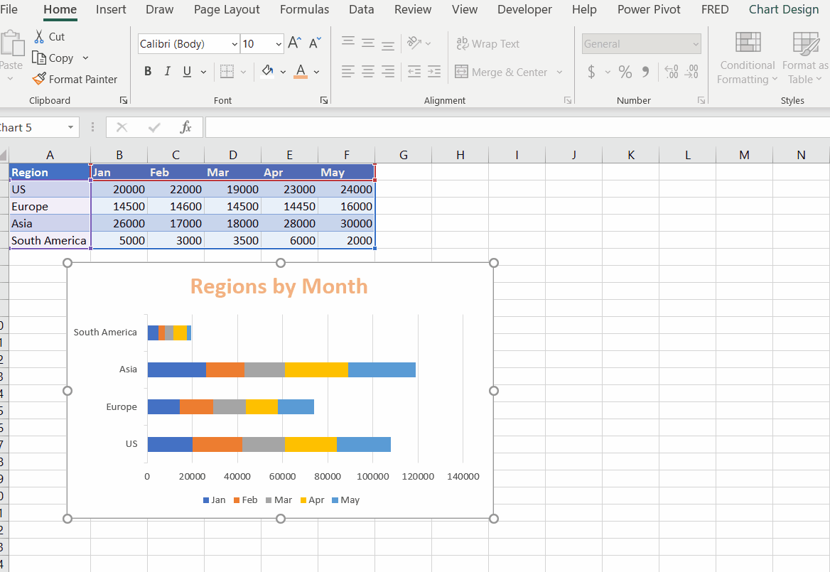
Chart Elements – Advanced
For the data series, you have the option of changing all the items in the series or individual items.
Let’s add data labels to the data series for Asia (gray bars).
- Select the Data Series (Gray)
- Click on the Green Plus
- Click the Data Labels option and select the check box

To apply the data labels to all the series, make sure no individual label is selected (unselect) and use the Data Label option:

Considerations with Bar Charts
As mentioned earlier, bar charts have the advantage of adding multiple items, as the user can scroll down. Bar charts are used for comparing data items. To compare data items while scrolling can frustrate the user. It’s best to keep the number of items low, unless there are good reasons to add the items.
Bar charts are best used for aggregated data, unless the number of items is small. For instance, when displaying two years of individual stock returns on a daily basis would not be practical in Excel. There are too many data points for Excel to handle appropriately. However, bar charts could be used for monthly, quarterly, or yearly returns. The more data items you have, the higher the aggregation should be.
The following charts show fictitious returns for two years on two fictitious stocks. The chart on the left is daily returns while the chart on the right show returns on a monthly basis.
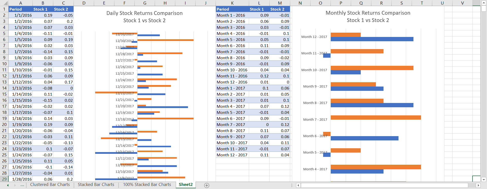
What is not shown in this chart is that the number of items for the daily returns scrolls down to row 795. The monthly returns, by contrast are only a few pages.
Note: Excel has a stock price charting option. However, this is for open-high-low-close prices and not returns.
The monthly returns improve the situation but may still be too granular. This is a perfect example of using discretion when having the user scroll down.
Bar charts give the user more flexibility in the length of labels. For instance, the following image shows a bar chart and a column chart using the same data points. The labels of the bar chart (1) are easy to read. Conversely, it’s not likely anyone would find the column chart labels (2) easy to read.
