Add Line of Best Fit (& Equation) – Excel & Google Sheets
Written by
Reviewed by
Last updated on October 30, 2023
This tutorial will demonstrate how to create a line of best fit and the equation in Excel and Google Sheets.
Add Line of Best Fit (& Equation) in Excel
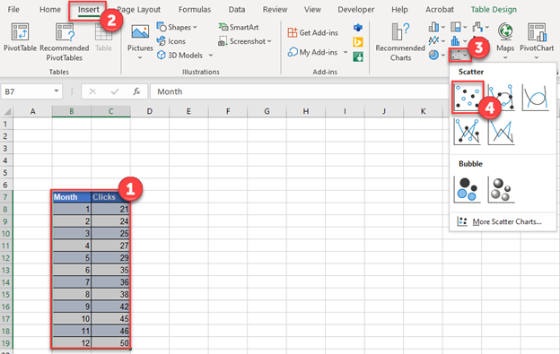
Adding a Scatterplot
- Highlight the data that you would like to create a scatterplot with
- Click Insert
- Click Scatterplot
- Select Scatter
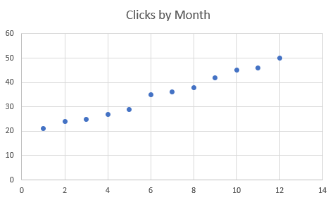
After creating your Scatterplot Graph, it should look something like below
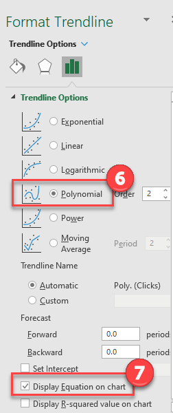
Adding your Trendline
- Click on the Graph
- Select Chart Design
- Click Add Chart Element
- Click Trendline
- Select More Trendline Options
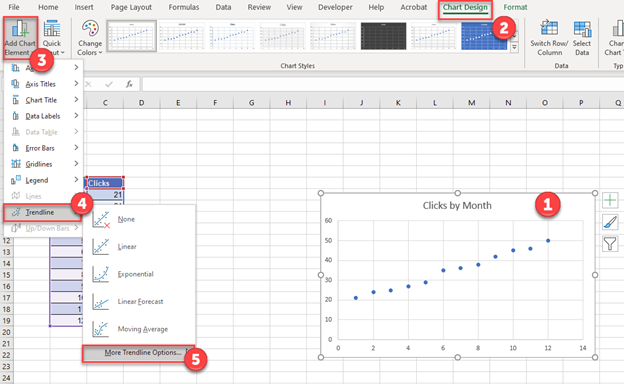
6. Select Polynomial
7. Check Display Equation on Chart
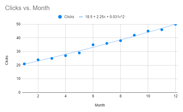
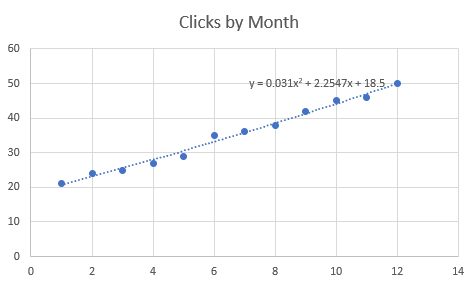
Final Graph with Trendline and Equation
After selecting those, a trendline of the series as well as the equation will appear on the graph as shown below.
Add Line of Best Fit (& Equation) in Google Sheets
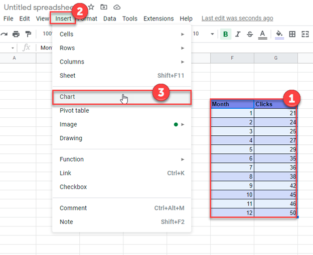
Create a Graph
- Highlight the dataset
- Select Insert
- Click Chart
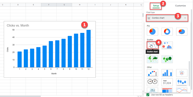
Change to Scatterplot
- Click on the Graph
- Select Setup
- Click Chart Type Box
- Select Scatter Chart
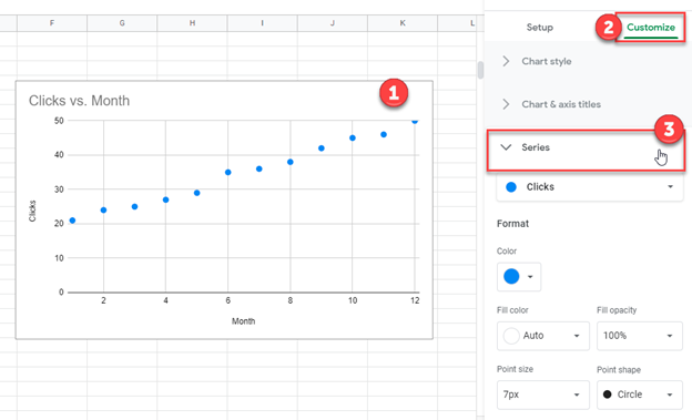
Add Trendline
- Click on the Scatterplot Graph
- Select Customize
- Click Series
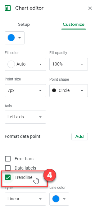
4. Check Trendline box
Add Equation
- Under Type, Select Polynomial
- Under Label, Select Use Equation
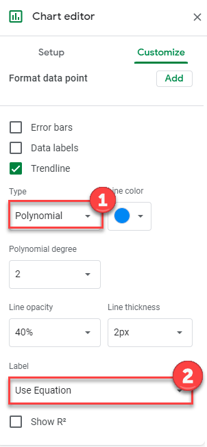
Final Graph with Trendline and Equation
As you can see, we now have a trendline and a polynomial equation of the best fitting line for the series.