Excel Burndown Chart Template – Free Download – How to Create
Written by
Reviewed by
This tutorial will demonstrate how to create a burndown chart in all versions of Excel: 2007, 2010, 2013, 2016, and 2019.
Burndown Chart – Free Template Download
Download our free Burndown Chart Template for Excel.
In this Article
- Burndown Chart – Free Template Download
- Getting started
- Step #1: Prepare your dataset.
- Step #2: Create a line chart.
- Step #3: Change the horizontal axis labels.
- Step #4: Change the default chart type for Series “Planned Hours” and “Actual Hours” and push them to the secondary axis.
- Step #5: Modify the secondary axis scale.
- Step #6: Add the final touches.
- Download Burndown Chart Template
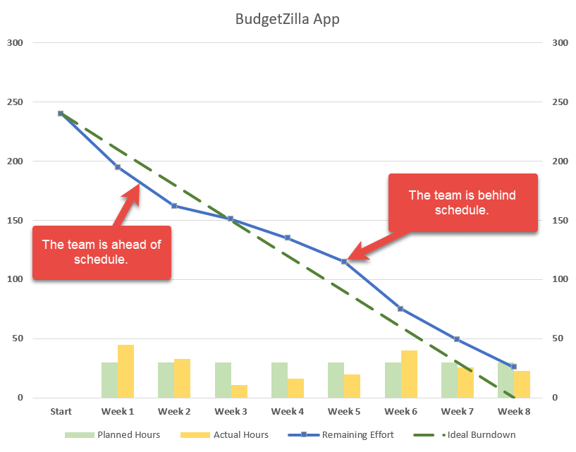
As the bread and butter of any project manager in charge of agile software development teams, burndown charts are commonly used to illustrate the remaining effort on a project for a given period of time.
However, this chart is not supported in Excel, meaning you will have to jump through all sorts of hoops to build it yourself. If that sounds daunting, check out the Chart Creator Add-in, a powerful, newbie-friendly tool for creating advanced charts in Excel while barely lifting your finger.
In this step-by-step tutorial, you will learn how to create this astounding burndown chart in Excel from scratch:
So, let’s get started.
Getting started
For illustration purposes, suppose your small IT firm has been developing a brand new budgeting app for about six months. Before hitting the first major milestone to show the progress to the client, your team had eight weeks to roll out four core features. As a seasoned project manager, you estimated it would take 240 hours to get the work done.
But lo and behold, that didn’t work out. The team failed to meet the deadline. Well, life is not a Disney movie, after all! What went wrong? In an effort to get to the bottom of the problem to figure out at what point things went off the rails, you set out to build a burndown chart.
Step #1: Prepare your dataset.
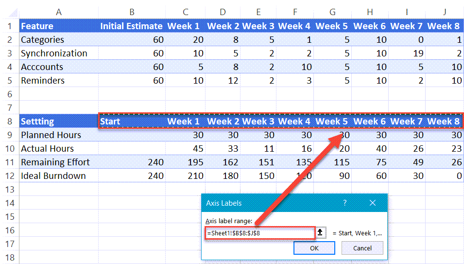
Take a quick look at the dataset for the chart:
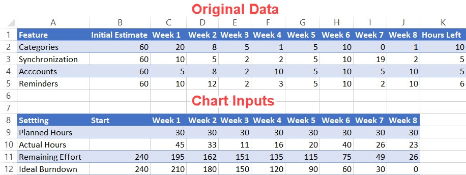
A quick take on each element:
- Original Data: Pretty self-explanatory—this is the actual data accumulated over the eight weeks.
- Chart Inputs: This table will make up the backbone of the chart. The two tables have to be kept separated to gain more control over the horizontal data label values (more on that later).
Now, let’s go over the second table more in detail so that you can easily customize your burndown chart.
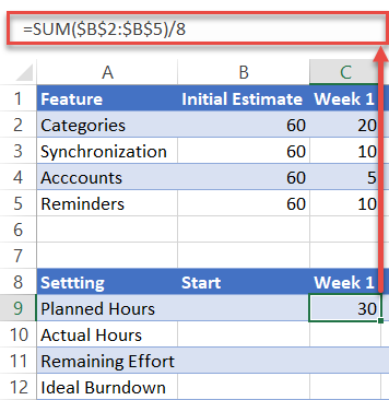
Planned Hours: This represents the weekly hours allocated to the project. To calculate the values, add up the initial estimate for each task and divide that sum by the number of days/weeks/months. In our case, you need to enter the following formula into cell C9: =SUM($B$2:$B$5)/8.
Quick tip: drag the fill handle in the bottom right corner of the highlighted cell (C9) across the range D9:J9 to copy the formula into the remaining cells.
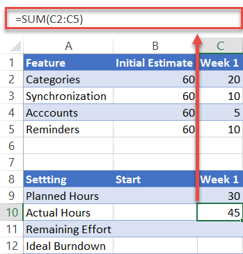
Actual Hours: This data point illustrates the total time spent on the project for a particular week. In our case, copy =SUM(C2:C5) into cell C10 and drag the formula across the range D10:J10.
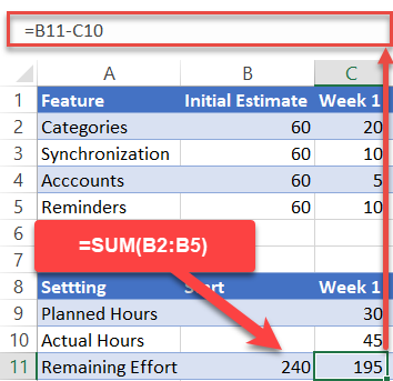
Remaining Effort: This row displays the hours left until project completion.
- For the value in the Start column (B11), just sum up the total estimated hours by using this formula: =SUM(B2:B5).
- For the rest (C11:J11), copy =B11-C10 into cell C11 and drag the formula across the rest of the cells (D11:J11).
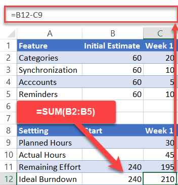
Ideal Burndown: This category represents the ideal trend of how many hours you need to pour into your project each week to meet your deadline.
- For the value in the Start column (B12), use the same formula as B11: =SUM(B2:B5).
- For the rest (C12:J12), copy =B12-C9 into cell C12 and drag the formula across the remaining cells (D12:J12).
Short on time? Download the Excel worksheet used in this tutorial and set up a customized burndown chart in less than five minutes!
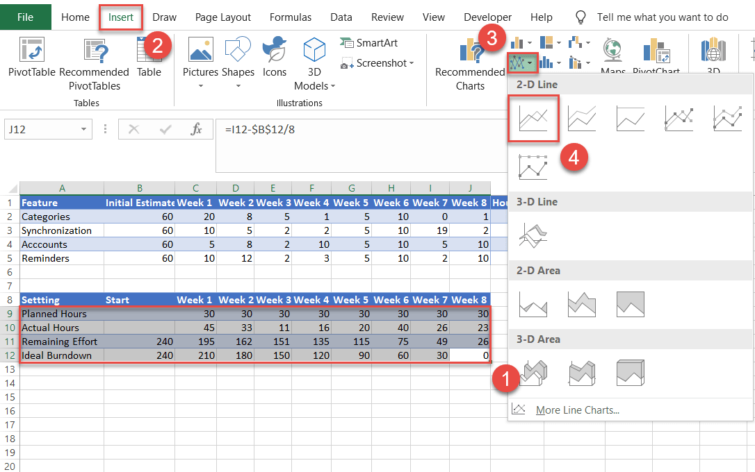
Step #2: Create a line chart.
Having prepared your set of data, it’s time to create a line chart.
- Highlight all the data from the Chart Inputs table (A9:J12).
- Navigate to the Insert tab.
- Click the “Insert Line or Area Chart” icon.
- Choose “Line.”
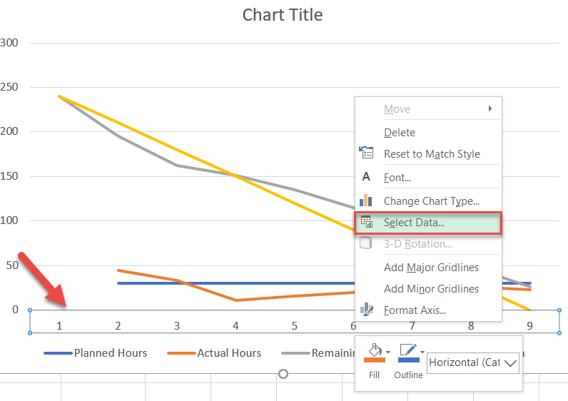
Step #3: Change the horizontal axis labels.
Every project has a timeline. Add it to the chart by modifying the horizontal axis labels.
- Right-click on the horizontal axis (the row of numbers along the bottom).
- Choose “Select Data.”
In the window that appears, under Horizontal (Category) Axis Labels, select the “Edit” button.
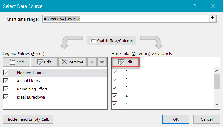
Now, highlight the header of the second table (B8:J8) and click “OK” twice to close the dialog box. Notice that because you have previously separated the two tables, you have complete control over the values and can change them the way you see fit.
Step #4: Change the default chart type for Series “Planned Hours” and “Actual Hours” and push them to the secondary axis.
Transform the data series representing the planned and actual hours into a clustered column chart.
- On the chart itself, right-click the line for either Series “Planned Hours” or Series “Actual Hours.”
- Choose “Change Series Chart Type.”
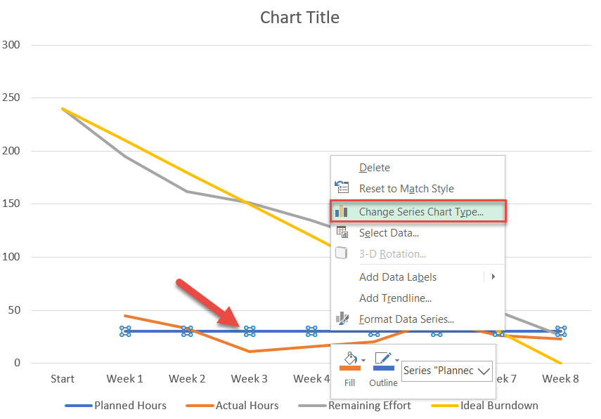
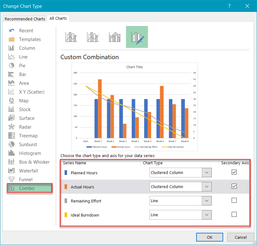
Next, navigate to the Combo tab and do the following:
- For Series “Planned Hours,” change “Chart Type” to “Clustered Column.” Also, check the Secondary Axis box.
- Repeat for Series “Actual Hours.”
- Click “OK.”
Step #5: Modify the secondary axis scale.
As you may have noticed, instead of being more like a cherry on top, the clustered column chart takes up half the space, stealing all the attention from the primary line chart. To work around the issue, alter the secondary axis scale.
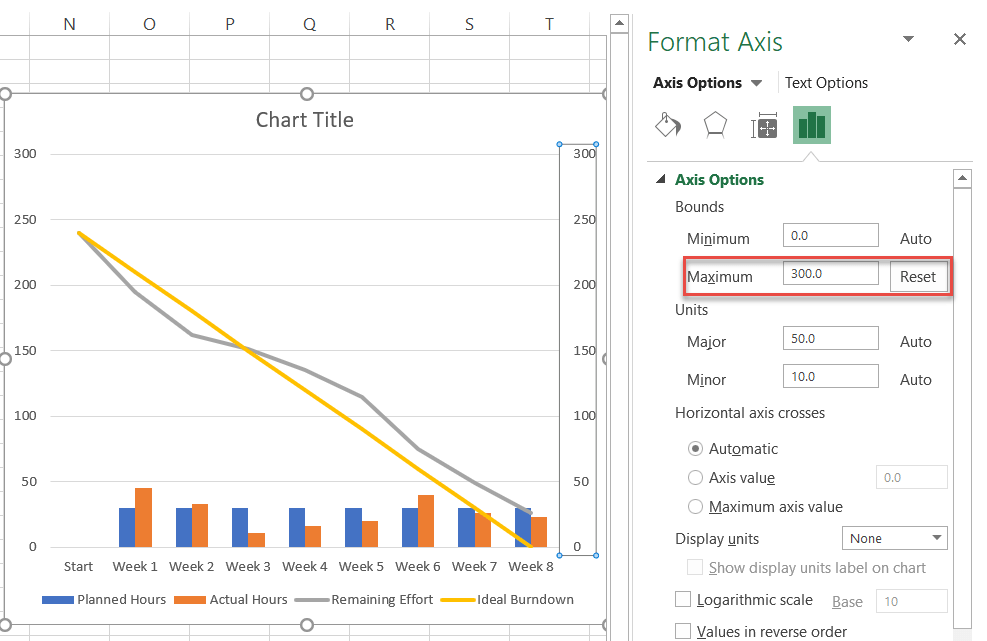
First, right-click on the secondary axis (the column of numbers on the right) and select “Format Axis.”
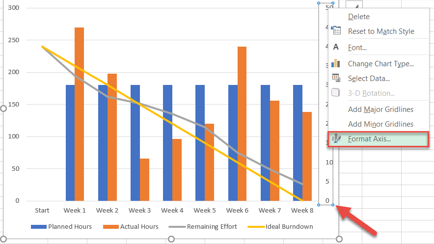
In the task pane that pops up, in the Axis Options tab, under Bounds, set the Maximum Bounds value to match that of the primary axis scale (the vertical one to the left of the chart).
In our case, the value should be set to 300 (the number at the top of the primary axis scale).
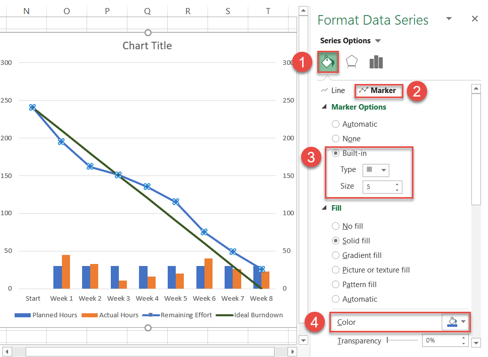
Step #6: Add the final touches.
Technically, the job is done, but since we refuse to settle for mediocrity, let’s “dress up” the chart by making use of what Excel has to offer.
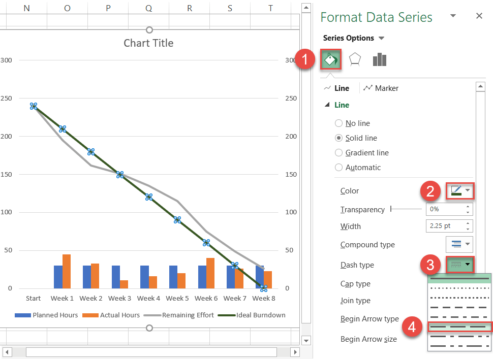
First, customize the solid line representing the ideal trend. Right-click on it and select “Format Data Series.”
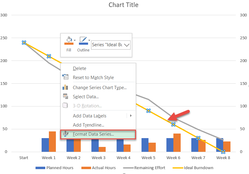
Once there, do the following:
- In the task pane that appears, switch to the Fill & Line tab.
- Click the Line Color icon and select dark green.
- Click the Dash Type icon.
- Choose “Long Dash.”
Now, move on to the line displaying the remaining effort. Select Series “Remaining Effort” and right-click to open the “Format Data Series” task pane. Then do the following:
- Switch to the Fill & Line tab.
- Click the Line Color icon and select blue.
- Go to the Marker tab.
- Under Marker Options, choose “Built-in” and customize the marker type and size.
- Navigate to the “Fill” section immediately below it to assign a custom marker color.
I also changed the column colors in the clustered column chart to something lighter as a means to accentuate the line chart.
As a final adjustment, change the chart title. You have now crossed the finish line!
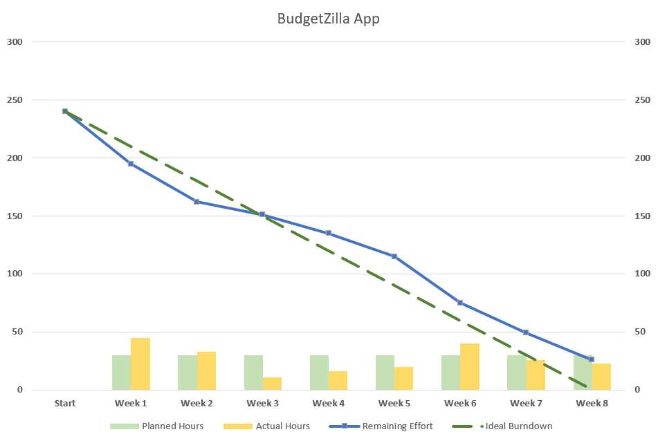
And voila, you have just added another arrow to your quiver. Burndown charts will help you easily see trouble coming from a long way off and make better decisions as you manage your projects.
