Change Chart Colors in Excel & Google Sheets
Written by
Reviewed by
Last updated on October 30, 2023
Change Chart Colors in Excel
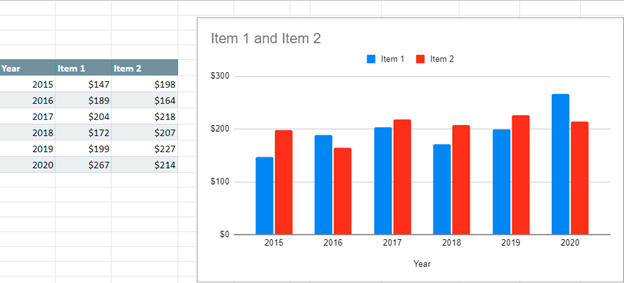
Starting with your Data
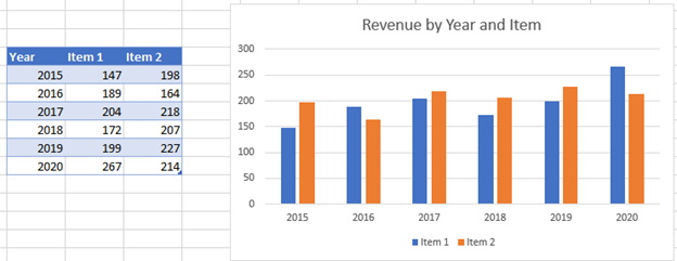
We’ll start with the data below showing a bar graph comparing revenue of two items. There are several ways that we can change the colors of a graph.
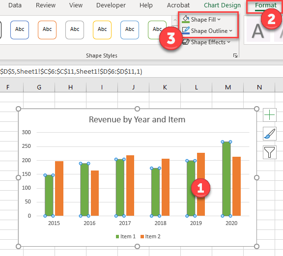
Changing Entire Series Color
- Click once on your series. (This will highlight all series items as shown below)
- Select Format
- Change Shape Fill or Shape Outline
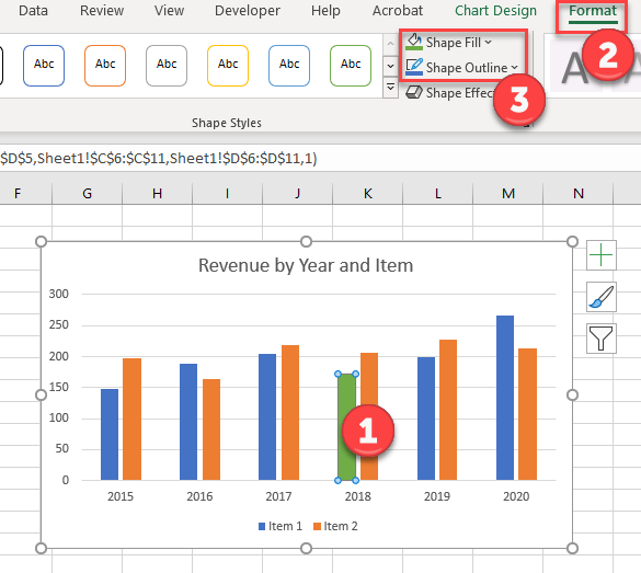
Changing Single Data Point Color
- Click twice on your series item. (This will highlight all series items as shown below)
- Select Format
- Change Shape Fill or Shape Outline
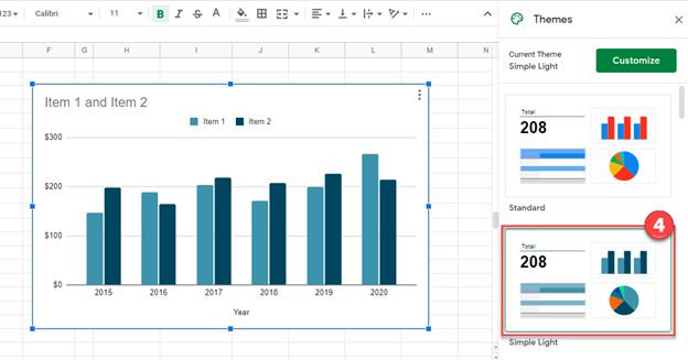
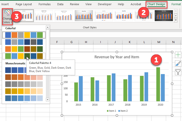
Changing Theme Color
- Click on graph
- Select Chart Design
- Click Change Colors and select your color theme
Change Chart Colors in Google Sheets
Starting with your Data
We’ll start with the same data that we did for the Excel version.
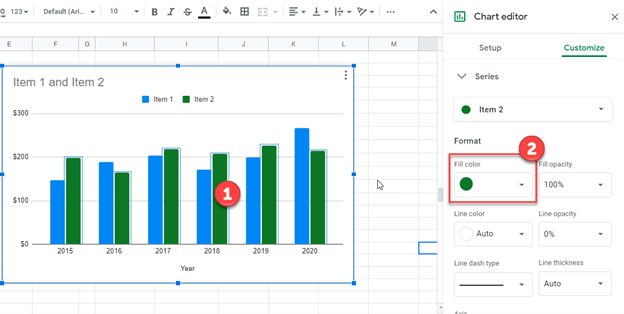
Changing Entire Series Color
- Click on your Series twice
- Under Chart Editor, select the Fill Color under Series
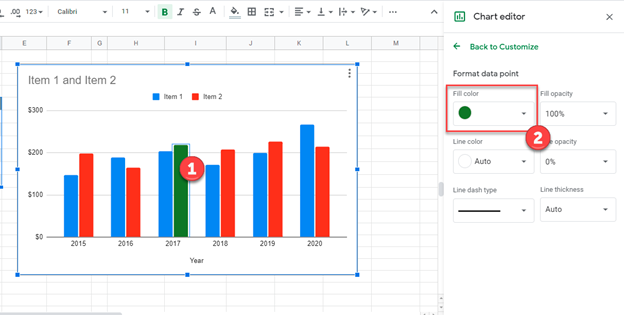
Changing Single Data Point Color
- Click on your single data point three times
- Change your Fill Color Under Format Data Point
Changing Theme Color
- Click on Graph
- Select Format
- Click Theme
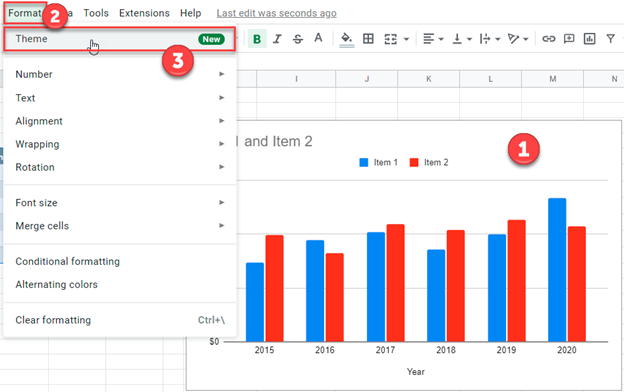
4. Select your Theme