Curve Fitting – Excel & Google Sheets
Written by
Reviewed by
Last updated on October 30, 2023
This tutorial will demonstrate how to create a curve fitting line in Excel & Google Sheets.
Creating Curve Fitting Line – Excel
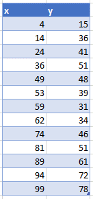
We’ll start with the following data:
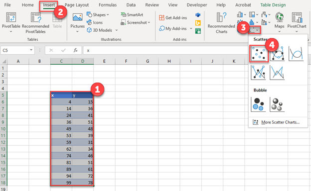
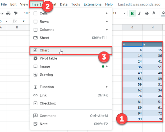
Creating a Scatterplot
- Highlight data
- Select Insert
- Select Scatterplots
- Select the first Scatterplot
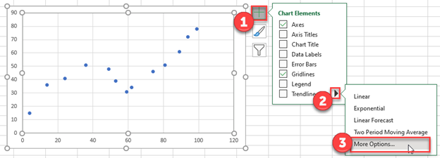
Creating a Trendline
- Select the + Sign in the top right of the graph
- Select the arrow next to Trendline
- Select More Options
4. Select the graph icon
5. Click Polynomial
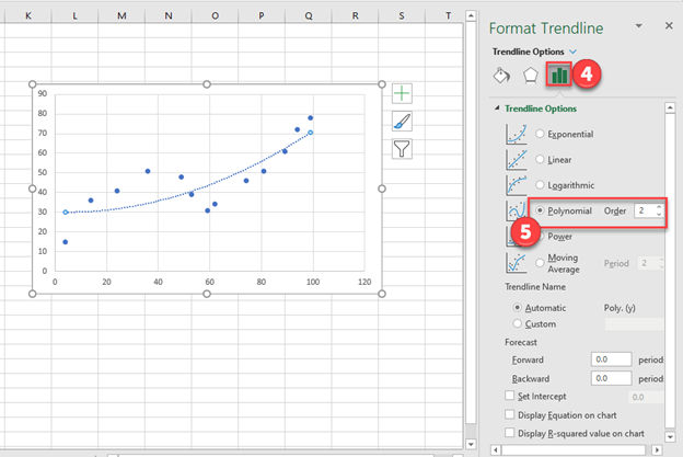
Changing Order of the Polynomial
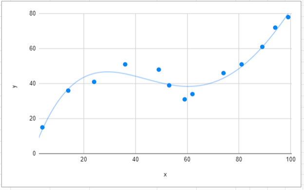
As you can see, increasing the Order adds more of a curve and fits the line more closely.
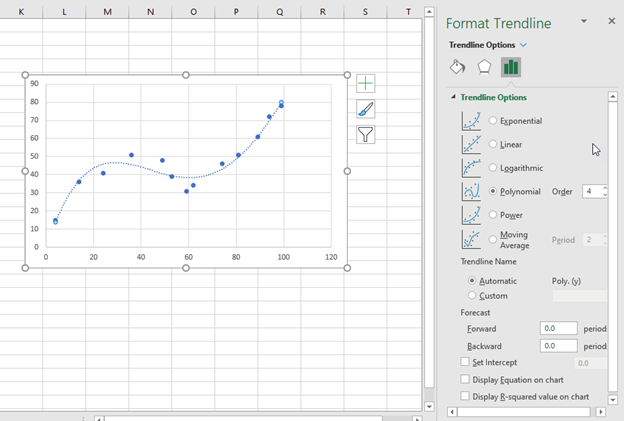
However, be careful to avoid “over-fitting” the data. Generally there should be a good reason to increase the Order number.
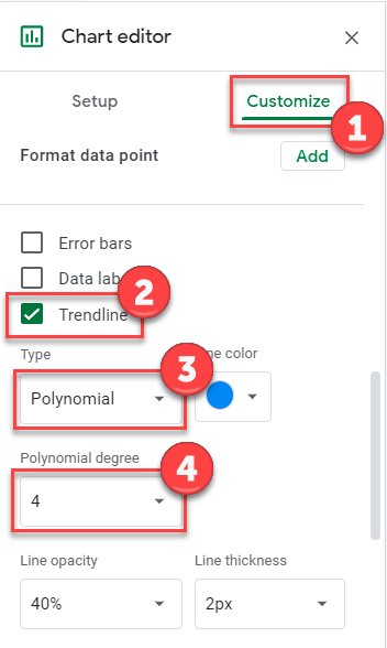
Creating Curve Fitting Line – Google Sheets
Creating a Scatterplot
- Highlight data
- Select Insert
- Click Chart
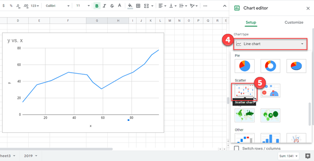
4. Click on the dropdown of the current Chart Type
5. Change it to Scatter Plot
Creating a Curve Trendline
- Select Customize
- Click Trendline
- Select Polynomial
- Select which Polynomial Degree (same as Order explained in Excel)
You can now see the final trendline with the curve as shown below.