Add / Move Data Labels in Charts – Excel & Google Sheets
Written by
Reviewed by
In this tutorial, we’ll add and move data labels to graphs in Excel and Google Sheets.
Adding and Moving Data Labels in Excel
Starting with the Data
In this example, we’ll start a table and a bar graph. We’ll show how to add label tables and position them where you would like on the graph.

Adding Data Labels
- Click on the graph
- Select + Sign in the top right of the graph
- Check Data Labels

Change Position of Data Labels
Click on the arrow next to Data Labels to change the position of where the labels are in relation to the bar chart

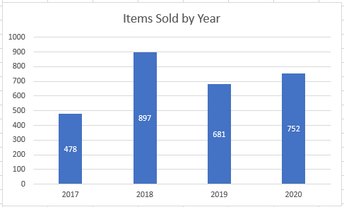
Final Graph with Data Labels
After moving the data labels to the Center in this example, the graph is able to give more information about each of the X Axis Series.
Adding and Moving Data Labels in Google Sheets
Starting with your Data
We’ll start with the same dataset that we went over in Excel to review how to add and move data labels to charts.
Add and Move Data Labels in Google Sheets
- Double Click Chart
- Select Customize under Chart Editor
- Select Series

4. Check Data Labels
5. Select which Position to move the data labels in comparison to the bars.

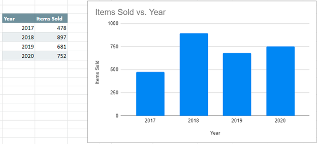
Final Graph with Google Sheets
After moving the dataset to the center, you can see the final graph has the data labels where we want.

