How to Create Dynamic Chart Titles in Excel
Written by
Reviewed by
In and of itself, the process of building Excel charts is pretty straightforward. However, making some chart elements dynamic with data takes a bit of extra work on your part.
And today, you will learn how to harness the power of dynamic chart titles.
Basically, the process entails linking an otherwise static chart title to a specific worksheet cell, so whatever you put into that cell will automatically appear as the new title.
That way, the technique does the dirty work of adjusting a chart title for you whenever the underlying data has been altered so that you will never let that small but important detail slip through the cracks—a scenario that, without a doubt, has happened to the best of us at least once.
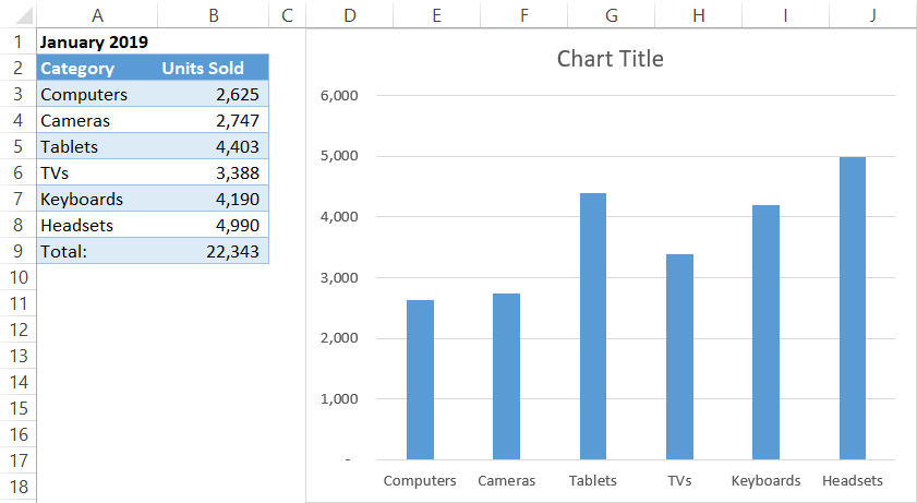
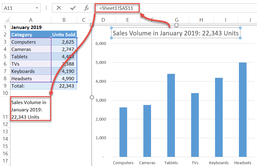
For illustration purposes, consider the following column chart illustrating the sales figures of a fictitious electronics store for January:
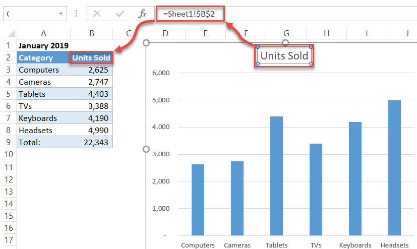
To cut to the chase, just follow these simple steps to link your chart title to any cell in the spreadsheet:
- Click on the chart title.
- Type “=” into the Formula Bar.
- Highlight the cell you are going to turn into your new chart title.
But that was child’s play compared to what dynamic chart titles are truly capable of. Now, we will take it to the next level by throwing formulas into the picture so that you can see how powerful the technique truly is.
Let’s put together a fancy-looking dynamic chart title that will use both the month and the sales volume data and link it to the chart shown above. Input the following formula into one of the blank cells (such as A11) and make sure the chart title is linked to that cell:
="Sales Volume in "&A1&": "&TEXT(B9, "#,#")&" Units"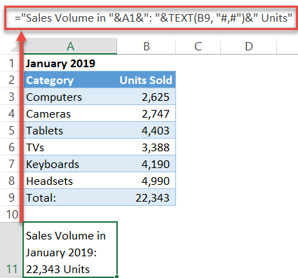
In this formula, the TEXT function formats a given value into text, making it possible to use the value as a building block for a dynamic chart title.
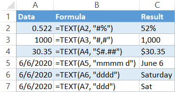
So, if you are going to use anything other than plain text for that purpose, check out the tutorial dedicated to the function, which shows in greater detail how to convert different types of data to text.
Here are just a few examples of formatting various values into text to be used in building dynamic chart titles:
The beauty of this method lies in its flexibility: If you change any of the linked values, the title will be automatically updated.
Still not impressed? Well, let’s turn up the heat even more by adding the sales figures for February and making the chart title display whether the sales went up or down in comparison to the previous month with this formula:
="Sales Volume in "&D1&": "&TEXT(E9, "#,#")&" Units "&IF(E9<B9, "(Down by "&TEXT((E9-B9)/-B9*100, "#")&" Percent)", "(Up by "&TEXT((E9-B9)/B9*100, "#")&" Percent)")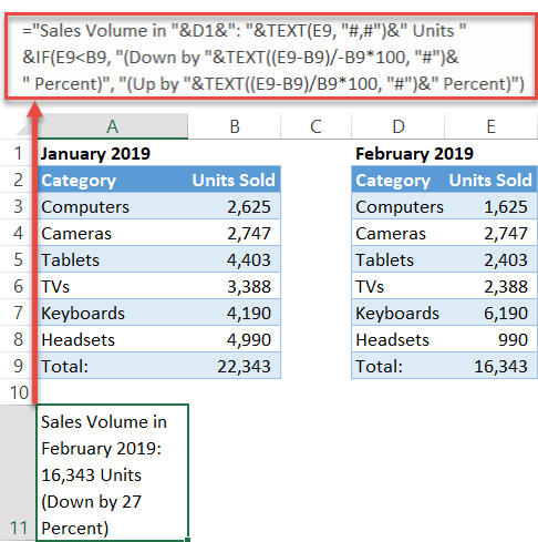
Just let that sink in. You have a simple chart title analyzing the sales volume dynamics. Sounds pretty incredible, right?
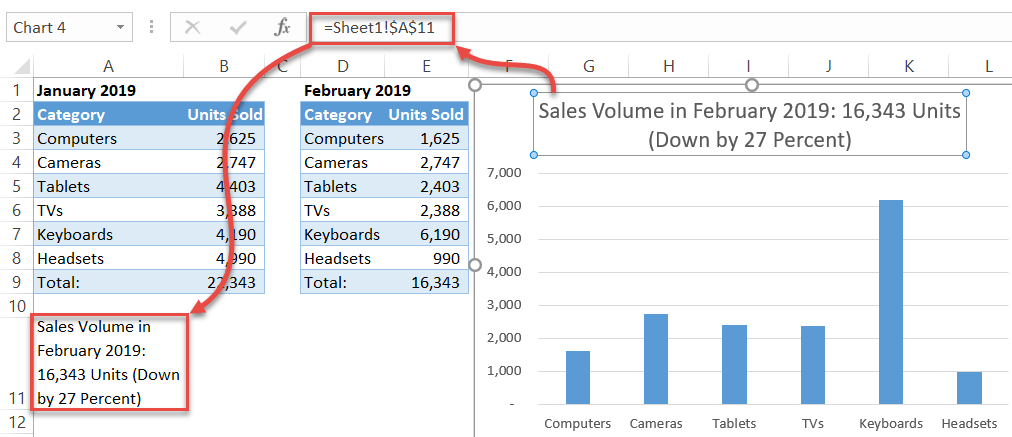
Here’s how it works: Drive the numbers down, and the chart title will adjust accordingly.
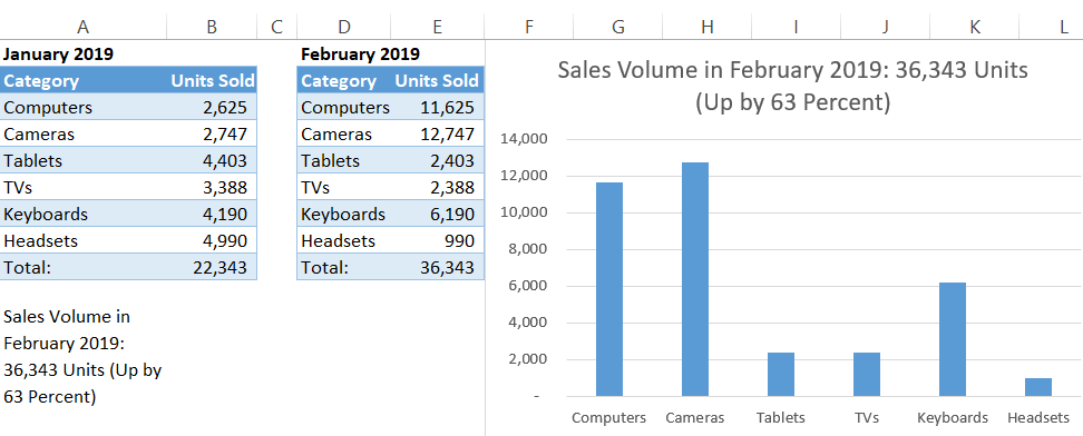
And that’s how you turn something so trivial like a chart title into your loyal ally that will help you improve your data visualization game by leaps and bounds.
