Excel Line Charts – Standard, Stacked – Free Template Download
Written by
Reviewed by
This tutorial will demonstrate how to create a Line Chart in Excel
Line charts are a popular choice for presenters. This chart type is familiar to most audiences. One of the best uses for them is trending data.
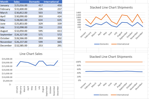
Like most charts, the line chart has three main styles:
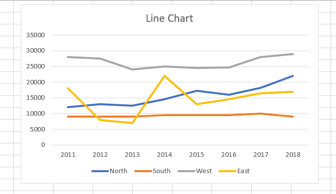
- Line Chart
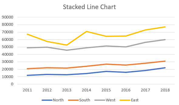
- Stacked Line Chart
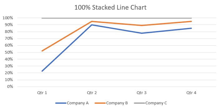
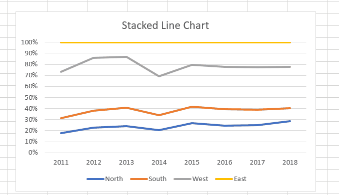
- 100% Stacked Line Chart
The line chart series also includes three other styles that are identical to the above but add markers to each data point in the chart:
How to Create a Line Chart
To create a line chart, follow these steps:
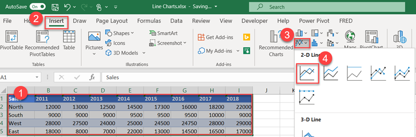
- Select the data to include for your chart.
- Select the Insert menu option.
- Click the “Insert Line or Area Chart” icon.
- Choose “2-D Line.”
Note: These steps may vary slightly depending on your Excel version. This may be the case for each section in this tutorial.
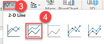
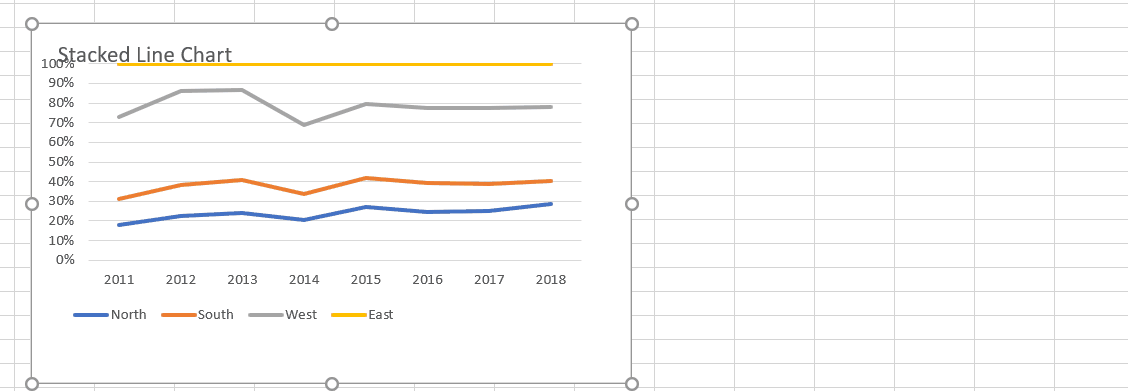
How to Create Stacked Line Charts
To create a stacked line chart, click on this option instead:
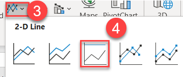
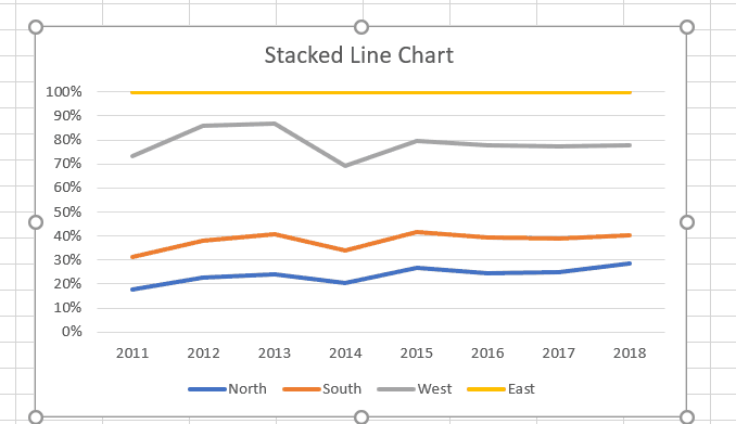
How to Create 100% Stacked Line Chart
To create a stacked line chart, click on this option instead:
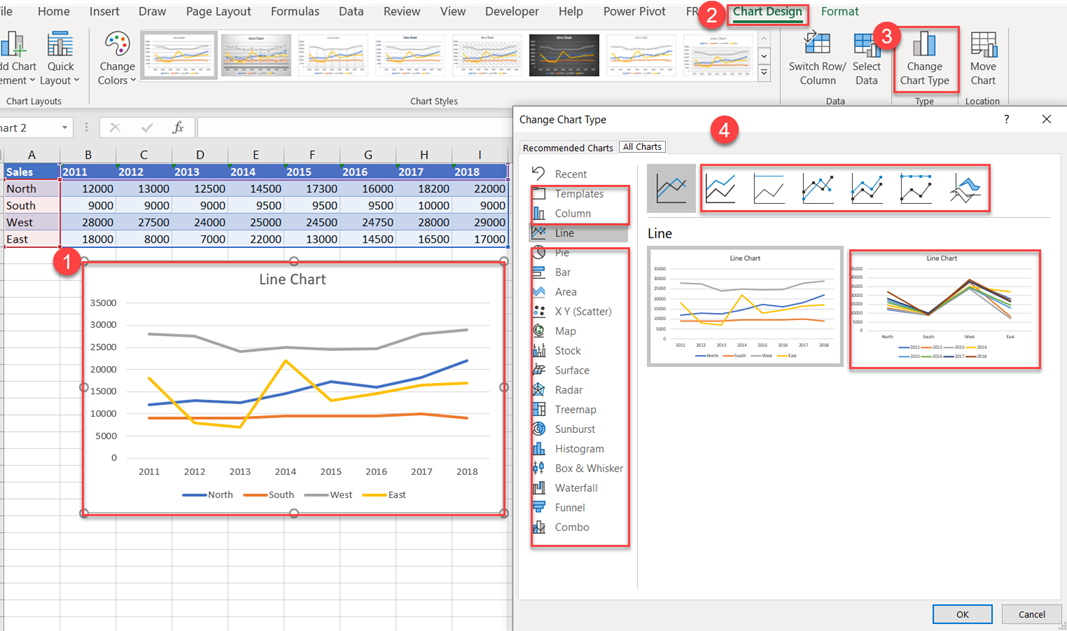
Change Chart Types
If the look of the chart you chose doesn’t look right, it’s easy to change in Excel, as follows:
- Select the chart you want to change.
- The Chart Design menu option will appear. Click on the option.
- Click on Change Chart Type.
- The current style that you initially chose will be selected. Click on any of the other options.
Swap Rows/Columns
When the chart doesn’t look right, sometimes all that is needed to do is swap the rows and columns. The following shows how to accomplish this task:
If you want to swap the rows and columns, follow these steps:
- Select the chart (if it isn’t already selected).
- Choose the “Chart Design” menu option.
- Click on the Switch Row/Column
The animation shows that you can toggle back and forth.
Editing Options for Line Charts
Like other charting options, several editing options are available to enhance or change your chart’s look. The following are some of the common editing features.
Edit Chart Title
To add a descriptive title, follow these steps:
- Select the chart (if not already selected)
- Click on the Chart Title
- Highlight the text
- Change the text to something meaningful.
Editing and Moving Individual Chart Objects
A chart is made up of several objects, including the title, the chart, axes, and legend. For most chart styles, these objects can be selected individually, as follows:
Many of these objects can be moved, as follows:
Customize Chart Elements
Chart Elements allow you to change the settings for your charts in one convenient location. To access:
- Click on the Chart
- Select the Green Plus (+) option
When you hover over each option, you’ll see a preview of what the chart will look like if you select that option. Most charts will have options specific to the chart type. The options shown in the animation are for Stacked Line Charts.
More options are available by selecting the black arrow as follows:
![]()
Chart Elements – Advanced
For the data series, you have the option of changing all the items in the series or individual items.
Let’s add data labels to the data series for the South data item (orange items).
- Select the Data Series (Orange)
- Click on the Green Plus (+)
- Click the Data Labels option and select the checkbox

To apply the data labels to all the series, make sure no individual label is selected (unselect) and use the Data Label option:

Considerations with Line Charts
Choosing the right chart types takes practice. It is also a personal choice or is dictated by your company or organization. Line charts often work for many presentations, but getting them right requires understanding their limitations.
When using a standard line chart, fewer data items are preferred. If you try to use too many data items, the chart becomes muddled, and you will lose the audience. The advantage of the line chart is their ability to show trends.
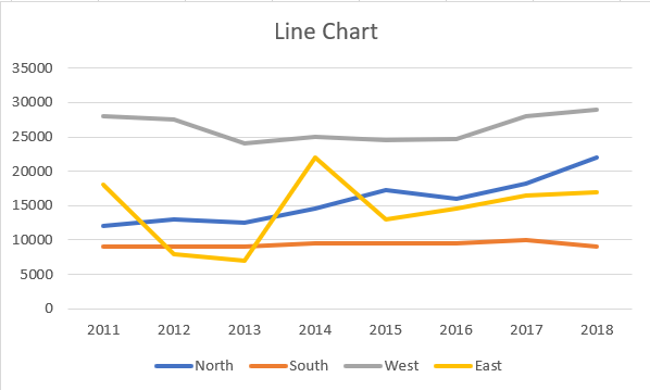
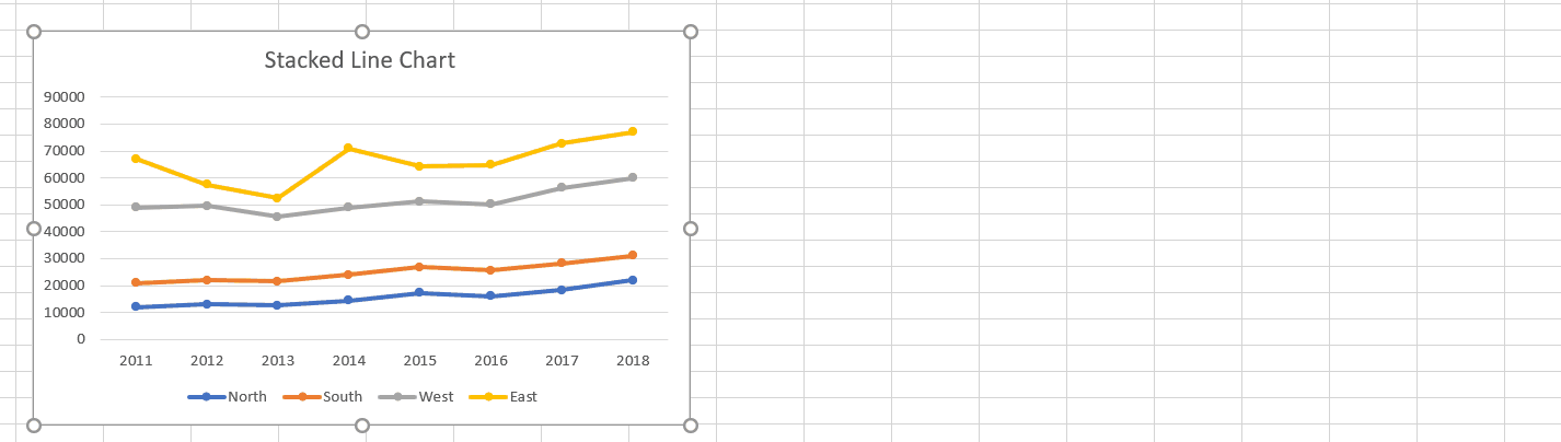
Stacked line charts work when you want to show the overall contribution of your items. This usually requires that the items are related and are part of a whole. For instance, showing sales by region would show each region’s sales, cumulatively.
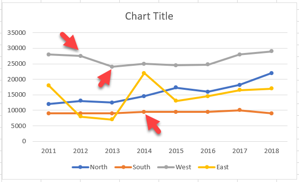
Cumulative data can confuse your audience. For instance, consider the following chart:
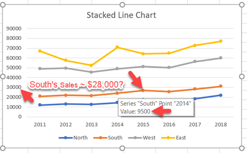
When you hover over the orange data point, you can see that the value shows 9,500. However, the vertical axis is showing the point to be at approximately 28,000. The actual value of both North and South added up is 26,800. As with any chart, if you have to spend an excessive amount of time explaining your presentation choices, you may want to consider different chart styles.
Another option is to change the order of the stack. You can do this easily in Excel as follows:
- Select the plot area
- Right-click and choose Select Data
- Click on one of the items in the Legend Entries (the animation shows North to start)
- Select the Up/Down arrow to move the items.
Preparing the Data
When creating charts, the fewer steps needed, the better. When you set up the trending data on rows, the chart wizard may misinterpret the data. For instance, here is a line chart of gas prices per year (with the years as the row header):
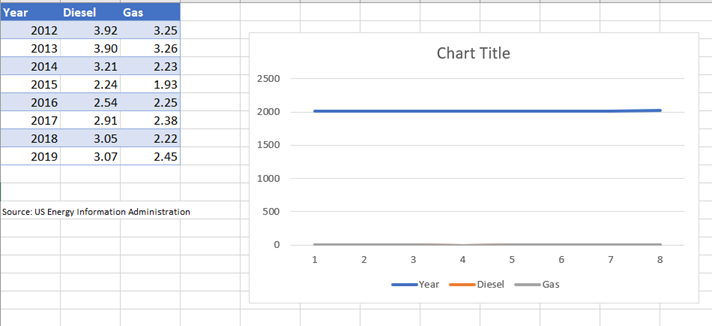
The Year column is being used as a data item. This is not likely to be the intended result.
To use the data in this trending-row format, you would need to select the Diesel and Gas columns separately:
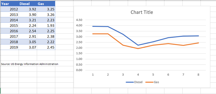
Then, you would need to change the horizontal axis to reflect the years.
Conversely, lining up the data with the trends as columns will help the chart wizard recognize the appropriate data items:
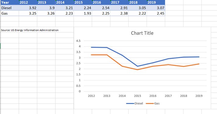
It is a trade-off between rearranging the data and changing the settings after the chart is created. There is no right or wrong answer. If you obtain the data in the proper format from the start, that could help streamline the process.
