Log-Log Plot in Excel & Google Sheets
Written by
Reviewed by
Last updated on October 30, 2023
Log-Log Plot in Excel
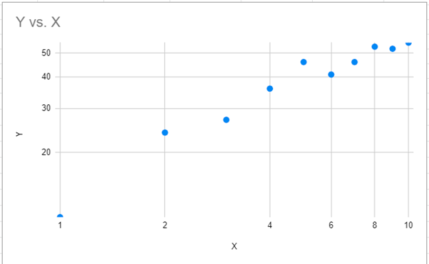
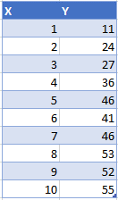
We’ll start with data that shows values for the X and Y Axis.
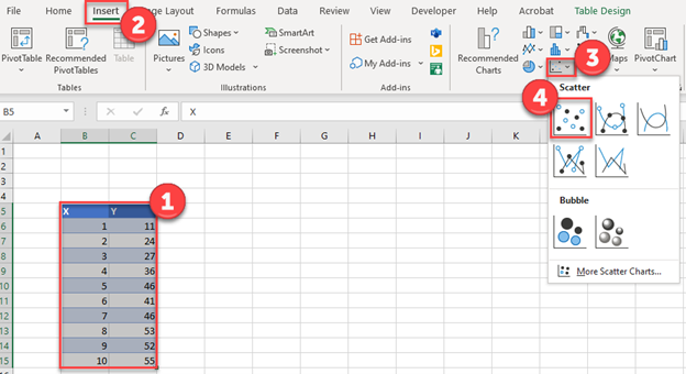
Creating a Scatterplot
- Highlight the data
- Select Insert
- Click Scatter
- Select the first Scatterplot
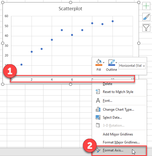
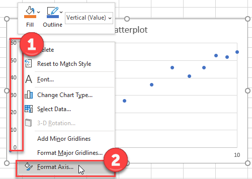
Change X Axis to Logarithmic
- Right click on the X Axis
- Select Format Axis
3. Check the Logarithmic Scale
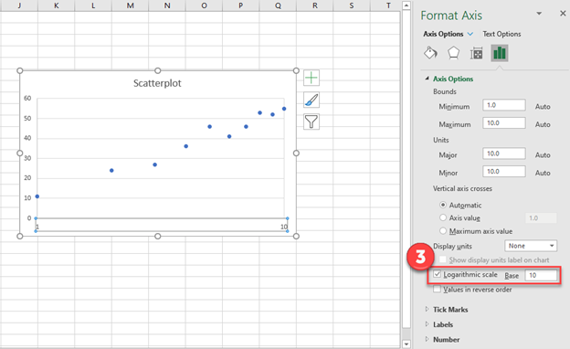
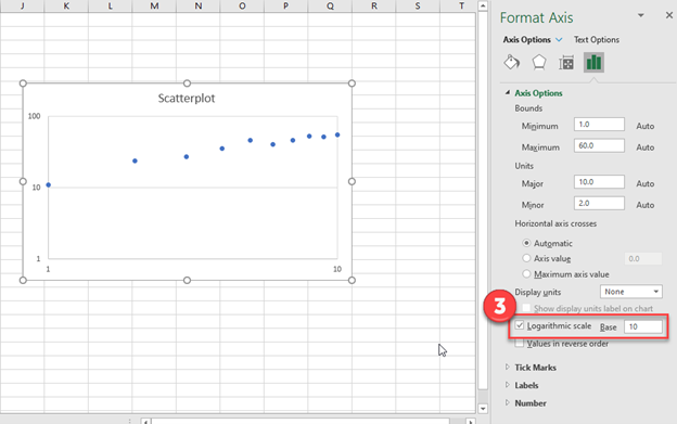
Change Y Axis to Logarithmic
- Right click Y Axis
- Select Format Axis
3. Click on Logarithmic Scale
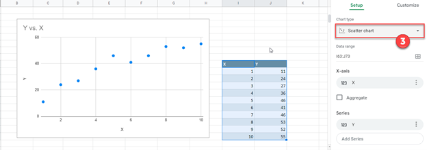
Log-Log Plot in Google Sheets
- Select Data
- Click on Chart
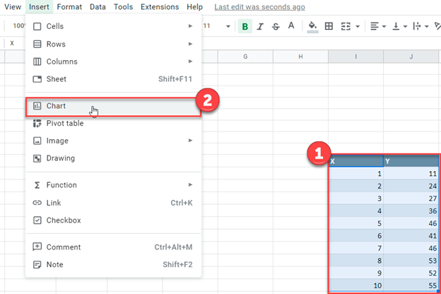
3. Change the Chart Type to Scatter Chart
Change X Axis to Logarithmic
- Select Customize
- Click Horizontal Axis
- Check Log Scale

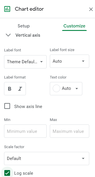
Change X Axis to Logarithmic
- Select Customize
- Click Vertical Axis
- Check Log Scale
Keep in mind you can adjust the Scale Factor for the X and Y Axis
Final Log-Log Plot in Google Sheets