How to Create a Mekko/Marimekko Chart in Excel
Written by
Reviewed by
This tutorial will demonstrate how to create a Marimekko chart in all versions of Excel: 2007, 2010, 2013, 2016, and 2019.
In this Article
- Mekko Chart – Free Template Download
- Getting Started
- Step #1: Set up a helper table.
- Step #2: Add the market segment data to the helper table.
- Step #3: Fill in the buffer rows.
- Step #4: Set the custom number format for the horizontal axis data column.
- Step #5: Compute and add the segment percentages to the axis column.
- Step #6: Find the horizontal axis values for the buffer rows.
- Step #7: Calculate the midpoints for the remaining cells in the horizontal axis column.
- Step #8: Set up the segment label data.
- Step #9: Set up the company share labels.
- Step #10: Plot a stacked area chart.
- Step #11: Lay the groundwork for the segment labels.
- Step #12: Add and position the custom segment labels.
- Step #13: Make the helper line chart invisible.
- Step #14: Modify the horizontal axis.
- Step #15: Modify the vertical axis.
- Step #16: Adjust the plot area size.
- Step #17: Insert the company share labels into the chart.
- Step #18: Add the borders separating the chart blocks.
- Step #19: Recolor the chart blocks.
- Download Marimekko Chart Template
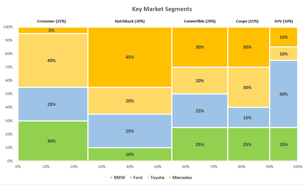
A Mekko chart (also known as a Marimekko chart or mosaic plot) is a two-dimensional stacked chart where the chart column width usually represents the dollar amount or relative size of a market segment while the chart column height breaks down each segment, revealing the key players as well as their respective company shares.
The graph provides a detailed overview of the target market, all in one place—which is why it has been used for decades by strategy consultants.
However, Excel still doesn’t have a built-in Marimekko chart type available, meaning you will have to build it manually yourself. For that reason, check out our Chart Creator Add-In, a tool that allows you to plot advanced Excel charts within seconds.
In this step-by-step tutorial, you will learn how to create this fully customizable Marimekko chart in Excel from the ground up, even if you are completely new to spreadsheets and chart design:
Getting Started
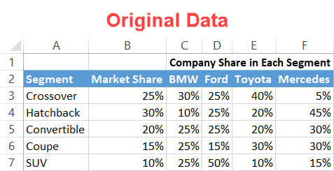
For illustration purposes, suppose you plan to launch a new car brand and penetrate the key market segments with your designs. That being said, you set out to build a mosaic plot using the following data:
Before we begin, full disclosure: a Mekko chart takes a multitude of steps to put together, so we strongly recommend you download the template to make it easier for you to follow the guide. Just don’t forget that since your actual data will differ from the example, you will have to adjust accordingly.
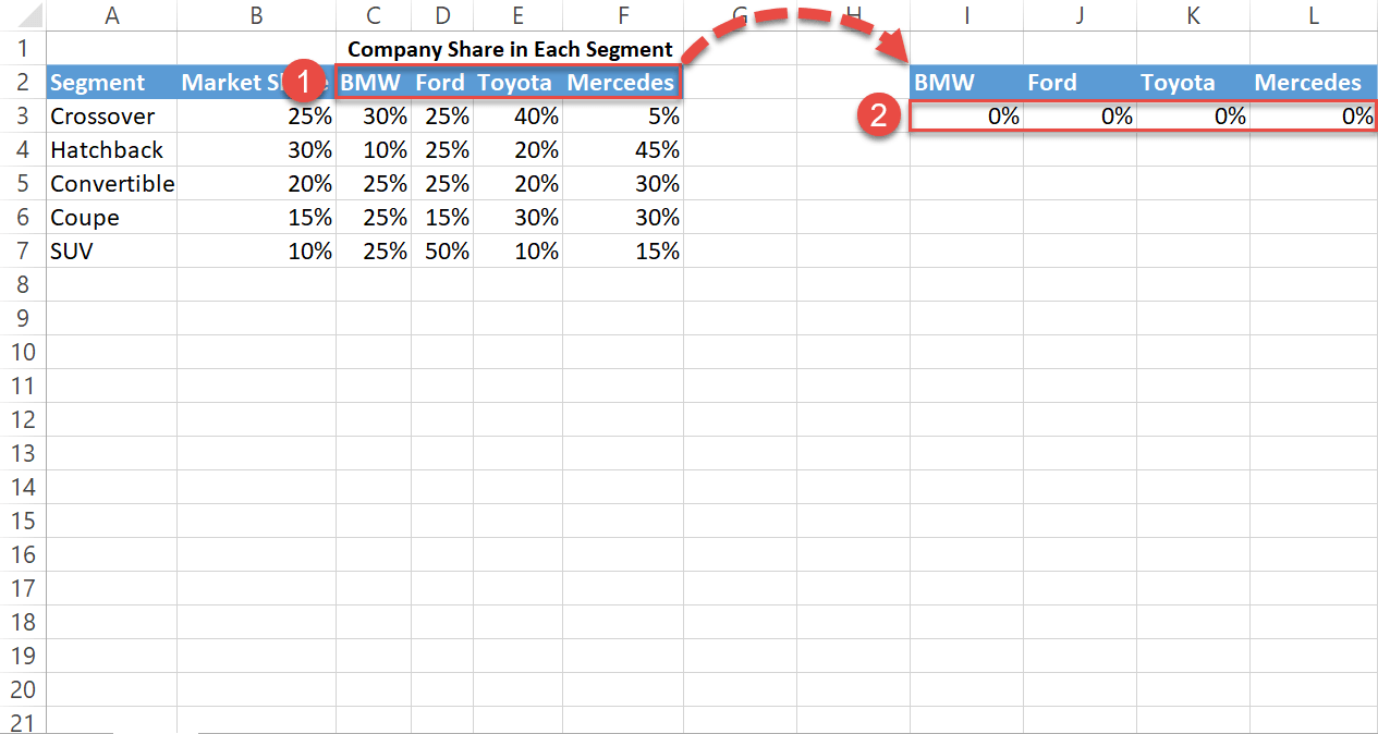
Step #1: Set up a helper table.
An old warrior mantra states: “The more you sweat in training, the less you bleed in battle.” To build a Mekko chart, you have to outline a separate helper table where all the chart data will be calculated and stored.
Let’s start out by copying the column headers containing the company names (C2:F2) into the blank cells a couple columns away from your actual data (I2:L2). Also, type “0%” into each cell below the header row (I3:L3) to outline the beginning of each chart column.
Step #2: Add the market segment data to the helper table.
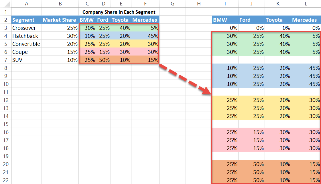
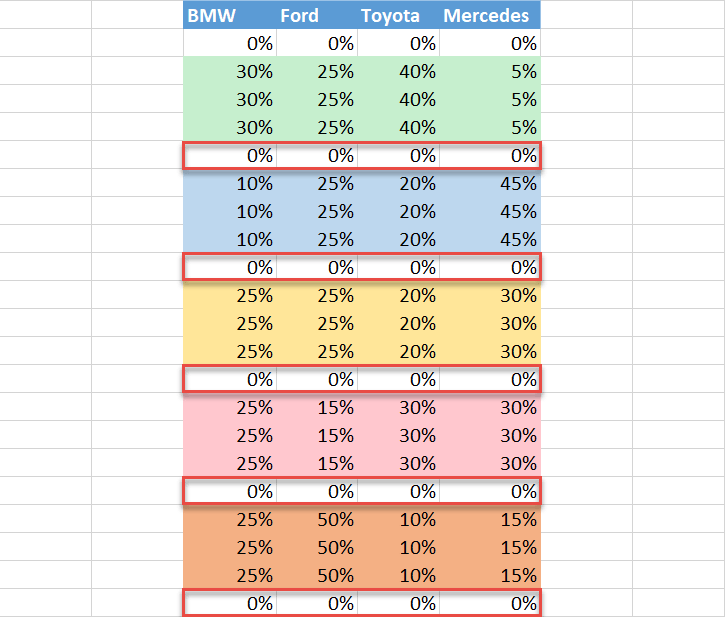
Copy three sets of duplicate data representing the company shares in each segment into the helper table. Each segment is color-coded here to make it easier to see what goes where.
It’s important to differentiate the segments with empty buffer rows which will separate the chart columns, holding the entire structure together.
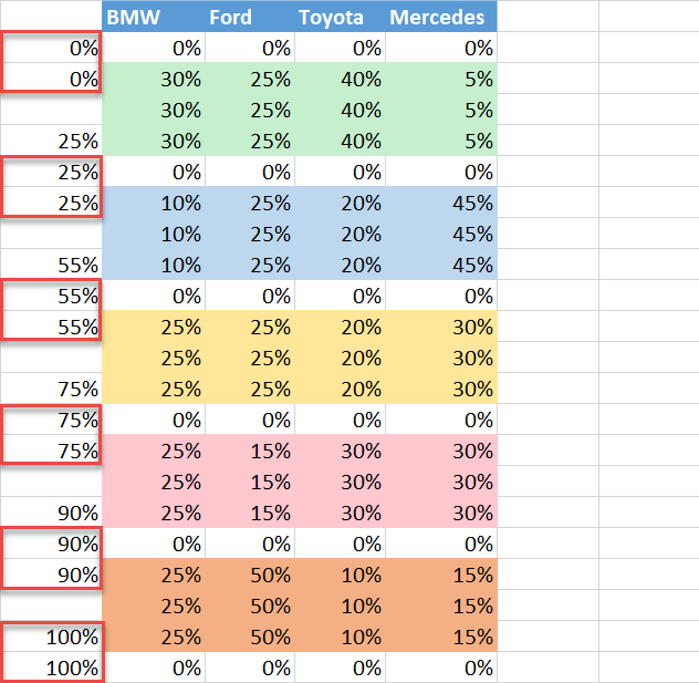
Step #3: Fill in the buffer rows.
Since the buffer rows act as separators and don’t represent actual data, you want them hidden.
To do that, fill in the buffer rows with zero percent values as shown on the screenshot below. Include an additional row of zeros at the end of the table:
Step #4: Set the custom number format for the horizontal axis data column.
To make magic happen for your Mekko chart, you need to manually build the horizontal axis scale from scratch in the column to the left of the helper table (column H).
First off, lay the groundwork by setting the custom number format for the axis column.
Highlight the cells to the left of the helper table, leaving out the header row (H3:H23), right-click on them, and choose “Format Cells.”
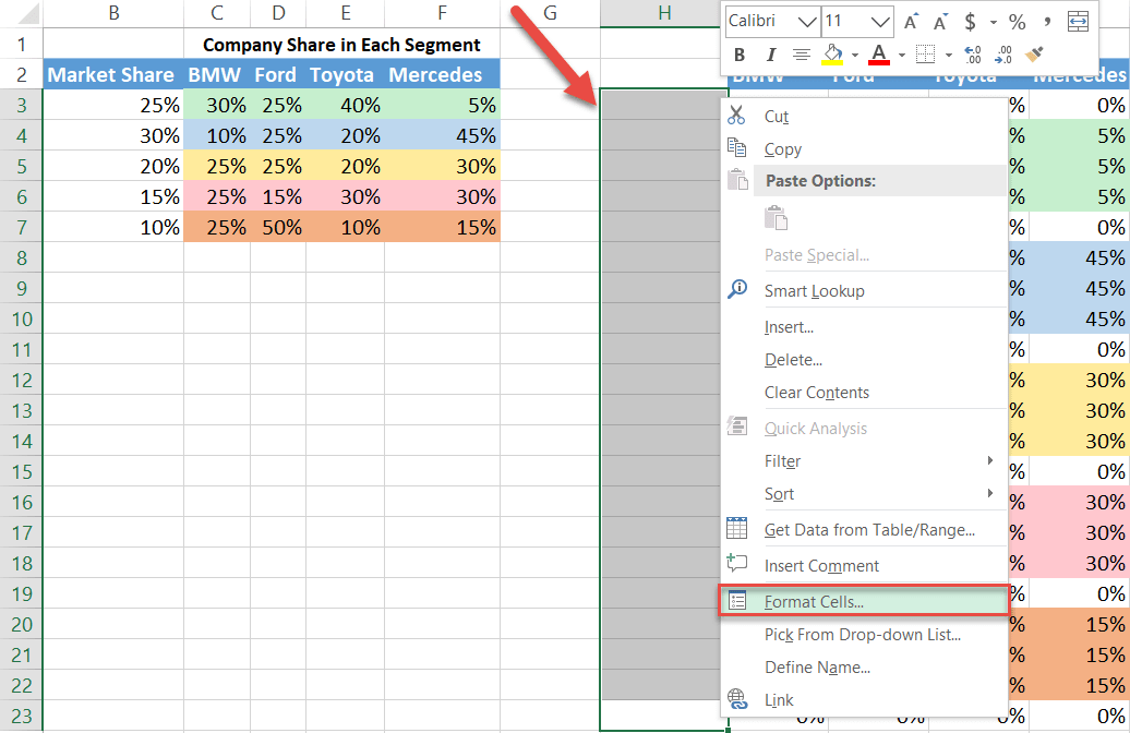
Now, set the custom number format for the cell range:
- In the Number tab, navigate to the Custom category.
- Enter 0”%” into the “Type” field.
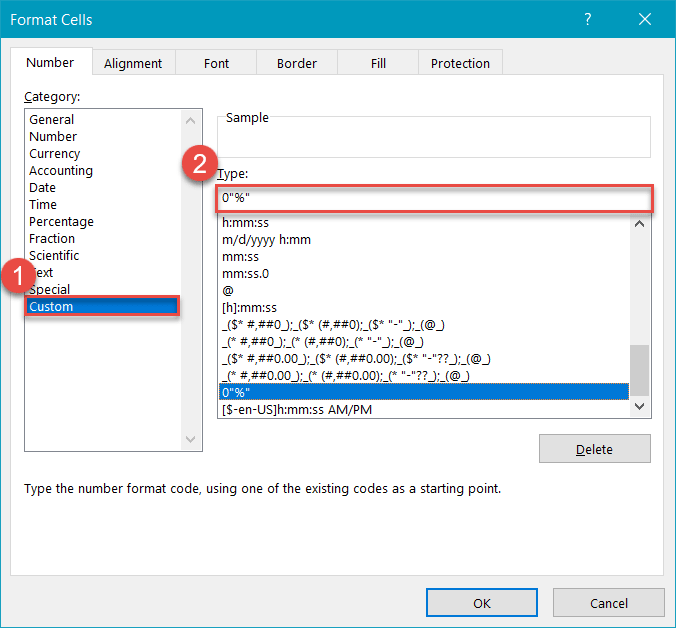
NOTE: Do not type anything into the header of the axis column! That will ruin the chart.
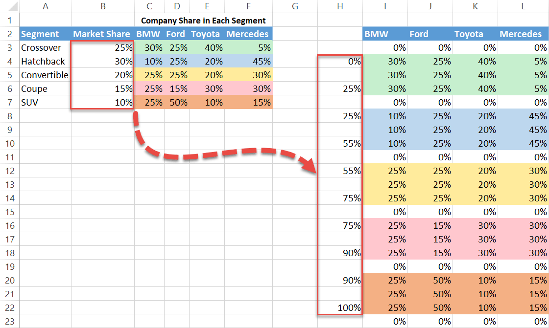
Step #5: Compute and add the segment percentages to the axis column.
Our next step is mapping out the column width for each segment to illustrate the respective market shares. The more shares there are, the wider the column will be, and vice versa.
To do that, you need to fill the cells in the axis column (column H) located next to the first and last row of each set of segment data in the helper table.
Here’s the drill: you start a count from zero (H4) and add up the market shares of each consecutive segment as you go along.
For instance, the first segment group (I4:L6), highlighted in light green, stands for the Crossover segment. Logically, we need to add its market share (B3, which shows 25%) to what we already have (0%) and type that sum into cell H6.
By the same token, add the second segment percentage (B4, which shows 30%) to the total percentage we have so far (25%) to get your values for the Hatchback segment, highlighted in light blue—type “25%” into H8 and “55%” into H10.
Continue with this process to the end of the list.
Step #6: Find the horizontal axis values for the buffer rows.
To create the “steps” effect of the Mekko chart, the buffer rows, though invisible, must be displayed on the horizontal axis to keep the columns separated.
For that, in the axis column (column H), pick the cells to the left of the buffer row data and fill them with the values that either precede or follow them. Here is how it looks:
Step #7: Calculate the midpoints for the remaining cells in the horizontal axis column.
The rest of the empty cells in the column are meant for the midpoints—the averages for each segment group—to help you position the data labels correctly.
To compute the midpoints, simply sum up the values in the axis column placed next to the first and last row of each segment group and divide that number by 2.
To find the midpoint for the first segment (H5), use this simple formula: type =(H6+H4)/2 into cell H5.
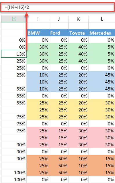
Once you have found your first midpoint, copy the formula into the remaining empty cells.
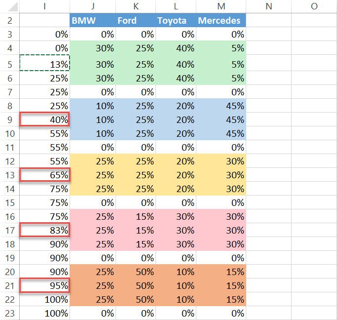
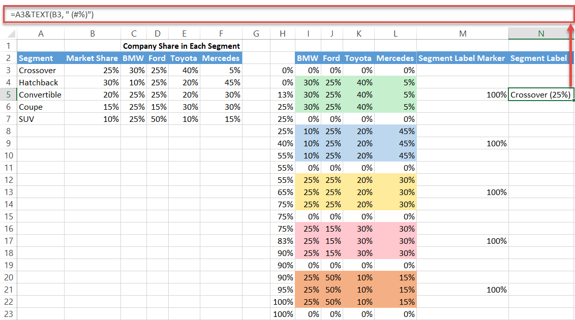
Step #8: Set up the segment label data.
Now it’s time to design the segment labels for your Mekko chart. To position the labels on top of each segment column, we need both X and Y values. You already have the X values figured out (H3:H23). Fortunately, finding the Y values is a lot easier.
To the right of the chart data, create a new column named “Segment Label Marker.” Then type “100%” solely into the cells located on the same rows as the midpoints, leaving the remaining cells blank.
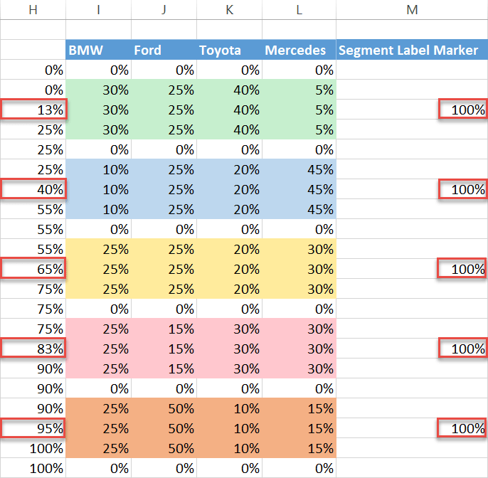
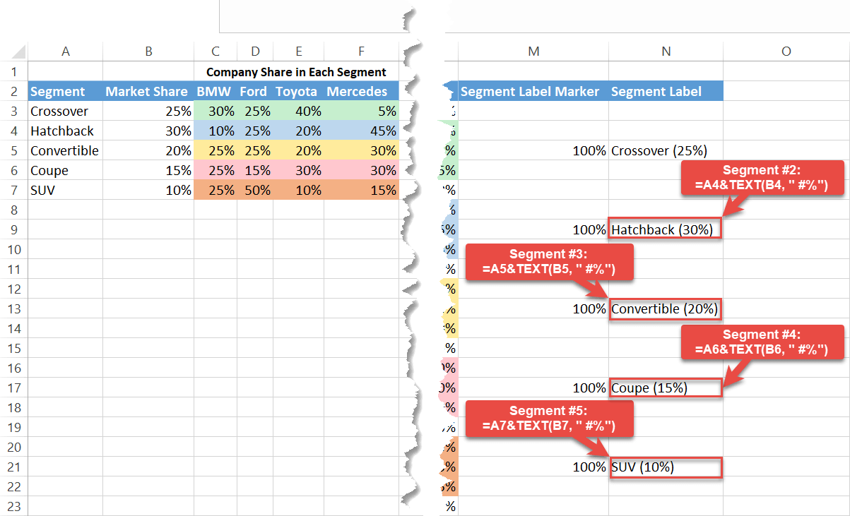
Once there, proceed to build the segment labels. Add another column to the right of the helper table and name it “Segment Label.”
Again, we only need the cells sharing the same rows with the midpoints. Select cell N5 and type this formula into it:
=A3&TEXT(B3, " (#%)")The formula binds together the segment name and the corresponding market share wrapped in parentheses.
In the exact same way, set up the labels for the remaining segments. Here is another screenshot for you to navigate through the process:
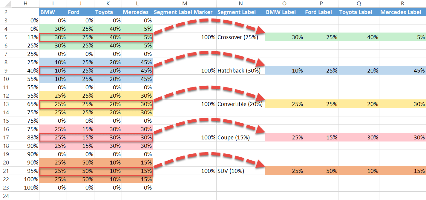
A Mekko chart that lacks the labels illustrating the company shares in each segment would be hard to read. Fortunately, it takes just a few seconds to design them.
Copy one set of segment data from each group in the helper table and paste it into the cells to the right of the chart data, leaving the rest empty. Again, the cells have to match the midpoints. That way, the first column (column O) will be responsible for displaying the labels for the first company (BMW), and so forth.
In addition, you can name the columns accordingly to avoid any mix-ups (O2:R2). The beauty of this method is that you gain full control over the label data.
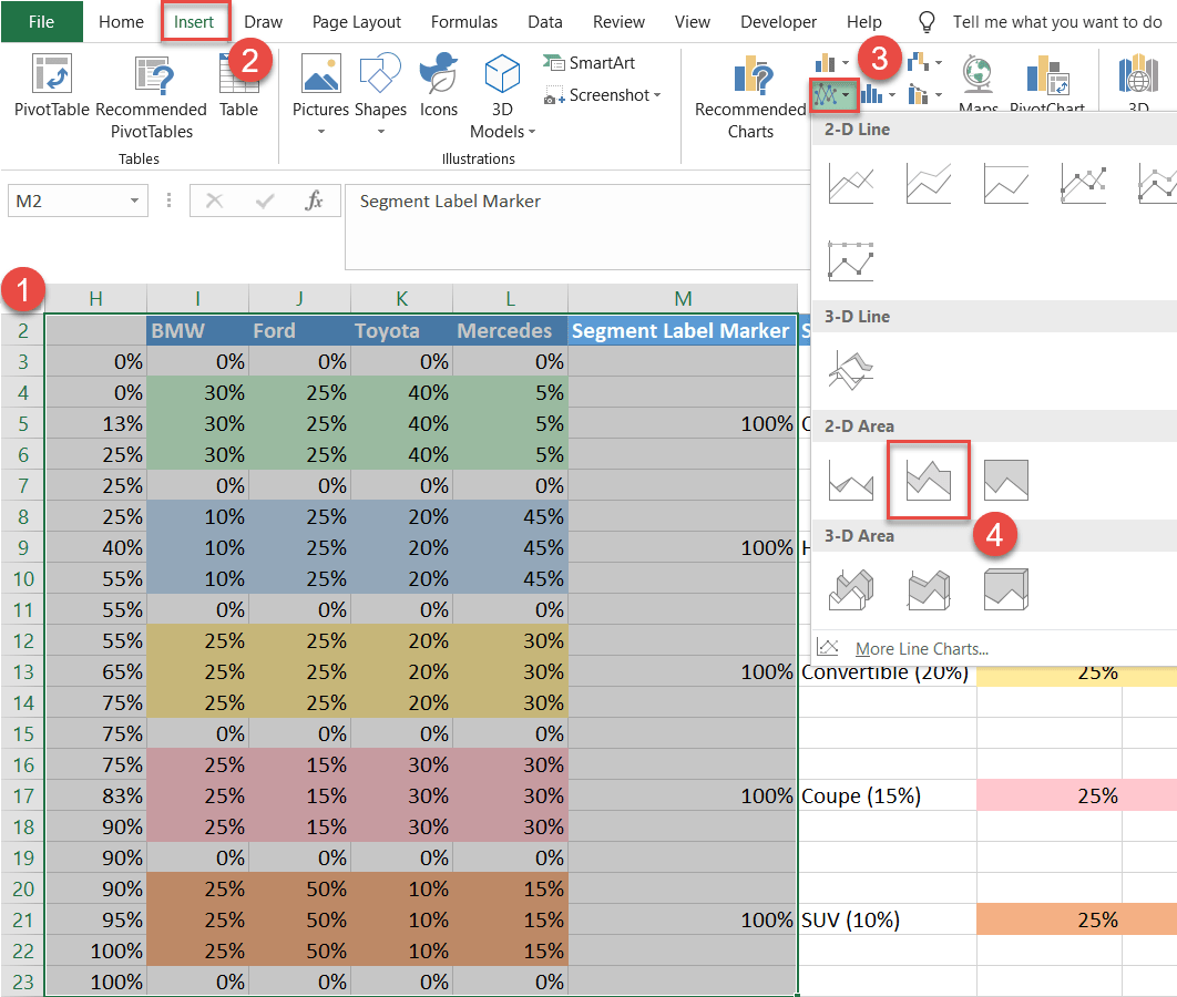
Step #10: Plot a stacked area chart.
At last, after all this preparation, it’s time to get down to plotting the chart.
- Highlight only the columns containing the horizontal axis values (column H), the segment data (columns I:L), and the segment label markers (column M), including the header row (H2:M23).
- Go to the Insert tab.
- Click the “Insert Line or Area Chart” button.
- Choose “Stacked Area.”
Step #11: Lay the groundwork for the segment labels.
It’s time to gradually transform the area chart into the Mekko graph. Let’s deal with the segment labels first.
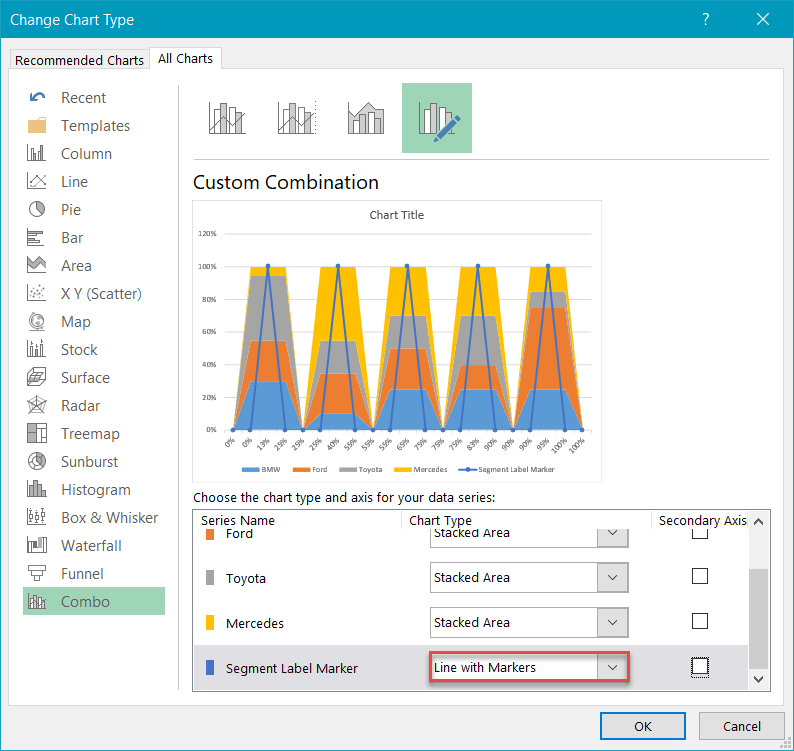
Right-click on Series “Segment Label Marker” (the triangle at the very top) and select “Change Series Chart Type.”
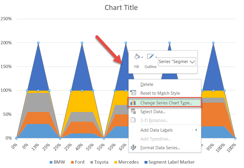
Next, for Series “Segment Label Marker,” change “Chart Type” to “Line with Markers.”
Then right-click on the markers representing Series “Segment Label Marker” and click “Add Data Labels.”
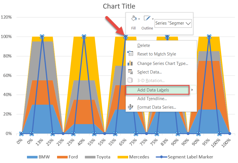
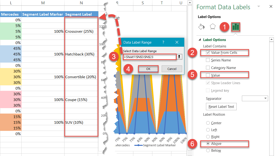
Step #12: Add and position the custom segment labels.
Now, replace the default labels with the ones you have previously prepared.
Right-click on any data label illustrating Series “Segment Label Marker” and choose “Format Data Labels.”
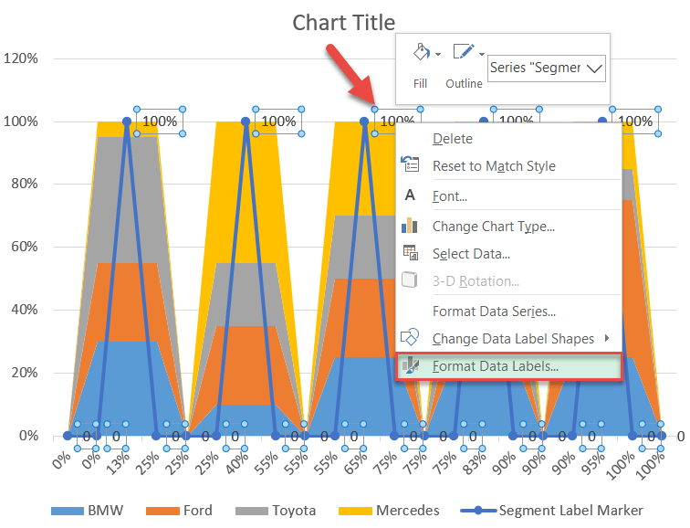
Next, do the following:
- Go to the Label Options tab.
- Check the “Value From Cells” box.
- Highlight all the cells from column Segment Label (N3:N23)—just don’t forget the empty ones at the bottom!
- Click “OK.”
- Under “Label Contains,” uncheck the “Value” box.
- Under “Label Position,” select “Above.”
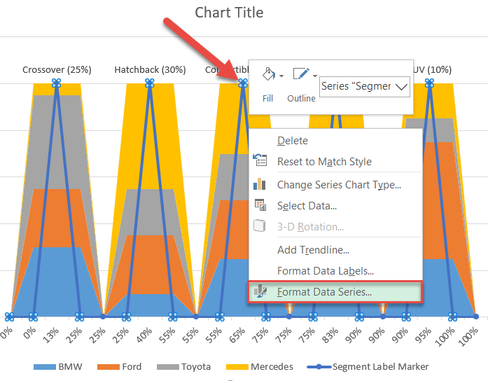
Step #13: Make the helper line chart invisible.
Miraculously, the segment labels appear centered above each market segment. We no longer need the underlying line chart, so let’s hide it.
Right-click on any segment label marker and select “Format Data Series.”
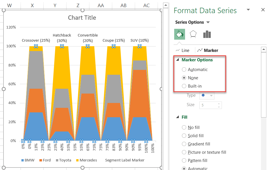
In the task pane that pops up, in the Fill & Line tab, under “Line,” select “No Line” and switch to the Marker tab.
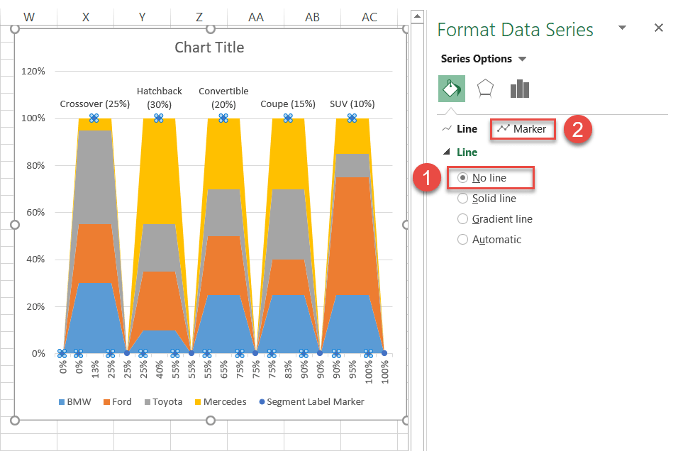
Under “Marker Options,” choose “None” to make the entire line chart vanish.
Also, double-click on the legend item named “Segment Label Marker” to select it and hit the “Delete” key to remove it—do the same with the gridlines.
Step #14: Modify the horizontal axis.
At this point, you may be teetering on the edge of mutiny, wondering, “Where is the promised Mekko chart?” Well, the time has come at last to finally harvest the fruits of your labor!
Right-click on the horizontal axis and select “Format Axis.”
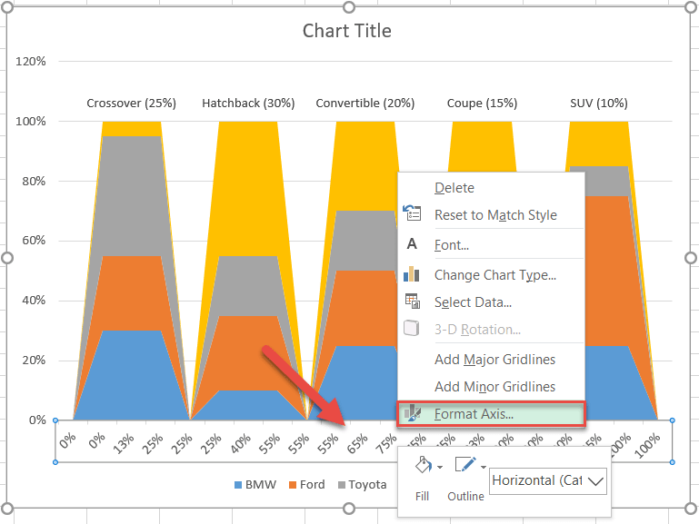
In the task pane that appears, change the axis type to see the graph morph into the Marimekko chart.
- Navigate to the “Axis Options” tab.
- Under “Axis Type,” choose “Date axis.”
- Set both the “Major Units” and “Minor Units” values to “10.”
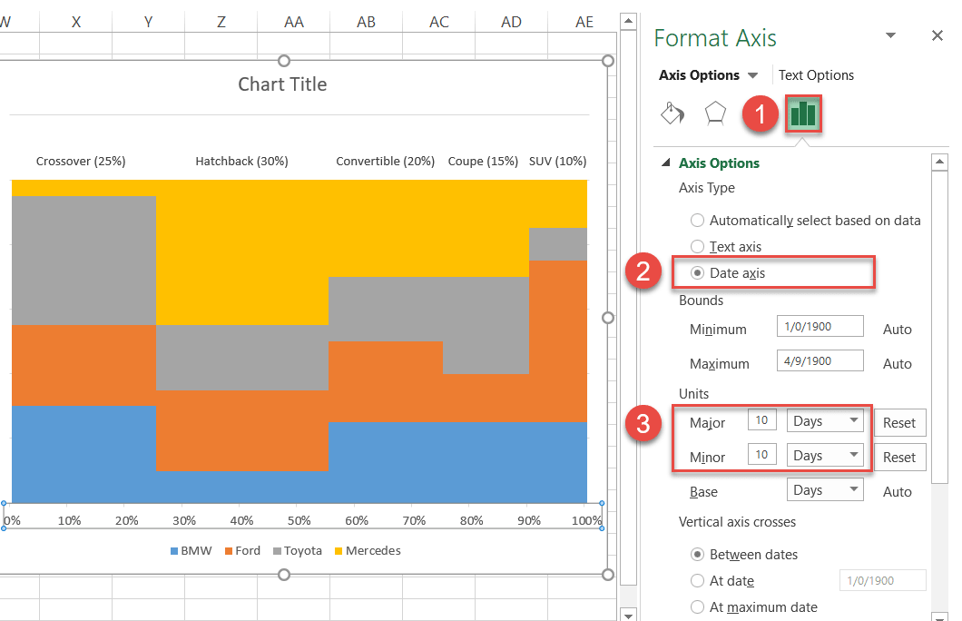
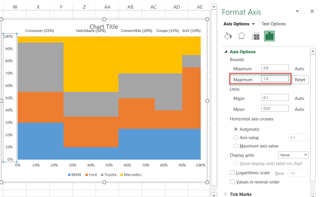
Step #15: Modify the vertical axis.
Without closing the task pane, jump to the vertical axis by selecting the column of numbers on the left and set the Maximum Bounds value to “1.”
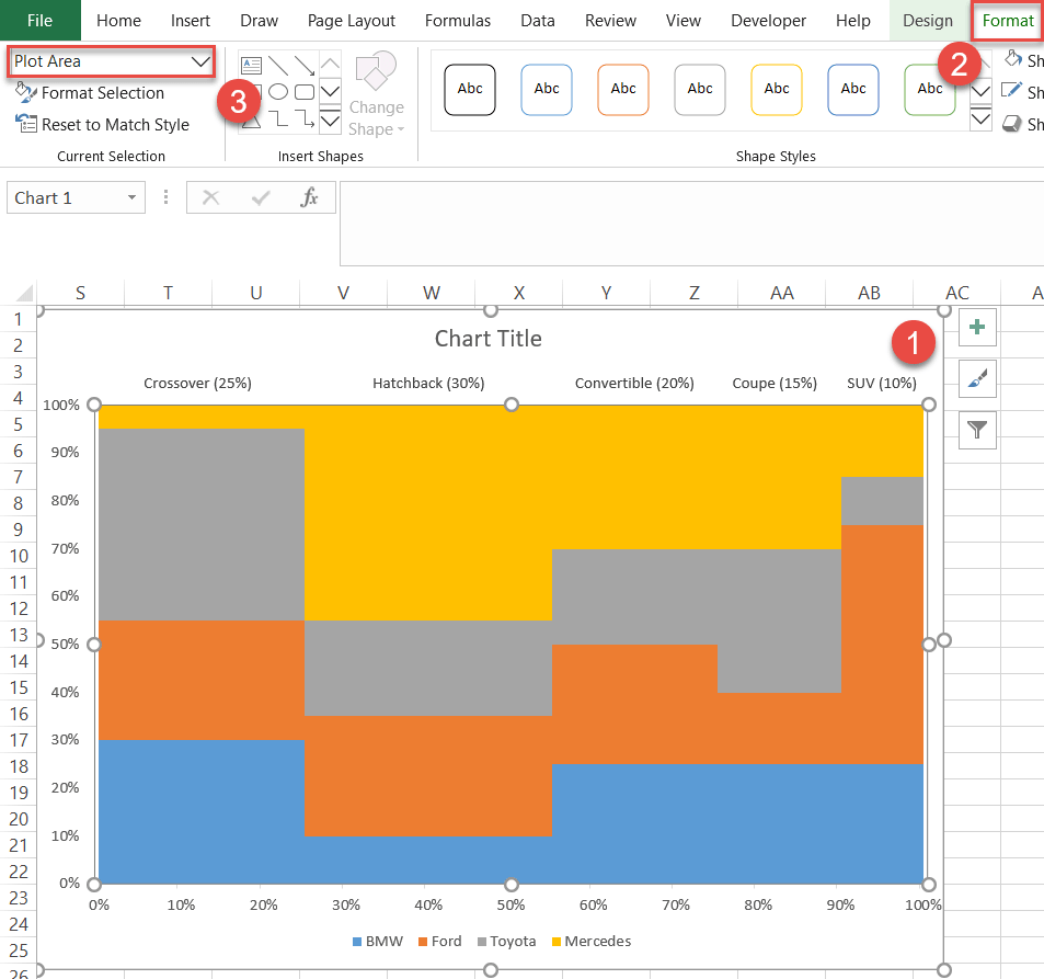
Step #16: Adjust the plot area size.
Inevitably, you will find the segment labels overlapping the chart title. Here is how you can work around the issue.
- Select the chart plot.
- Go to the Format tab.
- In the Current Selection group, click the dropdown menu and choose “Plot Area.”
After you have followed these steps, Excel gives you the handles to adjust the plot area however you see fit. Pull the handles downward to move the chart data away from the chart title.
Finally, add the data labels representing the company shares in each market segment.
First, add the default labels for each data series by following the same steps outlined in Step #11 (right-click on any data series > Add Data Labels).
Then, open the Format Data Labels task pane by following the process illustrated in Step #12 (right-click on any data label > Format Data Labels).
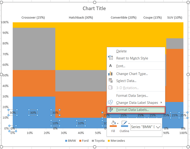
Once there, replace the default data labels with the custom ones the same way you did in Step #12 (Label Options > Value From Cells > Select Data Label Range > OK > Value), except for the data label ranges—pick the label data for each company from the respective columns you have previously set up (columns O:R).
Again, don’t forget to include the empty cells at the bottom of each column—or the trick won’t work.
Here is what the process looks like:
Go ahead and add the labels for each company. You can also make them bold and change the font size to help them stand out.
Step #18: Add the borders separating the chart blocks.
As a final adjustment, let’s do some fine-tuning to make the chart look great. We’ll start by adding borders to separate the chart blocks.
- Right-click any chart block.
- Click the “Outline” button.
- Select white.
- Scroll down to Weight.
- Set the border width to “2 ¼ pt.”
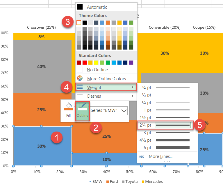
Rinse and repeat for the rest of the companies.
Step #19: Recolor the chart blocks.
You are one step away from the finish line! All you need to do is recolor the chart blocks by following a few simple steps.
- Right-click on any chart block.
- Click the “Fill” icon.
- Pick your desired color from the palette.
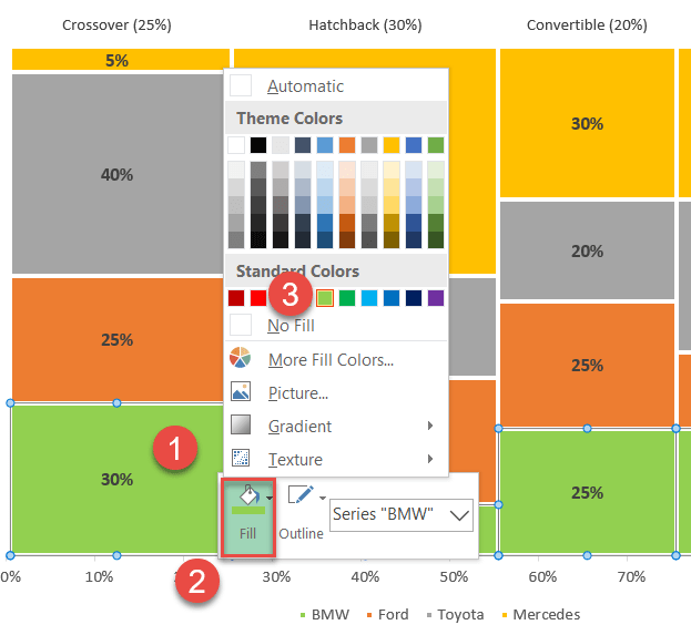
Change or remove the chart title, and your Mekko chart is ready.
And that’s how you do it! You can now build fully customizable, mind-blowing Marimekko charts from the ground up using basic built-in Excel tools and features to stay on top of your data visualization game.
Download Marimekko Chart Template
Download our free Marimekko Chart Template for Excel.
