How to Overlay Two Graphs in Excel
Written by
Reviewed by
Last updated on October 30, 2023
This tutorial will demonstrate how to overlay two graphs in Excel.
Overlay Two Graphs in Excel
Starting with your Graph
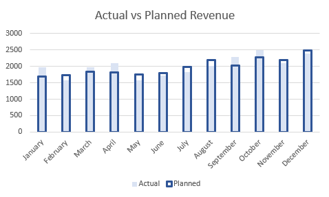
In this scenario, we want to show an overlay of two series of data; the actual vs planned for by month to see the variance between the two datasets.
Change Format of First Series
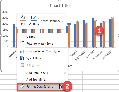
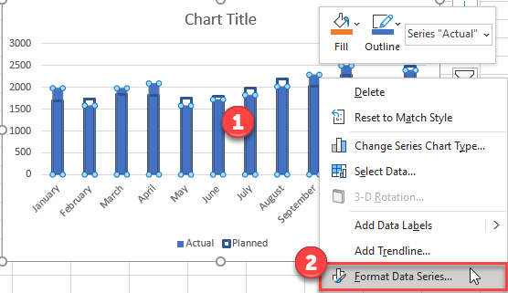
- Right click on the dataset that you would like to overlay. In this case, we clicked on the “Planned” Series
- Select Format Data Series
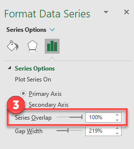
3. Change the Series Overlap to 100%
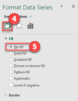
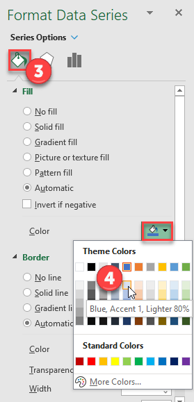
4. Click on the paint bucket under Format Series
5. Click on No Fill
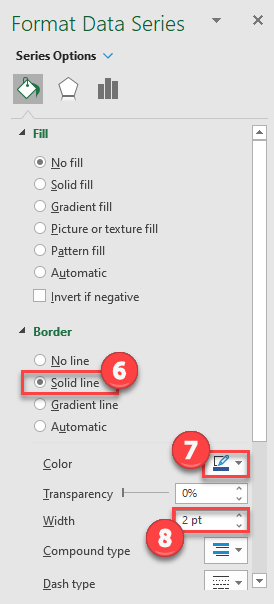
6. Under Border, Select Solid Line
7. Select a darker color. For this instance, we’ll use dark blue.
8. Change Width to 2 Pt.
Change Format of Second Series
- Right click on the second series (in this case, actual)
- Select Format Data Series
3. Click on the paint bucket under Format Data Series
4. Select a lighter version of the color your used for the first series. In this tutorial, we’ll use light blue
Final Graph with Overlay Graph
As you can see, we have a finished graph with the overlay showing planned vs actual