How to Create a Panel Chart in Excel
Written by
Reviewed by
This tutorial will demonstrate how to create a panel chart in all versions of Excel: 2007, 2010, 2013, 2016, and 2019.
In this Article
- Panel Chart – Free Template Download
- Getting Started
- Step #1: Add the separators.
- Step #2: Add a pivot table.
- Step #3: Design the layout of the pivot table.
- Step #4: Extract the data from the pivot table.
- Step #5: Create a line chart.
- Step #6: Make the line colors consistent.
- Step #7: Create the dividing lines.
- Step #8: Change the chart type of the dummy series.
- Step #9: Modify the secondary axes.
- Step #10: Add error bars.
- Step #11: Hide the helper chart elements.
- Download Panel Chart Template
A panel chart (also called a trellis chart or a small multiple) is a set of similar smaller charts compared side-by-side and divided by separators. Since these mini charts share the same axes and are measured on the same scale, basically, a panel chart consolidates all of them into one place.
Not only does the chart allow you to neatly display more information, it also helps you quickly compare or analyze the relationship between multiple data sets at once—while saving you a great deal of dashboard space.
As an example, take a look at the panel chart below, which combines four separate line charts comparing the annual revenue of Orange Ltd and Banana Ltd franchisees across four states for the past six years.
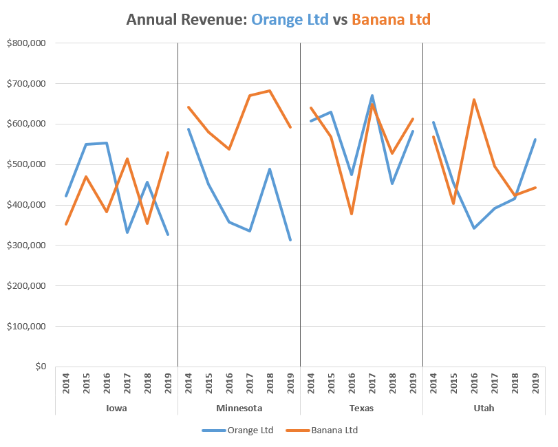
As you can see, the panel chart illustrates a bottomless well of useful data, as opposed to the jumble of lines you would end up getting if you simply opted for its built-in counterpart.
Unfortunately, this chart type is not supported in Excel, which means you will have to manually build it yourself. But before we begin, check out the Chart Creator Add-in, a versatile tool for creating advanced Excel charts and graphs in just a few click.
In this tutorial, you will learn how to plot a customizable panel chart in Excel from the ground up.
Getting Started
To illustrate the steps for you to follow, we need to start with some data. As you may have already guessed, we are going to compare the historical track record of the franchisees of two companies, Orange Ltd and Banana Ltd, in four different states—Iowa, Minnesota, Texas, and Utah.
With all that said, consider the following table:
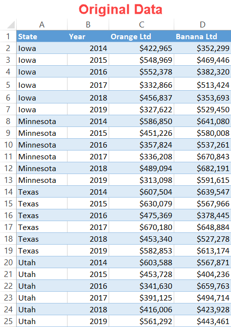
Let’s cover each column more in detail.
- State – This column represents the categories by which the chart will be split into smaller charts (panels). In our case, every mini line chart illustrates the performance dynamics for each of the states.
- Year – This column determines the horizontal axis scale. The values and formatting should be identical across all panels.
- Orange Ltd and Banana Ltd – These are your actual values. We are going to use just two sets of data for illustration purposes, but with the method shown in this tutorial, the sky is the limit.
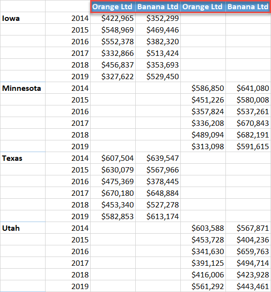
In the end, we want our data to look like this:
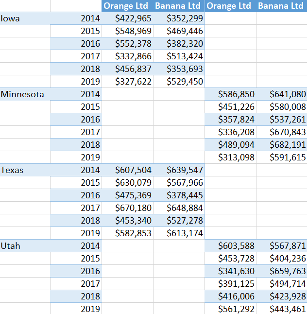
Technically, you can manipulate the data manually (if so, skip to Step #5). This approach may be preferable if your data is simple. Otherwise, we will show you how to use a pivot table to manipulate the data into the necessary format.
So, let’s dive right in.
Step #1: Add the separators.
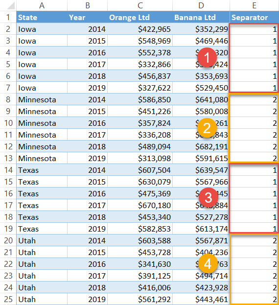
Before you can create a panel chart, you need to organize your data the right way.
First, to the right of your actual data (column E), set up a helper column called “Separator.” The purpose of this column is to split the data into two alternating categories—expressed with the values of 1 and 2—to lay the groundwork for the future pivot table.
Type “1” into each corresponding cell of column Separator that belong to the first category, Iowa (E2:E7). Then type “2” into all the respective cells that fall into the second category, Minnesota (E8:E13).
In the same way, fill the remaining blank cells in the column, alternating between the two separator values as you move from state to state.
Step #2: Add a pivot table.
Once you have completed Step #1, create a pivot table.
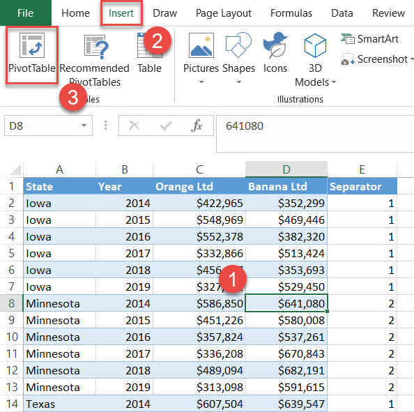
- Highlight any cell within the dataset range (A1:E25).
- Go to the Insert tab.
- Choose “PivotTable.”
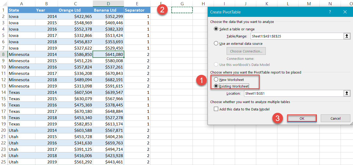
When the Create PivotTable dialog box appears, select “Existing Worksheet,” highlight any empty cell near your actual data (G1), and click “OK.”
Step #3: Design the layout of the pivot table.
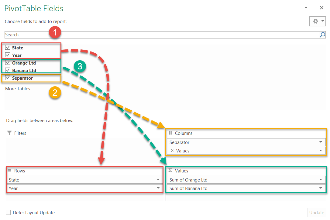
Immediately after your pivot table has been created, the PivotTable Fields task pane will pop up. In this task pane, shift the items in the field list into the following order—the order is important—to modify the layout of your new pivot table:
- Move “State” and “Year” to “Rows.”
- Move “Separator” to “Columns.”
- Move “Orange Ltd” and “Banana Ltd” to “Values.”
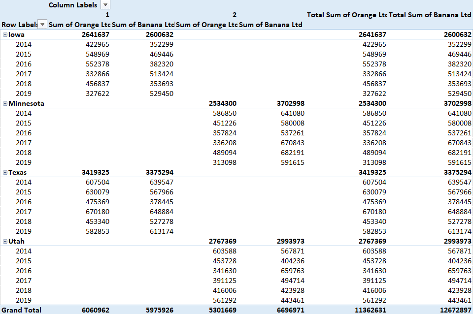
At this point, your pivot table should look something like this:
Now, change the layout type and remove the redundant table elements.
- Select any cell in the pivot table (G4:L26).
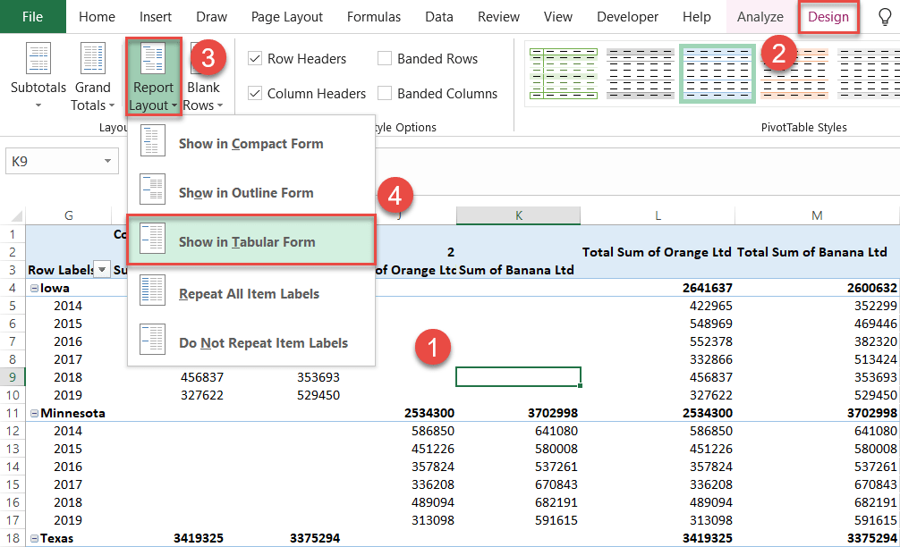
- Navigate to the Design tab.
- Click “Report Layout.”
- Choose “Show in Tabular Form.”
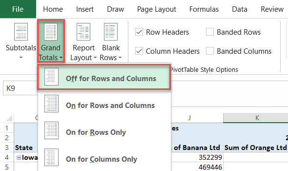
Still in the Design tab, click the “Grand Totals” icon and pick “Off for Rows and Columns” from the dropdown menu.
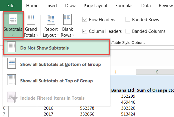
Next, click “Subtotals” and choose “Do Not Show Subtotals.”
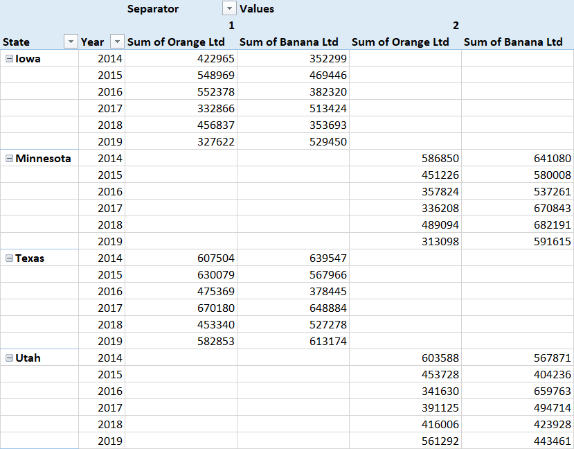
After you have followed all the steps, your pivot table should be formatted in this manner:
Step #4: Extract the data from the pivot table.
Since you don’t want to build a pivot chart (no, you don’t), it’s time to separate the data from the pivot table. Copy all the values from your pivot table (G4:L27) into the empty cells beside it. (An empty column between the sets of data will help avoid confusion.)
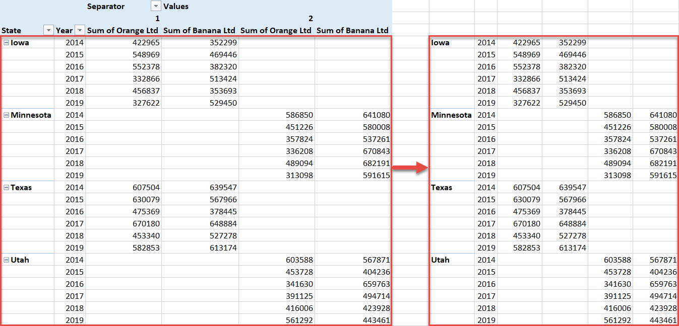
The header row (P3:S3) of your newly-created table is responsible for displaying chart legend items, so let’s add them quickly as well.
Since the pivot table effectively split the data into two quasi-line charts, your header row should go as follows:
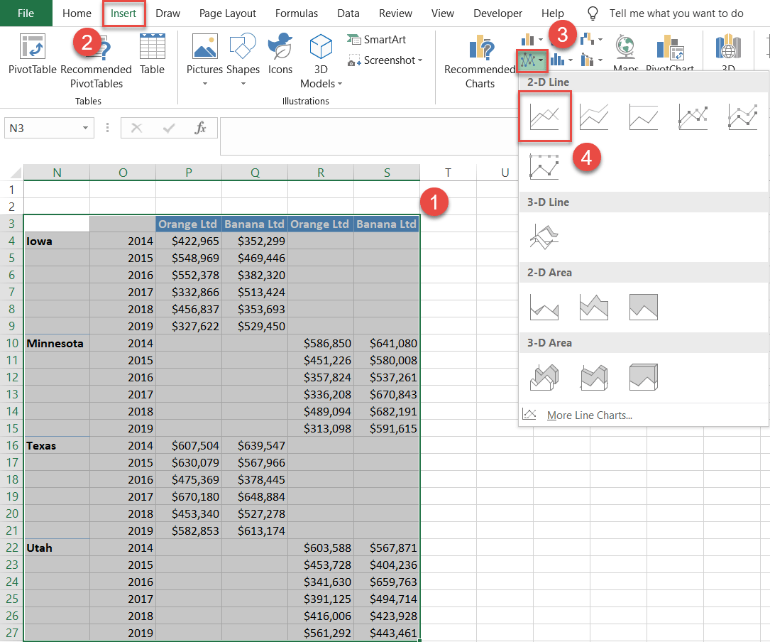
Step #5: Create a line chart.
Finally, plot a regular line chart and see what happens.
- Highlight the table containing the data extracted from the pivot table (N3:S27).
- Go to the Insert tab.
- Click the “Insert Line or Area Chart” button.
- Choose “Line.”
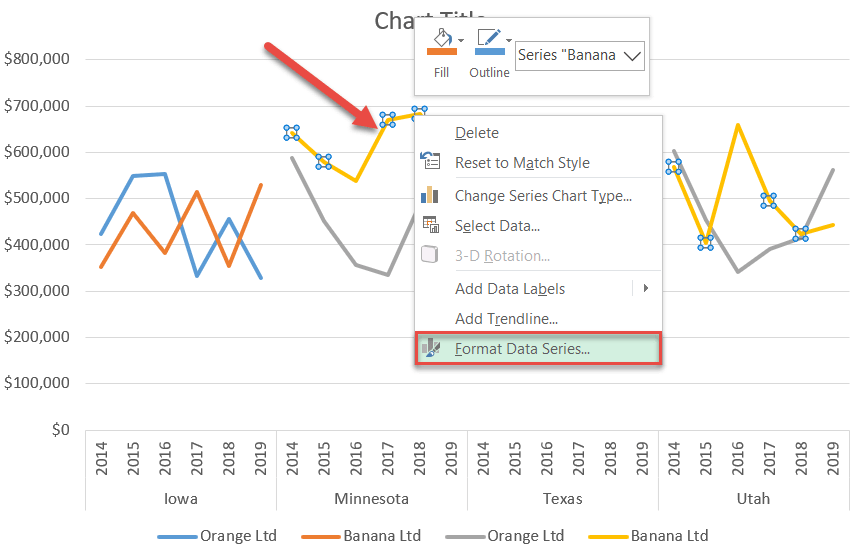
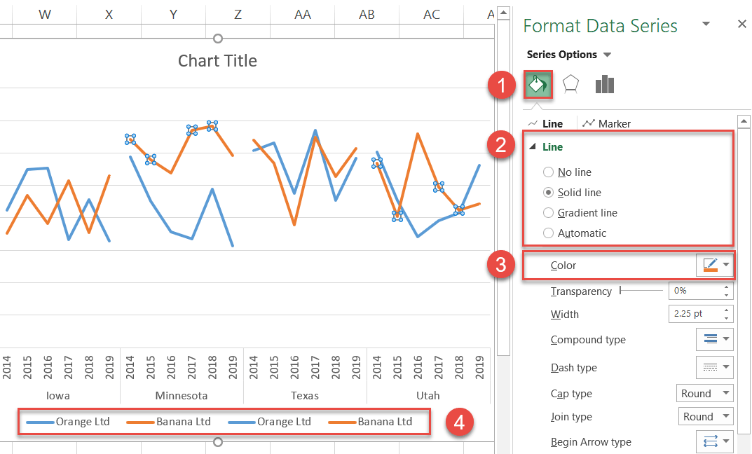
Step #6: Make the line colors consistent.
As you can see, Excel created a line chart with four different data series. Unify that data by using the same colors for each company.
Right-click on any data series and choose “Format Data Series.”
In the Format Data Series task pane, do the following:
- Switch over to the Fill & Line tab.
- Under “Line,” select “Solid Line.”
- Click the “Outline color” icon and pick your color from the palette. (Repeat for each line.)
- Double-check the chart legend to ensure you have matched the colors the right way.
Step #7: Create the dividing lines.
The task at hand may seem like nothing special, but it is not as easy as it sounds. Yes, you could simply draw the lines using built-in shapes, but they would end up being misplaced every time you resize the chart.
So, we are going to use vertical error bars instead, which will be positioned between each panel, right where the Y axis crosses the category axis.
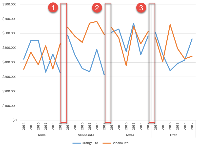
However, to work around the issue, you will have to jump through a few hoops. First, let’s create the helper chart data:
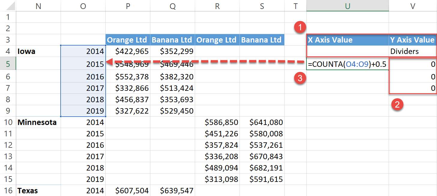
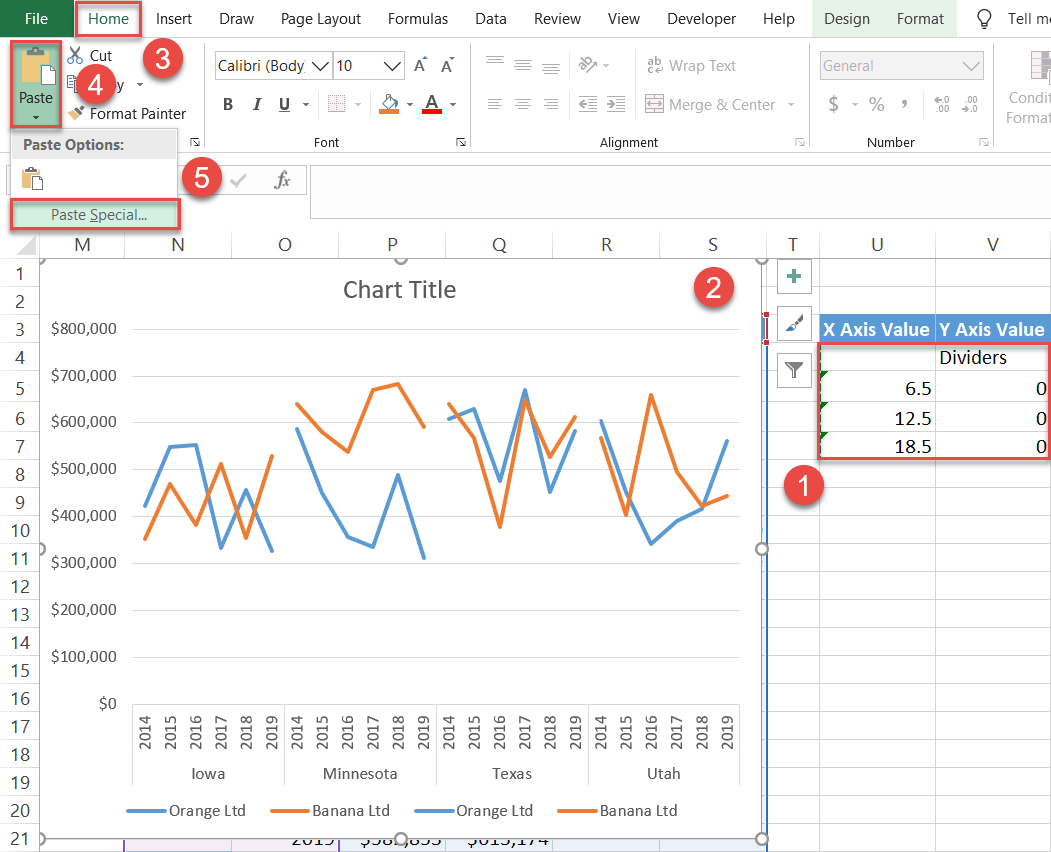
- Set up a separate dummy table the exact same way as you see it on the screenshot below. Leave cell U4 empty to make things work and type “Dividers” into V4.
- Type “0” into V5 and copy it down. The number of rows containing values in the table represents how many error bars will be eventually created. In this case, we need three error bars, so there will be three cells with “0” in them.
- Type “=COUNTA(O4:O9)+0.5” into U5.
The formula calculates the number of x-axis scale values used for one panel and calculates its midpoint to position the lines on the X axis right where the two axes meet.
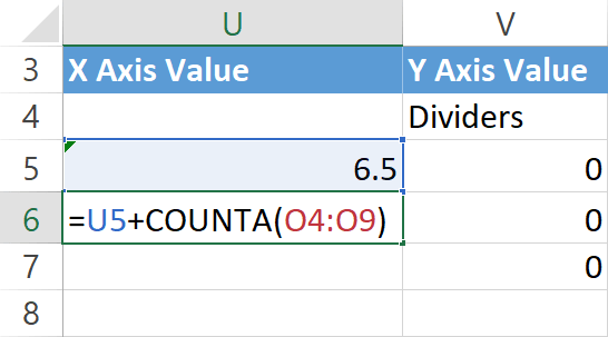
Now, type “=U5+COUNTA(O4:O9)” into U6 and copy it down into U7.
Once you have set up the helper table, insert that data into your panel chart.
- Highlight all the values in the helper table, except for the header row (U4:V7).
- Select the chart area.
- Go to the Home tab.
- Click “Paste.”
- Choose “Paste Special.”
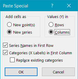
In the dialog box that appears, follow a few simple steps:
- Under “Add cells as,” select “New series.”
- Under “Values (Y) in,” choose “Columns.”
- Check the “Series Names in First Row” and “Categories (X Labels) in First Column” boxes.
- Click “OK.”
Step #8: Change the chart type of the dummy series.
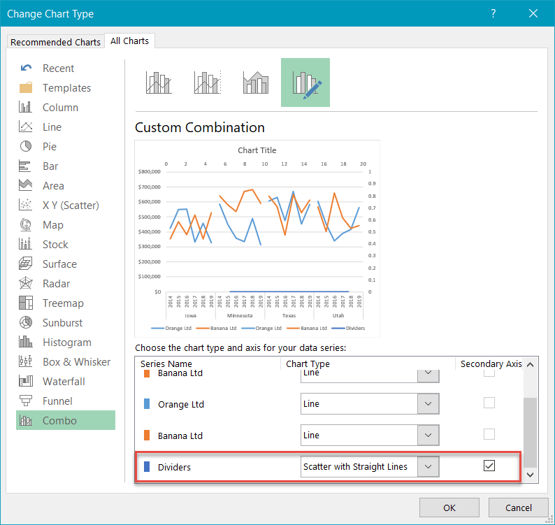
Right-click on the newly-added data series (Series “Dividers”) and choose “Change Series Chart Type.”
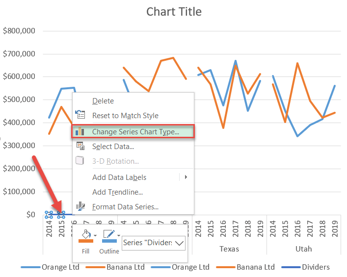
For Series “Dividers,” change “Chart Type” to “Scatter with Straight Lines.”
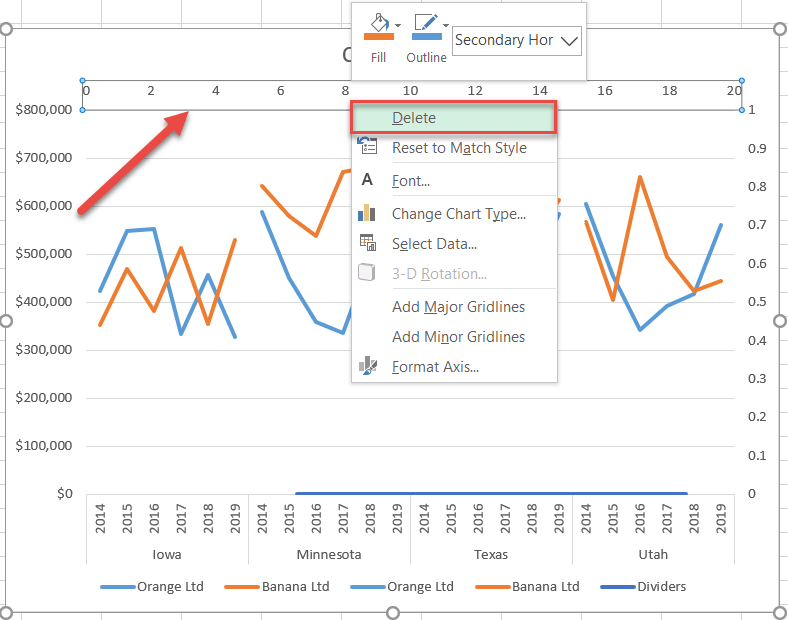
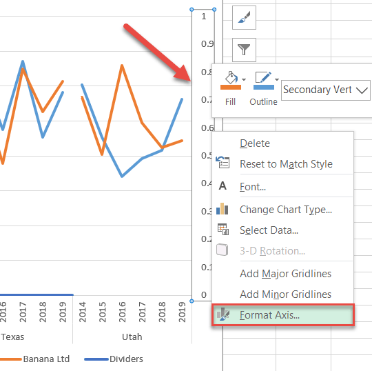
Step #9: Modify the secondary axes.
First, remove the secondary horizontal axis. Right-click on the numbers along the top of the chart and choose “Delete.”
Then, right-click on the secondary vertical axis along the right side of the chart and select “Format Axis.”
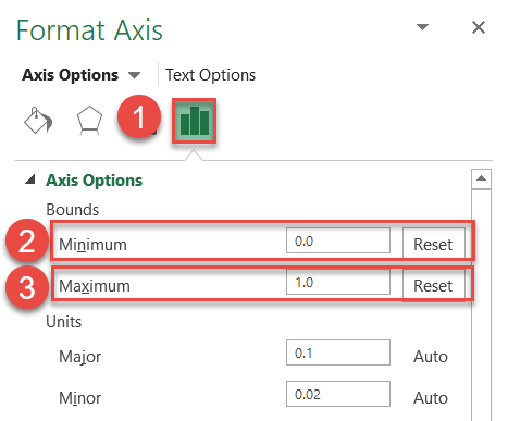
In the Format Axis task pane, set in stone the axis scale ranges:
- Switch to the Axis Options tab.
- Change the Minimum Bounds value to “0.”
- Set the Maximum Bounds value to “1.”
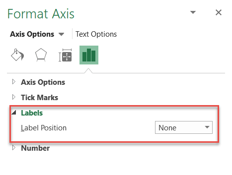
In the same tab, scroll down to the Labels section and change “Label Position” to “None” to hide the axis scale—if you simply delete it, that will ruin the chart.
Step #10: Add error bars.
The groundwork has now been laid, meaning you can finally add the error bars.
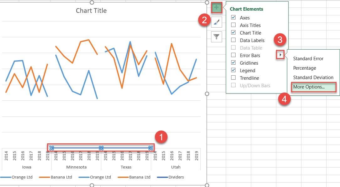
- Select Series “Dividers.”
- Click the Chart Elements icon.
- Click the arrow next to “Error Bars.”
- Choose “More Options.”
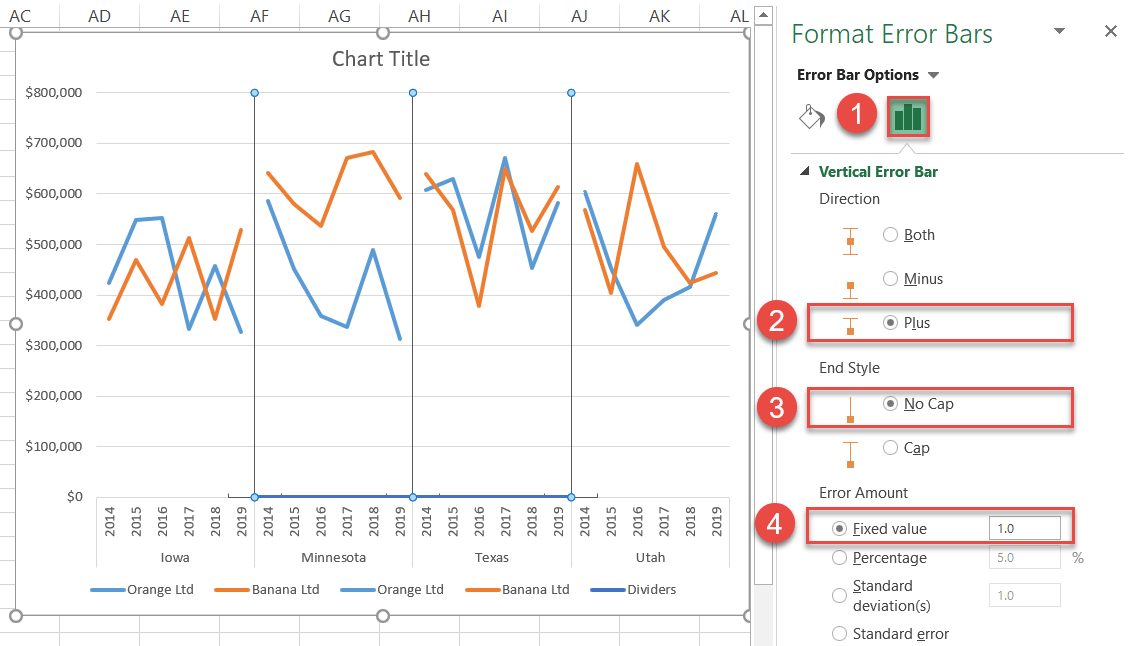
In the Format Error Bars task pane, modify the separators.
- Switch to the Error Bar Options tab.
- Under “Direction,” choose “Plus.”
- Under “End Style,” select “No Cap.”
- Under “Error Amount,” change “Fixed value” to “1.”
Step #11: Hide the helper chart elements.
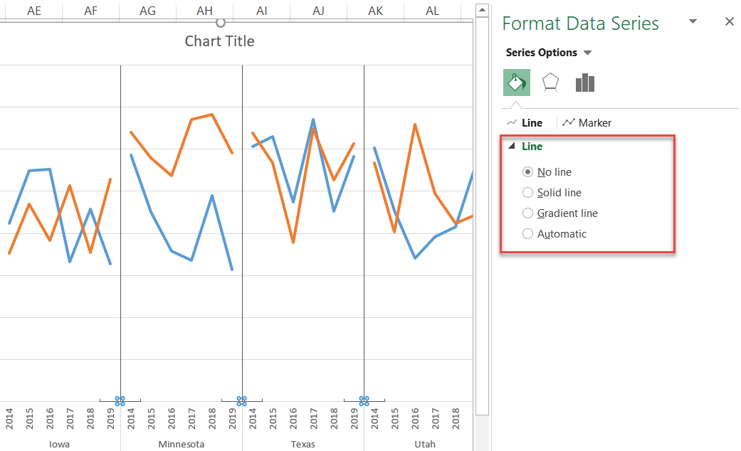
As the final step, remove the underlying secondary scatter plot, horizontal error bars, and duplicate legend items.
Let’s deal with the dummy series first. Select Series “Dividers,” navigate to the Format Data Series task pane, and in the Series Options tab, choose “No Line.”
Now, remove the horizontal error bars and every legend item save for “Orange Ltd” and “Banana Ltd” by selecting each item, right-clicking, and choosing “Delete.” By the end of this step, your panel chart should look like this:
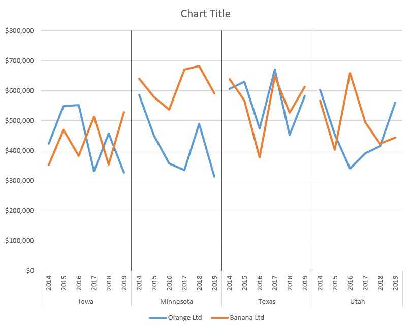
Change the chart title, and you have your stunning panel chart ready to go!
