How to Create a Pareto Chart in Excel
Written by
Reviewed by
This tutorial will demonstrate how to create a Pareto chart in all versions of Excel: 2007, 2010, 2013, 2016, and 2019.
Pareto Chart – Free Template Download
Download our free Pareto Chart Template for Excel.
In this Article
- Pareto Chart – Free Template Download
- Getting Started
- How to Create a Pareto Chart in Excel 2016+
- Step #1: Plot a Pareto chart.
- Step #2: Add data labels.
- Step #3: Add the axis titles.
- Step #4: Add the final touches.
- How to Create a Pareto Chart in Excel 2007, 2010, and 2013
- Step #1: Sort the data in descending order.
- Step #2: Calculate the cumulative percentages.
- Step #3: Create a clustered column chart.
- Step #4: Create a combo chart.
- Step #5: Adjust the secondary vertical axis scale.
- Step #6: Change the gap width of the columns.
- Step #7: Add data labels
- Step #8: Clean up the chart.
- Download Pareto Chart Template
A Pareto chart is a hybrid of a column chart and a line graph that indicates the relative importance of the factors or items in a given dataset along with their cumulative percentages. The chart owes its name to the Pareto principle, also known as the law of the vital few, which states that approximately 20% of the causes contribute to 80% of the effects.
The purpose of the chart is to discern the critical factors in a dataset, differentiating them from the insignificant ones.
A Pareto graph became a native chart type in Excel 2016, but for users of Excel 2013 or older versions, the only way to go is to manually build the chart from scratch.
In this tutorial, you will learn how to create a customizable Pareto chart both manually and by using the built-in charting tool in Excel.

Getting Started
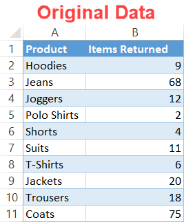
To show you the ropes, we need some raw data to work with. For that reason, let’s assume you set out to analyze the breakdown of the items returned to a clothing store, trying to figure out which product categories cause the most trouble.
With that in mind, consider the following data:
So, let’s dive right in.
How to Create a Pareto Chart in Excel 2016+
First, let me show you how to plot a Pareto chart by using the corresponding built-in Excel chart type introduced in Excel 2016.
With this method, it takes only a few clicks to set up the chart, but you lose out on some customization features—for instance, you can add neither data labels nor markers to the Pareto line.
So, if you need that extra level of customization, it makes sense to build the chart from the ground up. But first, here is the algorithm for those looking to take the easier route.
Step #1: Plot a Pareto chart.
Again, if you are using Excel 2016 or later, Excel allows you to create a simple Pareto chart while barely lifting a finger:
- Highlight your actual data (A1:B11).
- Go to the Insert tab.
- Click “Insert Statistic Chart.”
- Choose “Pareto.”
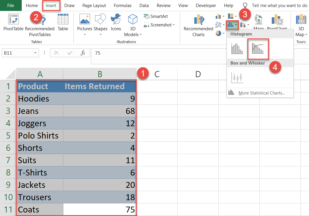
Magically, a Pareto chart will immediately pop up:
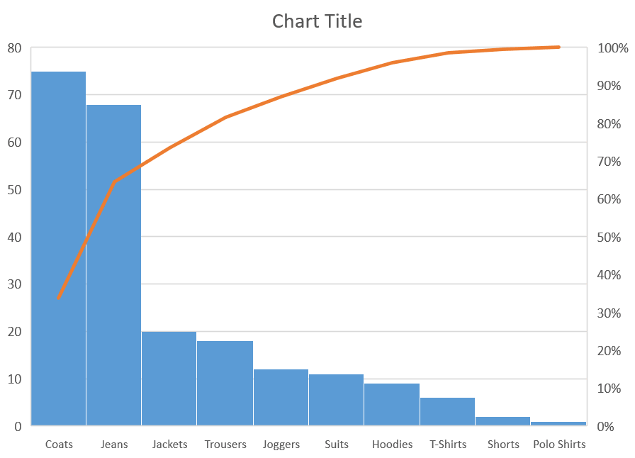
Technically, we can call it a day, but to help the chart tell the story, you may need to put in some extra work.
Step #2: Add data labels.
Start with adding data labels to the chart. Right-click on any of the columns and select “Add Data Labels.”

Customize the color, font, and size of the labels to help them stand out (Home > Font).
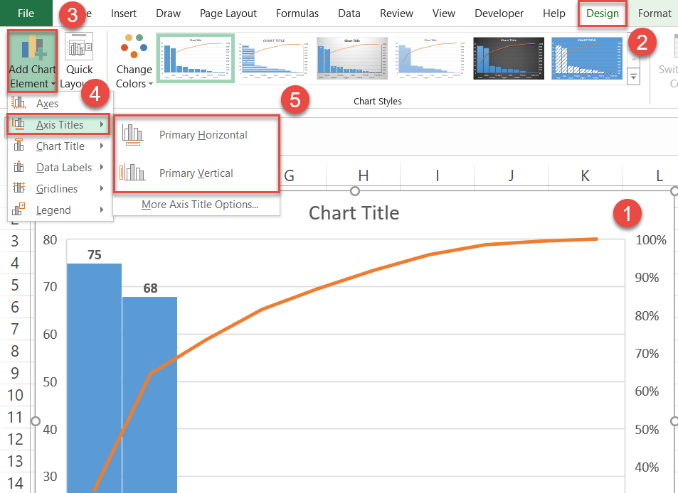
Step #3: Add the axis titles.
As icing on the cake, axis titles provide additional context to what the chart is all about.
- Select the chart area.
- Switch to the Design tab.
- Hit the “Add Chart Element” button.
- Pick “Axis Titles” from the dropdown menu.
- Select both “Primary Horizontal” and “Primary Vertical.”
Step #4: Add the final touches.
As we keep fine-tuning the chart, you can now remove the gridlines that serve no practical purpose whatsoever. Right-click on the gridlines and click “Delete” to erase them.
Finally, change the axis and chart titles, and the upgraded Pareto chart is ready!
How to Create a Pareto Chart in Excel 2007, 2010, and 2013
That was pretty fast. However, users of versions prior to Excel 2016 have no other choice but to do all the work themselves. But there’s a silver lining: that way, you get a lot more wiggle room for customization.
Even though all the screenshots were taken in Excel 2019, the method you are about to learn remains compatible with versions back to Excel 2007. Just follow along and adjust accordingly.

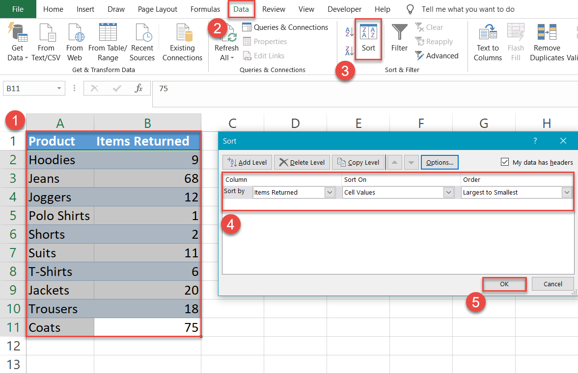
Step #1: Sort the data in descending order.
To start with, sort the data by the number of the items returned (column B) in descending order.
- Highlight your actual data (A1:B11).
- Go to the Data tab.
- Click the “Sort” button.
- In the Sort dialog box, do the following:
- For “Column,” select “Items Returned.”
- For “Sort On,” choose “Cell Values.”
- For “Order,” pick “Largest to Smallest.”
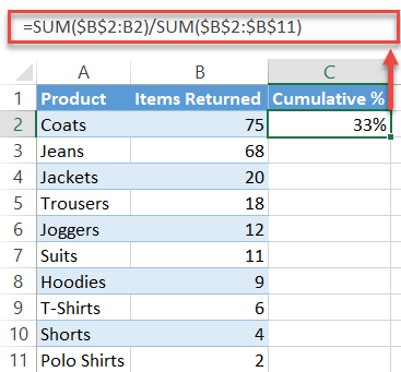
Step #2: Calculate the cumulative percentages.
Our next step is to create a helper column named “Cumulative %” which will add up the relative shares of the product categories in the dataset to be used as the values for charting the Pareto line.
To find the values, enter the following formula into C2 and copy it down by dragging the handle in the bottom right corner of the cell down through to cell C11:
=SUM($B$2:B2)/SUM($B$2:$B$11)Don’t forget to format the formula output as percentages (Home > Number group > Percent Style).
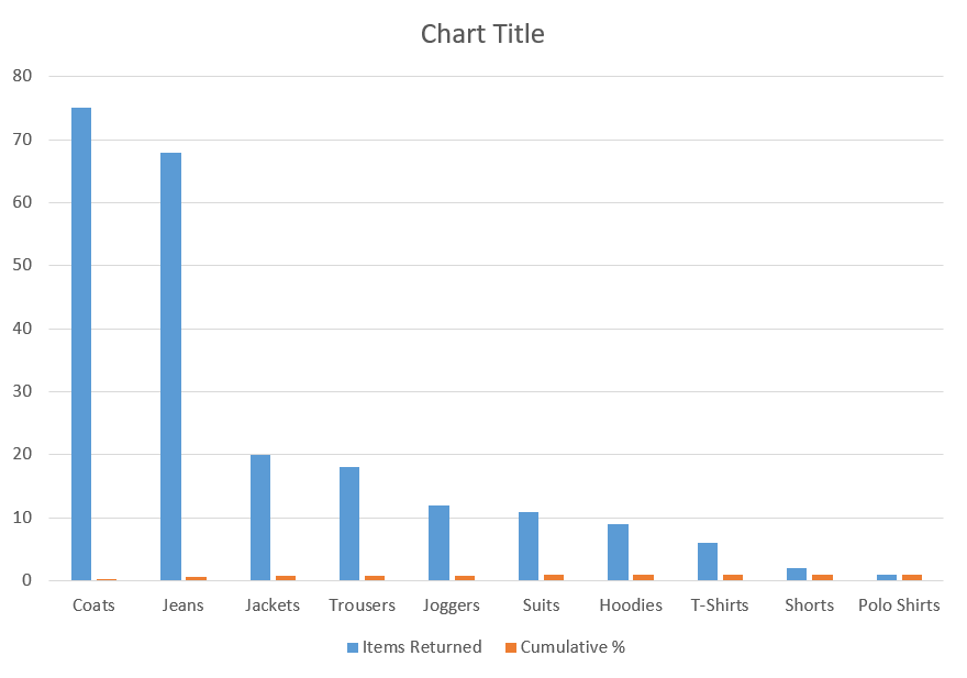
Step #3: Create a clustered column chart.
After the chart data has been arranged properly, plot a simple clustered column chart.
- Highlight all the chart data (A1:C11).
- Go to the Insert tab.
- Click “Insert Column or Bar Chart.”
- Select “Clustered Columns.”
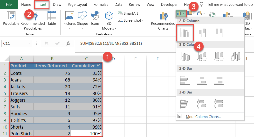
Once there, the future Pareto chart should look like this:
Step #4: Create a combo chart.
Now it’s time to turn the data series illustrating the cumulative percentages (Series “Cumulative %”) into a line chart.
Right-click on any of the tiny orange bars representing Series “Cumulative %” and pick “Change Series Chart Type” from the menu that appears.
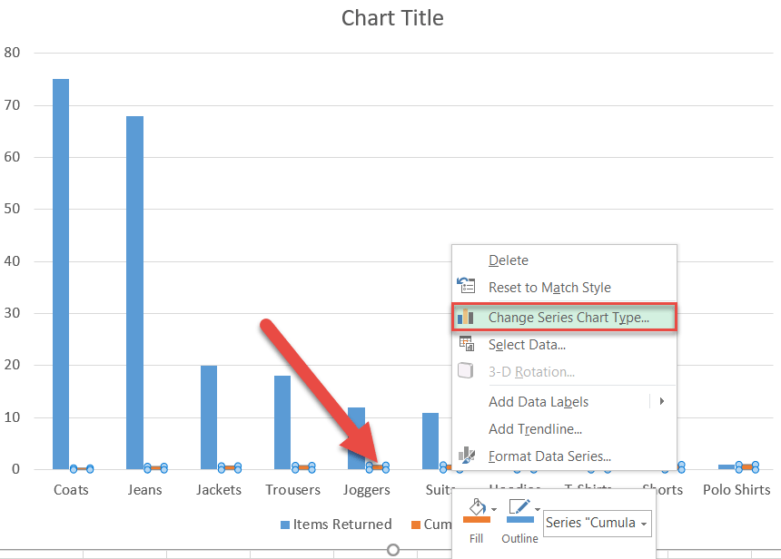
In the Change Chart Type dialog box, transform the clustered bar graph into a combo chart:
- Switch to the Combo tab.
- For Series “Cumulative %,” change “Chart Type” to “Line with Markers” and check the “Secondary Axis” box.
Excel 2010 or older versions: In the Change Chart Type tab, go to the Line tab and select “Line with Markers.” Then right-click on the line that appears, select Format Data Series, and in the Series Options tab, choose “Secondary Axis.”
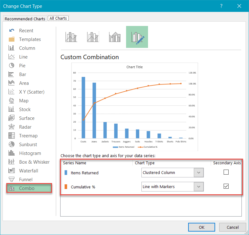
Having done that, your combo chart should look like this:
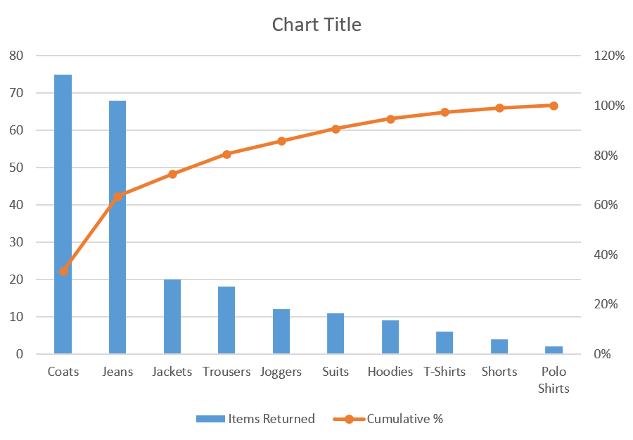
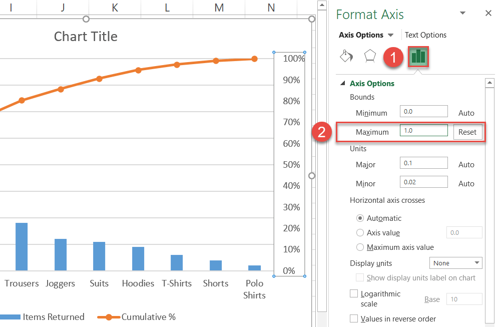
Step #5: Adjust the secondary vertical axis scale.
In a Pareto chart, the line chart values can never exceed one hundred percent, so let’s adjust the secondary vertical axis ranges accordingly.
Right-click on the secondary vertical axis (the numbers along the right side) and select “Format Axis.”
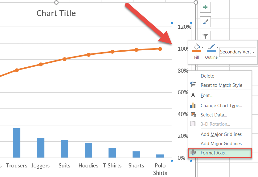
Once the Format Axis task pane appears, do the following:
- Go to the Axis Options
- Change the Maximum Bounds to “1.”
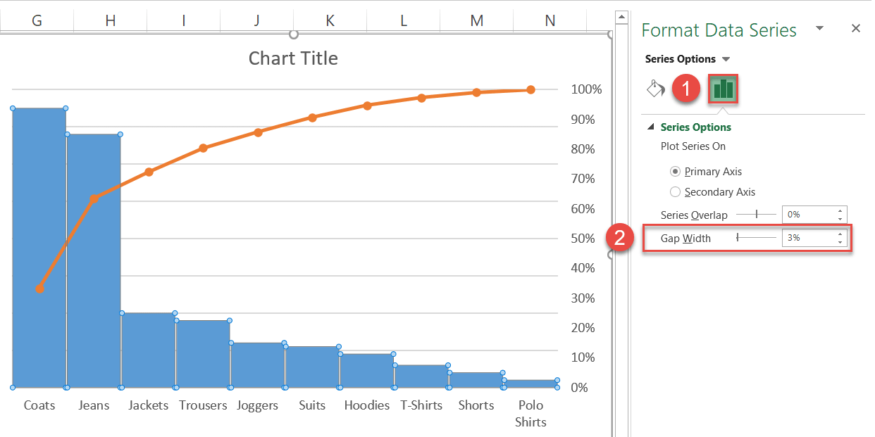
Step #6: Change the gap width of the columns.
Make the columns wider by tweaking the gap width of the corresponding data series (Series “Items Returned”).
To do that, right-click on any of the blue columns representing Series “Items Returned” and click “Format Data Series.”
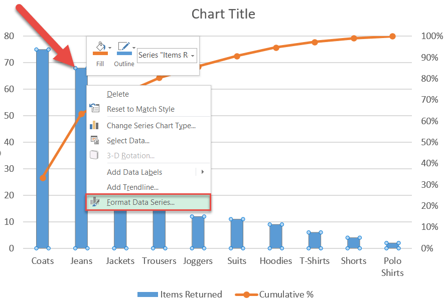
Then, follow a few simple steps:
- Navigate to the Series Options tab.
- Change “Gap Width” to “3%.”
Step #7: Add data labels
It’s time to add data labels for both the data series (Right-click > Add Data Labels).
As you may have noticed, the labels for the Pareto line look a bit messy, so let’s place them right above the line. To reposition the labels, right-click on the data labels for Series “Cumulative %” and choose “Format Data Labels.”
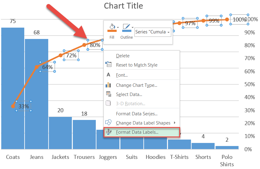
In the Format Data Labels task pane, change the position of the labels by doing the following:
- Go to the Label Options tab.
- Under “Label Position,” choose “Above.”

You can also change the color and size of the labels to differentiate them from each other.
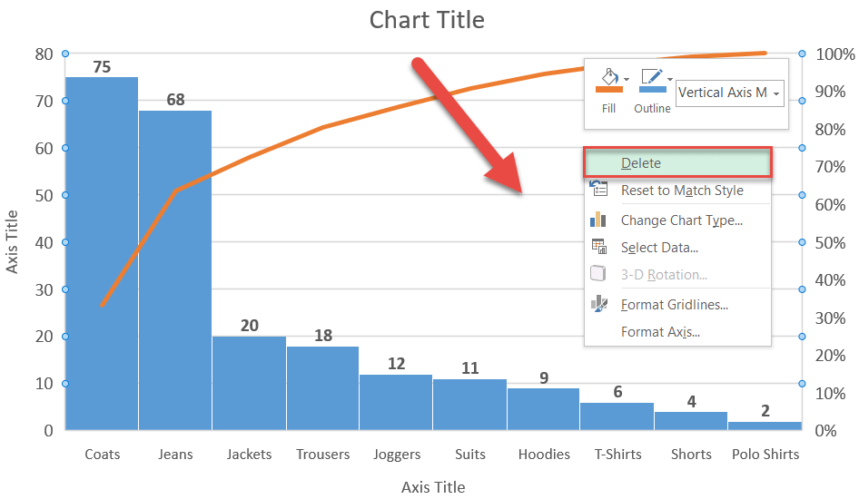
Step #8: Clean up the chart.
Finally, as we finish polishing up the graph, be sure to get rid of the chart legend and gridlines. Don’t forget to add the axis titles by following the steps shown previously (Design > Add Chart Element > Axis Titles > Primary Horizontal + Primary Vertical).
Your enhanced Pareto chart is ready!
