Percentage Change Chart – Excel
Written by
Reviewed by
This tutorial will demonstrate how to create a Percentage Change Chart in all versions of Excel.
Percentage Change – Free Template Download
Download our free Percentage Template for Excel.
In this Article
Percentage Change Chart – Excel
Starting with your Graph
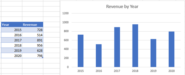
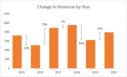
In this example, we’ll start with the graph that shows Revenue for the last 6 years. We want to show changes between each year.
Creating your Table
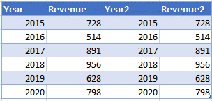
Copy Year and Revenue
Copy (Ctrl + C) and Paste (Ctrl + V) next to the box.
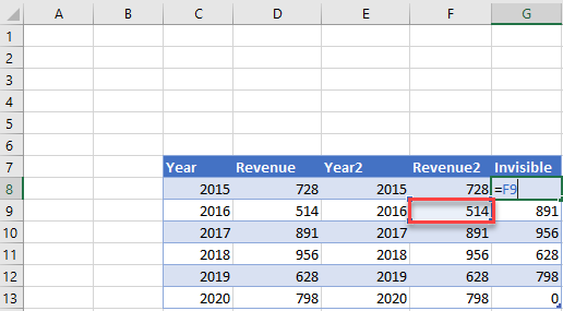
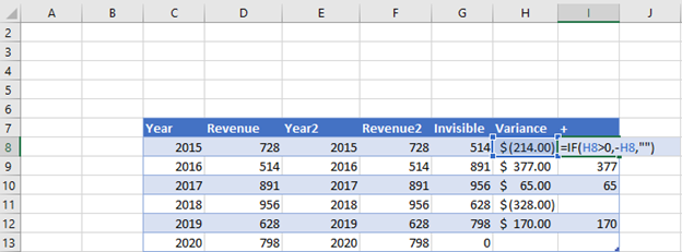
Add the Invisible Column
Add the second Revenue Item. Leave the last value blank
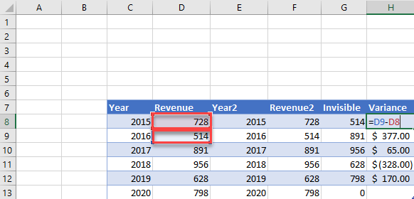
Add the Variance Column
In the Variance Column, select Second Value – First Value
Add the + Column
In the + Column, enter formula =IF(H8>0,-H8,””) This will show all the positive values
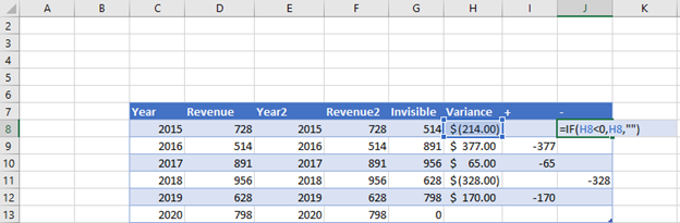
Add the – Column
In the = Column, enter formula =IF(H8<0,H8,””) This will show all the negative values
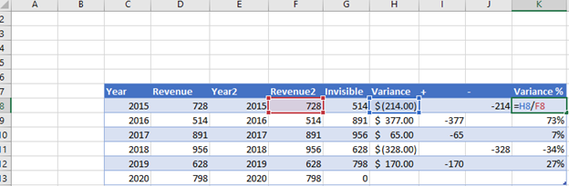
Add the Variance % Column
For the Variance Column, divide the Variance % by the Revenue, H8/F8
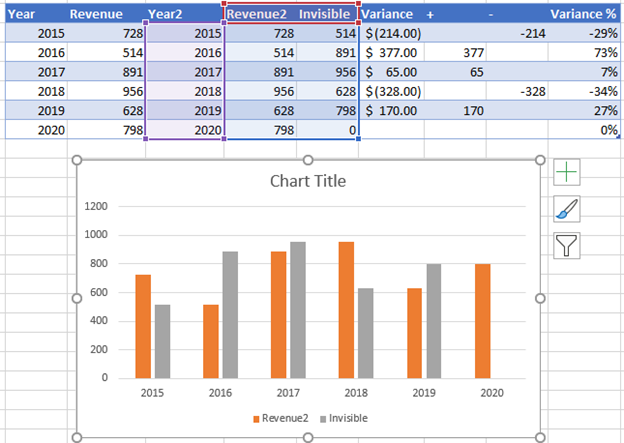
Creating the Graph
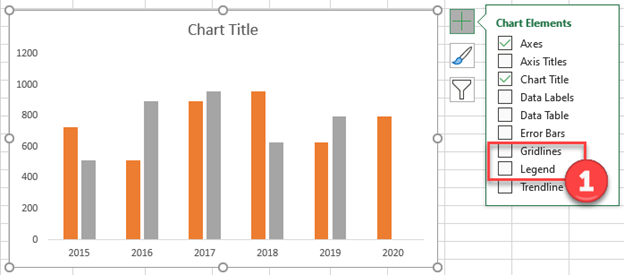
Create a Graph where the Year is your X Axis and the Revenue and Invisible Column are your Y Axis.
- Uncheck the boxes for Gridlines and legend
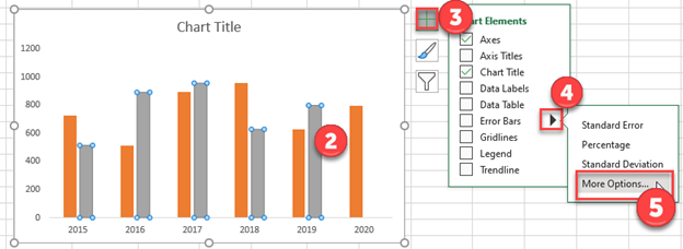
2. Click on the Invisible Series
3. Click on the + Sign in the top right of the graph
4. Select the Arrow next to Error Bars
5. Select More Options
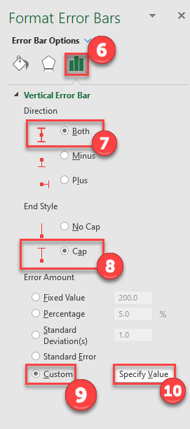
6. Under Format Error Bars, Select the Graph
7. For Direction, make sure Both is selected
8. For End Style, make sure Cap is selected
9. Under Error Amount, select Custom
10. Click on Specify Value
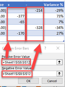
11. Highlight the Positive Values in Positive Error Value
12. Highlight the Negative Values in Negative Error Value
Formatting the Graph
- Right click on the Revenue Series
- Click on Format Data Series
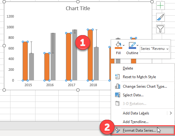
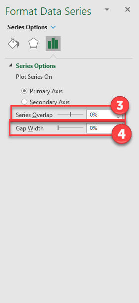
3. Change Series Overlap to 0%
4. Change Gap Width to 0%
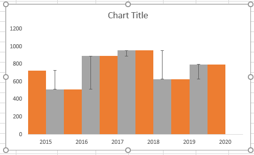
Your graph should look something like this so far
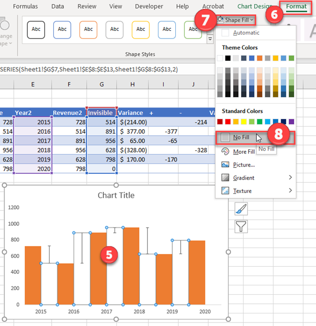
5. Select Invisible Bars
6. Click Format
7. Select Shape Fill
8. Click No Fill
Adding Labels
- While still clicking the invisible bar, select the + Sign in the top right
- Select arrow next to Data Labels
- Select More Options
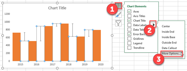
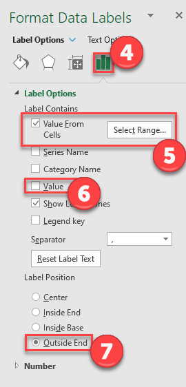
4. Select Graph under Format Data Labels
5. Check Value from Cells
6. Uncheck Value
7. Select Outside End
Final Graph
The final graph shows the variance between each series.
Percentage Change – Free Template Download
Download our free Percentage Template for Excel.
