Make a Percentage Graph in Excel or Google Sheets
Written by
Reviewed by
This graph will demonstrate how to create a percentage graph in Excel and Google Sheets.
Make a Percentage Graph in Excel
The goal of this tutorial is show how to make a percentage graph based on different datasets.
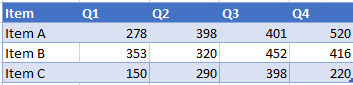
Start with Data
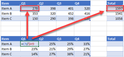
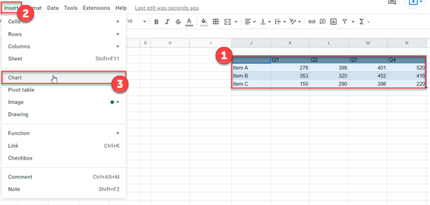
We’ll start with data below.
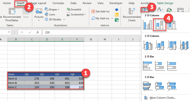
Creating a Stacked Bar Graph
- Highlight the data
- Click Insert
- Select Graphs
- Click Stacked Bar Graph
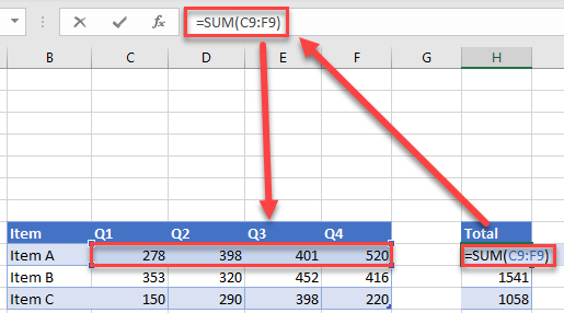
Add Items Total
Create a SUM Formula for each of the items to understand the total for each.
Find Percentages
Duplicate the table and create a percentage of total item for each using the formula below (Note: use $ to lock the column reference before copying + pasting the formula across the table). Each total percentage per item should equal 100%.
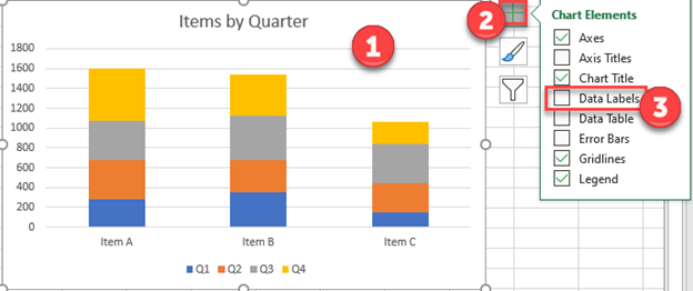
Add Data Labels on Graph
- Click on Graph
- Select the + Sign
- Check Data Labels
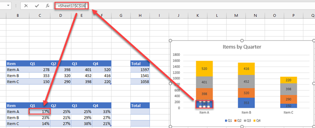
Change Labels to Percentage
Click on each individual data label and link it to the percentage in the table that was made.
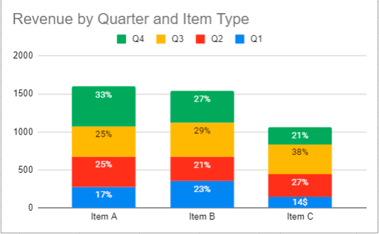
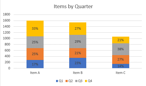
Final Percentage Graph in Excel
The final graph shows how each of the items change percentage by quarter.
Make a Percentage Graph in Google Sheets
Copy the same data on Google Sheets
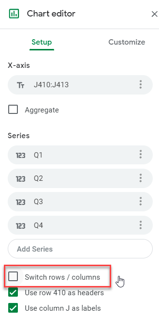
Creating a Graph
- Highlight table
- Select Insert
- Click Chart
If the X and Y Axis need to be swapped, check or uncheck Switch Rows/Columns
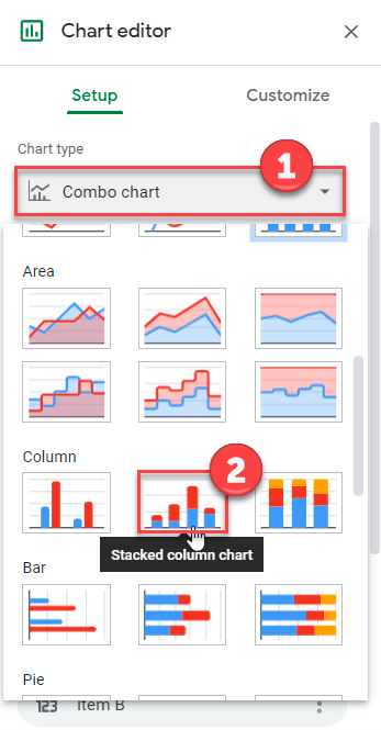
Change Chart Type
- Select Box under Chart Type
- Click Stacked Column Chart
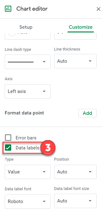
Adding Data Labels
- Click on Customize
- Select Series
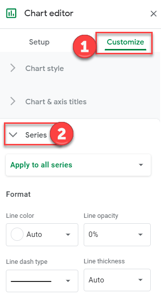
3. Check Data Labels
Double Click on each Data label and manually edit it to match the percentage (Can’t manually change this based on formula like you can in Excel)
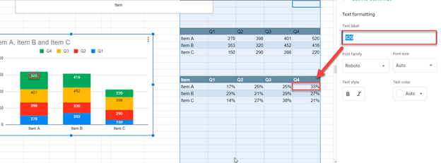
Final Percentage Graph in Google Sheets