Pie Chart – Show Percentage – Excel & Google Sheets
Written by
Reviewed by
This tutorial will demonstrate how to add percentages to a pie chart.
Adding Percentages to Pie Chart in Excel
Starting with your Graph
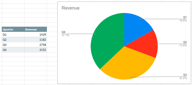
We’ll start this tutorial with a table and a pie chart shown based on the data. As you can see, the pie chart is made by using percentages of the total. Sometimes it is helpful to add percentages so that the end user can easily see what percentage each quarter makes up.

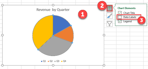
Add Data Labels
- Click on the chart
- Click the + Sign in the top right
- Select Data Labels
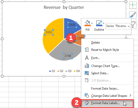
Change to Percentage
This will show the “Values” of the data labels. The next step is changing these to percentages instead.

- Right click on the new labels
- Select Format Data Labels
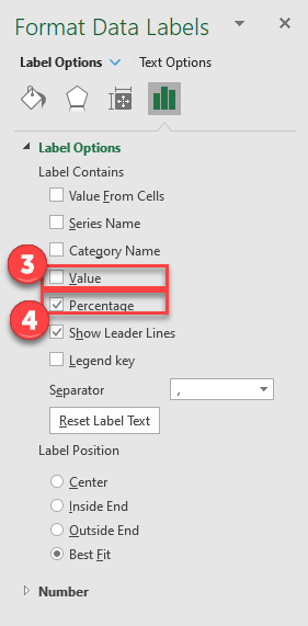
3. Uncheck box next to Value
4. Check box next to Percentage
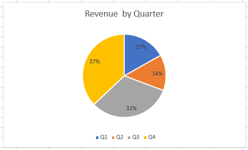
Final Graph with Percentage
After making these changes, your final graph should look like the one below where it shows the percentage that each slice represents.
Adding Percentages to a Pie Chart In Google Sheets
When creating a pie graph in Google Sheets, the percentages will automatically populate for each of the slices of the pie chart.