How to Plot Multiple Lines – Excel & Google Sheets
Written by
Reviewed by
This tutorial will demonstrate how to plot multiple lines on a graph in Excel and Google Sheets.
How to Plot Multiple Lines on an Excel Graph
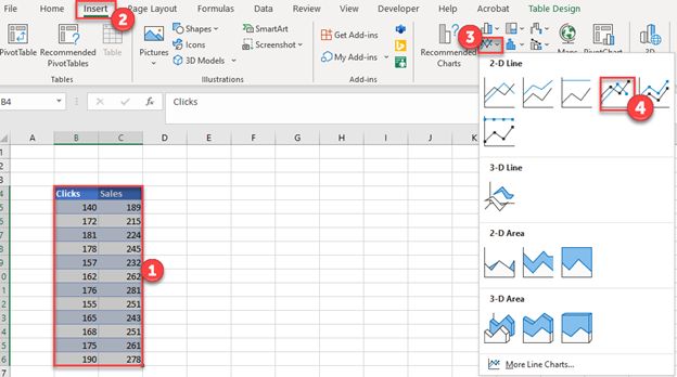
Creating Graph from Two Sets of Original Data
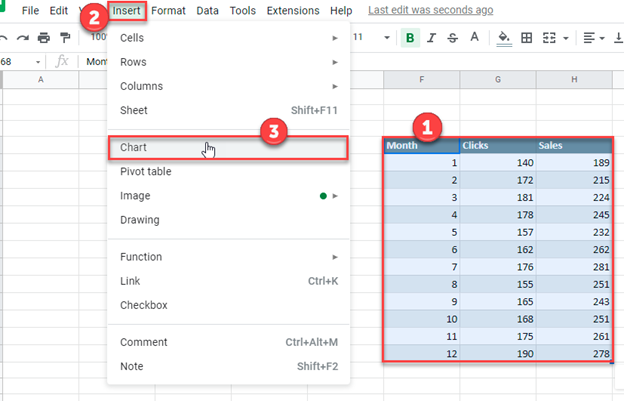
- Highlight both series
- Click Insert
- Select Line Graph
- Click Line with Markers
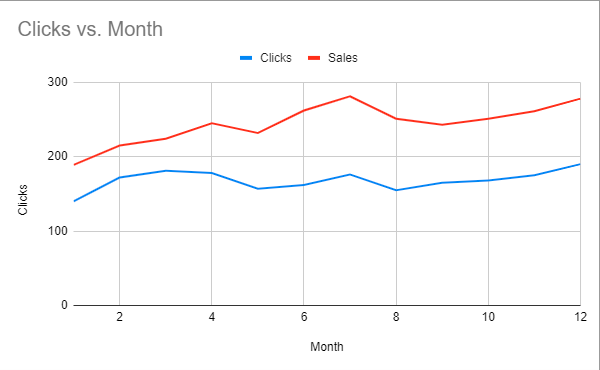
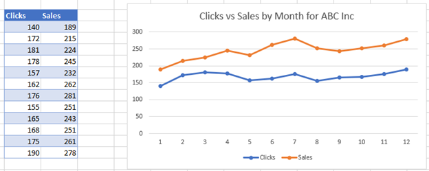
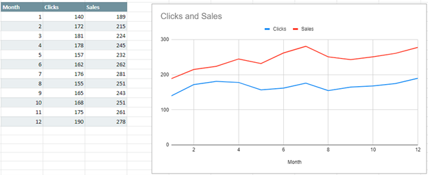
Final Graph with Multiple Lines
Below you can see what the graph looks like as we compare how clicks change and sales change in the same period. This can help determine if there are trends among the two datasets.
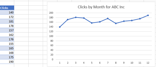
Adding to Graph in Order to Create Multiple Lines Graph
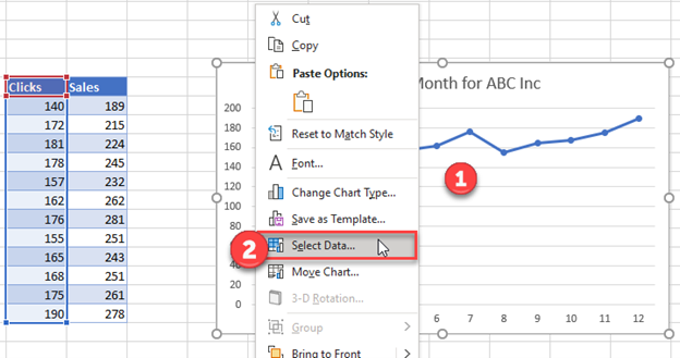
Instead of the scenario above, in this section, we’ll show what to do if you want to add to the graph to create a multiple lines graph. We’ll start with a single line graph below and show how to add another dataset.
- Right click on the graph
- Click Select Data
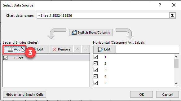
3. Click Add under Series
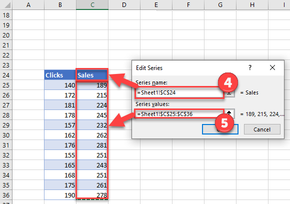
4. Select Series Name with updated header for new series
5. Select Series Values with updated values for new series
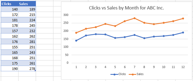
Final Graph with Multiple Lines
How to Plot Multiple Lines on Google Sheets
Creating Graph from Two Sets of Original Data
In Google Sheets, we want to set up the same data. But we also want to add the information that we want on the X Axis. Different from Excel, Google Sheets doesn’t automatically create this.
Create a Graph
- Highlight Graph
- Click Insert
- Select Chart
Change to Line Graph
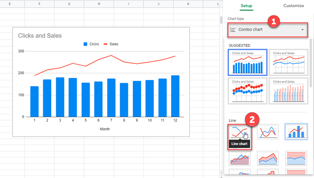
Once created, a bar on the right hand side will appear
- Click the chart under Chart Type. In this scenario, it is Combo Chart
- Change the chart to Line Chart
Final Graph with Multiple Lines Graph
Adding to Graph in Order to Create Multiple Lines Graph
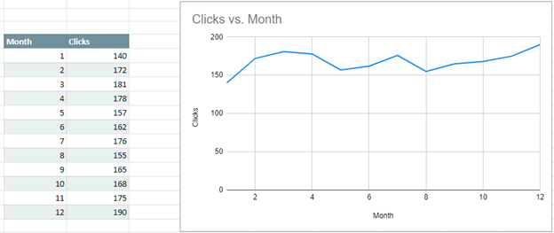
Similar to how we showed in Excel, we’ll show how to add to a single line graph to create a multiple line graph. We’ll start with the dataset showing month and clicks per month.
Adding Second Line to Graph
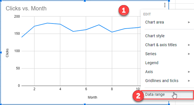
- Right click on Graph
- Select Data Range
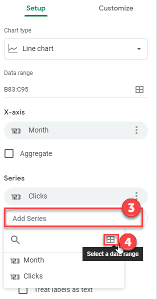
3. Click on Add Series
4. Click Select a Data Range
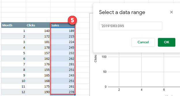
5. Highlight new series and Click OK
Final Graph with Multiple Lines Graph