How to Create a Polar Plot in Excel
Written by
Reviewed by
This tutorial will demonstrate how to create a polar plot in all versions of Excel: 2007, 2010, 2013, 2016, and 2019.
In this Article
- Polar Plot – Free Template Download
- Getting started
- Step #1: Set up a helper table.
- Step #2: Compute the Angle (theta) values.
- Step #3: Compute the Radius values.
- Step #4: Copy the last Radius values into the helper row.
- Step #5: Calculate the x- and y-axis values for each company.
- Step #6: Set up the second helper table for the polar plot grid.
- Step #7: Create a set of doughnut charts.
- Step #8: Reduce the Doughnut Hole size.
- Step #9: Set up the chart grid.
- Step #10: Add the chart data.
- Step #11: Change the chart type for the inserted data series.
- Step #12: Modify the horizontal and vertical axis scales.
- Step #13: Remove the gridlines, the axes, and the irrelevant legend items.
- Step #14: Add data labels.
- Step #15: Customize data labels.
- Step #16: Reposition the labels.
- Download Polar Plot Template
A polar plot is used to define a point in space within what is called the polar coordinate system, where rather than using the standard x- and y-coordinates, each point on a polar plane is expressed using these two values:
- Radius (r) – The distance from the center of the plot
- Theta (θ) – The angle from a reference angle
The plane itself is made up of concentric circles expanding outward from the origin, or the pole—hence the name. The polar plot comes in handy when the analyzed data has a cyclical nature.
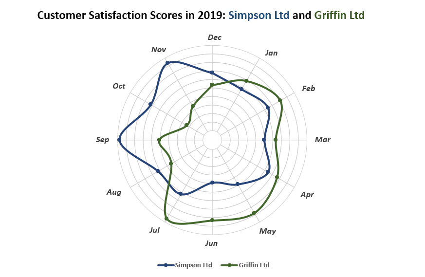
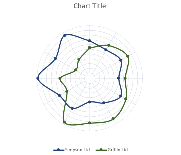
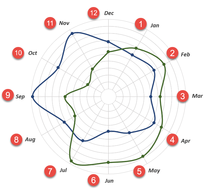
As an example, the chart below compares the customer satisfaction scores (CSAT), a metric that illustrates a customer’s satisfaction with a brand or product, of two organizations throughout 2019: Simpson Ltd and Griffin Ltd.
The plot enables you to quickly assess the good and bad months for each company, which facilitates better decision making.
However, here’s the rub:
Excel doesn’t support this chart type—in fact, it can’t even read polar coordinates—meaning you will have to build it from scratch. Also, don’t forget to check out the Chart Creator Add-In, a powerful tool for building mind-blowing advanced Excel charts and graphs in just a few clicks.
In this in-depth, step-by-step tutorial, you will learn how to turn your raw data into a polar plot in Excel from the ground up. For the record, this article is based on the tutorial created by Jon Peltier.
Getting started
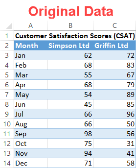
Since CSAT scores are commonly expressed as a percentage scale, consider the following table:
Step #1: Set up a helper table.
Right off the bat, outline a helper table where all the calculations for your chart will take place. To build the plot, you need to compute the polar coordinates first and, once there, convert them to the x- and y-axis values used by Excel to create the chart.
Set up a separate dummy table as follows:
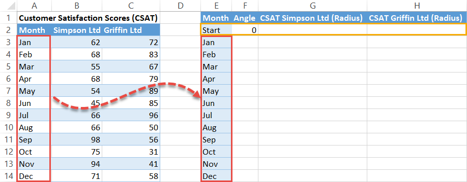
Notice how the helper table starts with a dummy row (E2:H2)—this determines the reference angle. Let’s talk about each element of the table a bit more in detail:
- Month – This column contains the qualitative categories derived from your original data. Type “Start” in the first cell (E2) and copy the categories (in our case, the months) right below it (E3:E14).
- Angle (Theta) – This column contains the theta values responsible for drawing the spokes where the actual values will be placed. You should always type “0” into the first cell (F2) of this column.
- CSAT Simpson LTD (Radius) and CSAT Griffin LTD (Radius) – These columns contain the radius values illustrating the performance of each company throughout the year.
Step #2: Compute the Angle (theta) values.
If you already have your r and theta values figured out, skip this part and scroll down to Step #4.
In this step, our aim is to evenly map out the spokes based on the number of categories in the dataset. As one full circular rotation equals 360 degrees, to pull off the task, you have to divide 360 by the number of categories in your dataset (in our case, twelve months).
Then, add up that number as you go along from zero to all the way to 360. And that’s where the COUNTA function comes into play. Basically, it counts the number of cells that are not empty within the specified range.
Copy this formula into cell F3:
=360/COUNTA($A$3:$A$14)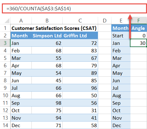
With that formula in cell F3, use this other formula in cell F4 to add up a given Angle value to the sum of all the theta values that go before it in the column:
=F3+360/COUNTA($A$3:$A$14)It is important to lock the cell range (A3:A14) to easily copy the formula into the remaining cells.
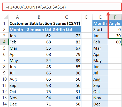
Now execute the formula for the rest of the cells in the column (F5:F14) by selecting F4 and dragging down the fill handle.
Step #3: Compute the Radius values.
The polar plot will be made up of 10 data rings, each radial point (the distance between the inner and outer edge of a ring) representing a ten percent increment on a scale from 0 to 100.
Since CSAT scores are also measured on the percentage scale, simply divide each CSAT score table by 10.
Here’s how you do that quickly and easily. To find the Radius values for the first company (Simpson Ltd), enter this tiny formula into cell G3 and copy it into the remaining cells (G4:G14):
=B3/10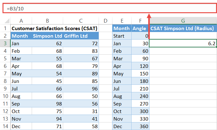
Now, by the same token, calculate the radii for the second company (Griffin Ltd):
=C3/10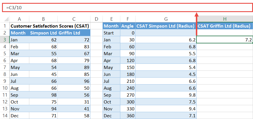
At this point, you may be thinking to yourself, “What if my data type differs? How do you adjust when comparing, for instance, the revenue generated by companies as opposed to CSAT scores?”
Simply put, you have to analyze your actual data, define the equivalent to one radial point (say $50,000), and divide all the values in your dataset by that number. Suppose some company generated $250,000 in May. To find your radius, divide $250,000 by 50,000. As simple as that.
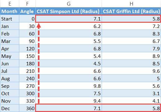
Step #4: Copy the last Radius values into the helper row.
Complete the table by copying the r values at the very bottom (G14:H14) of each column into the respective dummy cells (G2:H2).
Step #5: Calculate the x- and y-axis values for each company.
It’s time to move on to turning the polar coordinates into the relevant x- and y-axis values. Thanks to trigonometry, you can make the transition happen by using the two special formulas you are about to learn in a few seconds.
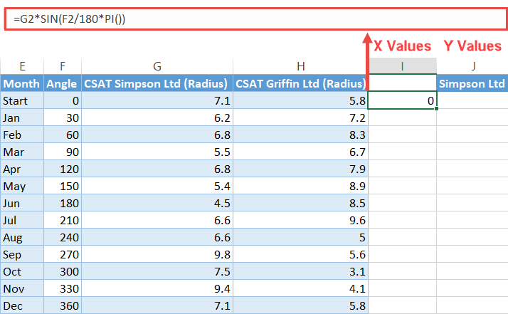
Let’s start with the x-axis values first. In the cell adjacent to the helper table (I2), enter the following formula:
=G2*SIN(F2/180*PI())Copy this formula into the remaining cells below it (I3:I14).
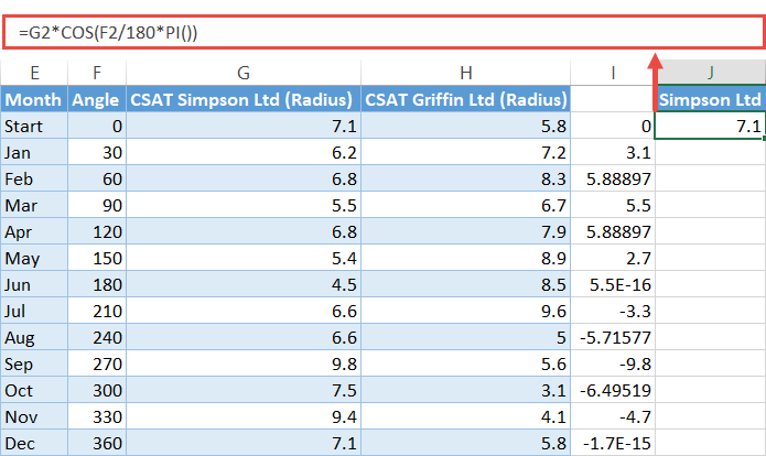
In just the same way, plug this formula into cell J2 to find the y-axis values and execute it for the rest of the cells (J3:J14) as well:
=G2*COS(F2/180*PI())Important note: Keep in mind that the header row cell (J1) of a column with y-axis values (column J) will act as the series name, meaning the value in that cell will go to the chart legend.
Repeat the exact same process to compute the X and Y values for the second company, adjusting the formula to use the data in the Griffin Ltd column:
=H2*SIN(F2/180*PI())=H2*COS(F2/180*PI())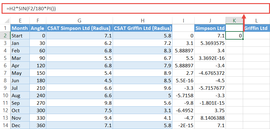
Step #6: Set up the second helper table for the polar plot grid.
Yes, you heard it right. You need yet another helper table. Fortunately, the worst is behind us as it won’t take a single formula to put the table together.
Take a quick look at it:

Essentially, the table is comprised of three elements:
- The qualitative scale (the yellow area or N2:N11) – This reflects the value intervals based on your actual data. Fill in the cells with percentages as shown in the screenshot. As an example of alternate data, if we were to analyze the revenue mentioned before, this column would go from $50,000 to $500,000.
- The header row (the red area or O1:Z1) – This contains all the category names derived from the original data table, just placed vertically.
- The grid values (the green area or O2:Z11) – These values will split the future data rings into equal parts, outlining the plot grid. Just pick a number out of thin air and copy it into all the cells within the range.
Step #7: Create a set of doughnut charts.
At last, you have gathered all the necessary chart data—that was pretty intense. Wave goodbye to functions and formulas because you can now start building the polar plot itself.
Start with setting up the polar plane by creating 10 doughnut charts stacked on top of each other:
- Highlight all the grid values from the second helper table (O2:Z11).
- Go to the Insert tab.
- Click the “Insert Pie or Doughnut Chart” button.
- Choose “Doughnut.”
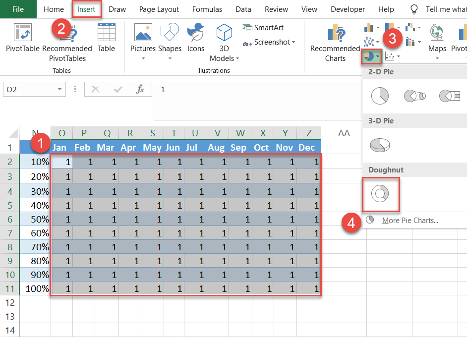
Excel should give you a set of 10 rings as a result.
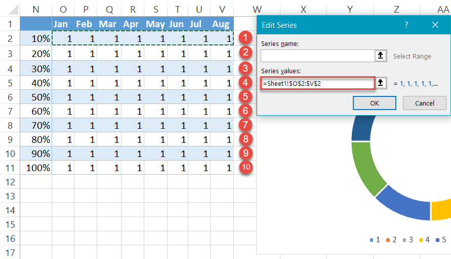
Sometimes Excel fails to read your data the right way. To work around the issue if this happens to you, follow a few straightforward instructions to stack your charts manually. For illustration purposes, let’s assume you set out to analyze the data for eight months instead.
First, select any empty cell and build an empty doughnut chart by following the steps outlined above.
Then, right-click on the chart plot and choose “Select Data.”
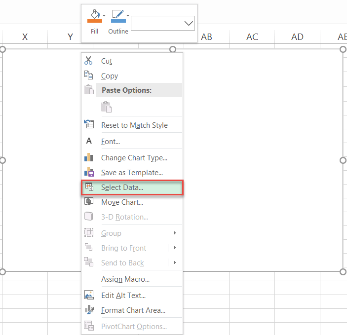
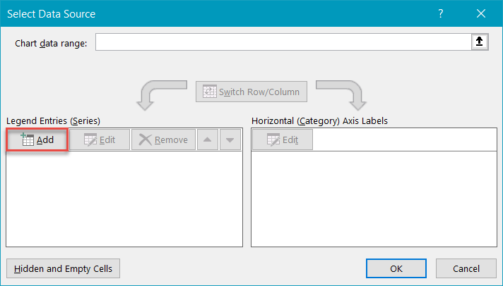
After that, in the Select Data Source dialog box, click the “Add” button.
In the Edit Series box, select all the grid values in the first row (O2:V2) and click “OK.”
As you may have guessed it, rinse and repeat for each row to get the same 10 rings plotted on the chart.
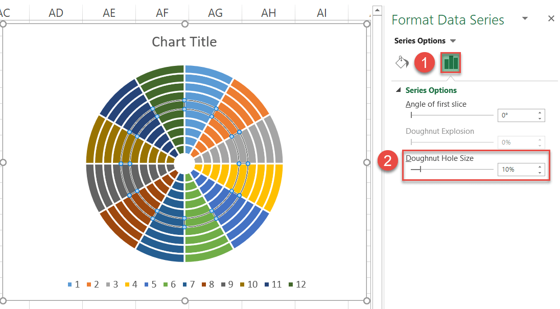
Step #8: Reduce the Doughnut Hole size.
As you see, all the rings have been squeezed together away from the center. Let’s change that by reducing the Doughnut Hole size.
- Right-click any data ring.
- Select “Format Data Series.”
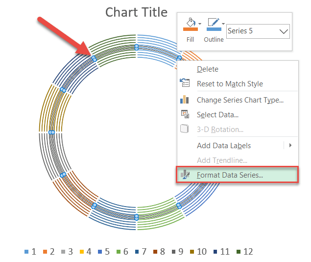
In the task pane that pops up, change the default Doughnut Hole Size value to make magic happen:
- Switch to the Series Options tab.
- Set the Doughnut Hole Size to “10%.”
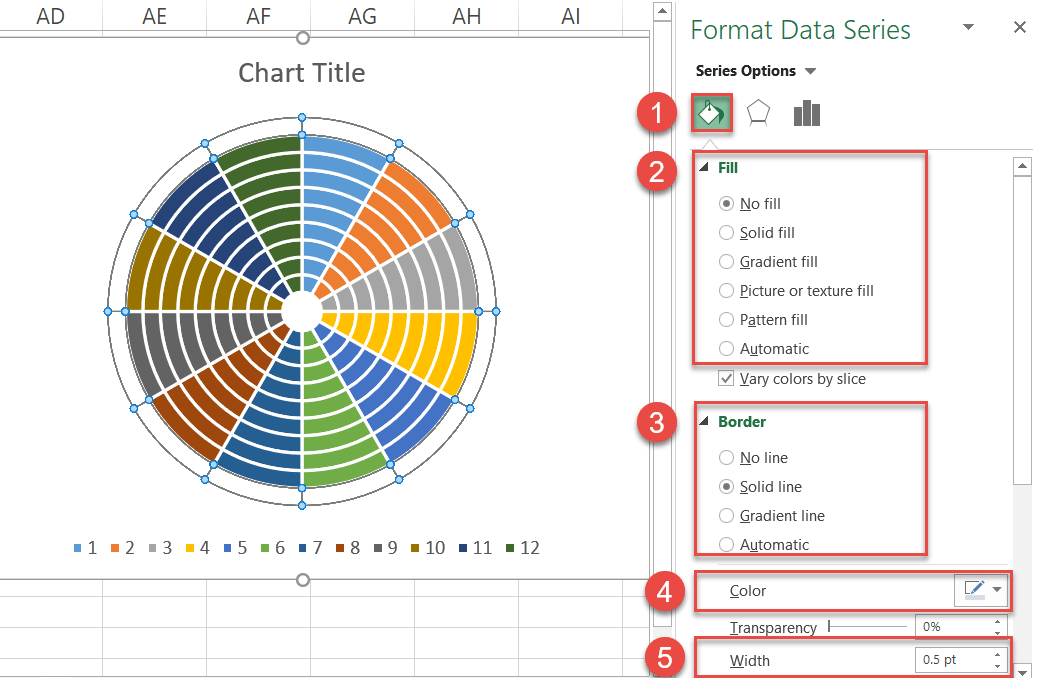
Step #9: Set up the chart grid.
In the same task pane, transform the rings into a grid by following these simple steps:
- Go to the Fill & Line tab.
- Under “Fill,” choose “No fill.”
- Under “Border,” select “Solid line.”
- Click the “Outline color” icon to open the color palette and select light gray.
- Set the Width to “5 pt.”
Rinse and repeat for the rest of the rings.
Step #10: Add the chart data.
Now that the groundwork has been laid, add the x and y values from the first helper table to the chart.
- Highlight all the x- and y-axis values illustrating the CSAT scores of the first company (Simpson Ltd) as well as the header row cells (I1:J14) and copy the data (right click and select Copy).
- Select the chart area.
- Navigate to the Home tab.
- Click the “Paste” button.
- Choose “Paste Special.”
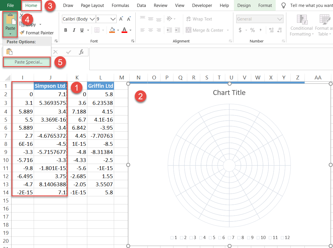
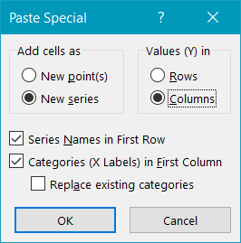
In the tiny Paste Special dialog box that appears, do the following:
- Under “Add cells as,” choose “New series.”
- Under “Values (Y) in,” select “Columns.”
- Check the “Series Names in First Row” and “Categories (X Labels) in First Column” boxes.
- Click “OK.”
Repeat the process to add the chart data linked to the second company (Griffin Ltd).
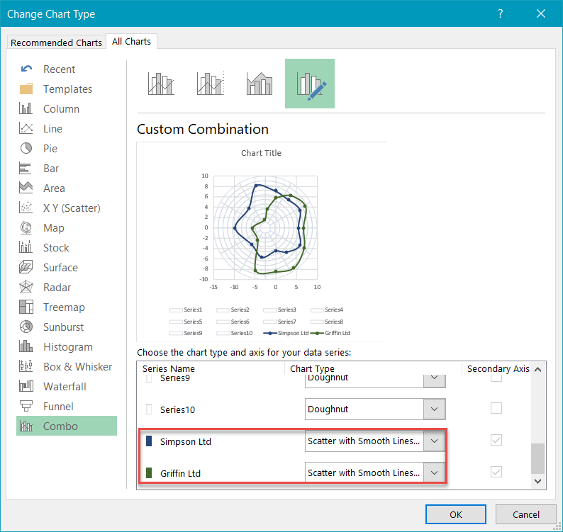
Step #11: Change the chart type for the inserted data series.
Now, change the chart type of both the newly-added series representing the actual values.
- Right-click on either of the series representing the actual values (either Series “Simpson Ltd” or Series “Griffin Ltd”).
- Choose “Change Series Chart Type.”
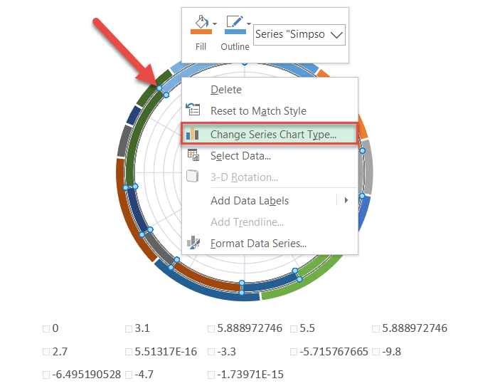
Once there, change the chart type for Series “Simpson Ltd” and Series “Griffin Ltd” to “Scatter with Smooth Lines and Markers.”
Step #12: Modify the horizontal and vertical axis scales.
Once the chart axes pop up, modify both the horizontal and vertical axis scale ranges for the chart to accurately reflect the data plotted on it.
- Right-click on the vertical axis.
- Choose “Format Axis.”
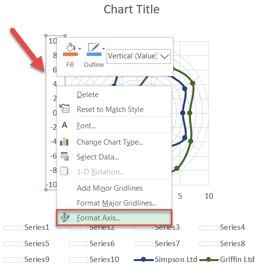
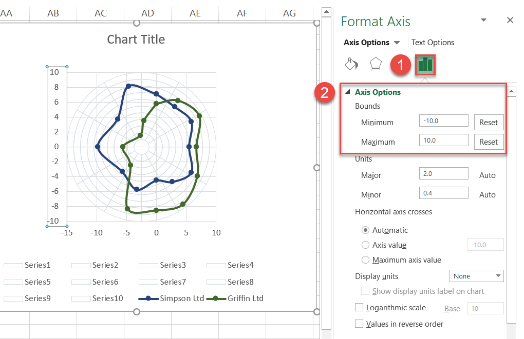
Once the task pane appears, define the new axis scale ranges:
- Go to the Axis Options tab.
- Set the Minimum Bounds value to “-10.”
- Change the Maximum Bounds value to “10.”
After that, jump to the horizontal axis and do the exact same thing.
Step #13: Remove the gridlines, the axes, and the irrelevant legend items.
Clean up the plot by removing the chart elements that have no practical value whatsoever: the gridlines, the axes, as well as all the legend items—save for the two that you actually need (marking the company information).
To do that, double-click on each element, then right-click on it again, and choose “Delete.”
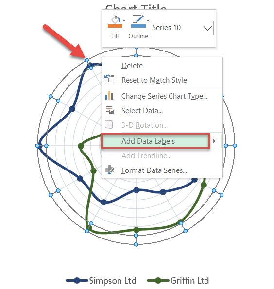
Step #14: Add data labels.
As we gradually move toward the end of our grand Excel adventure, it’s time to add the data labels representing each qualitative category in your dataset.
Right-click on the outer ring (Series “10”) and choose “Add Data Labels.”
Step #15: Customize data labels.
Basically, all you need to do here is replace the default data labels with the category names from the table containing your actual data.
Right-click on any data label and select “Format Data Labels.”
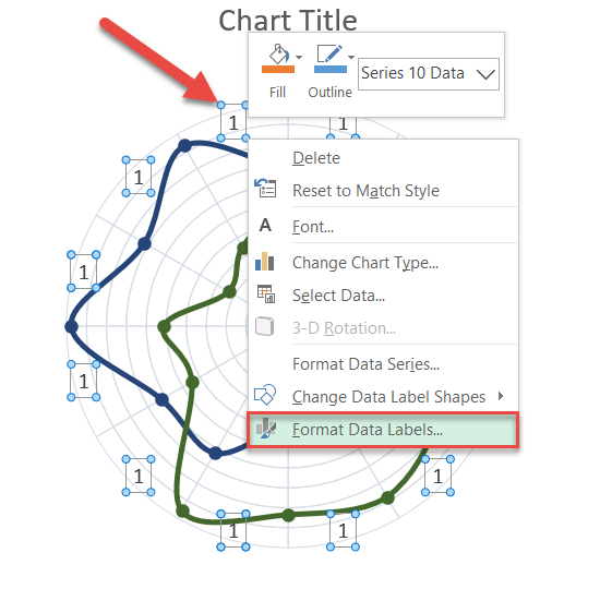
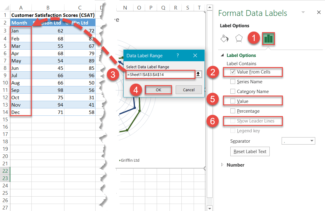
When the task pane opens, replace the values by doing the following:
- Go to the Label Options tab.
- Check the “Value From Cells” box.
- Highlight the category values from your original data table (A3:A14).
- Click “OK.”
- Uncheck the “Value” box.
- Uncheck the “Show Leader Lines” box.
Step #16: Reposition the labels.
Now, shift the labels around a bit by placing them along the rim of the outer ring in the order shown on the screenshot below. This will have to be done manually by dragging each title to the proper position.
Finally, change the chart title, and you’re all set!
