How to Create Progress Charts (Bar and Circle) in Excel
Written by
Reviewed by
This tutorial will demonstrate how to create a progress chart in all versions of Excel: 2007, 2010, 2013, 2016, and 2019.
Progress Chart – Free Template Download
Download our free Progress Chart Template for Excel.
In this Article
- Progress Chart – Free Template Download
- Getting Started
- Prep Chart Data
- How to Create a Progress Bar Chart
- Step #1: Create a stacked bar chart.
- Step #2: Design the progress bars.
- Step #3: Add data labels.
- Step #4: Insert custom data labels.
- Step #5: Adjust the horizontal axis scale.
- Step #6: Clean up the chart.
- Step #7: Add the axis titles.
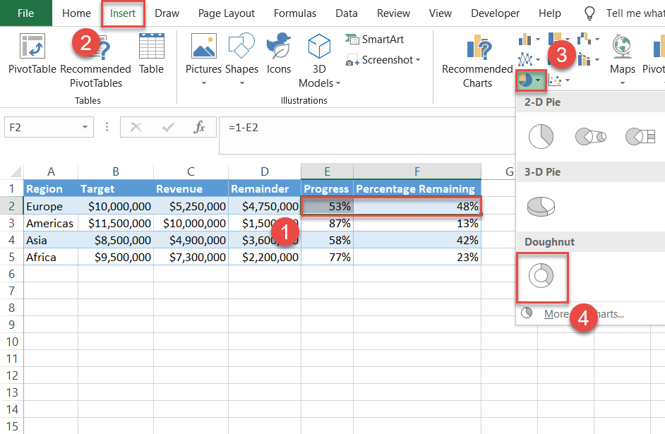
- How to Create a Progress Circle Chart
- Step #1: Build a doughnut chart.
- Step #2: Reduce the hole size.
- Step #3: Recolor the slices.
- Step #4: Modify the borders.
- Step #5: Add a text box.
- Download Progress Chart Template
A progress chart is a graph that displays the progress made toward a certain goal. The chart allows you to monitor and prioritize your objectives, providing critical data for strategic decision-making.
In Excel, there’s always ten ways to do anything. However, all the seemingly endless variety of tricks, techniques, and methods boils down to just two types of progress charts:
- Progress bar chart
- Progress circle chart
However, these chart types are not supported in Excel, which means that the only way to go is to manually build the charts from scratch. For that reason, don’t forget to check out the Chart Creator Add-in, a versatile tool for creating complex Excel graphs in just a few clicks.
But have no fear. In this step-by-step tutorial, you will learn how to create both the progress bar and the progress circle charts in Excel.
Getting Started
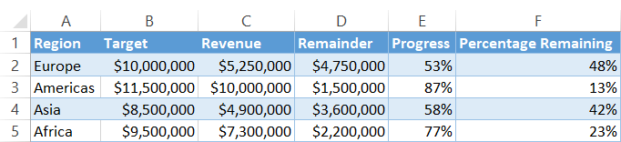
For illustration purposes, let’s assume you need to analyze the performance of your international e-commerce business against the stated revenue goals across four major regions: Europe, Asia, Africa, and the Americas.
With that in mind, consider the following table:
The columns are pretty self-explanatory, so let’s get down to the nitty-gritty.
Prep Chart Data
Before we begin, you need to add three additional helper columns and determine the necessary chart data for building the charts.
By the end of this step, your chart data should look like this:
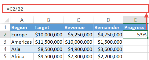
First, set up column Remainder (column D). This column contains the gross revenue the company has to generate in order to reach the stated goal for each region.
To find the respective values, type this simple formula into cell D2 and copy it down through cell D5:
=B2-C2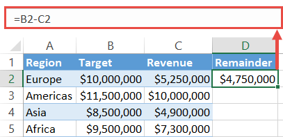
Next, add column Progress (column E). Just like column Revenue (column C), this one represents the progress made in each region, here shown as percentages which will end up being used as data labels further down the road.
To find the percentages, enter the following formula into E2 and copy it down to E5:
=C2/B2Once you have executed it for the entire column (E2:E5), select the formula output and change the number formatting to percentages (Home > Number group > Percent Style).
Two formulas down, one to go. Finally, create the third helper column Percentage Remaining.
Simply put, this column represents the progress yet to be made, expressed in percentages. These values will be used for building the future progress circle chart.
Type this formula into F2, copy it down to F5, and convert the column values (F2:F5) into percentages:
=1-E2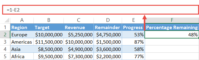
Having done all that, it’s now time to roll up your sleeves and get down to work.
How to Create a Progress Bar Chart
Let’s tackle this chart type first. A progress bar chart is made up of vertical progress bars—hence the name—and allows you to compare multiple categories at once, saving a great deal of dashboard space.
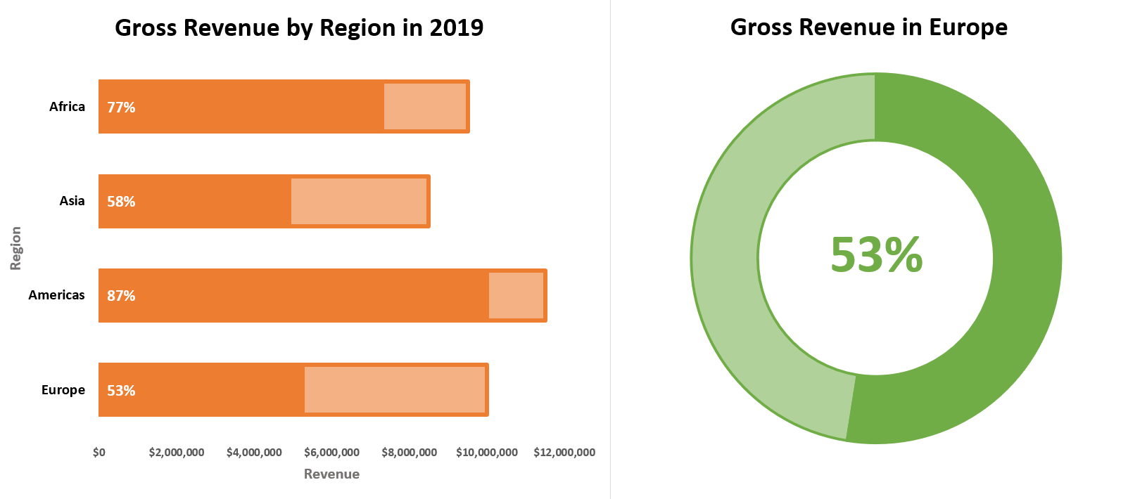
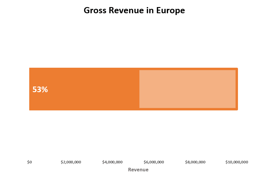
As an example, take a quick glance at this progress chart comprised of four progress bars illustrating the company’s performance in each region.
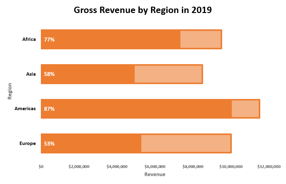
Looks great, right? Follow the steps below to learn how you can turn your raw data into this fancy progress chart.
Step #1: Create a stacked bar chart.
Right off the bat, plot a basic stacked bar chart.
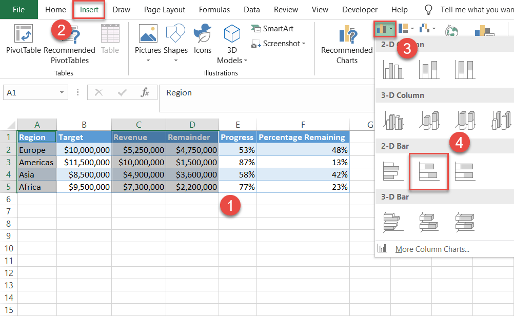
- Highlight all the cells in columns Region, Revenue, and Remainder by holding down the Ctrl key (A1:A5 and C1:D5).
- Go to the Insert tab.
- Click “Insert Column or Line Chart.”
- Select “Stacked Bar.”
Once you have selected it, your chart will appear. However, if you need to create a chart containing a single progress bar—to zoom in on one region, say, Europe—the process is slightly different.
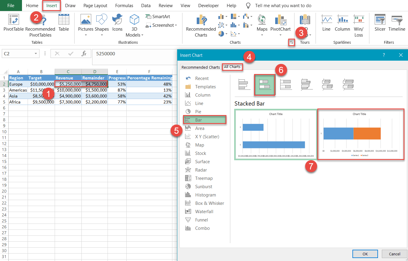
- Select only the two corresponding values in columns Revenue and Remainder (C2:D2).
- Go to the Insert tab.
- In the Charts group, click the “See All Charts” icon.
- In the Insert Chart dialog box, navigate to the All Charts tab.
- Select “Bar.”
- Click “Stacked Bar.”
- Choose the chart to the right.
Step #2: Design the progress bars.
Our next step is to transform the stacked bars into the progress bars.
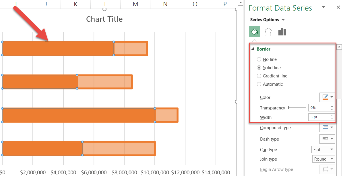
To start with, right-click on any of the orange bars representing Series “Remainder” and select “Format Data Series.”
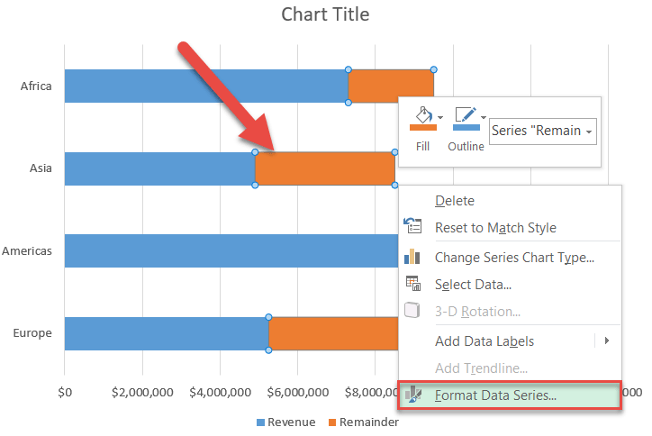
In the task pane that pops up, recolor the bars to illustrate the progress left to be made:
- Switch to the Fill & Line tab.
- Change “Fill” to “Solid fill.”
- Open the color palette and pick orange.
- Set the Transparency to “45%.”
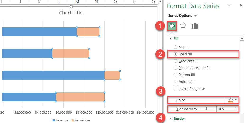
In the same tab, navigate to the Border section and add borders around the bars:
- Under “Border,” choose “Solid line.”
- Set the border color to orange.
- Change the Width to “3pt.”
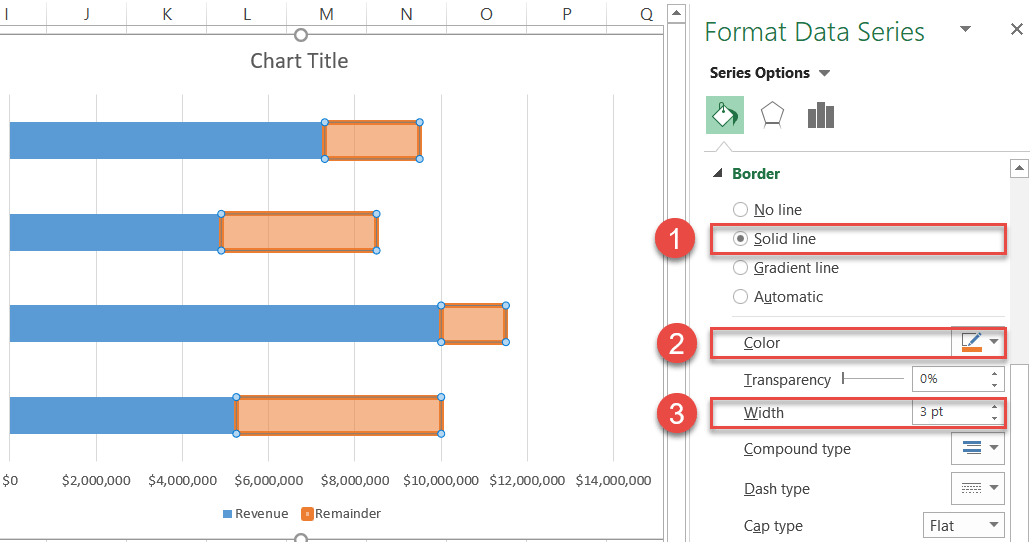
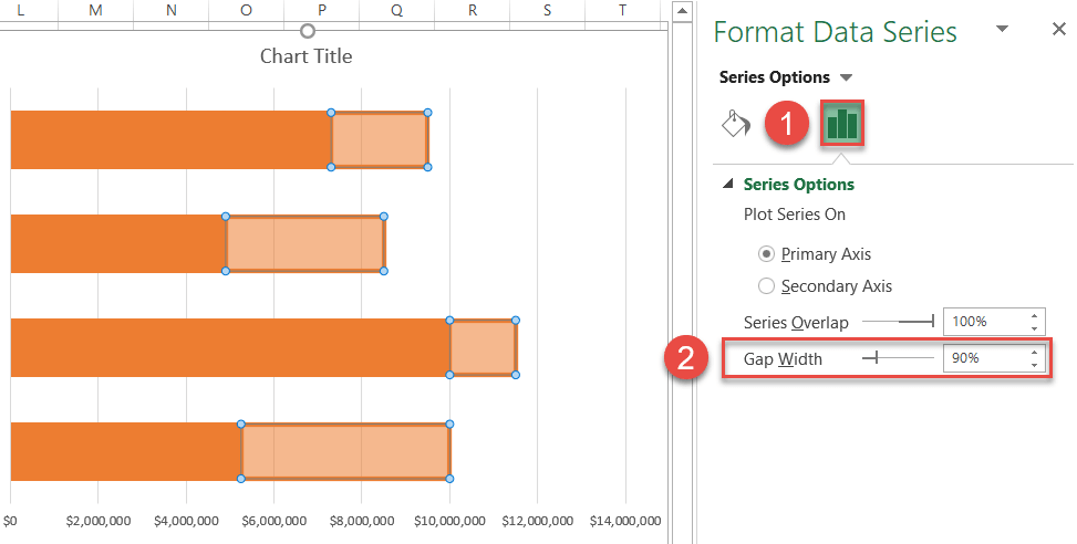
Now, select any of the blue bars illustrating Series “Revenue,” change the color of the data series to orange, and make the borders match those of Series “Remainder.”
Finally, regulate the widths of the bars.
- In the same task pane, go to the Series Options tab.
- Change the Gap Width to “90%.”
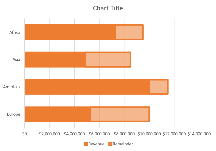
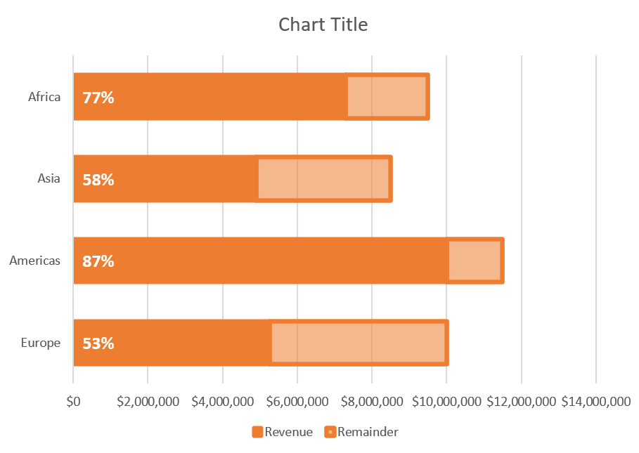
Once you are done tweaking the progress bars, your chart should look like this:
Step #3: Add data labels.
To make the chart more informative, it’s time for data labels to enter the scene.
Right-click on Series “Revenue” and select “Add Data Labels.”

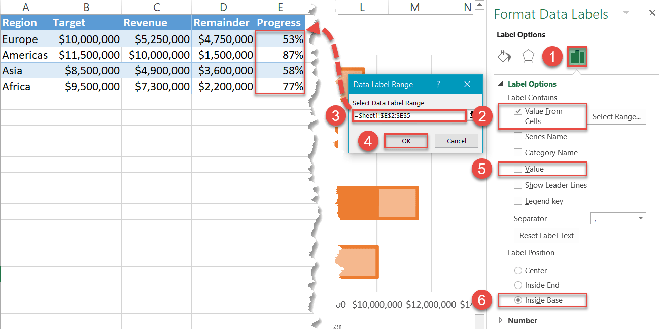
Step #4: Insert custom data labels.
Now, replace the default data labels with the respective percentages for each progress bar.
To do that, right-click on any of the data labels and choose “Format Data Labels.”
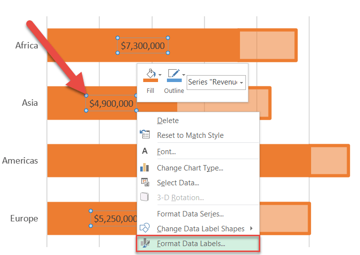
In the task pane that appears, do the following:
- Navigate to the Label Options tab.
- Check the “Value From Cells” box.
- In the Data Label Range dialog box, highlight all the values in column Progress (E2:E5).
- Hit the “OK” button.
- Uncheck the “Value” box.
- Under “Label Position,” choose “Inside Base.”
Also, change the font size and color of the labels to help them stand out (Home > Font). Once the job is done, your progress chart should look like this:
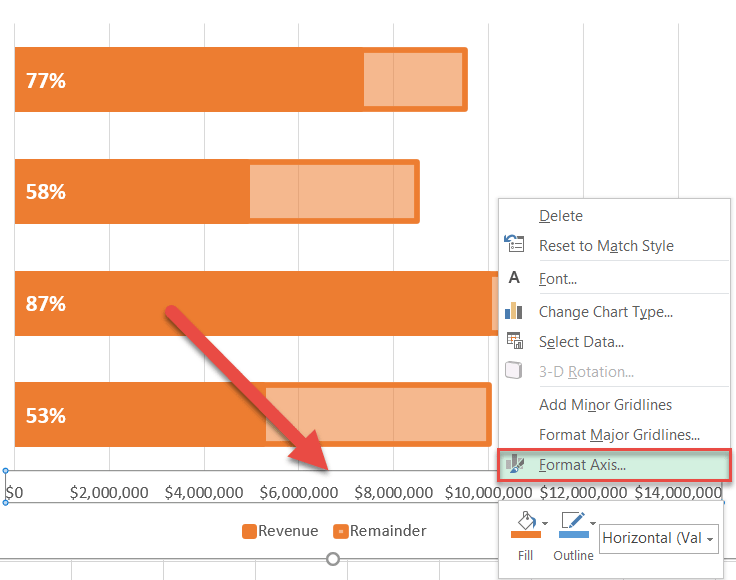
Step #5: Adjust the horizontal axis scale.
In order to get rid of the empty space, tailor the horizontal axis scale ranges to the actual values.
Right-click on the horizontal axis and choose “Format Axis.”
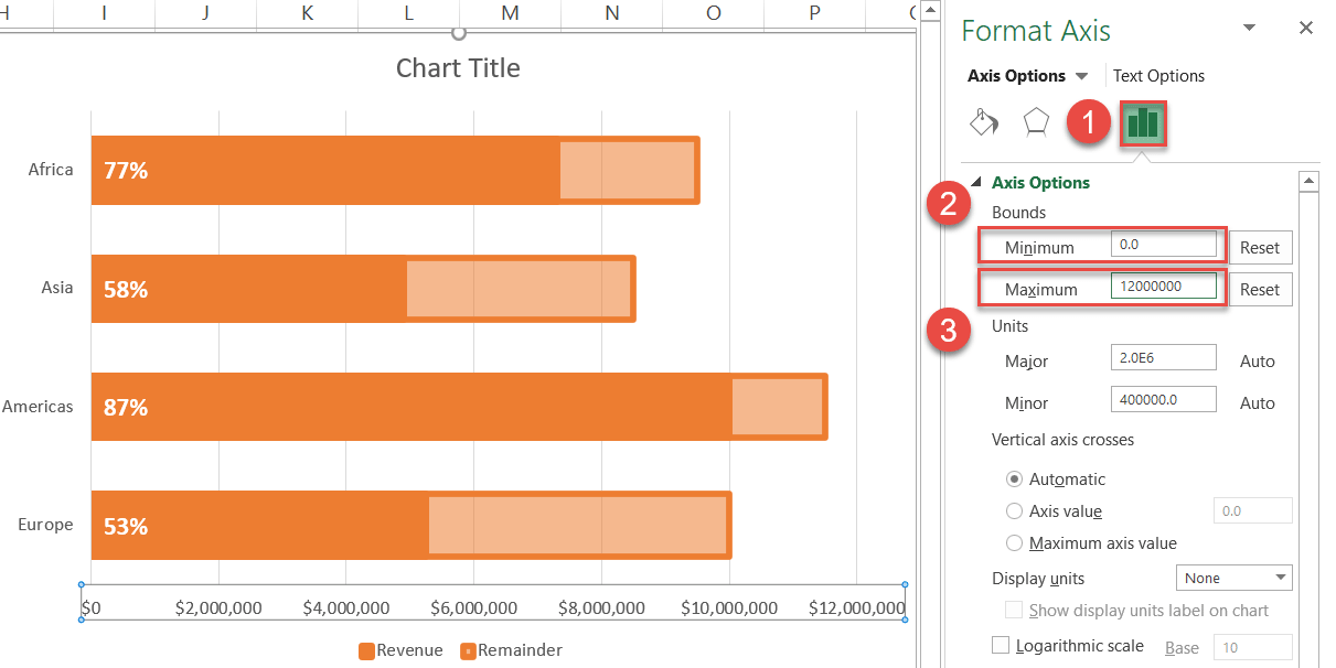
In the Format Axis task pane, modify the axis scale ranges:
- Go to the Axis Options tab.
- Set the Minimum Bounds to “0.”
- Set the Maximum Bounds to “12000000.”
Step #6: Clean up the chart.
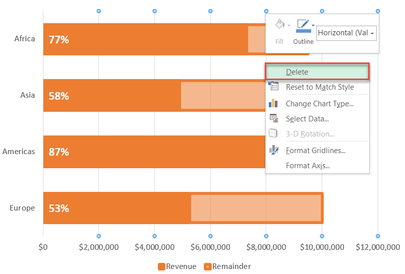
Before calling it a day, clean up the chart plot by removing some of its redundant elements.
First, erase the gridlines and chart legend. Right-click on each of the chart elements and select “Delete.”
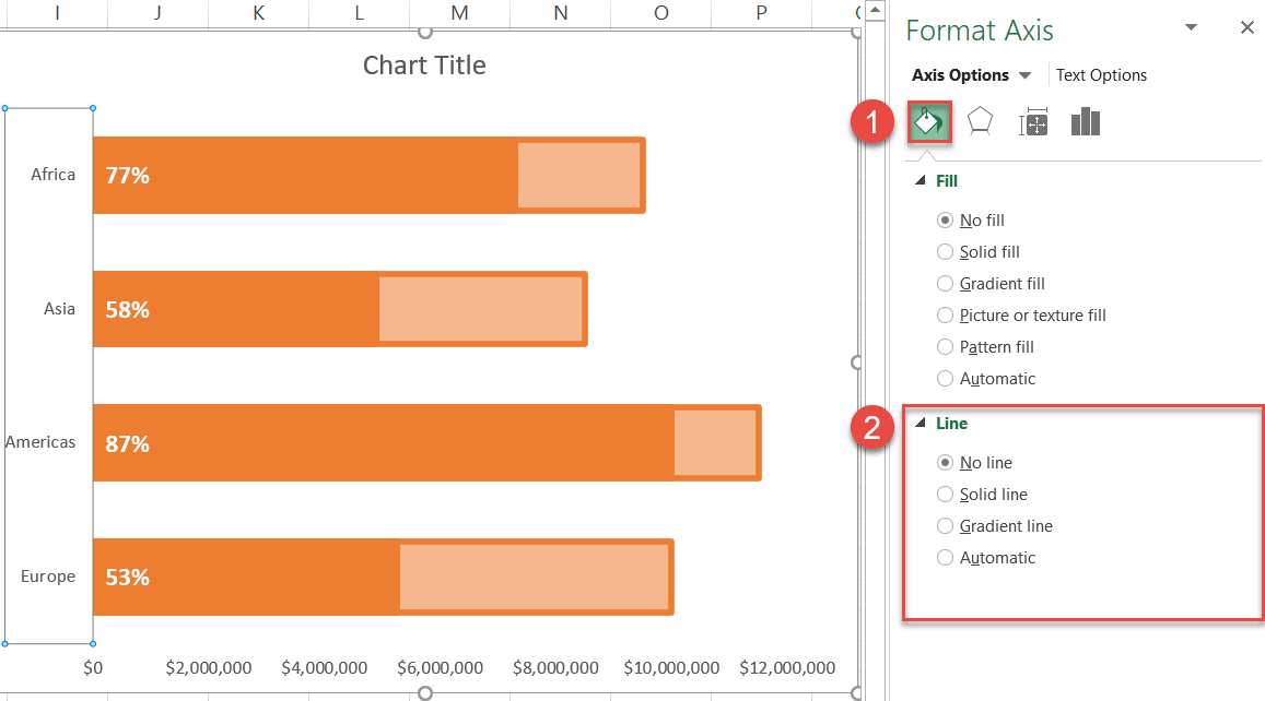
We need to take the vertical axis border out of the picture as well. Right-click on the vertical axis and open the Format Axis task pane.
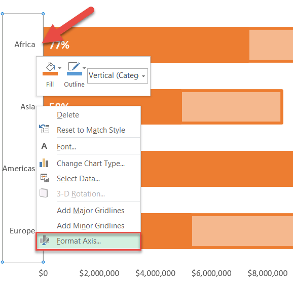
In the task pane, go to the Fill & Line tab and change “Line” to “No line.”
Also, enlarge the axis labels and make them bold (Home > Font).
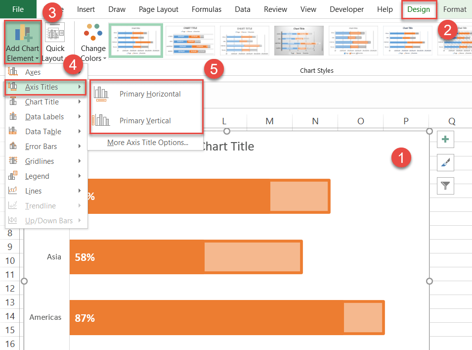
Step #7: Add the axis titles.
As a final touch, insert the axis titles into the chart.
- Select the chart area.
- Switch to the Design tab.
- Hit the “Add Chart Elements” button.
- Click “Axis Titles.”
- Choose “Primary Horizontal” and “Primary Vertical.”
Change the chart and axis titles to match your chart data. Now your progress bar chart is ready!
What’s more, take a look at the alternative chart containing a single progress bar that was created following the same steps shown above. With this technique, the sky is the limit!
How to Create a Progress Circle Chart
A progress circle chart serves the same purpose, with the exception of using a circle to illustrate the progress made. Fortunately, this chart type takes way less effort to build than its counterpart.
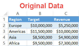
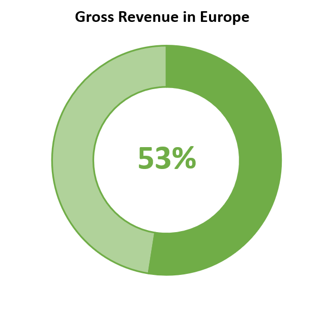
Let me show you how to plot this dynamic progress circle chart illustrating the performance of the company in Europe.
Step #1: Build a doughnut chart.
First, create a simple doughnut chart. Use the same chart data as before—but note that this chart focuses on just one region rather than comparing multiple regions.
- Select the corresponding values in columns Progress and Percentage Remaining (E2:F2).
- Go to the Insert tab.
- Click “Insert Pie or Doughnut Chart.”
- Choose “Doughnut.”
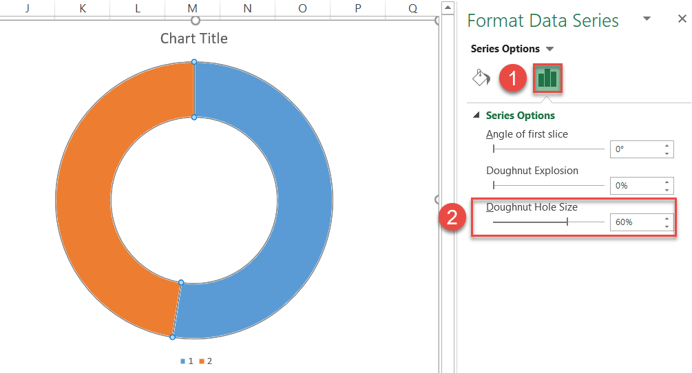
Step #2: Reduce the hole size.
As you can see, the doughnut ring looks a bit skinny. However, you can increase the width of the ring by slightly tweaking the hole size.
Right-click on either of the slices, open the Format Data Series task pane, and do the following:
- Switch to the Series Options tab.
- Change the Doughnut Hole Size to “60%.”
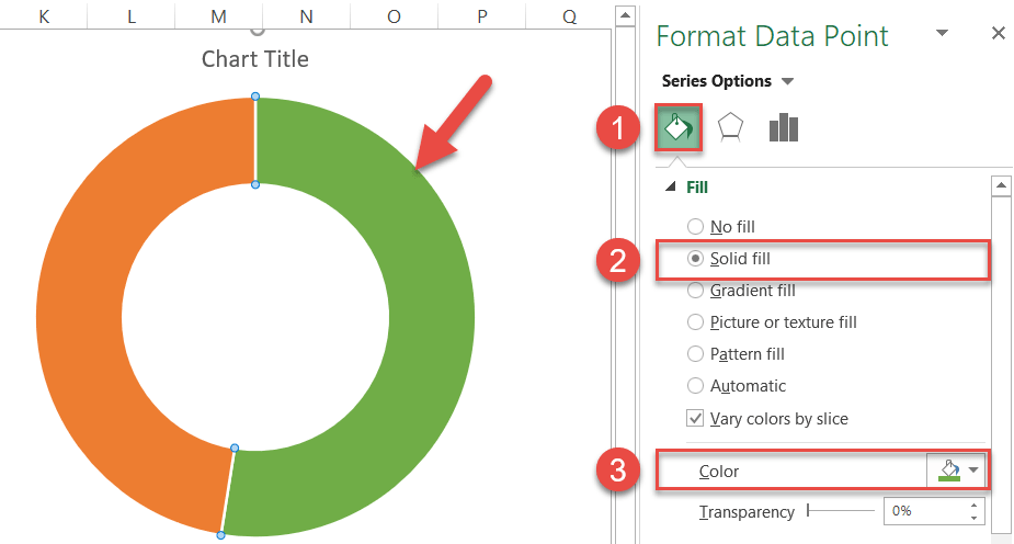
Step #3: Recolor the slices.
The chart tells us nothing so far. In our case, it all boils down to the color scheme. Recolor the slices to make “Series 1 Point 1” represent the progress reached and “Series 1 Point 2” display the revenue yet to be generated.
Double-click on “Series 1 Point 1” then right-click on it and open the Format Data Point task pane. Once there, change the color scheme by following these simple steps:
- Go to the Fill & Line tab.
- Under “Fill,” choose “Solid fill.”
- Change the slice color to green.
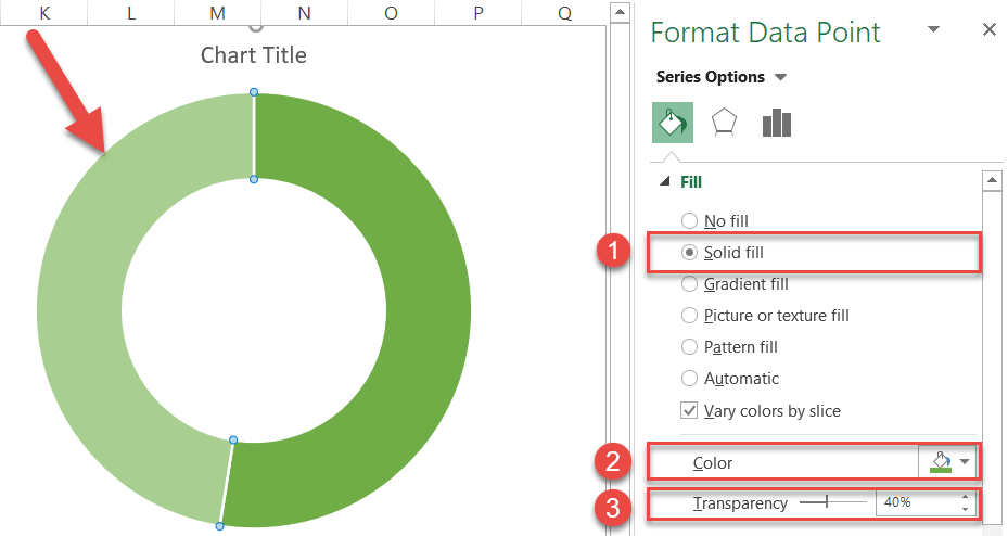
In the same tab, jump to “Series 1 Point 2” and recolor it accordingly:
- Change “Fill” to “Solid fill.”
- Pick green from the color palette.
- Set the Transparency value to “40%.”
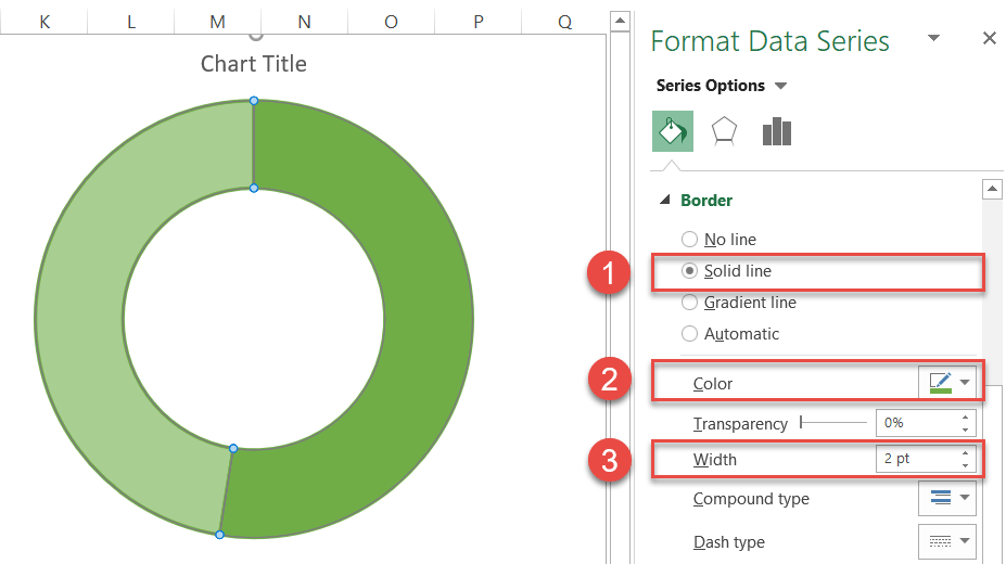
Step #4: Modify the borders.
Click the chart plot area once to select both the data series, right-click on them, open the Format Data Series task pane, and alter the borders by doing the following:
- Under “Border” in the Fill & Line tab, select “Solid line.”
- Change the border color to green.
- Set the Width to “2pt.”
Step #5: Add a text box.
Finally, add a text box containing the actual value reflecting the performance in Europe against the stated goal.
- Select the chart area.
- Go to the Insert tab.
- Select “Text Box.”
- Create a text box.
- Type “=” into the Formula Bar.
- Select the corresponding cell in column Progress (E2).
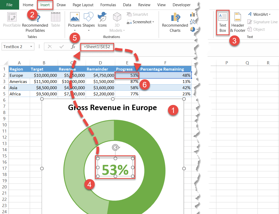
Adjust the text color, weight, and size to fit your style (Home > Font). You also do not need the legend in the chart, so right-click it and select “Delete.”
As a final touch, change the chart title, and you’re all set!
And now, over to you. You have all the information needed to create mind-blowing progress charts in Excel.
