How to Create a Quadrant Chart in Excel
Written by
Reviewed by
This tutorial will demonstrate how to create a quadrant chart in all versions of Excel: 2007, 2010, 2013, 2016, and 2019.
Quadrant Chart – Free Template Download
Download our free Quadrant Chart Template for Excel.
In this Article
- Quadrant Chart – Free Template Download
- Getting Started
- Step #1: Create an empty XY scatter chart.
- Step #2: Add the values to the chart.
- Step #3: Set the rigid minimum and maximum scale values of the horizontal axis.
- Step #4: Set the rigid minimum and maximum scale values of the vertical axis.
- Step #5: Create a new table for the quadrant lines.
- Step #6: Add the quadrant lines to the chart.
- Step #7: Change the chart type of the newly-added elements.
- Step #8: Modify the quadrant lines.
- Step #9: Add the default data labels.
- Step #10: Replace the default data labels with custom ones.
- Step #11: Add the axis titles.
- Download Quadrant Chart Template
In its essence, a quadrant chart is a scatter plot with the background split into four equal sections (quadrants). The purpose of the quadrant chart is to group values into distinct categories based on your criteria—for instance, in PEST or SWOT analysis.
Unfortunately, the chart is not supported in Excel, meaning you will have to build it from scratch on your own. Check out the Chart Creator Add-in, a newbie-friendly tool for creating advanced Excel charts in just a few clicks.
In this step-by-step tutorial, you will learn how to plot this highly customizable Excel quadrant chart from the ground up:

Getting Started
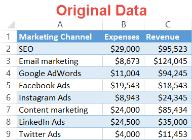
For illustration purposes, let’s assume you have set your mind to track the performance of every marketing channel your high-end brand is using and separate the wheat from the chaff. What should be prioritized, and what should be cast aside?
In this case, the quadrants will split the chart into four areas, effectively grouping together the best- and worst-performing options to help you make well-informed decisions.
Here is a sample table showing the amount of money spent on each marketing channel along with the revenue it generated:
So, let’s get started.
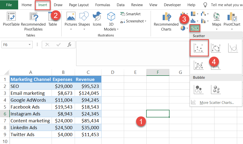
Step #1: Create an empty XY scatter chart.
Why empty? Because as experience shows, Excel may simply leave out some of the values when you plot an XY scatter chart. Building the chart from scratch ensures that nothing gets lost along the way.
- Click on any empty cell.
- Switch to the Insert tab.
- Click the “Insert Scatter (X, Y) or Bubble Chart.”
- Choose “Scatter.”
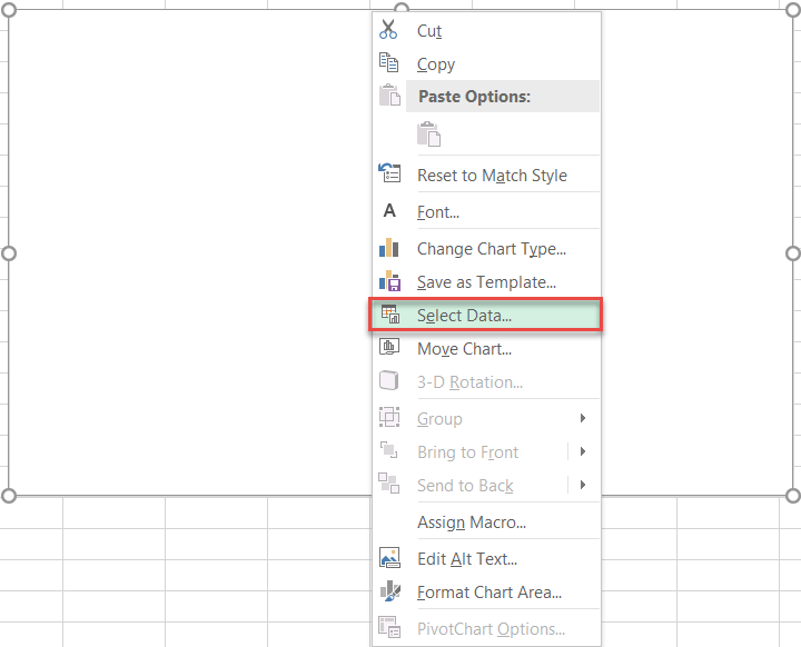
Step #2: Add the values to the chart.
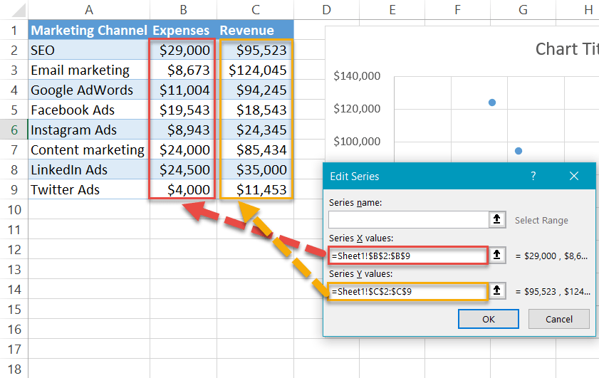
Once the empty chart appears, add the values from the table with your actual data.
Right-click on the chart area and choose “Select Data.”
Another menu will come up. Under Legend Entries (Series), click the “Add” button.
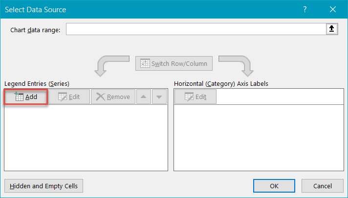
Next, do the following:
- For “Series X values,” highlight all the values in column Expenses (column B).
- For “Series Y values,” select all the values in column Revenue (column C).
- Select “OK” to set the series.
- Select “OK” again to close the dialog box.
In addition, delete the gridlines by right-clicking on the chart element and choosing “Delete.” And don’t forget to change the chart title.
Step #3: Set the rigid minimum and maximum scale values of the horizontal axis.
You need to set the horizontal axis scale in stone as a means to prevent Excel from rescaling it—and shifting the chart around that way—when you alter your actual data.
To do that, right-click on the horizontal axis (the numbers along the bottom of the chart) and choose “Format Axis.”
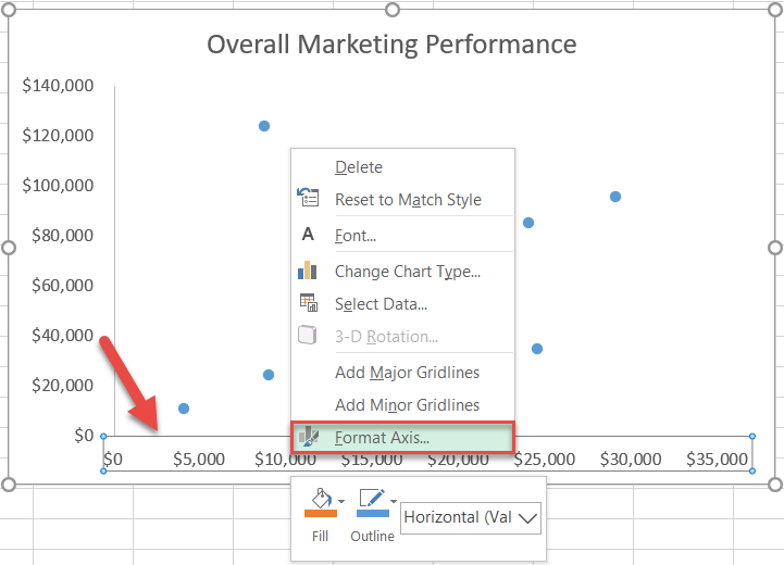
In the task pane that pops up, do the following:
- Switch to the Axis Options tab.
- Set the Minimum Bounds value to zero.
- Change the Maximum Bounds value to the maximum number based on your data (in our case, that’s 30,000).
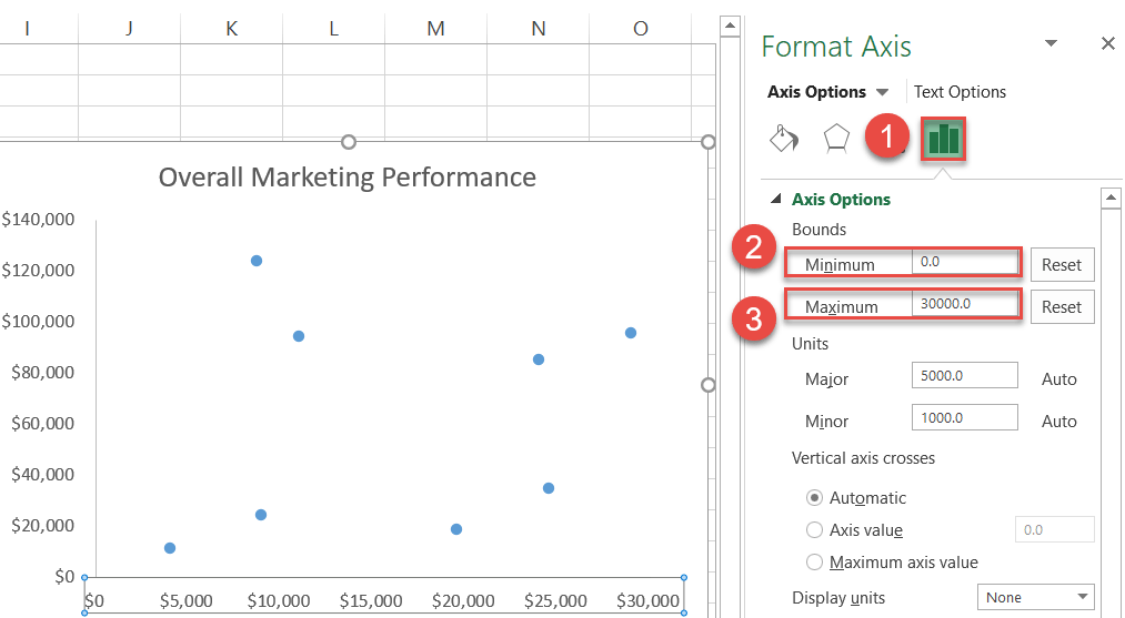
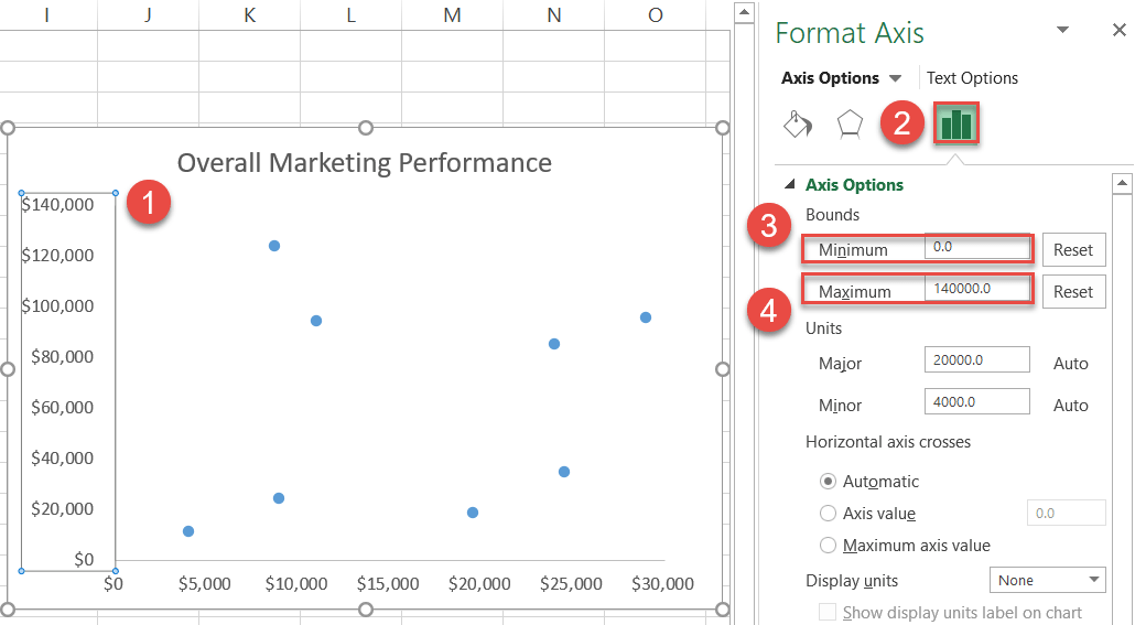
Step #4: Set the rigid minimum and maximum scale values of the vertical axis.
Without closing the pane, switch over to the vertical axis and repeat the steps outlined above.
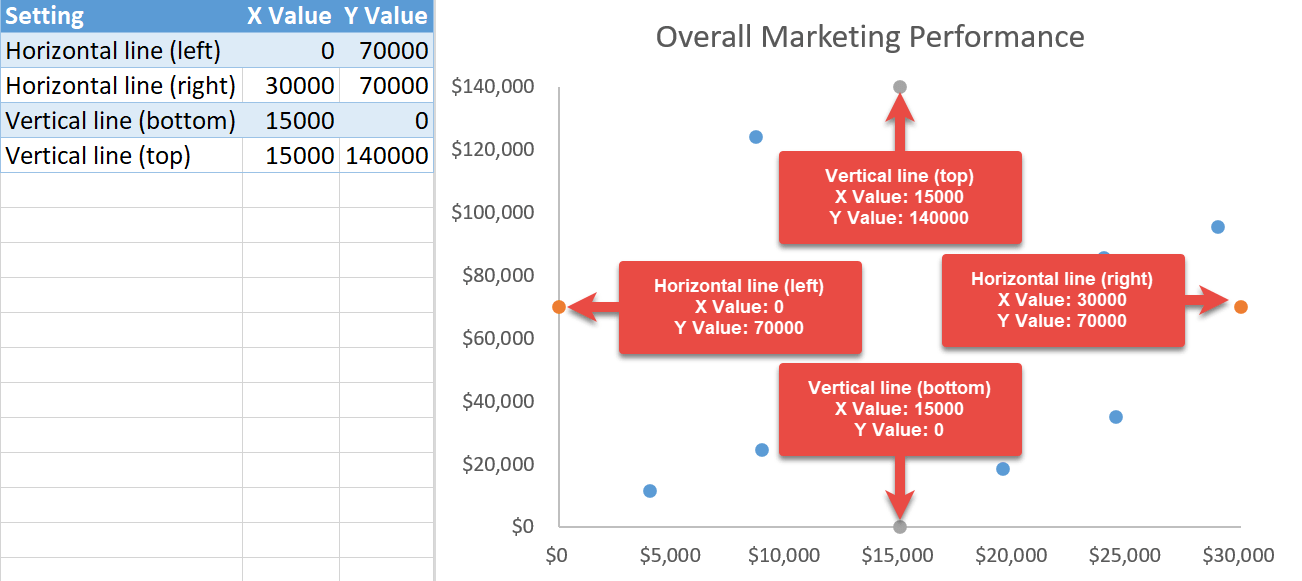
Step #5: Create a new table for the quadrant lines.
Here comes the hard part. Having laid the groundwork, you now need to place four dots on each side of the chart to draw the accurate quadrant lines based off of the axis numbers.
To make it happen, set up the following table next to your actual data:
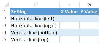
While each element is pretty much self-explanatory, calculating the X and Y values for each category might sound complicated at first, but in reality, you will get through it in less than three minutes.
So how do you figure out your values? Just follow the instructions below:
- For Horizontal line (left):
- Set the X value to zero.
- Set the Y value to half of the vertical axis Maximum Bounds value, which you have previously set (140,000/2=70,000).
- For Horizontal line (right):
- Set the X value to the horizontal axis Maximum Bounds value (30,000).
- Set the Y value to half of the vertical axis Maximum Bounds value (140,000/2=70,000).
- For Vertical line (bottom):
- Set the X value to half of the horizontal axis Maximum Bounds value (30,000/2=15,000).
- Set the Y value to zero.
- For Vertical line (top):
- Set the X value to half of the horizontal axis Maximum Bounds value (30,000/2=15,000).
- Set the Y value to the vertical axis Maximum Bounds value (140,000).
Here is how it looks:
Step #6: Add the quadrant lines to the chart.
Once you have set up the table, it’s time to move the values to the chart.
Right-click on the chart, choose “Select Data,” and click “Add” in the window that appears.
First, let’s add the horizontal quadrant line.
Click the “Series X values” field and select the first two values from column X Value (F2:F3). Move down to the “Series Y values” field, select the first two values from column Y Value (G2:G3). Under “Series name,” type Horizontal line. When finished, click “OK.”
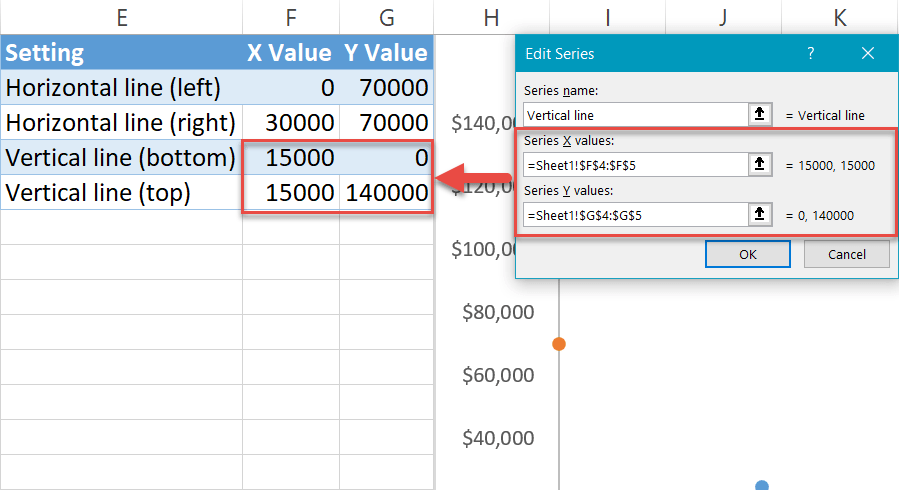
Next, tackle the vertical quadrant line. Click the “Add” button again and move the remaining data to the chart.
Click the “Series X values” field, select the remaining two values from column X Value (F4:F5). Move down to the “Series Y values” field and select the remaining two values from column Y Value (G4:G5). Under “Series name,” type Vertical line. When finished, click “OK.”
Step #7: Change the chart type of the newly-added elements.
The worst is behind us. Now it’s time to connect the dots.
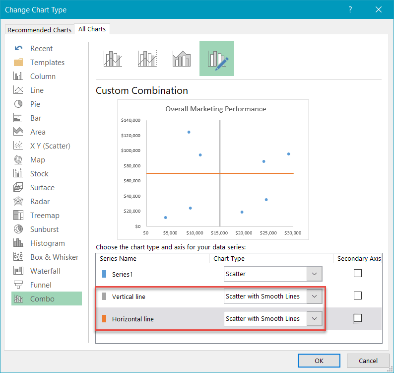
Right-click on any of the four dots and pick “Change Series Chart Type” from the menu.
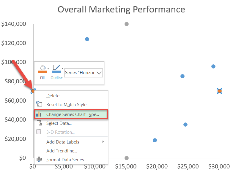
In the “Chart Type” dropdown menu next to the two series representing the quadrant data (“Vertical line” and “Horizontal line”), choose “Scatter with Smooth Lines.”
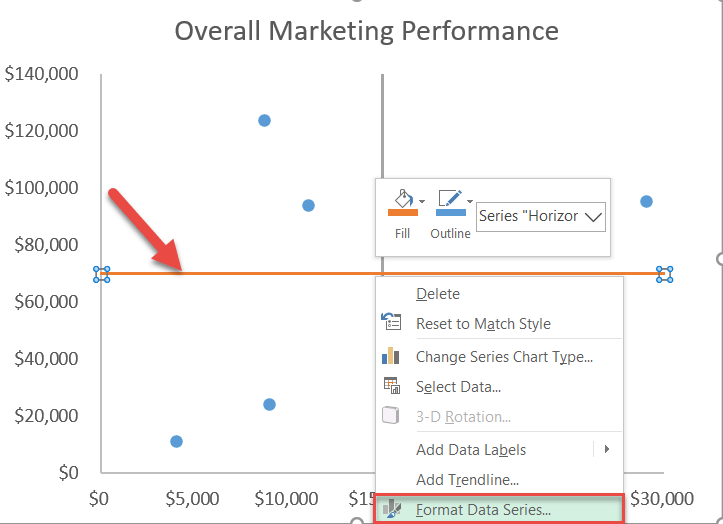
Step #8: Modify the quadrant lines.
Let’s slightly alter the quadrant lines to make them fit the chart style.
Right-click on the horizontal quadrant line and choose “Format Data Series.”
Once the task pane pops up, do the following:
- Switch to the Fill & Line tab.
- Click the “Fill Color” icon to pick your color for the line.
- Set the Width value to 1 pt.
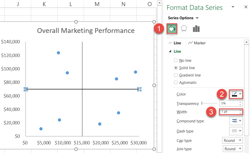
Repeat the same process for the vertical quadrant line.
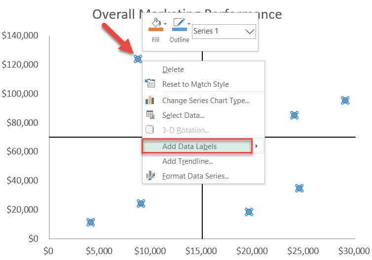
Step #9: Add the default data labels.
We’re almost done. It’s time to add the data labels to the chart.
Right-click any data marker (any dot) and click “Add Data Labels.”
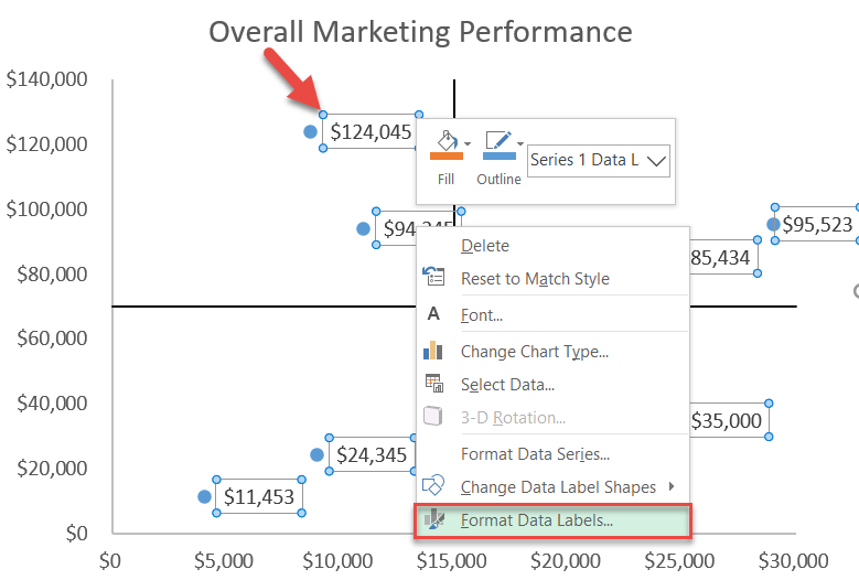
Step #10: Replace the default data labels with custom ones.
Link the dots on the chart to the corresponding marketing channel names.
To do that, right-click on any label and select “Format Data Labels.”
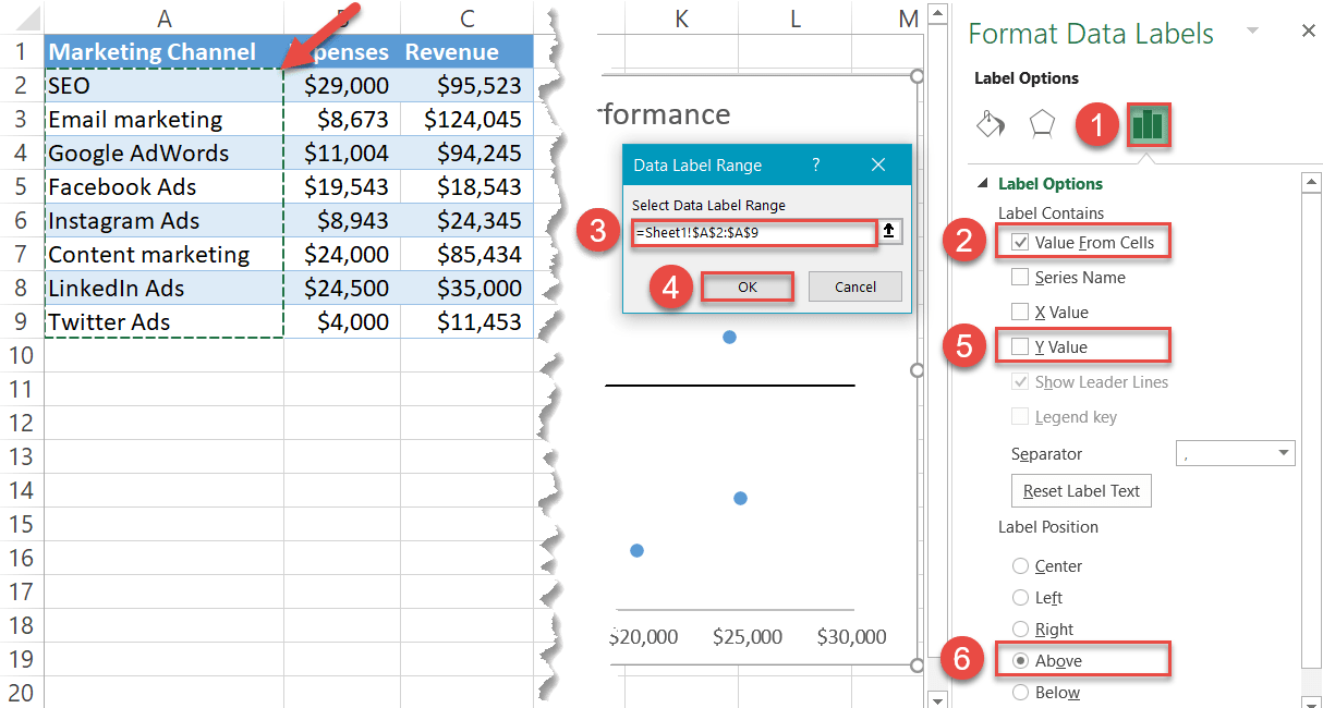
In the task pane that comes up, do the following:
- Navigate to the Label Options tab.
- Check the “Value From Cells” box.
- Select all the names from column A.
- Click “OK.”
- Uncheck the “Y Value” box.
- Under Label Position, select “Above.”
You can customize the labels by playing with the font size, type, and color under Home > Font.
Step #11: Add the axis titles.
As a final adjustment, add the axis titles to the chart.
- Select the chart.
- Go to the Design tab.
- Choose “Add Chart Element.”
- Click “Axis Titles.”
- Pick both “Primary Horizontal” and “Primary Vertical.”
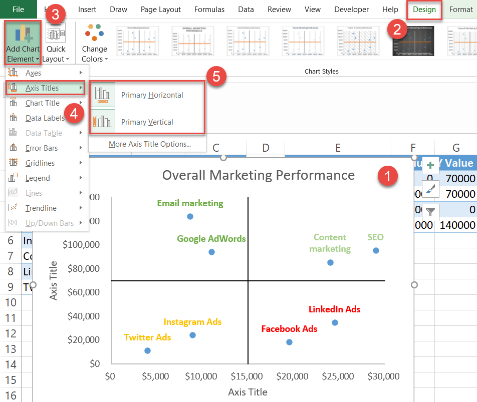
Change the axis titles to fit your chart, and you’re all set.
And that is how you harness the power of Excel quadrant charts!
