How to Add Secondary Axis (X & Y) in Excel & Google Sheets
Written by
Reviewed by
This tutorial will demonstrate how to add a Secondary Axis in Excel and Google Sheets.
How to Add Secondary Axis (X & Y) in Excel
There are a variety of ways that a secondary axis can come in handy. This can be helpful when you’re plotting value ranges in a number of series that vary greatly, or when you’re trying to graph two separate kinds of charts (commonly bar and line graph).
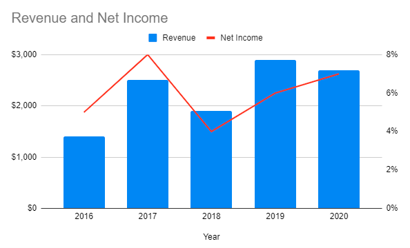
In the below graph, you can see an example where there is both a primary axis and a secondary axis. You can see that these include different ranges on both axes. The Primary Axis shows the range of Total Revenue, and the Secondary Axis shows the % of Net Income. Therefore, you can visually show two separate series in one graph by using this.
- Primary Axis
- Secondary Axis
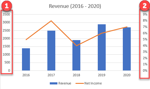
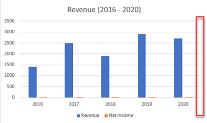
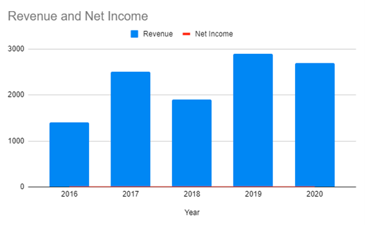
Starting with your Base Graph
We’ll start with the base graph. In this case, we added two series: Revenue and Net Income. Since Revenue is in $ and Net Income is in %, the Net Income barely shows on the graph. In this case, the graph would tell more if the percentages showed on the Secondary Axis, which is shown on the right side.
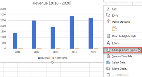
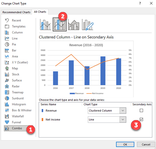
Changing Chart Type
Right click on graph the select Change Chart Type
Adding Secondary Axis
- Click on Combo
- Click the second box that shows Clustered Column – Line on Secondary Axis
- Select the Chart Type of each Series and which Series to show on Secondary Axis and Click OK.
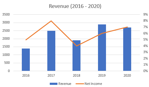
Final Graph with Secondary Axis
You can see the final graph now shows the Revenue on the Primary (Left) Axis and the Net Income is on the Secondary (Right) Axis. This visualizes the data in a way that is easier to understand.
How to Add a Secondary Axis in Google Sheets
Starting with your Base Graph
You can see when creating the graph in Google Sheets, it shows up the same way as it does in Excel.
Adding a Secondary Axis
- Double Click on Graph
- Click on Customize
- Click on Series
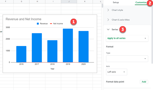
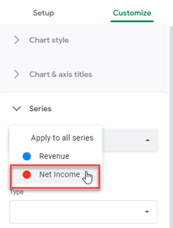
4. Under Series where it says, Apply to all Series, change this to the series you want on the secondary axis. In this case, we’ll select “Net Income”
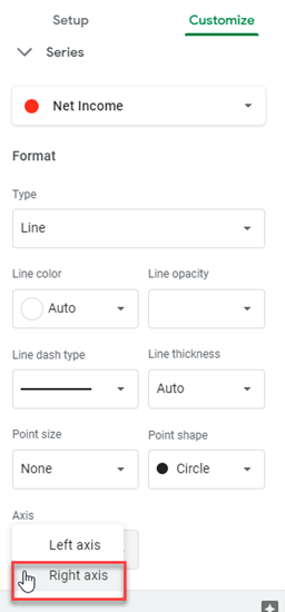
5. Scroll down under Axis and Select Right Axis
Final Graph with Secondary Axis
Now the final graph shows the Revenue on the Primary (left) axis and the Net Income on the Secondary (right) axis.