Make Time Series Graph / Plot – Excel & Google Sheets
Written by
Reviewed by
Last updated on October 30, 2023
This tutorial demonstrates how to create a time series graph in Excel & Google Sheets.
Make Time Series Graph / Plot – Excel
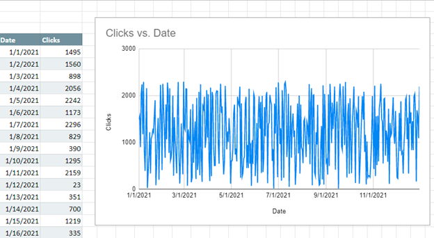
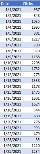
We’ll start with the below data that shows how many clicks a website received per day. We want to show how to visualize this time series.
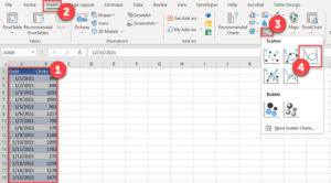
Creating a Graph
- Highlight the time series data
- Select Insert
- Select Scatterplot
- Click on Scatter with Smooth Lines
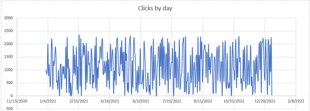
Time Series Scatterplot Graph
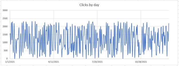
You can see the graph that is made below
You can see the final time series graph after cleaning up the X and Y Axis.
Make Time Series Graph / Plot – Google Sheets
- Highlight data
- Select Insert
- Click Chart
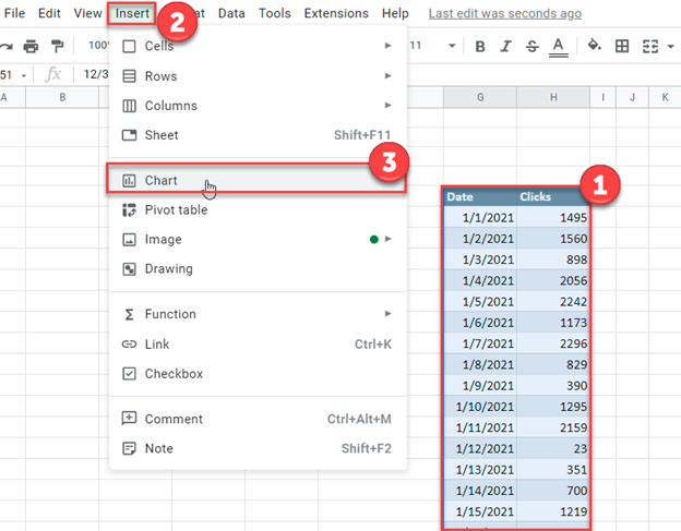
And your time series graph is created: