How to Create a Timeline Chart in Excel
Written by
Reviewed by
This tutorial will demonstrate how to create a timeline chart in all versions of Excel: 2007, 2010, 2013, 2016, and 2019.
Timeline Chart – Free Template Download
Download our free Timeline Chart Template for Excel.
In this Article
- Timeline Chart – Free Template Download
- Getting Started
- Step #1: Set up a helper column.
- Step #2: Build a line chart.
- Step #3: Create two additional data series.
- Step #4: Change the chart type of the newly-created data series.
- Step #5: Add custom data labels.
- Step #6: Create custom error bars.
- Step #7: Make the columns overlap.
- Step #8: Recolor the columns.
- Step #9: Add the data labels for the progress columns.
- Step #10: Clean up the chart area.
- Download Timeline Chart Template
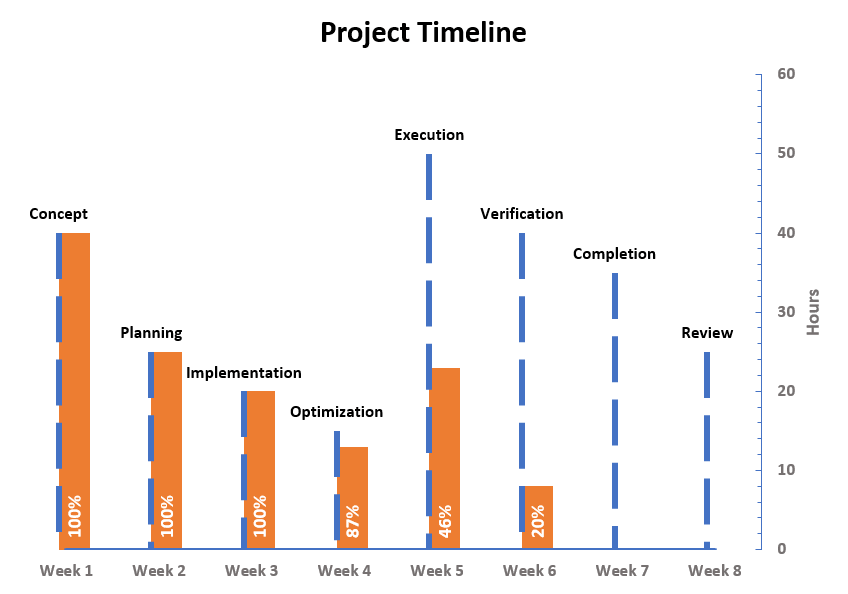
A timeline chart (also known as a milestone chart) is a graph that uses a linear scale to illustrate a series of events in chronological order.
The purpose of the chart is to neatly display the milestones that need to be reached (or have been achieved), the time allocated for completing each task, and the overall progress of a given project.
With all that data gathered in one place, milestone charts have been widely used in project management for years as a handy tool for planning, strategizing, and determining workflow optimization.
However, this chart type is not supported in Excel, meaning you will have to build it from scratch by following the steps shown below. Also, don’t forget to check out the Chart Creator Add-in, a powerful tool that simplifies the tedious process of creating advanced Excel charts to just a few clicks.
In this in-depth, step-by-step tutorial, you will learn how to create this fully customizable timeline chart in Excel from the ground up:
Getting Started
First, we need some raw data to work with. For illustration purposes, suppose you were put in charge of a small team stuck in the middle of developing a mobile app. With the deadline looming, you have no time to waste on trivial things and need to spring into action right away.
Trying to size up what you have gotten yourself into, you set out to plot a timeline chart using the following data:
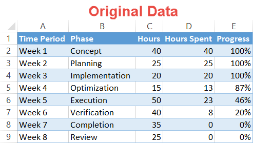 To help you adjust to your own data accordingly, let’s talk a bit more about each element of the table.
- Time Period: This column contains the timescale data labels.
- Phase: This column represents the key milestones.
- Hours: This column characterizes the number of hours allocated to each progress point and determines the line height of each milestone in the future chart.
- Hours Spent: This column illustrates the actual hours spent on a given milestone.
- Progress: This column contains the data labels showing the progress made on each milestone.
Having sorted out your chart data, let’s dive into the nitty-gritty.
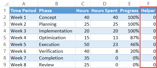
Step #1: Set up a helper column.
Right off the bat, create a dummy column called “Helper” (column F) and fill the cells in the column with zeros to help you position the timescale at the bottom of the chart plot.
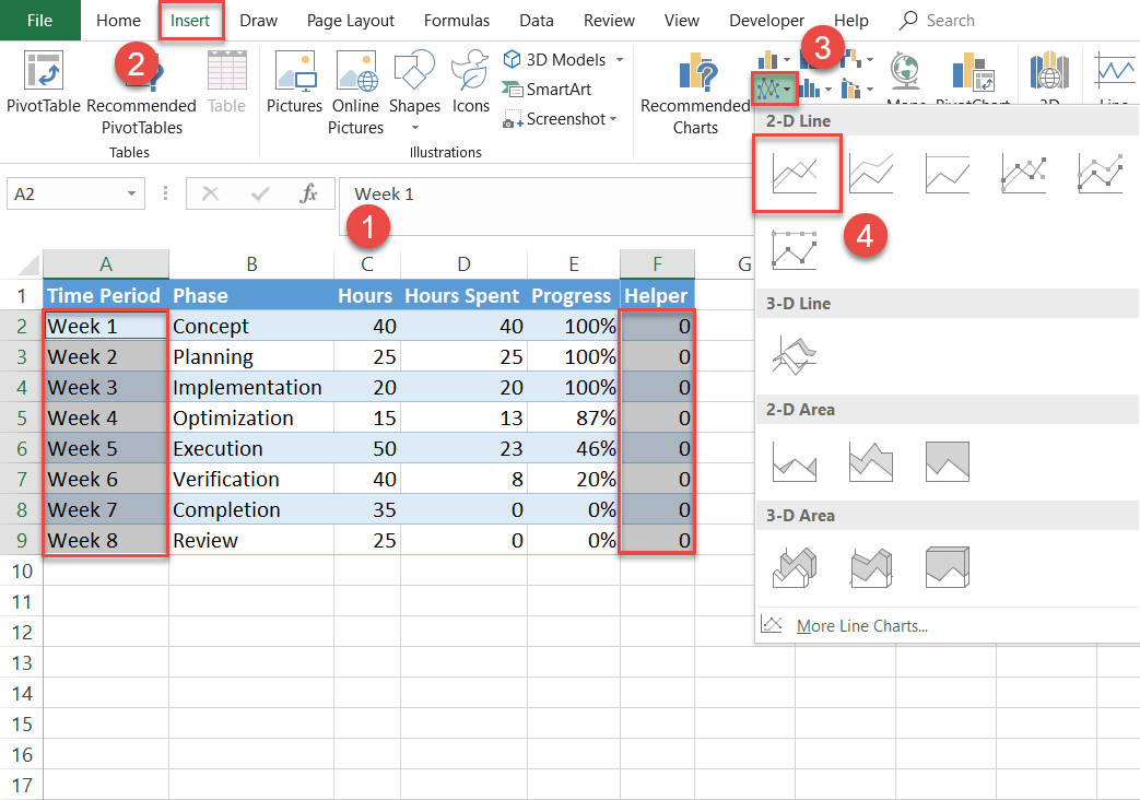
Step #2: Build a line chart.
Now, plot a simple line chart using some of the chart data.
- Highlight all the values in columns Time Period and Helper by holding down the Ctrl key (A2:A9 and F2:F9).
- Go to the Insert tab.
- Click the “Insert Line or Area Chart” button.
- Select “Line.”
Step #3: Create two additional data series.
Once the line graph appears, manually add the remaining data to avoid any mix-ups—as the adage goes: if you want something done right, do it yourself.
Right-click the chart plot and pick “Select Data” from the menu.
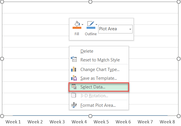
Next, click “Add” to open the Edit Series dialog box.
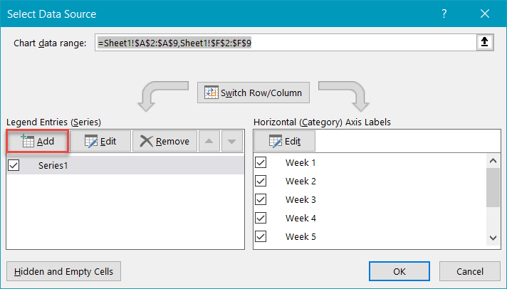
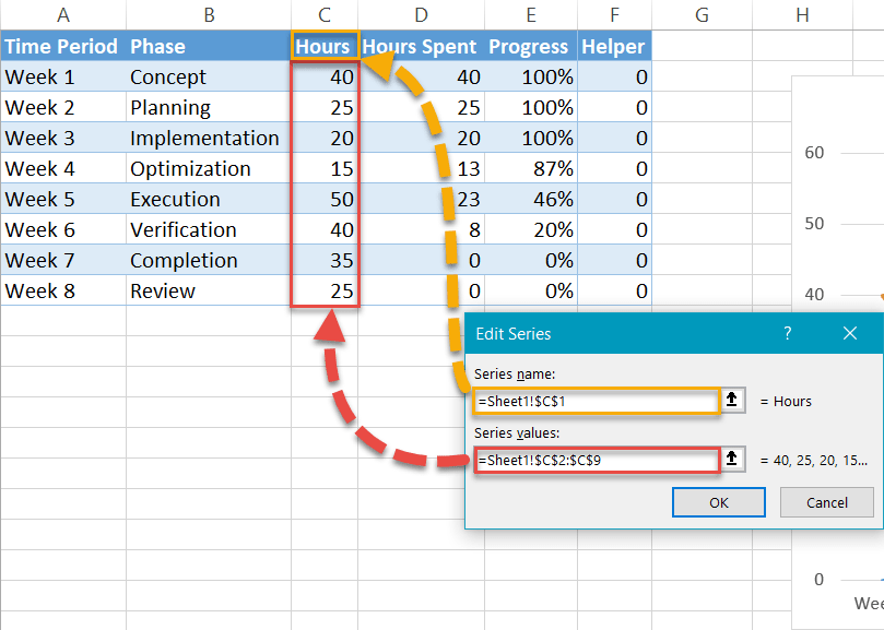
In the dialog box, create Series “Hours” from the following chart data:
- For “Series values,” highlight all the values in column Hours (C2:C9).
- For “Series name,” select the corresponding column header (C1).
- Click “OK.”
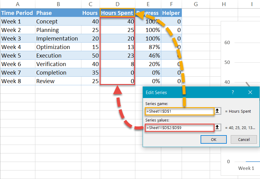
In the exact same way, design Series “Hours Spent”:
- For “Series values,” select all the Hours Spent values (D2:D9).
- For “Series name,” highlight the respective column header (D1).
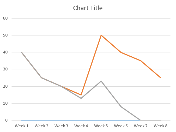
Once you have imported all the data into the milestone chart, it should look like this:
Step #4: Change the chart type of the newly-created data series.
The groundwork has been laid, meaning you can proceed to convert the two data series into columns.
Right-click on any of the two lines representing Series “Hours” and Series “Hours Spent” and select “Change Series Chart Type.”
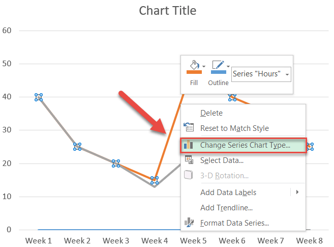
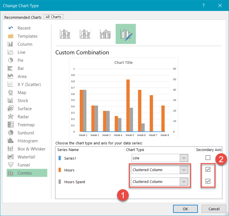
Once the Change Chart Type window pops up, follow these simple steps:
- For Series “Hours” and Series “Hours Spent,” change “Chart Type” to “Clustered Column.”
- Check the “Secondary Axis” box for both of them.
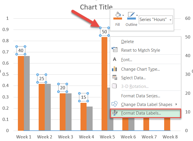
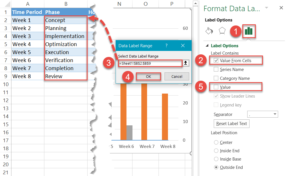
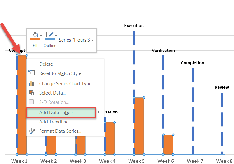
Step #5: Add custom data labels.
Our next step is to add the data labels characterizing each phase. To start with, select Series “Hours” (any of the orange columns) and choose “Add Data Labels.”

Now, right-click on any of the data labels and choose “Format Data Labels.”
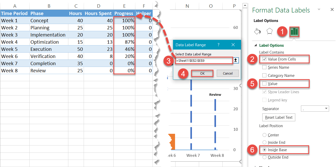
In the Format Data Labels task pane, replace the default data labels with the respective values from column Phases (column B):
- Navigate to the Label Options tab.
- Check the “Value From Cells” box.
- Highlight all the values in column Phase (B2:B9).
- Click “OK.”
- Uncheck the “Value” box.
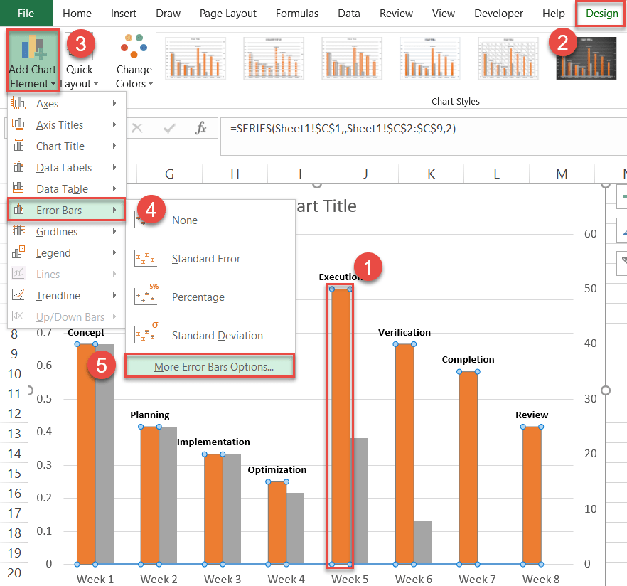
Step #6: Create custom error bars.
Now it’s time to design the vertical dashed lines signifying the hours allocated to each phase. But the columns we have don’t fit the bill—Excel just won’t let you make them thin enough.
That is where error bars enter the scene to save the day.
- Select any of the orange columns representing Series “Hours.”
- Go to the Design tab.
- Hit the “Add Chart Element” button.
- Click “Error Bars.”
- Choose “More Error Bars Options.”
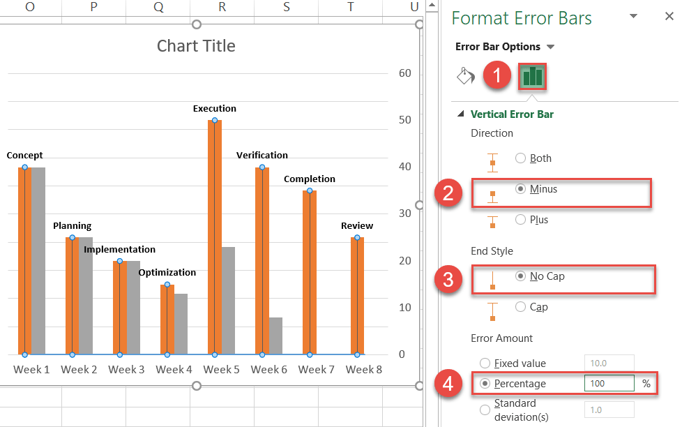
In the Format Error Bars task pane, modify the error bars in the following way:
- Switch to the Error Bar Options tab.
- Under “Direction,” choose “Minus.”
- Under “End Style,” select “No Cap.”
- Under “Error Amount,” set the Percentage value to “100%.”
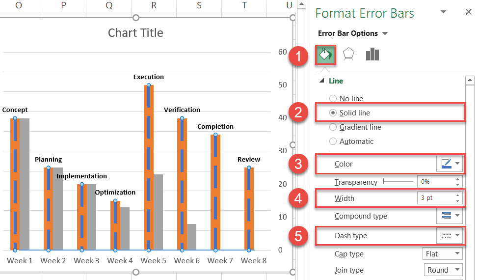
In the same task pane, turn the error bars into the dashed lines we need by following these simple steps:
- Switch over to the Fill & Line tab.
- Under “Line,” choose “Solid line.”
- Click the “Outline Color” icon and pick dark blue.
- Set the Width to “3pt.”
- Change the Dash Type to “Long Dash.”
Step #7: Make the columns overlap.
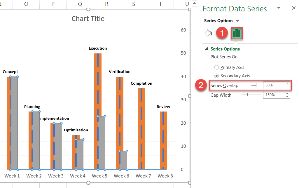
Once you have successfully set up the error bars, you will need to make the columns slightly overlap. To do that, right-click on any of the columns representing Series “Hours” (the orange columns) and click “Format Data Series.”
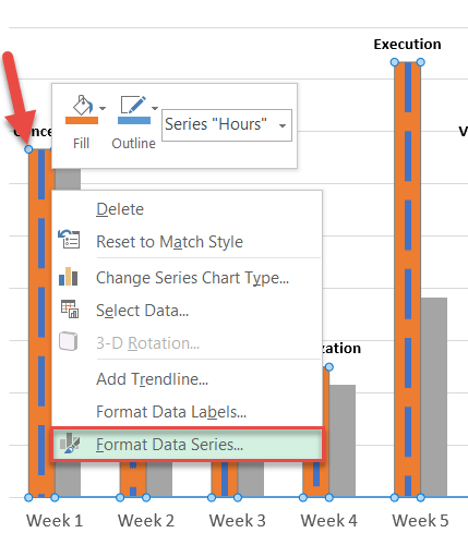
In the Format Data Series task pane, do the following:
- Go to the Series Options tab.
- Increase “Series Overlap” to “50%.” If needed, tinker with this value to regulate how much the columns overlap.
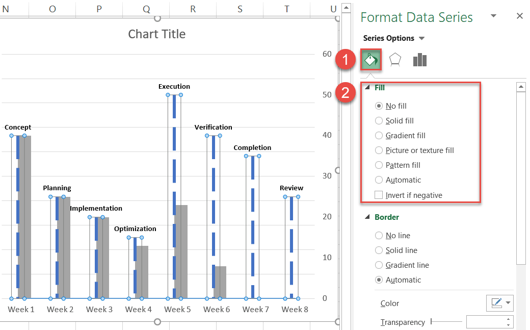
Step #8: Recolor the columns.
At this point, the timeline chart needs a bit of fine-tuning, so let’s tackle the color scheme first.
The orange columns have served us well, but we no longer need them displayed on the chart plot. Since simply removing them would ruin the chart, making the columns transparent is the way to go without collapsing the underlying structure.
- In the same Format Data Series task pane, switch to the Fill & Line tab.
- Under “Fill,” choose “No fill.”
One down, one to go. Make the other data series (Series “Hours Spent”) more colorful by picking some brighter alternative to the depressing grey from the color palette.
- Right-click on any column representing Series “Hours Spent” and open the Format Data Series task pane.
- In the Fill & Line tab, set the Fill to “Solid fill.”
- Open the color palette and pick orange.
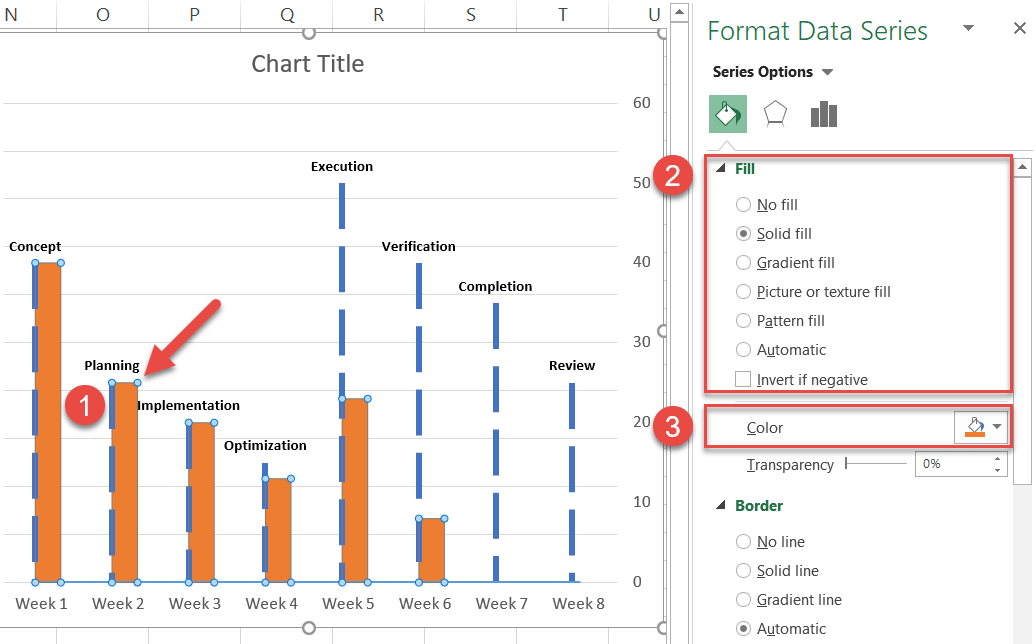
That’s much better, isn’t it?
Step #9: Add the data labels for the progress columns.
In order to polish up the timeline chart, you can now add another set of data labels to track the progress made on each task at hand. Right-click on any of the columns representing Series “Hours Spent” and select “Add Data Labels.”
Once there, right-click on any of the data labels and open the Format Data Labels task pane. Then, insert the labels into your chart:
- Navigate to the Label Options tab.
- Check the “Value From Cells” box.
- Highlight all the values in column Progress (E2:E9).
- Click “OK.”
- Uncheck the “Value” box.
- Under “Label Position,” choose “Inside Base.”
Now, in the same task pane, rotate the custom data labels 270 degrees to fit them into the columns.
- Go to the Size & Properties tab.
- Change “Text direction” to “Rotate all text 270°.”
- Adjust the weight and color of the text to make it more readily visible (Home > Font). You may also need to resize the chart to help avoid overlapping data (drag the resize handles on the sides of the chart plot).

With this much data at hand, you can quickly get a clear picture of what’s going on.
Step #10: Clean up the chart area.
Technically, you have your milestone chart—but frankly, it looks a bit messy. So before calling it a day, let’s get rid of the redundant chart elements as well as adjust a few minor details here and there.
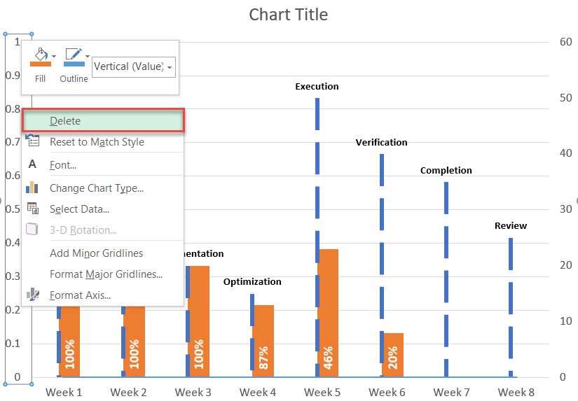
First, right-click on the primary vertical axis and select “Delete.” Ditto for the gridlines.
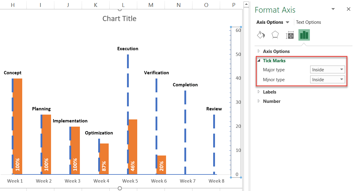
After this, right-click on the secondary vertical axis and open the Format Axis tab. Go to the Axis Options tab and under “Tick Marks,” change both “Major type” and “Minor type” to “Inside.”
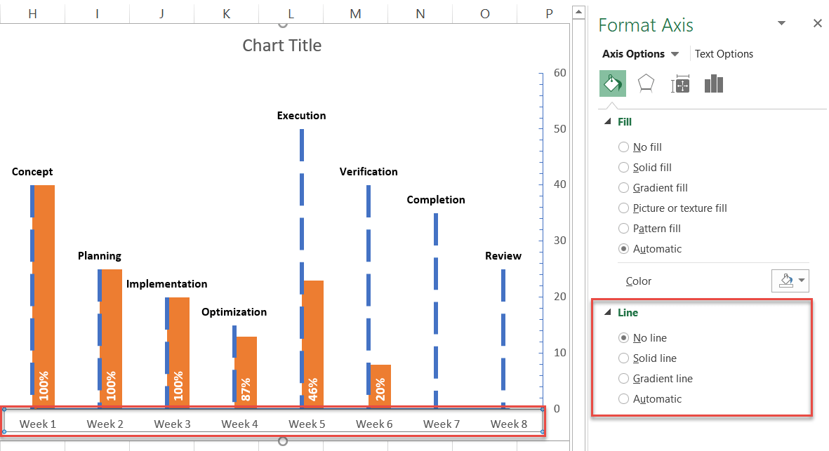
Without closing the task pane, select the primary horizontal axis, open the Fill & Line tab, and change “Line” to “No line.”
Finally, add the secondary vertical axis title to make the milestone chart more informative.
- Select the chart plot.
- Go to the Design tab.
- Click the “Add Chart Elements” button.
- Select “Axis Titles.”
- Choose “Secondary Vertical.”
Change the title of the secondary vertical axis and of the chart itself to fit your chart data, and you have just crossed the finish line—hooray!
With this stunning timeline chart in your tool belt, regardless of how rocky things might get, you can always keep your eyes on the big picture without getting mired in the daily workflow.
