Tornado Chart Excel Template – Free Download – How to Create
Written by
Reviewed by
This tutorial will demonstrate how to create a tornado chart in all versions of Excel: 2007, 2010, 2013, 2016, and 2019.
Tornado Chart – Free Template Download
Download our free Tornado Chart Template for Excel.
In this Article
- Tornado Chart – Free Template Download
- Getting started
- Step #1: Sort the rows of the table by column B in ascending order.
- Step #2: Create a clustered bar chart.
- Step #3: Add a secondary axis.
- Step #5: Change the secondary axis scale.
- Step #6: Change the primary axis scale.
- Step #7: Remove the secondary axis and change the primary axis scale number formatting.
- Step #8: Move the category axis labels to the left.
- Step #9: Add the data labels.
- Step #10: Move the data labels to the center.
- Step #11: Resize the chart bars.
- Download Tornado Chart Template
A tornado chart (also known as a butterfly or funnel chart) is a modified version of a bar chart where the data categories are displayed vertically and are ordered in a way that visually resembles a tornado.
But unless you use our Chart Creator Add-in that allows you to build advanced dynamic Excel charts—like tornado charts—in a single click, you will need to create this chart manually.
In today’s ultra-newbie-friendly tutorial, you will learn how to design a simple tornado chart from scratch, even if you have never used Excel for data visualization before.

Without beating around the bush, let’s roll up our sleeves and get down to work.
Getting started
Bill Gates once famously said, “Content is king.” In Excel, data runs the show.
Which brings us to the data for your tornado chart.
For illustration purposes, we are going to compare gross online and retail sales of each tea blend for a fictitious tea wholesale company. A tornado chart will help us neatly display our comparative analysis to unearth hidden opportunities for expanding our tea empire—this time around, however, in a peaceful way.
Here is how you need to prepare your dataset:
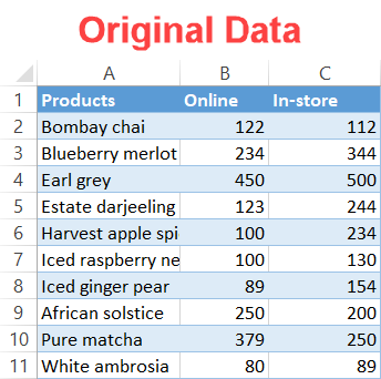
A quick rundown on each element:
- Column A: This column determines how many bars your tornado chart will have.
- Column B and C: These are the two variables used for comparison.
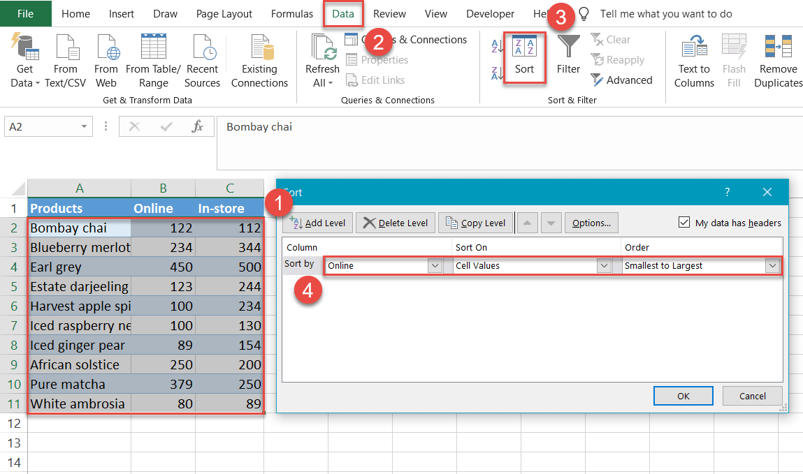
Step #1: Sort the rows of the table by column B in ascending order.
First things first: sort the rows by column B, listing the values from smallest to largest. That way, the largest bar will be at the top of the chart while the smallest will be placed at the bottom.
- Highlight all the chart data.
- Click the Data
- In the Sort & Filter group, select the “Sort”
- In each dropdown menu, sort by the following:
- For “Column,” select “Online” (Column B).
- For “Sort On,” select “Values” / “Cell Values.”
- For “Order,” select “Smallest to Largest.”
- Click OK to close the dialog box.
Step #2: Create a clustered bar chart.
Now, you need to put together a clustered bar chart that will serve as the backbone for the tornado chart.
- Select your chart data.
- Go to the Insert
- Click the “Insert Column or Bar Chart” icon.
- Choose “Clustered Bar.”
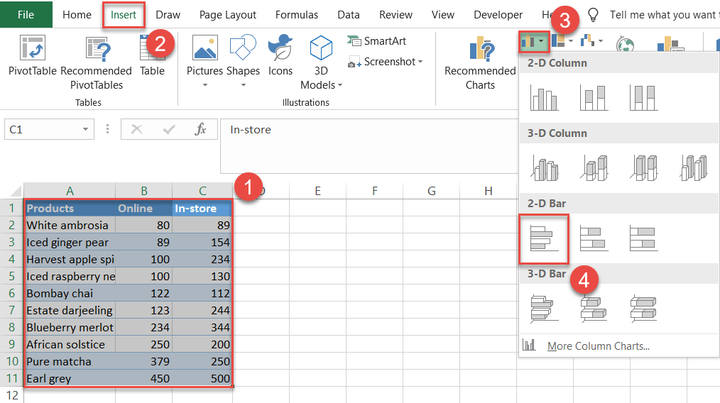
Once the clustered bar chart appears, you can remove the chart legend (typically at the bottom of the chart). Right-click the legend and select “Delete.”
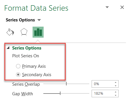
Step #3: Add a secondary axis.
Adding a secondary axis will allow us to reposition the bars, molding the chart into a tornado shape.
First, right-click on any column B chart bar (any of the blue bars) and choose “Format Data Series.”
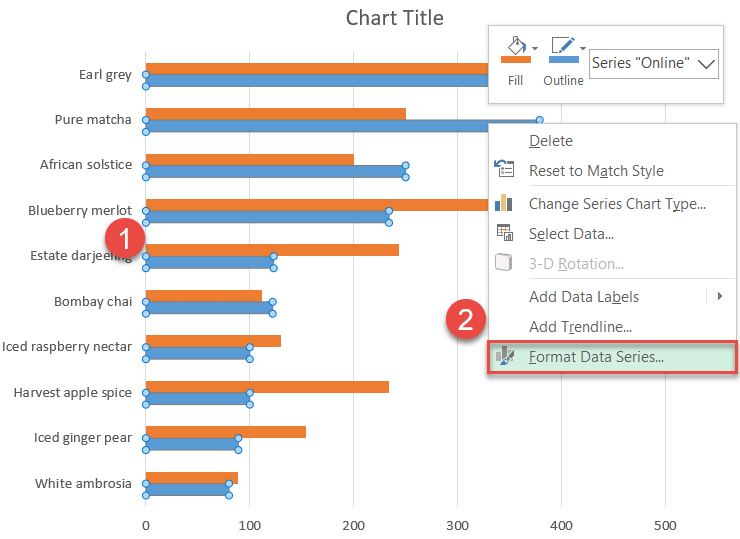
In the task pane that appears, make sure you are in the Series Options tab. Under “Plot Series On,” click the “Secondary Axis” radio button.
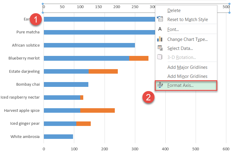
Step #5: Change the secondary axis scale.
Once there, modify the primary and secondary axis scales for the metamorphosis to take place. Let’s dive into the juicy stuff, dealing with the secondary axis first.
Select the secondary axis (the set of numbers at the top of the chart) and right-click on it. Then choose “Format Axis.”
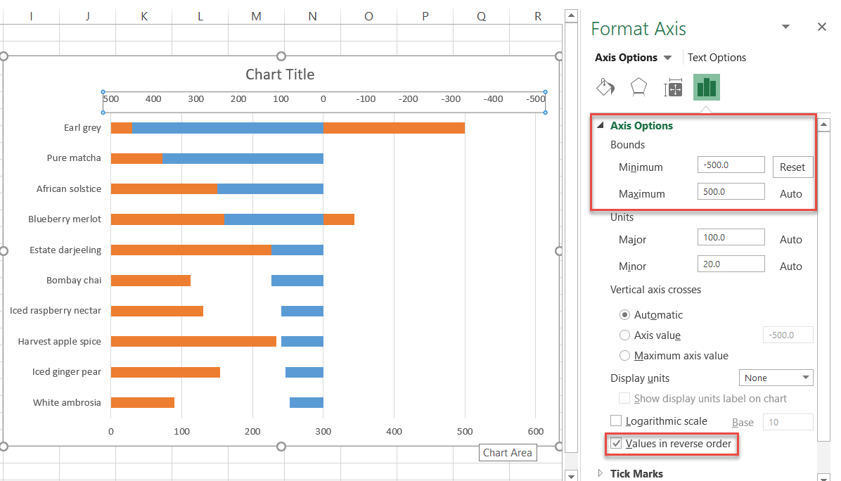
In the Axis Options tab, set the Minimum Bounds value to -500 and the Maximum Bounds value to 500.
An important note: make sure you check the “Values in reverse order” box.
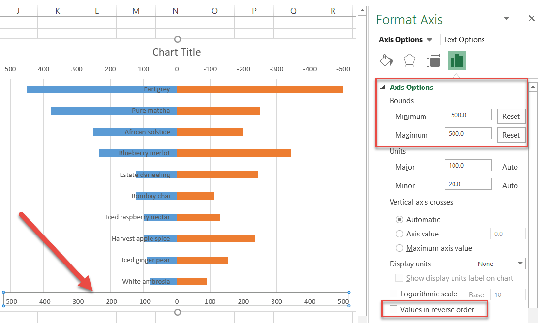
Step #6: Change the primary axis scale.
Rinse and repeat: apply the same process to the primary axis (the set of numbers at the bottom). Set the exact same minimum (-500) and maximum (500) values for the primary axis—but leave the “Values in reverse order” box unchecked.
At this point, you might be thinking to yourself, “Wait a minute, how do I know what value to use to set the right range if my data differs between the two groups?” Don’t panic. Here’s a good rule of thumb: pick the largest value in your data chart and round it up.
In this case, the largest value in our list is 500 (with in-store Earl Grey). Therefore, that is the number we used to determine the range of our minimum and maximum values.
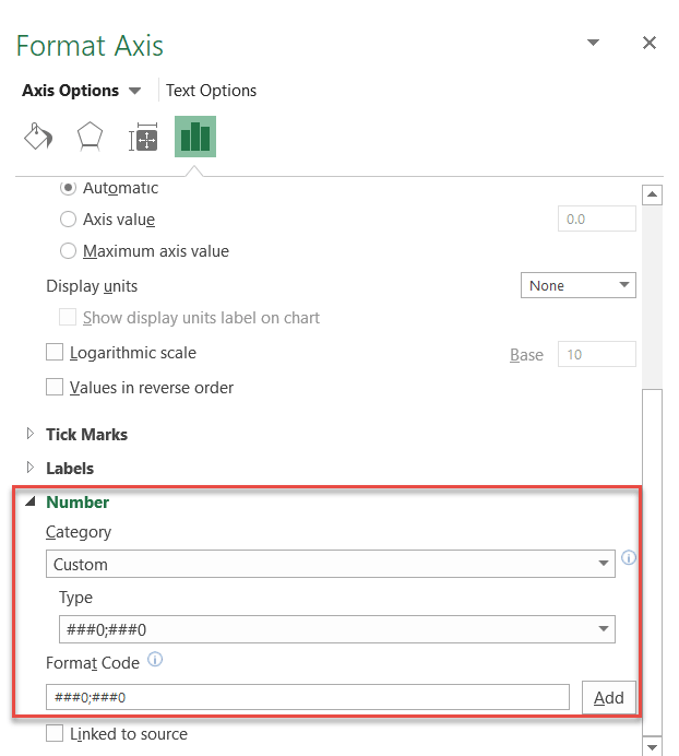
Step #7: Remove the secondary axis and change the primary axis scale number formatting.
It’s time to wave goodbye to the secondary axis as we no longer need it. Right-click on the secondary axis and select “Delete” to remove it.
Now, you may have noticed that some of the numbers on the primary axis scale are negative. Fortunately, it doesn’t take a rocket scientist to solve the issue:
- Right-click on the primary axis and choose “Format Axis.”
- Click the “Axis Options” icon.
- Open up the “Number” dropdown.
- Select “Custom” in the “Category” dropdown menu.
- Pick “###0;###0” from the “Type”
- Enter “###0;###0” into the “Format Code” field.
- Close the pane.
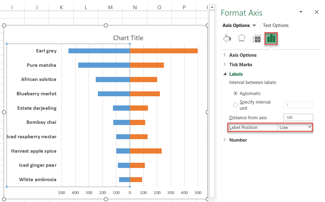
Step #8: Move the category axis labels to the left.
Right-click on the vertical category axis labels (in our case, the product names) and choose “Format Axis.”
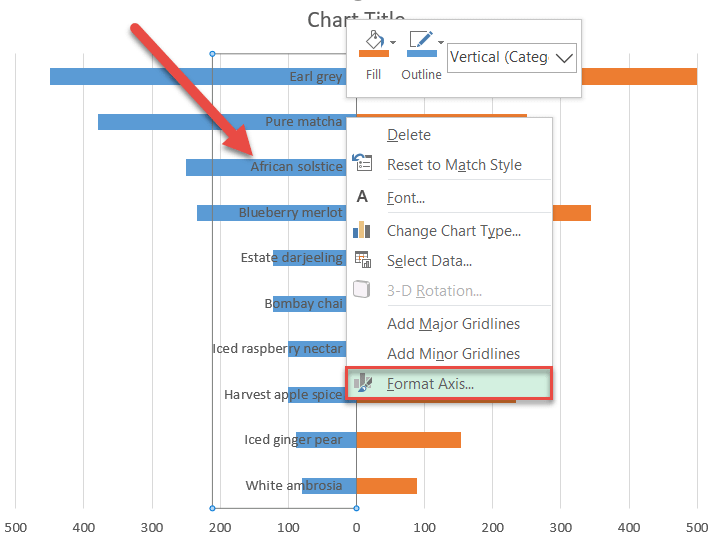
Next, in the “Format Axis” pane, go to the “Axis Options” tab, move down to the “Labels” section, and set the “Label Position” to “Low.” You can also make the labels bold (from the Home tab at the top of the Excel window) so they stand out more.
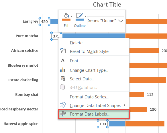
Step #9: Add the data labels.
To make our tornado chart more informative, add labels representing your actual data values.
Right-click on any blue bar on the chart and choose “Add Data Labels.”
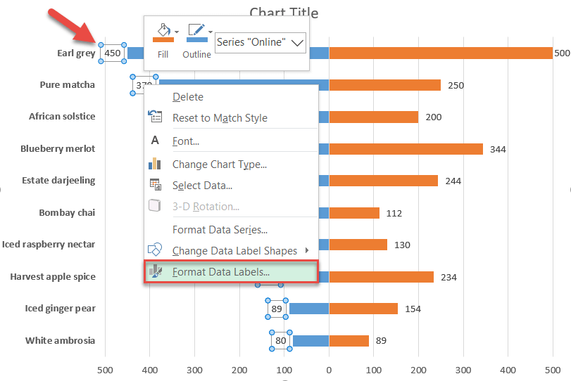
Do the same for the other half of the tornado chart.
Step #10: Move the data labels to the center.
Polishing up the final details, you can improve what you already have even more by moving the labels to the center of the chart. Here is how you do it.
Right-click the label and click “Format Data Labels.”
In the “Format Data Labels” pane, click the “Label Options” icon. Then set the “Label Position” to “Inside Base.”
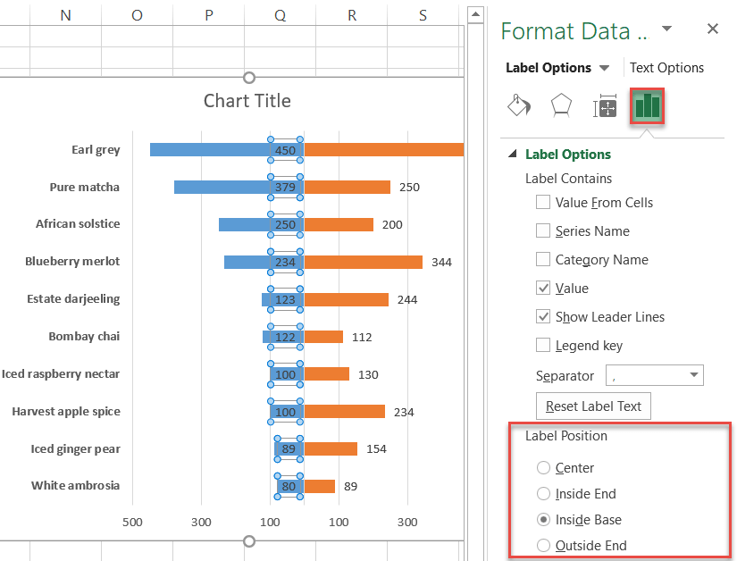
Once there, color the text white and make it bold.
Repeat for the other half of the tornado chart.
Step #11: Resize the chart bars.
Just one last thing and we are done with the tornado chart for good. Those bars look skinny, so let’s pump them up a bit to make the chart more pleasing to the eye.
Right-click on any blue bar and select “Format Data Series.”
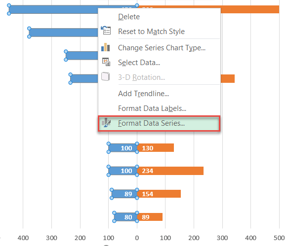
In the “Series Options” tab, set the “Gap Width” value to 10%. Do the same thing to the other side of the chart. As a final adjustment, update the chart title.
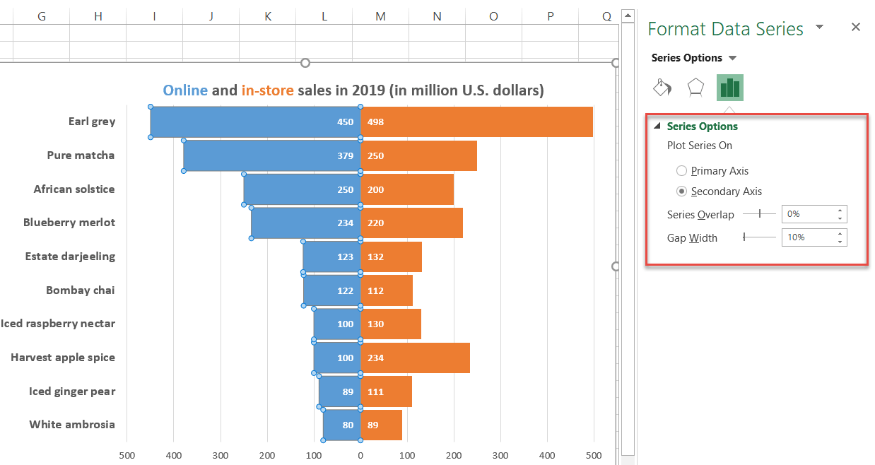
Ta-da! You are all set now. You have just added another tool to your data visualization belt.
Get ready to blow everyone away with astounding Excel tornado charts!
