How to Create Venn Diagram in Excel – Free Template Download
Written by
Reviewed by
This tutorial will demonstrate how to create a Venn diagram in all versions of Excel: 2007, 2010, 2013, 2016, and 2019.
Venn Diagram – Free Template Download
Download our free Venn Diagram Template for Excel.
In this Article
- Venn Diagram – Free Template Download
- Getting Started
- Prep Chart Data
- Step #1: Find the number of elements belonging exclusively to one set.
- Step #2: Compute the chart values for the intersection areas of two circles.
- Step #3: Copy the number linked to the intersection area of three sets into column Chart Value.
- Step #4: Outline the x- and y-axis values for the Venn diagram circles.
- Step #5: Find the Circle Size values illustrating the relative shares (optional).
- Step #6: Create custom data labels.
- Step #7: Create an empty XY scatter plot.
- Step #8: Add the chart data.
- Step #9: Change the horizontal and vertical axis scale ranges.
- Step #10: Remove the axes and the gridlines.
- Step #11: Enlarge the data markers.
- Step #12: Draw the circles.
- Step #13: Change the x- and y-axis coordinates to adjust the overlapping areas (optional).
- Step #14: Add data labels.
- Step #15: Customize data labels.
- Step #16: Add text boxes linked to the intersection values.
- Step #17: Hide the data markers.
- Step #18: Add the chart title.
- Download Venn Diagram Template
A Venn diagram is a chart that compares two or more sets (collections of data) and illustrates the differences and commonalities between them with overlapping circles. Here’s how it works: the circle represents all the elements in a given set while the areas of intersection characterize the elements that simultaneously belong to multiple sets.
The diagram helps demonstrate all the possible relationships between the sets, providing a bottomless well of analytical data—which is why it has been widely used across many industries.
Unfortunately, this chart type is not supported in Excel, so you will have to build it from scratch on your own. Also, don’t forget to check out our Chart Creator Add-in, a tool for building stunning advanced Excel charts while barely lifting a finger.
By the end of this step-by-step tutorial, you will learn how build a dynamic Venn diagram with two or three categories in Excel completely from the ground up.
Getting Started
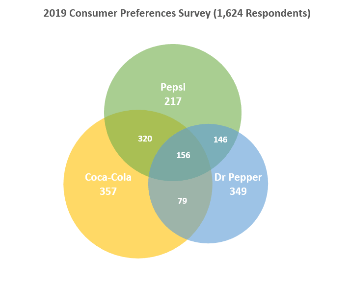
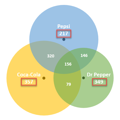
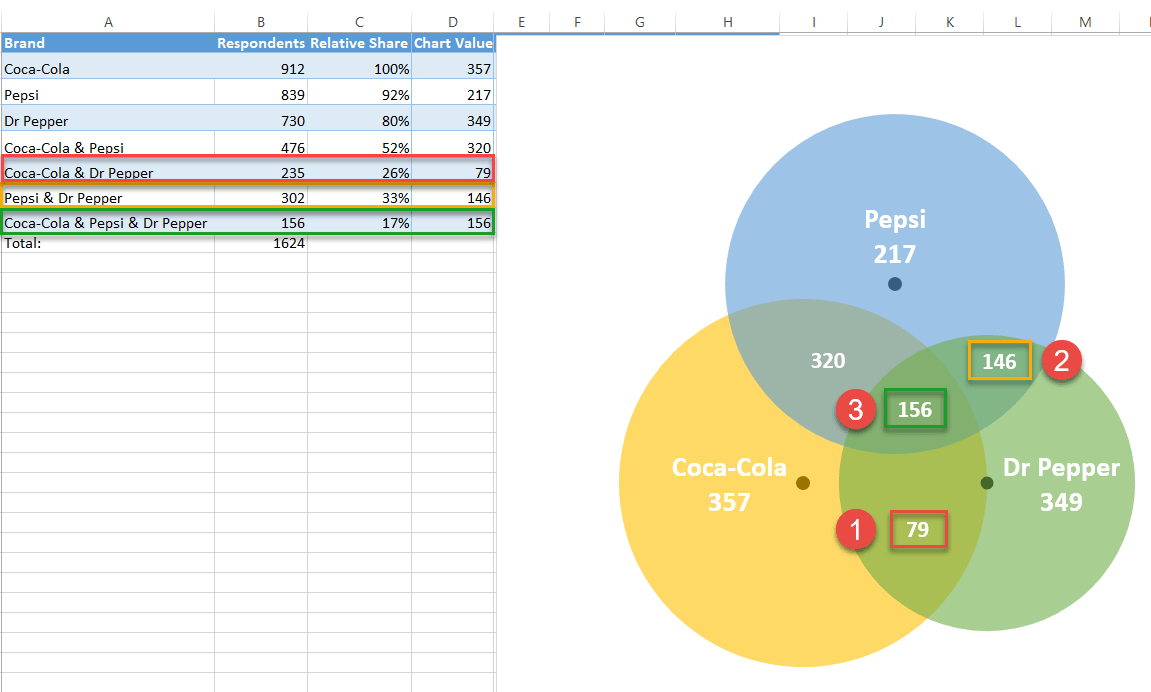
First, we need some raw data to work with. To show you the ropes, as you may have guessed from the example diagram above, we are going to analyze the results of a fictitious survey gauging the brand preferences of 1,624 respondents who drink cola on a daily basis. The brands in question are Coca-Cola, Pepsi, and Dr Pepper.
From all these soft drink lovers, some turned out to be brand evangelists who stuck exclusively to one brand while others opted for two or three brands at once.
With all that said, consider the following table containing the survey results:
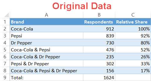 Here’s a quick overview of the table elements:
- Brand – This column defines the sets in the survey as well as all possible combinations of the sets.
- Respondents – This column represents the corresponding values for each set in general and each combination in particular.
- Relative Share (optional) – You may want to compare your data in other ways, such as determining the relative share of each set in relation to the largest set. This column exists for such a purpose. Since Coke is the biggest kid on the block, cell B2 will be our reference value (100%).
So, without further ado, let’s get to work.
Prep Chart Data
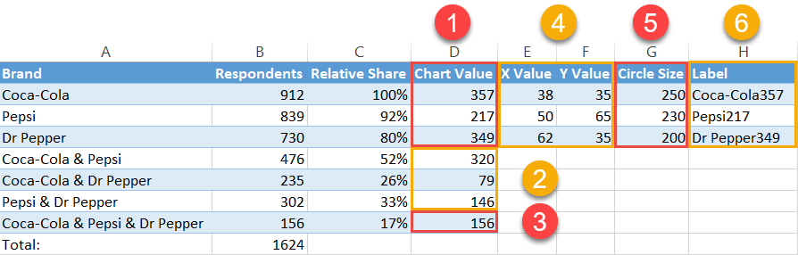
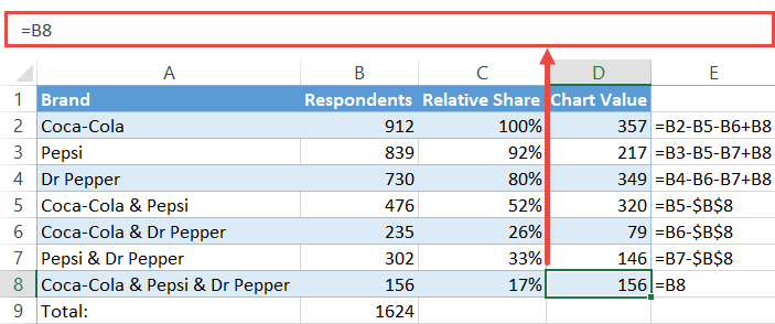
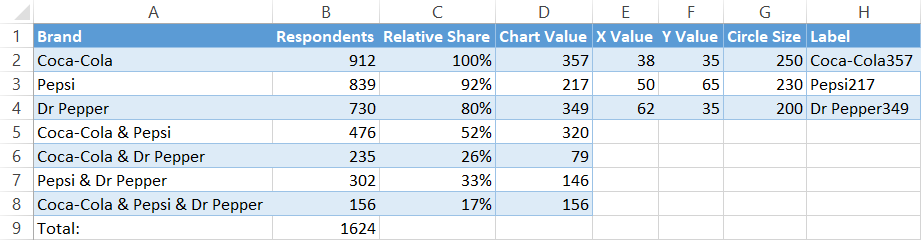
Before you can plot your Venn diagram, you need to compute all the necessary chart data. The first six steps extensively cover how to determine the pieces of the puzzle. By the end of Step #6, your data should look like this:
 For those of you who want to skip the theoretical part and spring right into action, here is the algorithm for you to follow:
- Step #1 – Calculate Chart Values:
- Type “=B2-B5-B6+B8” into cell D2.
- Type “=B3-B5-B7+B8” into cell D3.
- Type “=B4-B6-B7+B8” into cell D4.
- Step #2 – Calculate Chart Values cont.:
- Enter “=B5-$B$8” into D5 and copy the formula down into D6 and D7.
- Step #3 – Calculate Chart Values cont.:
- Set cell D8 equal to B8 by typing “=B8” into D8.
- Step #4 – Position the Bubbles:
- Add the constant values for X and Y to your worksheet just the way you can see on the screenshot above (E2:F4).
- Step #5 – Calculate the Circle Sizes:
- Enter “=250*C2” into G2 and copy it down into the next two cells (G3:G4).
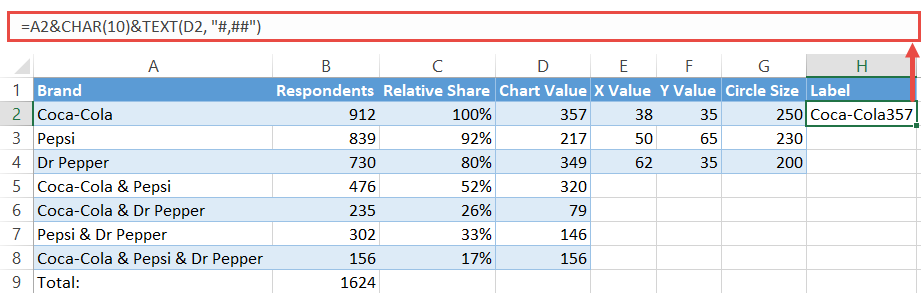
- Step #6 – Create the Diagram Labels:
- Copy “=A2&CHAR(10)&TEXT(D2, “#,##”)” into H2 and copy the formula into the next two cells (H3:H4).
Now let’s break down each step into more detail.
Step #1: Find the number of elements belonging exclusively to one set.
Unfortunately, you can’t simply take the numbers from the original data table and run with them. If you were to do so, you would actually count some of the survey answers multiple times, effectively skewing the data.
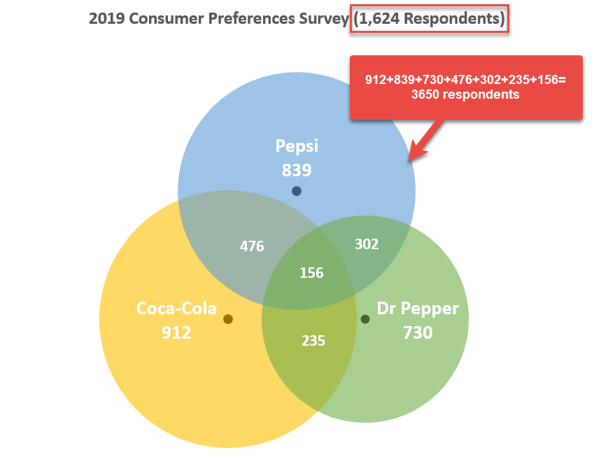
Why is that the case? Well, since a Venn diagram is made up of intersecting areas closely related to one another, any given set can be a part of multiple other sets at once, resulting in duplicate values.
For example, the set “Coca-Cola” (B2) includes all the respondents who voted for the brand, pulling answers from four different categories:
- Cola-Cola & Pepsi
- Coca-Cola & Dr Pepper
- Coca-Cola & Pepsi & Dr Pepper
- Only Coca-Cola
That’s why you need to separate the wheat from the chaff and find a corresponding chart value for each survey option from the original table.
That being said, our first step is to differentiate the respondents who chose solely one cola brand from everybody else. These folks are characterized by the following numbers on the diagram:
- 357 for Coca-Cola
- 217 for Pepsi
- 349 for Dr Pepper
Pick a corresponding value from your actual data (B5) and subtract from it the value representing the area where all the three circles overlap (B8).
Let’s find out how many respondents actually answered “Coca-Cola & Pepsi” by entering this formula into cell D5:
=B5-$B$8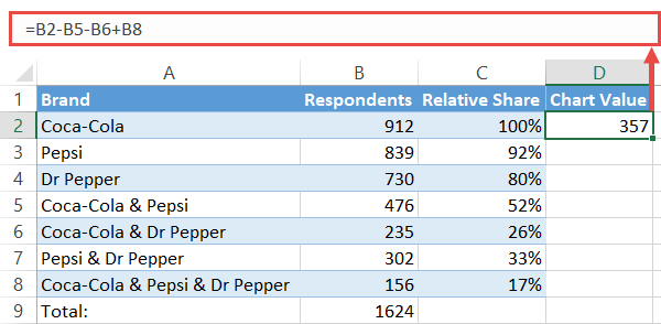
By the same token, use these formulas to find the chart values for categories “Pepsi” (A3) and “Dr Pepper” (A4):
- For “Pepsi,” enter “=B3-B5-B7+B8” in D3.
- For “Dr Pepper,” type “=B4-B6-B7+B8” in D4.
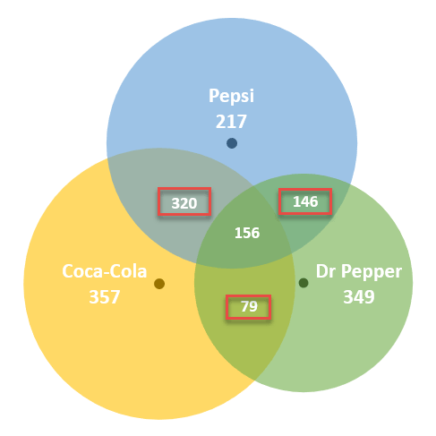
Step #2: Compute the chart values for the intersection areas of two circles.
When computing the numbers representing the intersection of two sets—where the values within a given intersection area simultaneously belong to two sets—the same issue of duplicate values arises.
Fortunately for us, it should only take a moment to work around the problem. Again, these are the numbers we are looking for:
Pick a corresponding value from your actual data (B5) and subtract from it the value representing the area where all the three circles overlap (B8).
Let’s find out how many respondents actually answered “Coca-Cola & Pepsi” by entering this formula into cell D5:
=B5-$B$8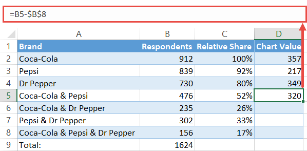
Copy the formula into cells D6 and D7 by dragging down the fill handle.
Step #3: Copy the number linked to the intersection area of three sets into column Chart Value.
The only value that you can take from your original data is the one right in the middle of the diagram.
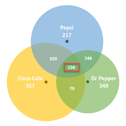
Complete the column of chart values by copying the number of respondents who chose all the three brands into the adjacent cell (D8). Simply type “=B8” into D8.
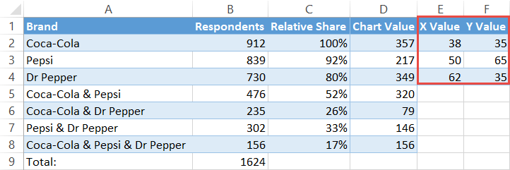
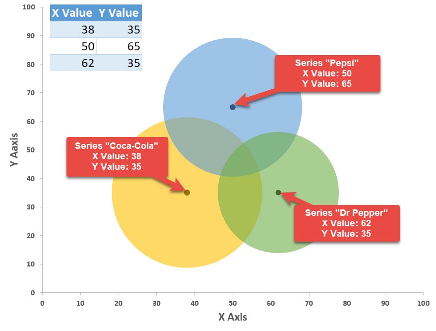
Step #4: Outline the x- and y-axis values for the Venn diagram circles.
In a blank cell near the table with your data, map out the x- and y-axis coordinates which will be used as the centers of the circles.
The following values are constants that will determine the position of Venn diagram circles on the chart plot, giving you full control over how far away from each other the circles will end up being placed.
In Step #13, you will learn how to change the size of the overlapping areas by modifying these values.
For now, all you have to do is copy them into your spreadsheet:
| X Value | Y Value |
| 38 | 35 |
| 50 | 65 |
| 62 | 35 |
For Venn diagrams with only two categories, use these coordinates:
| X Value | Y Value |
| 39 | 50 |
| 66 | 50 |
If you don’t need this data, move on to Step #7.
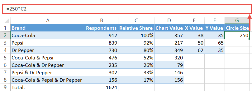
To make the circles proportional to the reference value (C2), set up a column labeled “Circle Size” and copy this formula into G2.
=250*C2For the record, the number “250” is a constant value based on the coordinates to help the circles overlap.
Execute the formula for the remaining two cells (G3:G4) which signify the other two circles of the diagram by dragging the fill handle.
Step #6: Create custom data labels.
Before we can finally proceed to building the diagram, let’s quickly design custom data labels that will contain the name of a given set along with the corresponding value that counts the number of respondents who chose solely one cola brand.
Set up another dummy column (column H) and enter the following formula into H2:
=A2&CHAR(10)&TEXT(D2, "#,##")Execute the formula for the remaining cells (H3:H4).
Once you have followed all the steps outlined above, your data should look like this:
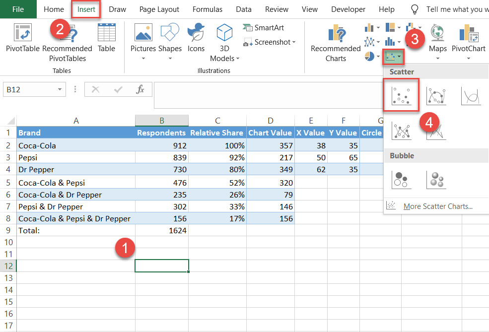
Step #7: Create an empty XY scatter plot.
At last, you have all the chart data to build a stunning Venn diagram. As a jumping-off point, set up an empty scatter plot.
- Select any empty cell.
- Go to the Insert tab.
- Click the “Insert Scatter (X,Y) or Bubble Chart” icon.
- Choose “Scatter.”
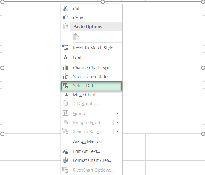
Step #8: Add the chart data.
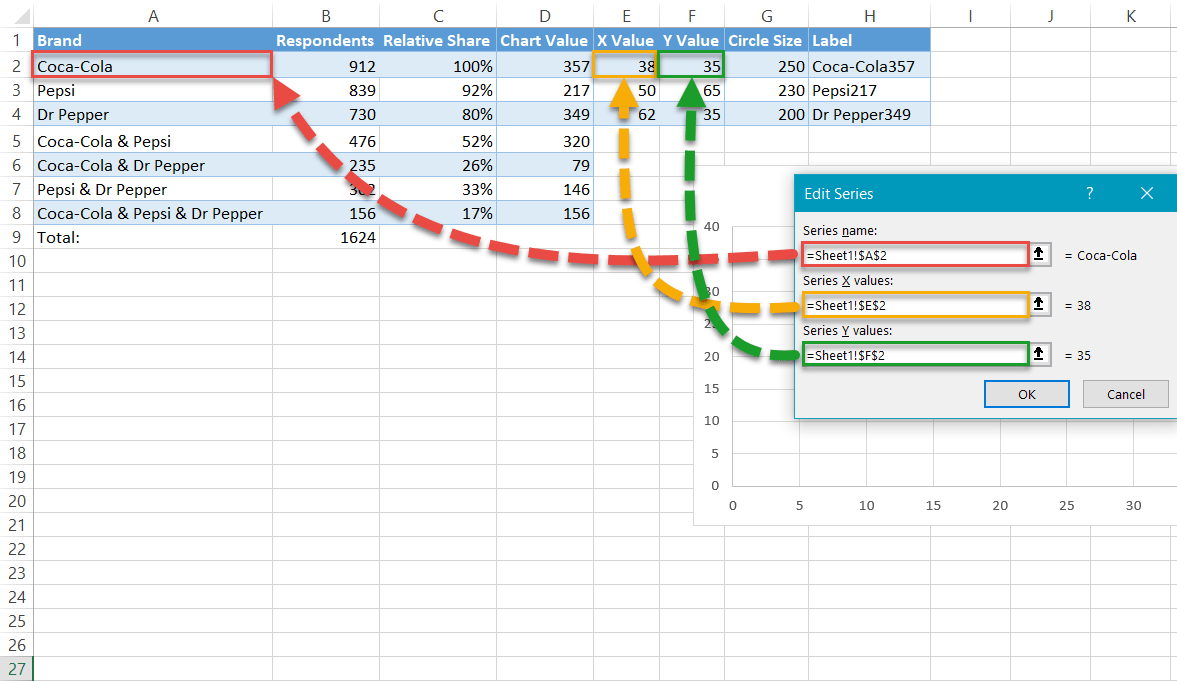
Add the x- and y-axis values to outline the position of the circles. Right-click on the chart plot and pick “Select Data” from the menu that appears.
In the Select Data Source dialog box, choose “Add.”
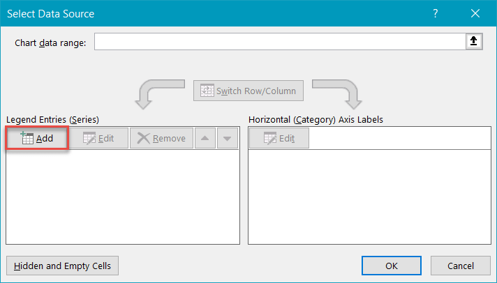
Once there, add a new data series named “Coca-Cola:”
- For “Series name,” highlight cell B2.
- For “Series X values,” select cell E2.
- For “Series Y values,” select cell F2.
Use this method to create Series “Pepsi” (B3, E3, F3) and Series “Dr Pepper” (B4, E4, F4).
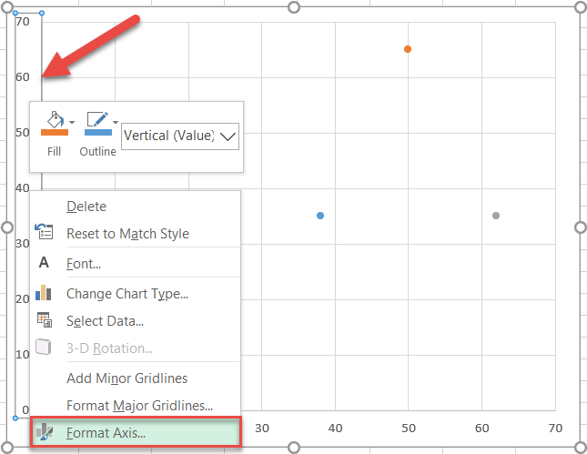
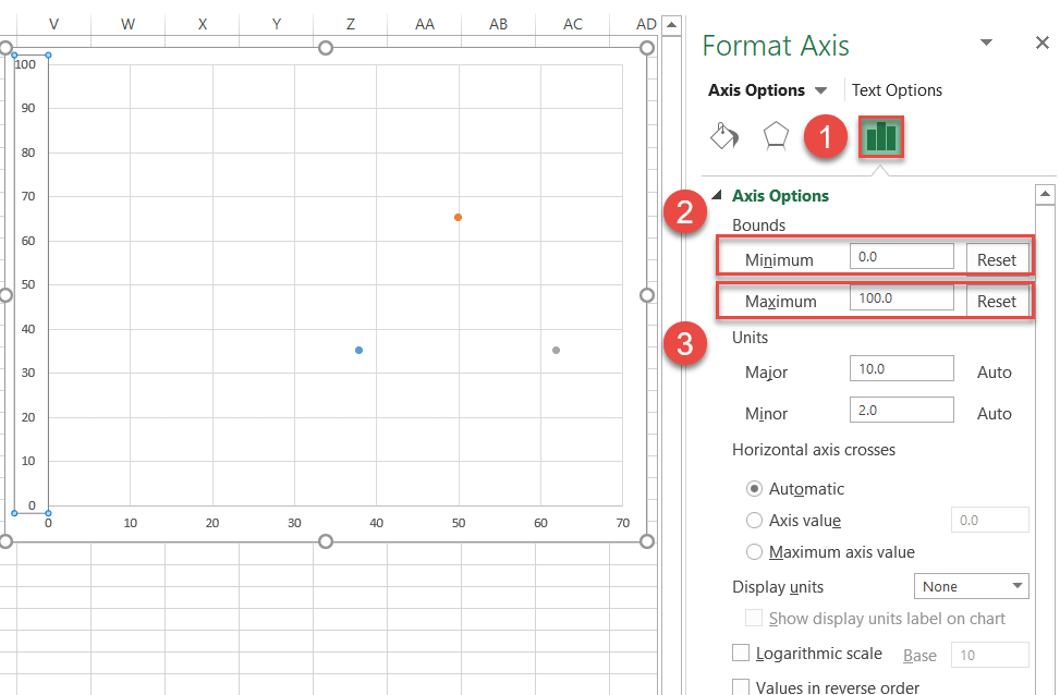
Step #9: Change the horizontal and vertical axis scale ranges.
Rescale the axes to start at 0 and end at 100 to center the data markers near the middle of the chart area.
Right-click on the vertical axis and select “Format Axis.”
In the Format Axis task pane, do the following:
- Navigate to the Axis Options tab.
- Set the Minimum Bounds to “0.”
- Set the Maximum Bounds to “100.”
Jump to the horizontal axis and repeat the same process.
Step #10: Remove the axes and the gridlines.
Clean up the chart by erasing the axes and gridlines. Right-click each element and select “Delete.”
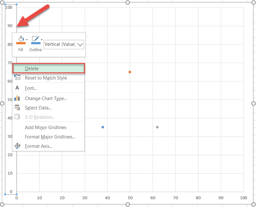
Now would be a good time to make your chart larger so you can better see your new fancy Venn diagram. Select the chart and drag the handles to enlarge it.
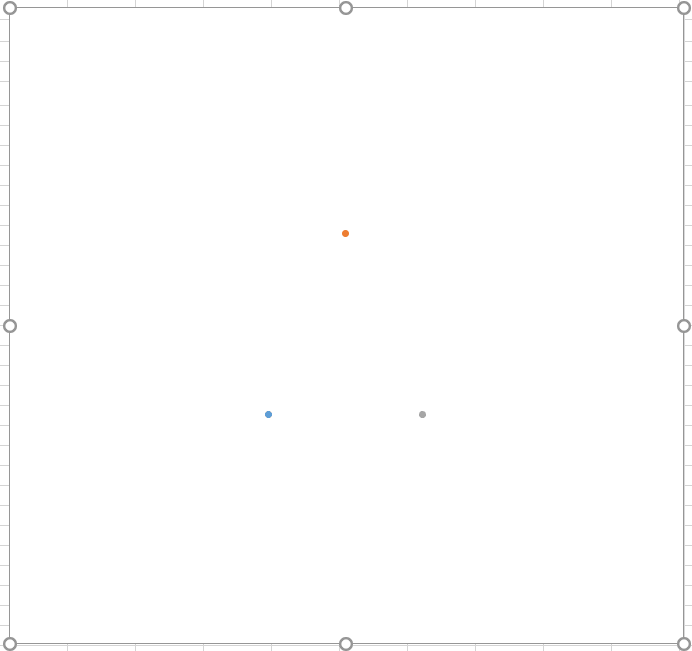
Here is what you should have at this point—minimalism at its finest:
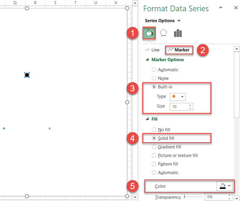
Step #11: Enlarge the data markers.
To streamline the process, make the markers larger or they will get buried beneath the circles further down the road.
Right-click on any of the three data markers and choose “Format Data Series.”
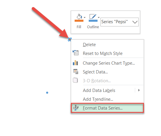
In the task pane, follow these simple steps:
- Click the “Fill & Line” icon.
- Switch to the Marker tab.
- Under “Marker Options,” check the “Built-in” radio button and set the Size value to “10.”
- Under “Fill,” select “Solid Fill.”
- Click the “Fill Color” icon to open the color palette and choose black.
Rinse and repeat for each data series.
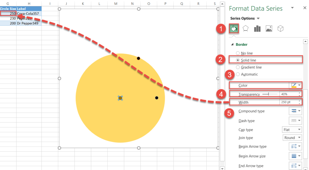
Step #12: Draw the circles.
Without closing the tab, scroll down to the Border section and create the circles for the Venn diagram by following these instructions:
- Click “Solid line.”
- Open the color palette and choose different colors for each data marker:
- For Series “Coca-Cola,” pick gold.
- For Series “Pepsi,” select green.
- For Series “Dr Pepper,” choose blue.
- Change “Transparency” to “40%.”
- Change “Width” for each data series to the corresponding values in column Circle Size (column G):
- For Series “Coca-Cola,” enter “250” (G2).
- For Series “Pepsi,” type in “230” (G3).
- For Series “Dr Pepper,” set the value to “200” (G4).
NOTE: If you want the circles to be the same, simply set the Width value to “250” for each.
Step #13: Change the x- and y-axis coordinates to adjust the overlapping areas (optional).
Normally, you should leave the X and Y coordinates determining the position of circles unaltered. However, for those looking to customize the way the circles should overlap, here is how you do it.
To refresh your memory, take a look at the coordinates underlying the Venn diagram used in the tutorial.
| X Value | Y Value |
| 38 | 35 |
| 50 | 65 |
| 62 | 35 |
These are the x- and y-axis values positioning the first (Series “Coca-Cola”), second (Series “Pepsi”), and third (Series “Dr Pepper”) circle respectively. Here is how it works:
As you may have guessed, you can effortlessly change how much the circles overlap by modifying the coordinates—which allows you to move the circles left and right (x-axis values) and up and down (y-axis values) however you see fit.
For instance, let’s push the circle representing Series “Coca-Cola” a bit upward—thereby increasing the overlapping area between Series “Coca-Cola” and Series “Pepsi”—since we have a comparatively large number of respondents drinking only these two brands.
To pull off the trick, simply alter the corresponding y-axis value.
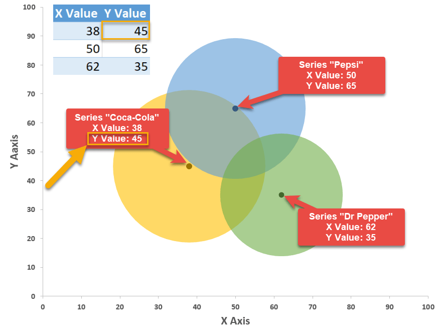
Using this method will take your Venn diagrams to a whole new level, making them unbelievably versatile.
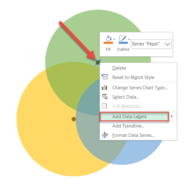
Step #14: Add data labels.
The rest of the steps will be dedicated to making the diagram more informative.
Repeat the process outlined in steps 14 and 15 for each data series.
First, let’s add data labels. Right-click on the data marker representing Series “Pepsi” and choose “Add Data Labels.”
Step #15: Customize data labels.
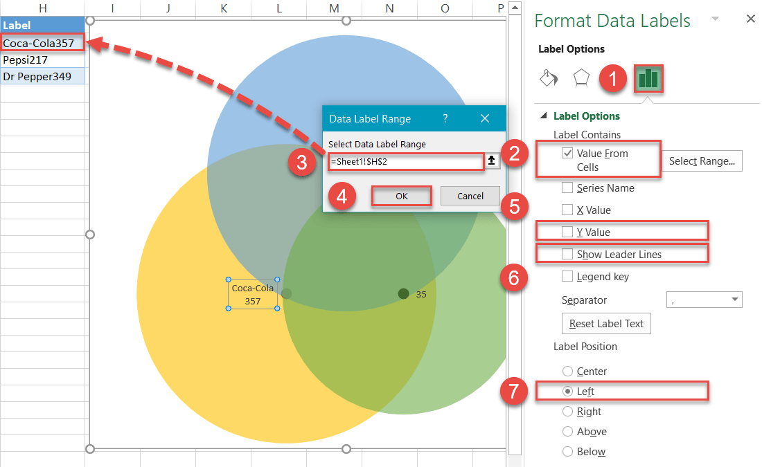
Replace the default values with the custom labels you previously designed. Right-click on any data label and choose “Format Data Labels.”
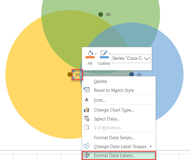
Once the task pane pops up, do the following:
- Go to the Label Options tab.
- Click “Value From Cells.”
- Highlight the corresponding cell from column Label (H2 for Coca-Cola, H3 for Pepsi, and H4 for Dr Pepper).
- Click “OK.”
- Uncheck the “Y Value” box.
- Uncheck the “Show Leader Lines” box.
- Under “Label Position,” choose the following:
- For Series “Pepsi,” click “Above.”
- For Series “Coca-Cola,” select “Left.”
- For Series “Dr Pepper,” pick “Right.”
- Adjust font size/boldness/color under Home > Font.
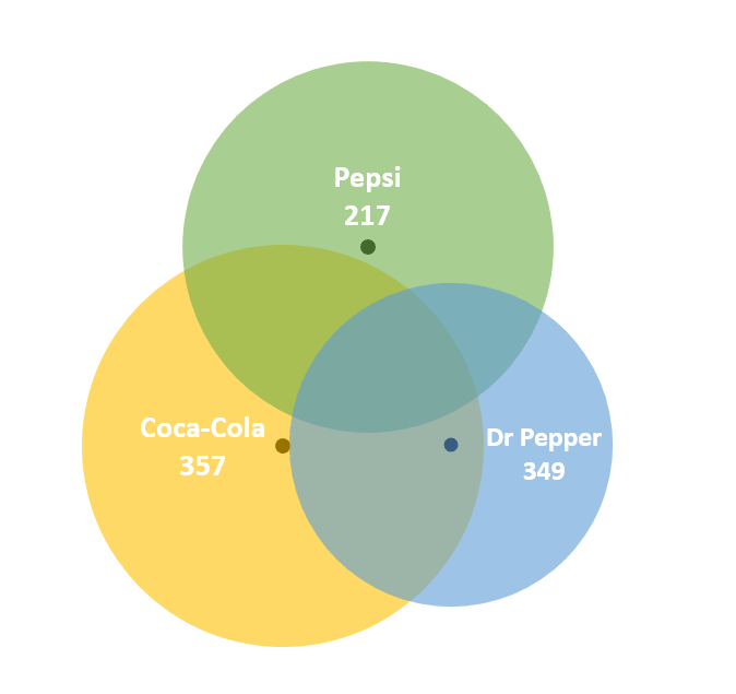
When you have finished this step, your diagram should look like this:
Step #16: Add text boxes linked to the intersection values.
Insert four text boxes for each overlapping part of the diagram to display the corresponding number of people who opted for multiple brands at once.
- Select the plot area.
- Go to the Insert tab.
- Click the “Text Box” button.
- Create a text box.
- Type “=” into the Formula Bar.
- Highlight the corresponding cell from column Chart Value (column D).
- Adjust font size/boldness/color to match the other labels under Home > Font.
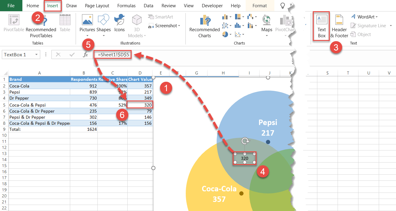
In the same way, add the rest of the overlap values to the chart. Here is another screenshot to help you navigate through the process.
Step #17: Hide the data markers.
You no longer need the data markers supporting the diagram, so let’s make them invisible. Right-click on any data marker, open the Format Data Series tab, and do the following:
- Click the “Fill & Line” icon.
- Switch to the Marker tab.
- Under “Fill,” choose “No fill.”
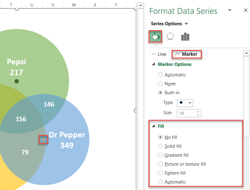
Repeat the process for each data marker.
Step #18: Add the chart title.
Finally, add the chart title:
- Select the plot area.
- Click the “Chart Elements” icon.
- Check the “Chart Title” box.
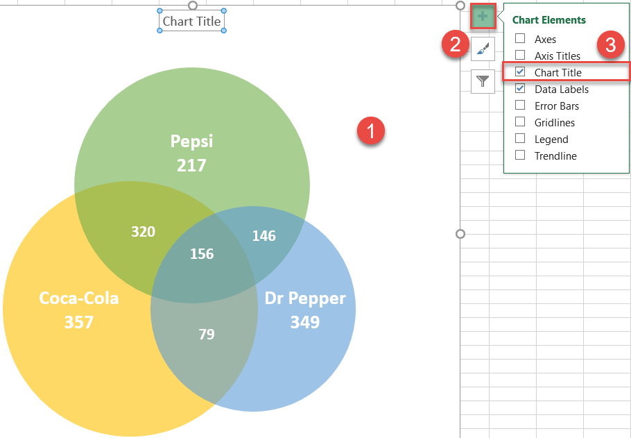
Change the chart title to fit your data, and your stellar Venn diagram is ready!
