How to Create a Waterfall Chart in Excel
Written by
Reviewed by
This tutorial will demonstrate how to create a waterfall chart in all versions of Excel: 2007, 2010, 2013, 2016, and 2019.
Waterfall Chart – Free Template Download
Download our free Waterfall Chart Template for Excel.
In this Article
- Waterfall Chart – Free Template Download
- Getting Started
- How to Create a Waterfall Chart in Excel 2016+
- Step #1: Plot a waterfall chart.
- Step #2: Set the subtotal and total columns.
- Step #3: Change the color scheme.
- Step #4: Tailor the vertical axis ranges to your actual data.
- Step #5: Fine-tune the details.
- How to Create a Waterfall Chart in Excel 2007, 2010, and 2013
- Step #1: Prepare chart data.
- Step #2: Build a stacked column chart.
- Step #3: Hide Series “Invisible.”
- Step #4: Adjust the color scheme.
- Step #5: Change the gap width to “20%.”
- Step #6: Adjust the vertical axis ranges.
- Step #7: Add and position the custom data labels.
- Step #8: Clean up the chart area.
- Download Waterfall Chart Template
A waterfall chart (also called a bridge chart, flying bricks chart, cascade chart, or Mario chart) is a graph that visually breaks down the cumulative effect that a series of sequential positive or negative values have contributed to the final outcome.
Conventionally, the first and last columns represent the initial and final values separated by intermediary adjustments that depict the succession of steps it took to get from point A to point B.
This type of chart has been widely used by professionals across all major industries for conducting quantitative analysis—ranging from decoding financial statements to monitoring store inventory.
Bridge graphs were introduced as a built-in chart type only in Excel 2016, meaning that users of earlier Excel versions have no other choice but to create the chart from the ground up.
For that reason, in this tutorial you will learn how to create this Mario chart both manually from scratch and by turning to the native chart type that does all the dirty work for you.

Getting Started
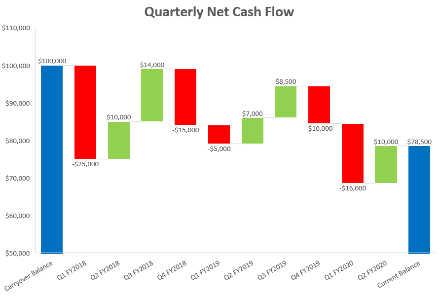
Right out of the gate, we need to throw some raw data into the picture. So, for illustration purposes, let’s assume you set out to analyze the quarterly net cash flow of some fictitious company.
With all that in mind, consider the following data:
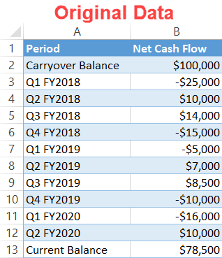
To help you be able to adjust the chart to your own needs, let’s talk about the table in greater detail:
- Period: This column represents a sequence of positive and negative values to be plotted on the chart.
- Net Cash Flow: This column is made up of the corresponding values. The first (B2) and last (B13) cells contain the initial and final values while the remaining numbers in between stand for the quantitative changes over time.
Now that you know the essentials of the chart, we can move on to the nitty-gritty.
How to Create a Waterfall Chart in Excel 2016+
First, let me show you a solution for those seeking the path of least resistance.
By using the built-in, ready-made template—provided you use Excel 2016 or 2019—it shouldn’t take you more than a few simple steps to set up a waterfall chart.
However, it all comes with the price of limited customization options and potential compatibility issues; older versions of Excel simply cannot process more recent native chart types.
Bottom line: whenever you are going to send a chart around, it’s always a safer bet to build it manually.
Step #1: Plot a waterfall chart.
To begin with, create a default waterfall chart based on your actual data. The beauty of this method is that you don’t have to jump through any hoops whatsoever:
- Highlight all the data (A1:B13).
- Go to the Insert tab.
- Select the “Insert Waterfall, Funnel, Stock, Surface, or Radar Chart” button.
- Choose “Waterfall.”
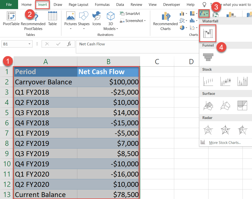
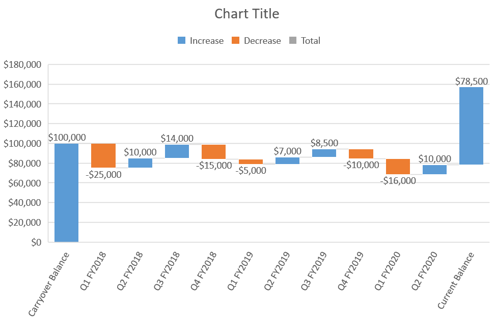
Instantly, your flying bricks chart will spring up:
Step #2: Set the subtotal and total columns.
Our next step is to separate the initial and final values from the “flying bricks.”
Double-click and then right-click on the columns representing the data points “Carryover Balance” and “Current Balance” and choose “Set as Total.”
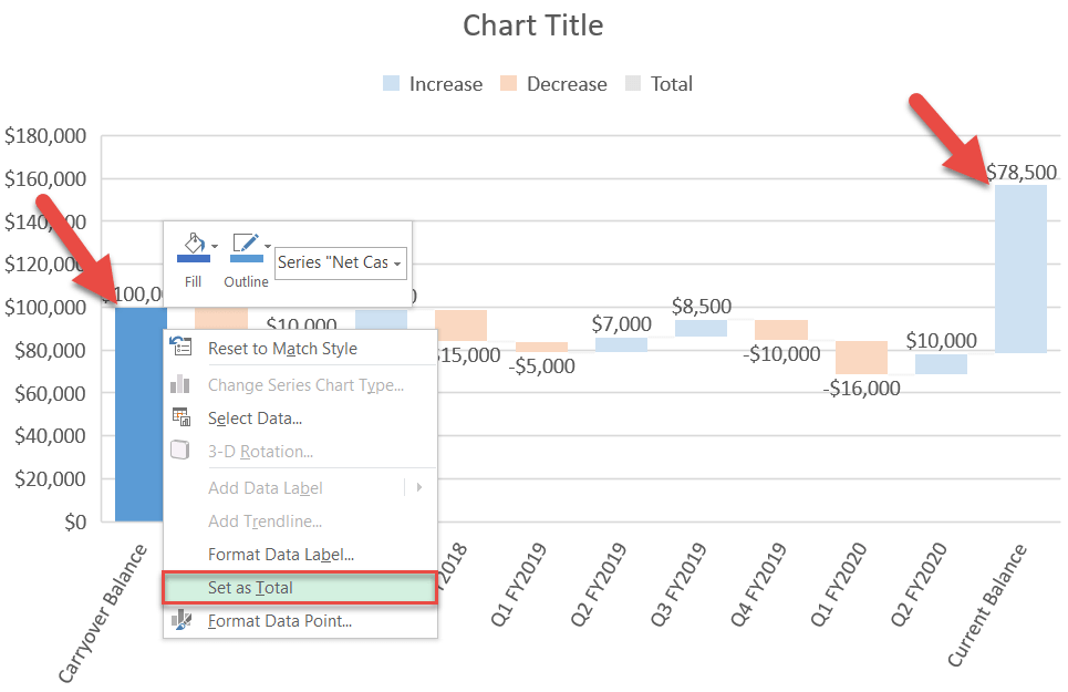
Technically, you may want to stop right there and leave the chart as it is. But this cascade graph tells us nothing about the data plotted on it.
Why settle for less? Instead, you can substantially improve your newly-created Mario chart by changing a few things here and there.
Step #3: Change the color scheme.
One effective way to improve your chart is to let the color scheme work for you, not the other way around. Recolor the data series in a way that helps to convey what the chart is all about.
- Double-click and then right-click on the legend item representing Series “Decrease.”
- Select the “Fill” button.
- Pick red from the color palette.
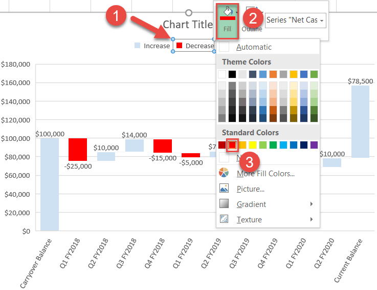
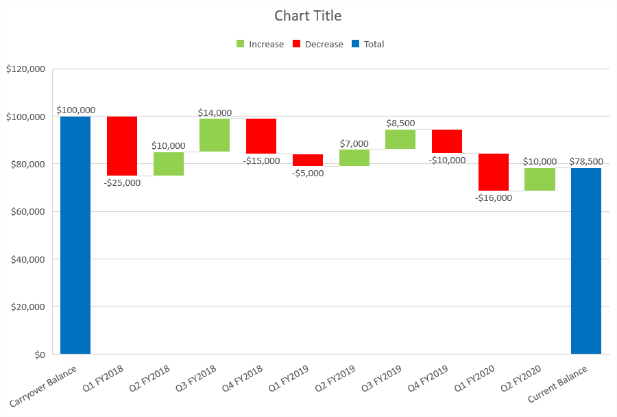
In the same way, recolor Series “Increase” to green and Series “Totals” to blue. Once there, your cascade chart should look like this:
Step #4: Tailor the vertical axis ranges to your actual data.
In order to zoom in on the floating columns for more detail, modify the vertical axis scale. Right-click on the primary vertical axis and click “Format Axis.”
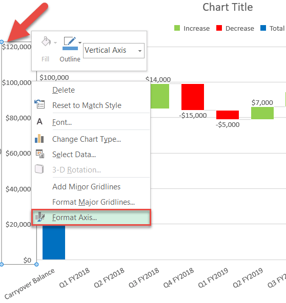
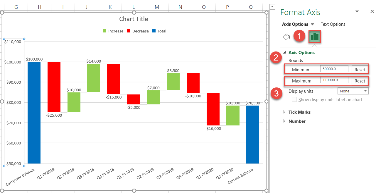
In the Format Axis task pane, follow these simple steps:
- Switch to the Axis Options tab.
- Set the Minimum Bounds to “50,000.”
- Set the Maximum Bounds to “110,000.”
Step #5: Fine-tune the details.
It’s common sense that the more elements that comprise the chart, the messier it looks. So let’s get rid of the unnecessary elements by removing the legend and gridlines.
Right-click on the chart legend and choose “Delete” from the menu that pops up. Repeat the same process for the gridlines.
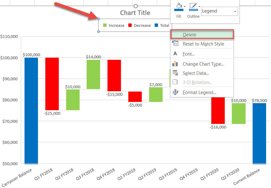
Finally, change the chart title, and you can call it a day!
How to Create a Waterfall Chart in Excel 2007, 2010, and 2013
This tutorial would end right here if the method shown above was compatible with all versions of Excel. Unfortunately, that’s not the case.
For that reason, you may want to consider manually plotting the chart from scratch, even if you use Excel 2016 or 2019.
Obviously, it takes more time to put the graph together that way, but the payoff is well worth the effort.
By the end of this section, you will learn how to create this customizable, dynamic bridge chart compatible with all versions of Excel:
Without further ado, let’s get the ball rolling.
Step #1: Prepare chart data.
Frankly, this step is the hardest.
Simply put, our custom waterfall graph will be created based on a stacked column chart. But to pull it off, we need to add some additional helper data into the equation.
For your convenience, take a quick glance at how your chart data should be organized by the end of the preparation phase.
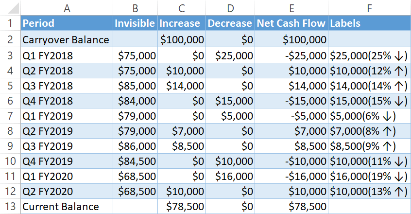
For those taking their first baby steps on the road to Excel mastery, this table may seem downright daunting, but in reality, anyone can handle the task by following the detailed instructions outlined below.
Let’s start off by adding three helper columns named “Invisible” (column B), “Increase” (column C), and “Decrease” (column D), which are going to contain the dummy values for positioning your actual data on the future chart.
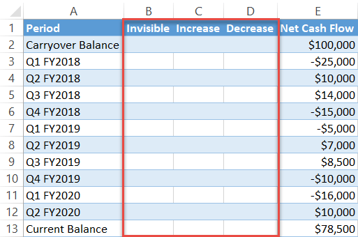
And if columns Increase and Decrease are rather self-explanatory, what’s the deal with column Invisible? Basically, these values will form the invisible base of the future stacked column chart in order to prop the actual values up to the appropriate height.
Let’s deal with column Increase first: Enter the following formula into cell C2 and drag it down using the fill handle to execute it for the remaining cells (C3:C13):
=IF(E2>0, E2, 0)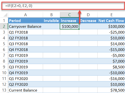
Now, type the mirror formula into the first cell of column Decrease (column D) and copy it down as well:
=IF(E2<=0, -E2, 0)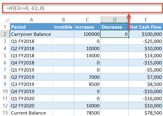
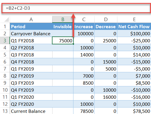
Two down, one to go. Having found the necessary chart data, you can now set up column Invisible to accurately chart the cash flow fluctuations by typing the following formula into the second cell of the column (B3) and copying it down to B12:
=B2+C2-D3NOTE: It’s absolutely essential for you to leave the first and last cells (B2 and B13) of the column empty!
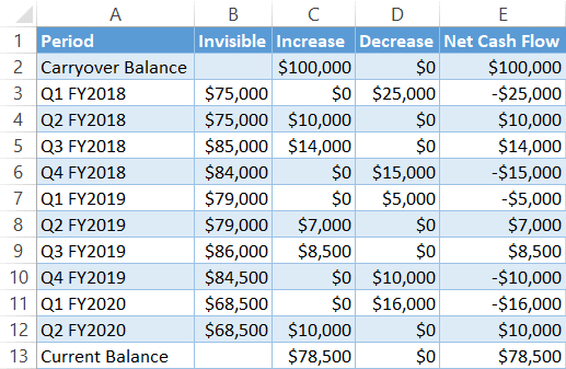
Don’t forget to format all the chart data as currency (Home > Number group > Currency).
At this point, here is how your expanded table should look:
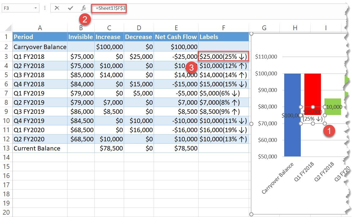
As one final adjustment, set up yet another column named “Labels” that will contain fancy custom data labels.
Once you have this column set up, enter this formula into the second cell of the column Labels (F3) and copy it down, leaving the first cell (F2) and last cell (F13) empty:
=IF(E3<=0, TEXT(-E3, "$#,##")&CHAR(10)&TEXT(-E3/SUM(B3:D3), "(#% ↓)"), TEXT(E3, "$#,##")&CHAR(10)&TEXT(E3/SUM(B3:D3), "(#% ↑)"))Those working with other number formats should apply this formula instead:
=IF(E3<=0, TEXT(-E3, "#,##")&CHAR(10)&TEXT(-E3/SUM(B3:D3), "(#% ↓)"), TEXT(E3, "#,##")&CHAR(10)&TEXT(E3/SUM(B3:D3), "(#% ↑)"))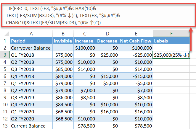
Step #2: Build a stacked column chart.
We made it over the hump, so the time to build our waterfall chart has finally come.
- Select all the data in columns Period, Invisible, Increase, and Decrease (A1:D13).
- Go to the Insert tab.
- Click “Insert Column or Bar Chart.”
- Choose “Stacked Column.”
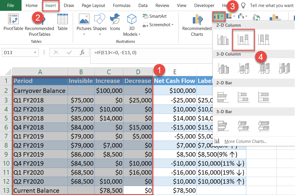
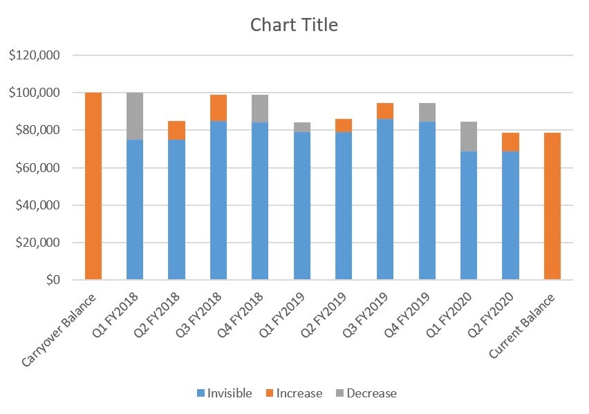
Excel will put together this simple graph that will be eventually transformed into a stunning waterfall chart:
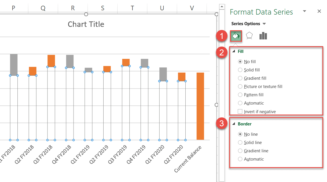
Step #3: Hide Series “Invisible.”
Before we move on to the rest of the chart, hide the underlying data series pushing the floating columns to the top. Right-click on any of the blue columns representing Series “Invisible” and open the Format Data Series task pane.
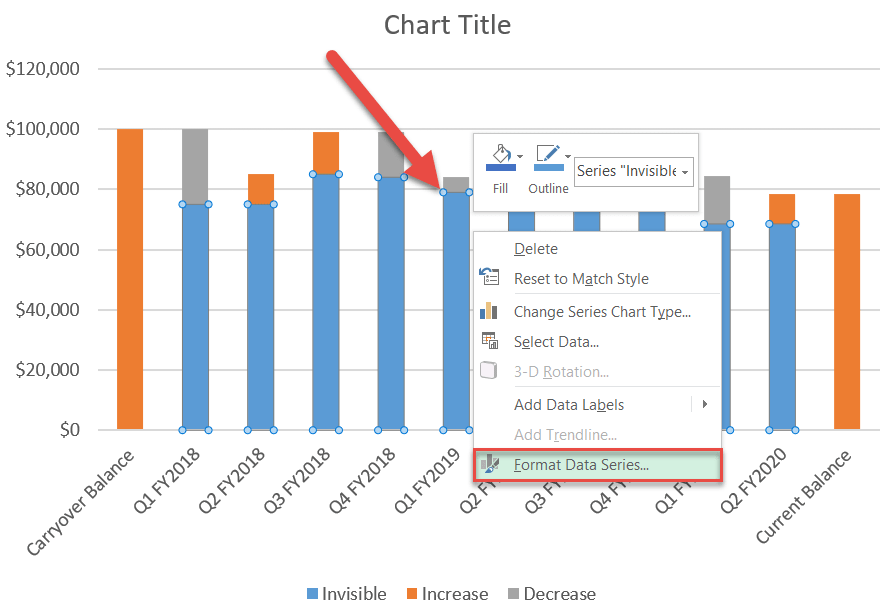
Once there, make the helper columns invisible:
- Go to the Fill & Line tab—the Fill tab in older versions of Excel.
- Under “Fill,” select “No fill.”
- Under “Border,” click “No line.”
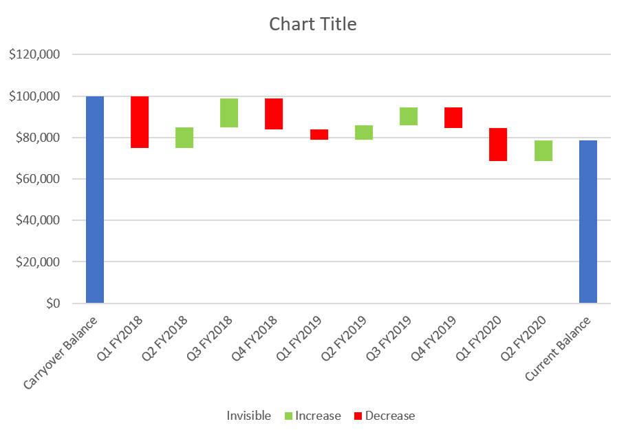
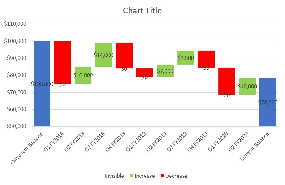
Step #4: Adjust the color scheme.
In the same Format Data Series task pane, recolor each data series by following the identical steps shown above (Series Options > Fill > Solid fill > Color) so that it can be understood intuitively at a glance:
- For Series “Decrease,” pick red.
- For Series “Increase,” pick green.
- Additionally, double-click on the columns “Carryover Balance” and “Current Balance” and recolor them blue.
Here is what you should end up having at this point:
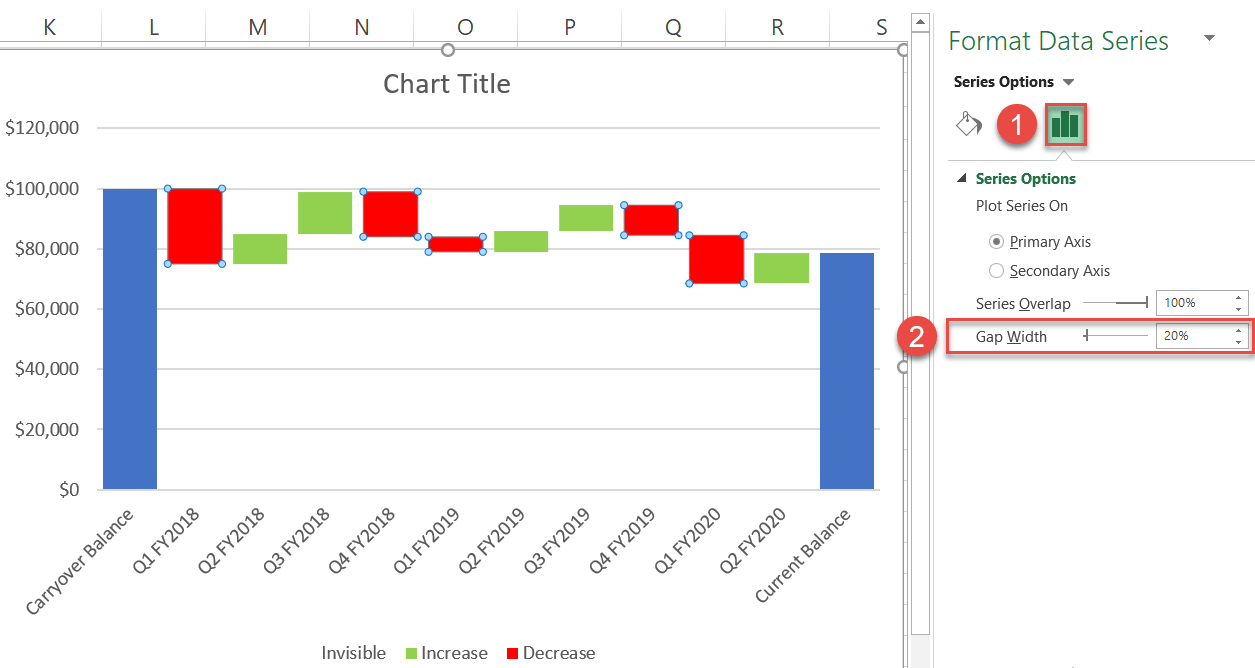
Step #5: Change the gap width to “20%.”
Now, increase the width of the columns for better visual perception.
- Open the Format Data Series task pane (right-click one of the data series and choose Format Data Series) and switch to the Series Options tab.
- Change “Gap Width” to “20%.”
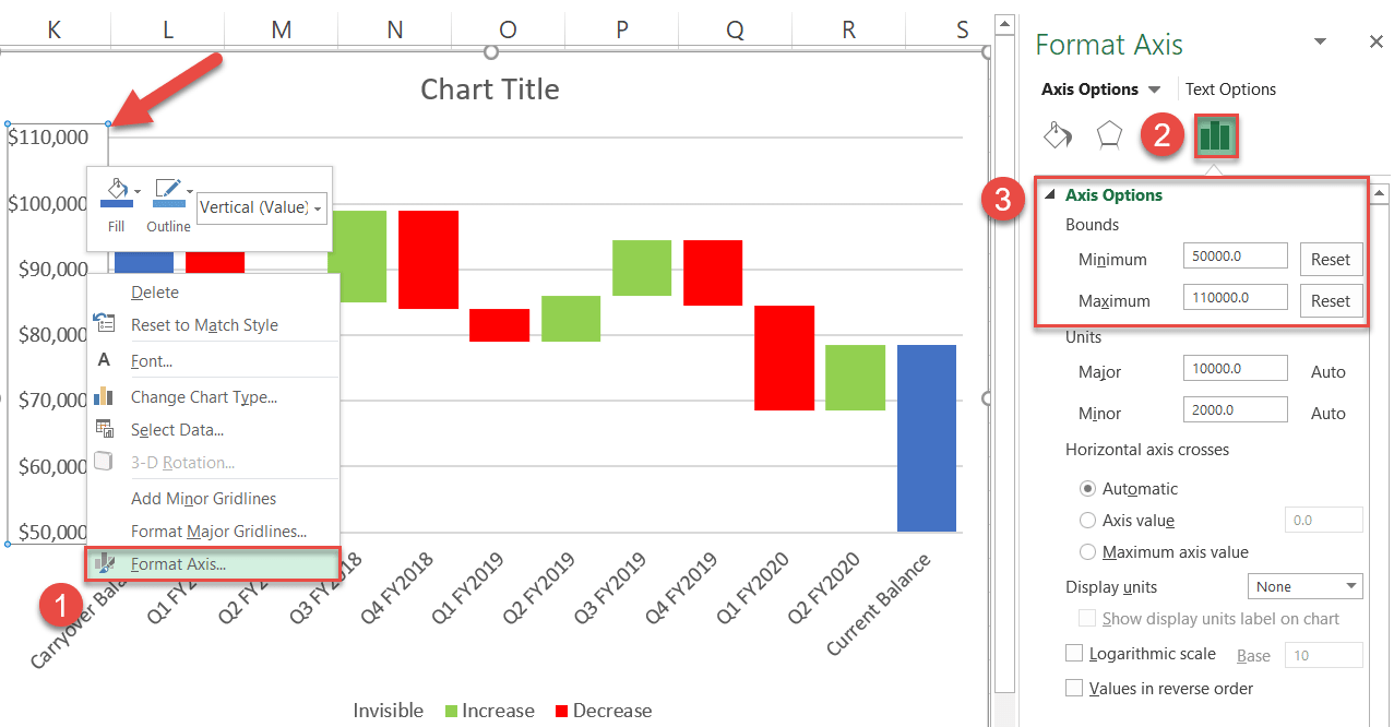
Step #6: Adjust the vertical axis ranges.
Again, the axis scale should be modified to zoom in more closely on the data. To quickly recap the process for those who skipped the first section of this tutorial, here is how you do it:
- Right-click on the vertical axis and choose “Format Axis.”
- In the task pane, open the Axis Options tab.
- Under “Bounds,” change “Minimum” to “50,000” and “Maximum” to “110,000.”
Step #7: Add and position the custom data labels.
Those custom data labels have been waiting around for too long—so let’s finally put them to use. Right-click on any column and select “Add Data Labels.”
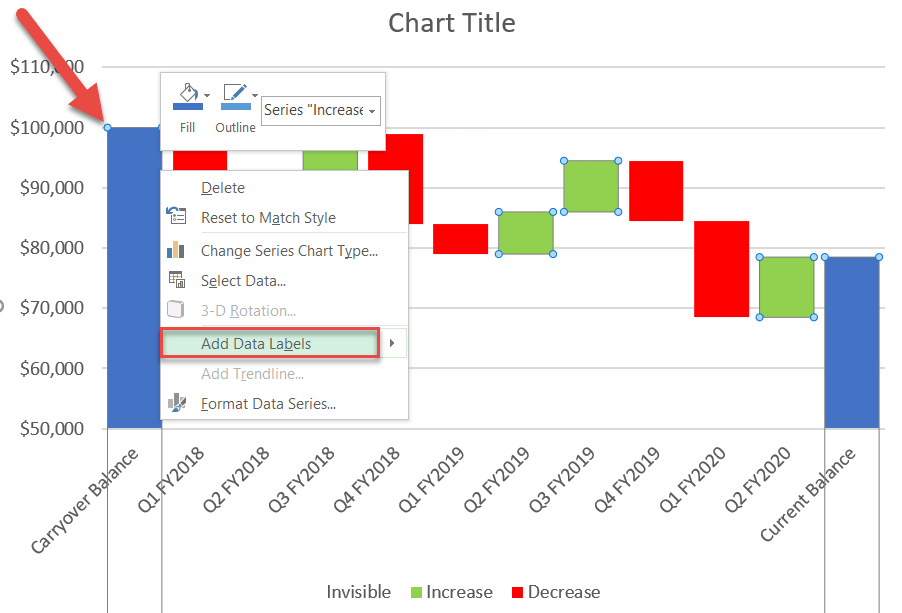
Immediately, the default data labels tied to the helper values will be added to the chart:
But that is not exactly what we are looking for. To work around the issue, manually replace the default labels with the custom values you prepared beforehand.
- Double-click the data label you want to alter.
- Enter “=” into the Formula bar.
- Highlight a corresponding cell in column Labels.
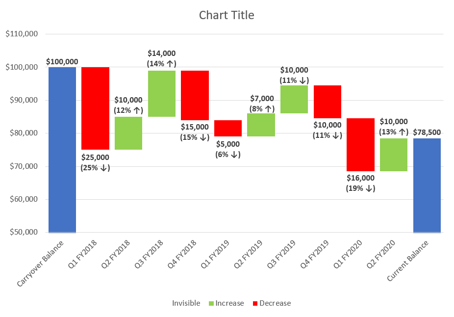
Replace the remaining data labels by repeating the same process for every floating column.
Once there, you will need to drag the labels to their respective positions: all the positive values should be placed above the respective green columns while the negative ones have to be moved under the red columns.
After you have successfully tackled the labels, your Mario chart should transform into something like this:
Step #8: Clean up the chart area.
Finally, remove the chart legend and gridlines that bring nothing to the table (Right-click > Delete). Change the chart title, and there you have your waterfall chart!
Download Waterfall Chart Template
Download our free Waterfall Chart Template for Excel.
