Relative Frequency Distribution – Excel and Google Sheets
This tutorial will demonstrate how to calculate the relative frequency distribution in Excel and Google Sheets.
A Frequency Distribution is a distribution of the number of occurrences of a set of events. In other words, a frequency distribution shows different values in a dataset and the number of times the values occur in the dataset.A Relative Frequency Distribution shows the occurrence of an event as a proportion of the total number of occurrences of all events in a given set of events. In other words, a relative frequency distribution shows the number of times a value appears in a dataset as a proportion of the size of the dataset.
The Relative Frequency of an event can be seen as the probability of the event occurring in a random draw.
Relative Frequency Distribution Formula
The relative frequency distribution is calculated using the formula:

where fi is the relative frequency of each event, value, or class;
ni is the number of occurrence (frequency) of each event, value, or class; and
N is the total number of occurrences of all events (total frequency).
Properties of a Relative Frequency Distribution
- Relative frequencies can be expressed as a decimal number of a percentage.
- When expressed as a decimal number, each relative frequency takes up a value between 0 and 1, and the sum of all relative frequencies must be 1.
- When expressed as a percentage, each relative frequency takes up a value between 0% and 100%, and the sum of all relative frequencies must be 100%.
How to Calculate Relative Frequency Distribution in Excel
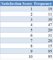
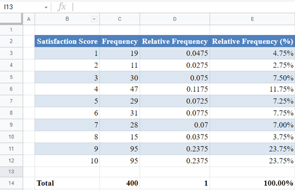
Background: An Internet Service Provider is conducting a customer satisfaction survey from a random sample of its users. They asked each surveyed customer to rate their services in the past 90 days on a scale of 1 to 10, where 10 represents excellent, and 1 represents miserable. The results from the survey are collated and presented in the table below. Calculate the relative frequency distribution of the result of the survey.
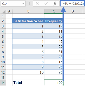
First, calculate the total frequency.
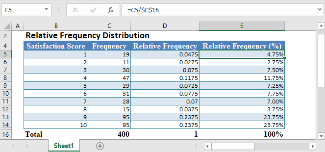
Then, calculate the Relative Frequency by dividing each Frequency by the Total Frequency.
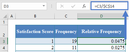
Note: Double-Click the bottom right corner of the cell to fill down the data to the rest of the column.
The complete Relative Frequency column is shown below.
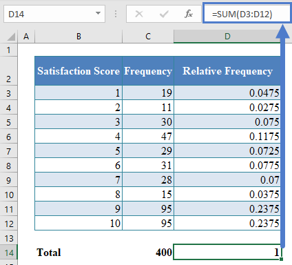
Note: The sum of all relative frequencies must be 1 .
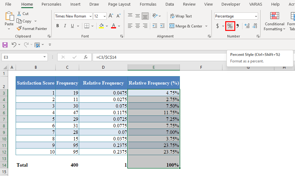
You can express the Relative Frequencies as percentages by selecting the Relative Frequency column and clicking the ‘Percent Style’ button.
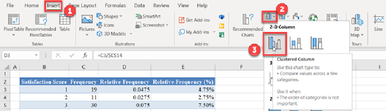
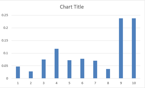
To visualize the relative frequency distribution, you can create a frequency distribution histogram or bar chart, depending on the type of data you are working with.
To do this, select the Clustered Column chart in the Insert Column or Bar Chart chart type on the Charts group of the Insert tab.
The resulting bar chart is shown below.
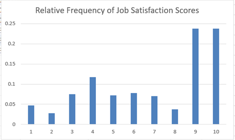
Edit the chart title by clicking on the Chart Title in the chart and typing your desired title.
Add the horizontal and the vertical axis titles by selecting the chart, then click on the Chart Design tab, then on the Add Chart Element button, then on Axis Title, and then on Primary Horizontal for the horizontal axis title or on Primary Vertical for the vertical axis title.
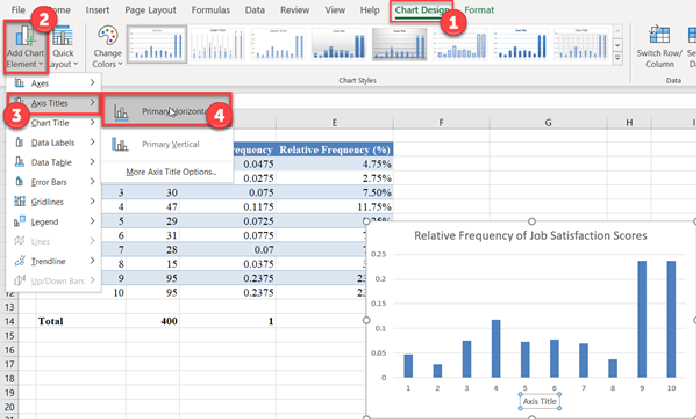
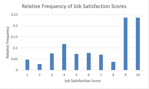
Then, edit the titles as required.
Relative Frequency Distribution in Google Sheets
The Relative Frequency Distribution can be calculated in Google Sheets in a similar way as it is calculated in Excel as shown in the picture below.
First, follow the method described in the Excel section to obtain the Relative Frequency Distribution table.
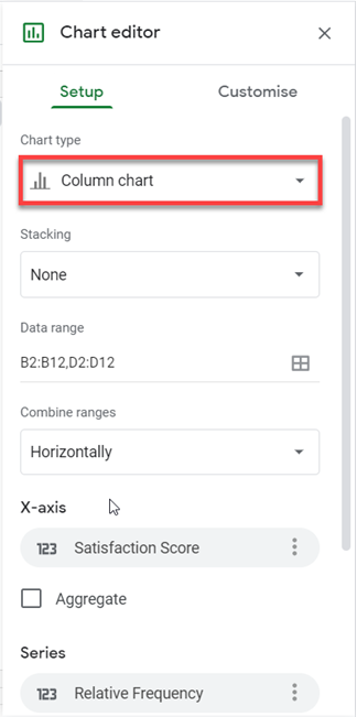
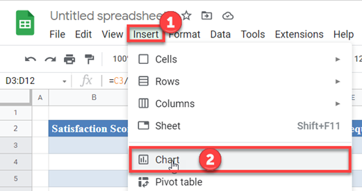
To create the relative frequency distribution bar chart in Google Sheet, first, highlight the Satisfaction Score and the Relative Frequency column, and then click the Chart option from the Insert tab.
The resulting chart is shown below.
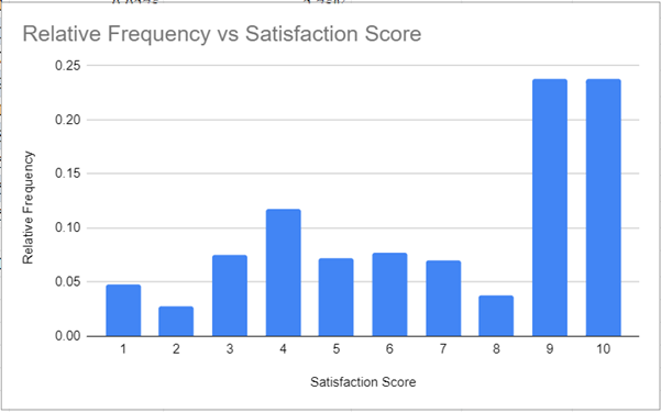
If the resulting chart is not a bar chart, change the Chart type to Column Chart in the Setup section of the Chart Editor. You can also make other settings as required.