Break Chart Axis – Excel
Written by
Reviewed by
This tutorial will demonstrate how to create a break in the axis on an Excel Chart.
How to Break Chart Axis in Excel
Break a Chart with a Secondary Axis in Excel
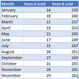
Starting with your Data
In this tutorial, we’re going to show how to create a graph with a secondary axis. We’ll start with the example data below.
Adding a Graph
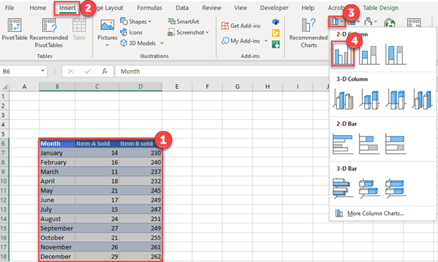
- Highlight the Data to Graph
- Click on Insert
- Select Graphs
- Click on the first Bar Graph
Adding a Secondary Graph
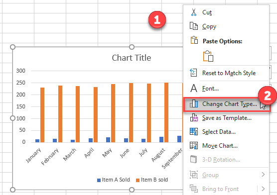
- Right click on the graph
- Select Change Chart Type
3. Click on Combo
4. Change both Series to Line Graph
5. Check one of the Series for Secondary Axis

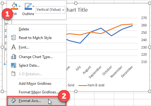
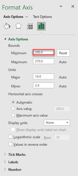
Changing Axis
- Right click on the Primary Axis
- Select Format Axis
3. Increase the Maximum Axis to bring this line to the bottom of the graph (decrease it in your trying to bring it to the top of the graph)
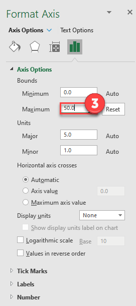
4. Decrease the Minimum Axis to bring this line to the top of the graph (increase it in your trying to bring it to the top of the graph)
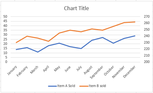
Final Graph with Secondary Axis
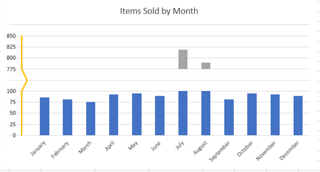
Break Axis on a Chart in Excel
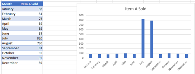
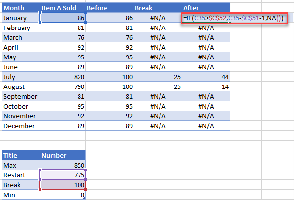
If you have data that has a large swing in the numbers, the graph doesn’t always show it well. Instead, we want to show a break in the axis so that we can show the graphs easier.
Create Axis in Graph
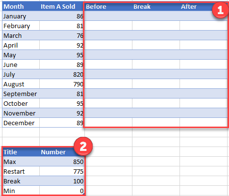
- Next to the original data, add a column for Before, Break, and After.
- Create a Table for the Max Number, where the new axis will Restart, where the axis will Break, and the Min number
Fill in Table
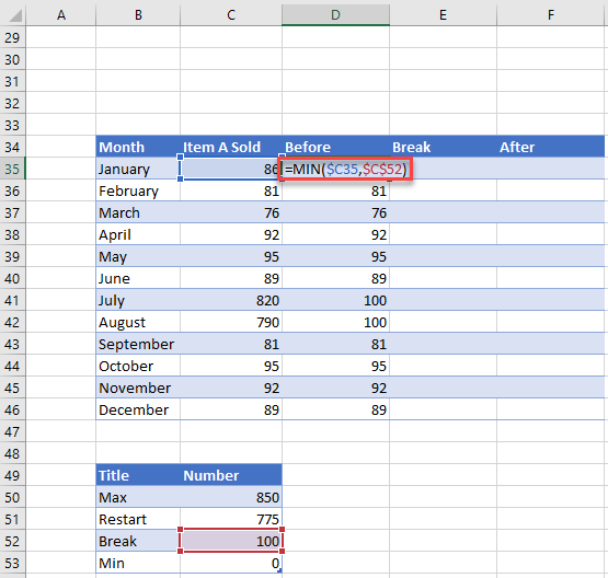
Before: =MIN($C35,$C$52); Finding the minimum value between the Actual Item Sold and the Break
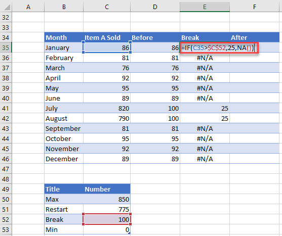
Break: =IF(C35>$C$52,125,NA()); Finding which items will go after the break. 125 signifies how large the break is
After: =IF(C35>$C$52,C35-$C$51-1,NA()); This is how much of the axis after the break will appear
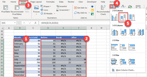
Create a Chart
- Highlight First Column
- Hold down Control and highlight data for Before, Break, and After
- Click Insert
- Select Bar Graph
- Click Stacked Bar Graph
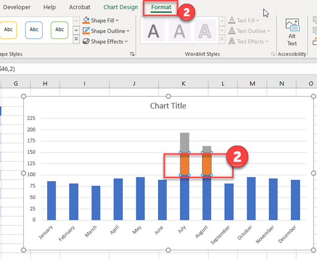
Format Series
- Click on Middle Portion (This will be the Split)
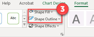
- Select Format
3. Change Shape Fill & Shape Outline to No Fill
Creating Dummy Axis
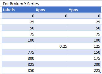
Create a table with the following information:
- Labels: Create the Axis that you would like to show with the break in it
- Xpos: Fill in .25 for the break
- YPos: Create the current Y Axis Labels
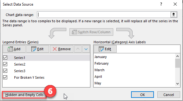
Add Dummy Data to Graph
- Right click on graph
- Click Select Data
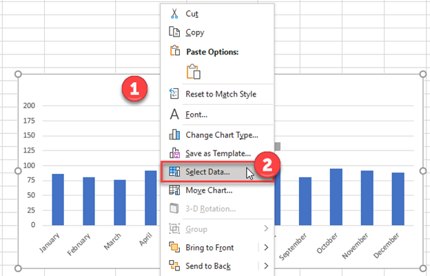
3. Click Add
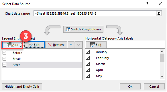
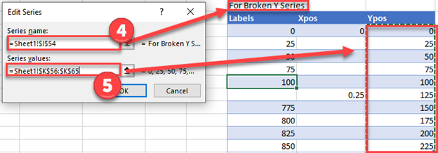
4. For the Series Name, select “For Broken Y Series”
5. For Series Value, select value under YPos
6. Right click on new series
7. Click on Change Series Chart Type
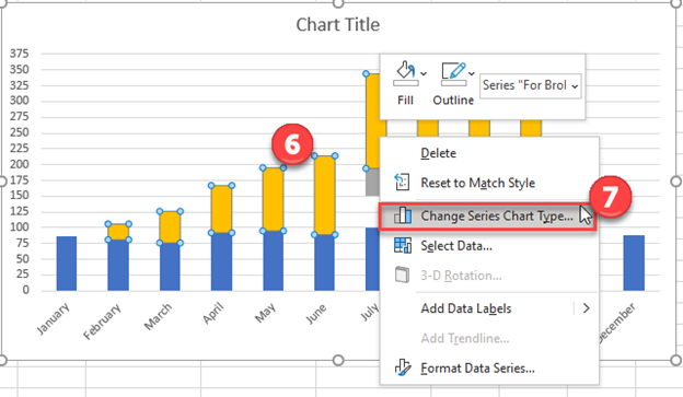
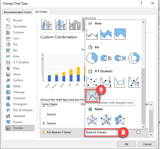
8. For Series called “For Broken Y Series”, click box
9. Select Scatter with Straight Lines
Change Axis
- Right Click new Line
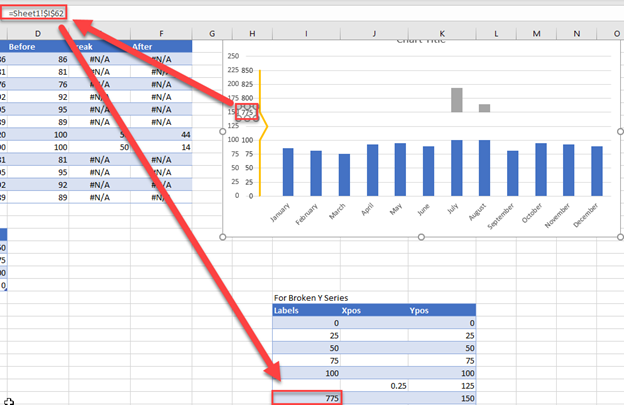
- Click Select Data
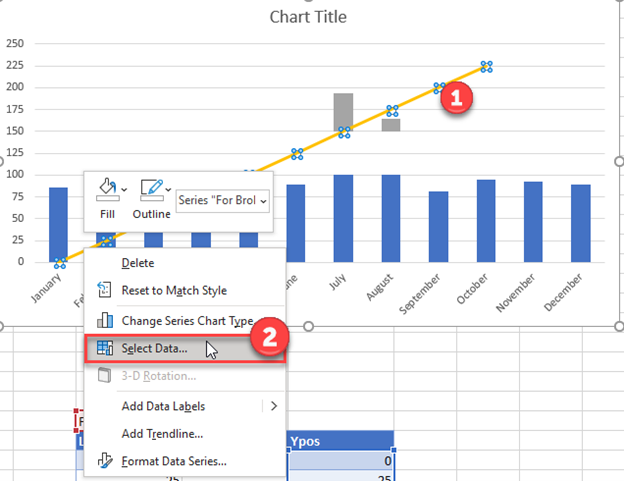
3. Select “For Broken Y Series”
4. Click Edit
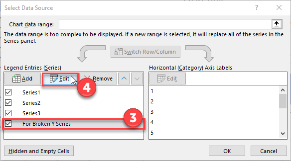
5. For Series X Values, Select Data under XPos. Click Ok.
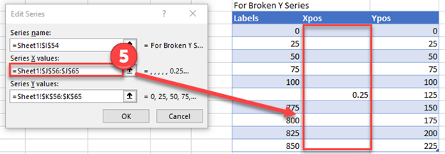
6. Select Hidden and Empty Cells
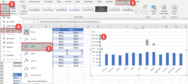
Changing Y Axis Range
- Click on the new line you just made
- Select Chart Design
- Click Add Chart Element
- Click Data Labels
- Select Left
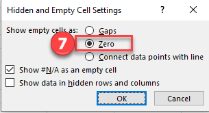
6. Change Empty cells to Zero. Click OK.
Changing Labels
- Click on each individual axis
- Click on the formula bar
- Select the Labels that you want the Y Axis to show
Note 1: Do this for each label
Note 2: Click Delete for the Gap and the other Y Axis
Final Graph with Broken Axis
Your final result should look like below, showing the break in the axis.