How to Create a Bullet Graph in Excel
Written by
Reviewed by
This tutorial will demonstrate how to create a bullet graph in all versions of Excel: 2007, 2010, 2013, 2016, and 2019.
Bullet Graph – Free Template Download
Download our free Bullet Graph Template for Excel.
In this Article
- Bullet Graph – Free Template Download
- Getting Started
- Step #1: Plot a stacked column chart.
- Step #2: Change the axis labels.
- Step #3: Create a combo chart and push Series “Target” and Series “Actual” to the secondary axis.
- Step #4: Delete the secondary axis.
- Step #5: Create the markers for Series “Target.”
- Step #6: Adjust the gap width for the “Actual” columns.
- Step #7: Recolor the “Actual” columns black.
- Step #8: Color the quantitative scale.
- Step #9: Adjust the gap width between the chart columns.
- Step #10: Add the data labels (optional).
- Download Bullet Graph Template
Developed by data visualization expert Steven Few, the bullet graph is a modified column or bar chart used for tracking performance against a goal.
Conventionally, the graph contains five main elements: (1) a text label describing the graph, (2) a quantitative scale for evaluating the actual value, (3) three to five qualitative scale ranges, (4) a data marker that displays the target value, and (5) a data marker representing the actual value.
The graph was designed as a superior substitute to meter and gauge charts, especially when it comes to illustrating large amounts of data; it displays more information with less footprint, preserving precious dashboard space.
Depending on the task at hand, a bullet graph can be either horizontal or vertical. However, here’s the rub:
Unless you use our Chart Creator Add-in that allows you to build bullet graphs—as well as other advanced Excel charts—in just a few clicks, you will have to build the graph yourself because it is not supported in Excel.
In this step-by-step tutorial, you will learn how to create this vertical bullet graph in Excel from scratch, as introduced in Steven Few’s Bullet Graph Design Specifications: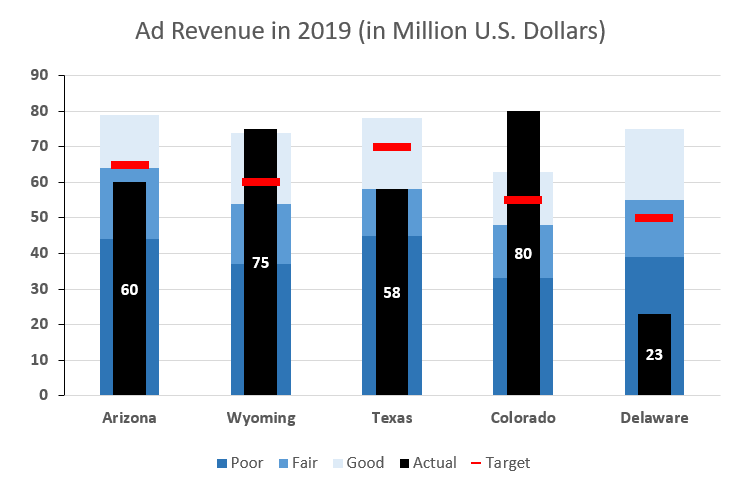
Getting Started
For illustration purposes, let’s assume you run a huge network of digital properties and set out to analyze the ad revenue generated in five states across the US:
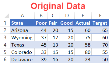
Since the table elements are pretty self-explanatory, let’s dive right in without beating around the bush.
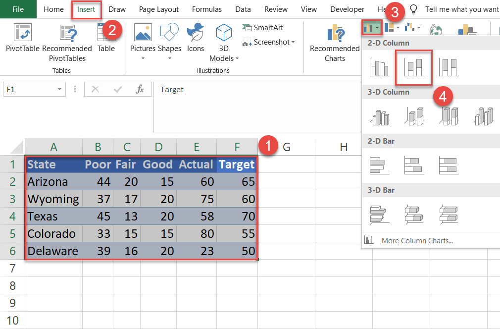
Step #1: Plot a stacked column chart.
To start with, create a simple stacked column chart.
- Highlight the entire table containing your actual data, including the header row (A1:F6).
- Go to the Insert tab.
- Click the “Insert Column or Bar Chart” icon.
- Choose “Stacked Column.”
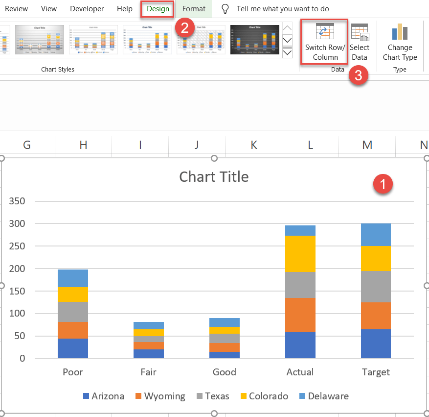
Step #2: Change the axis labels.
Occasionally, Excel can misplace the text labels. We want the states to show on the horizontal axis labels and the ratings to show in the legend labels. To fix that, just follow a few simple steps:
- Select the chart plot.
- Navigate to the Design tab.
- Click on the “Switch Row/Column” button.
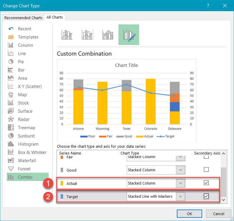
Step #3: Create a combo chart and push Series “Target” and Series “Actual” to the secondary axis.
Some additional tweaking will be needed to get all the graph elements in the right place.
First, right-click on any of the data markers representing Series “Target” (F2:F6) and choose “Change Series Chart Type.”
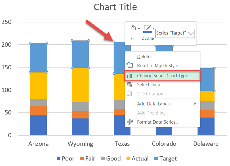
Once there, do the following:
- Move Series “Actual” (E2:E6) to the secondary axis by checking the “Secondary Axis” box.
- For Series “Target,” change “Chart Type” to “Stacked Line with Markers” and push it to the secondary axis as well.
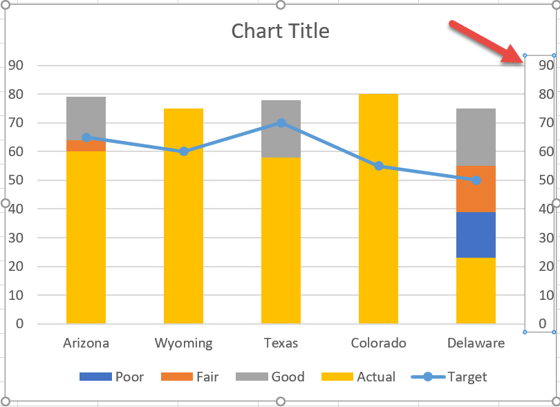
Step #4: Delete the secondary axis.
Get rid of the secondary axis as you no longer need it. Right-click on the secondary axis (the numbers along the right side of the chart) and choose “Delete” to remove it.
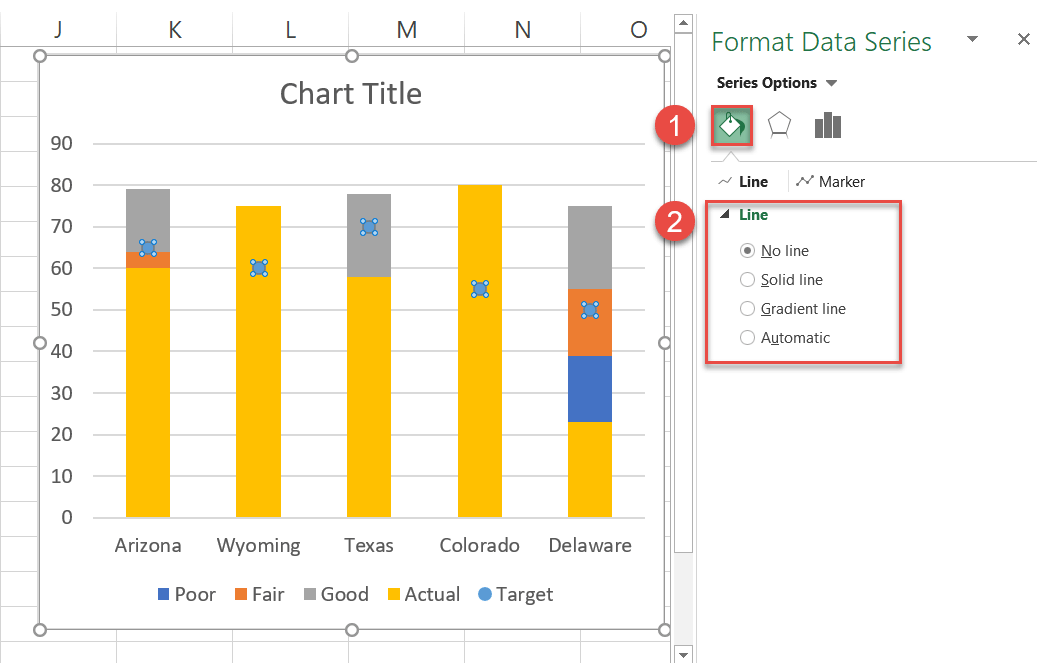
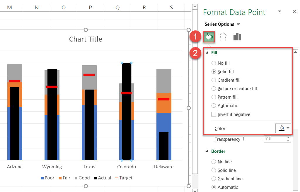
Step #5: Create the markers for Series “Target.”
It’s time to set up the horizontal bars that will represent the target values. Right-click on any of the data markers symbolizing Series “Target” and choose “Format Data Series.”
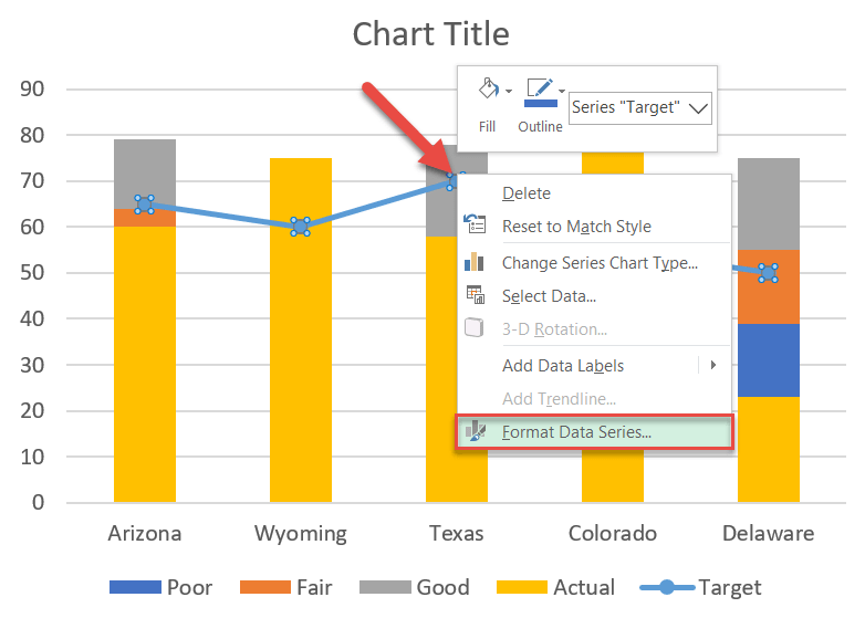
From there, in the task pane that pops up, remove the lines connecting the markers:
- Click the “Fill & Line” icon.
- In the Line tab, select “No Line.”
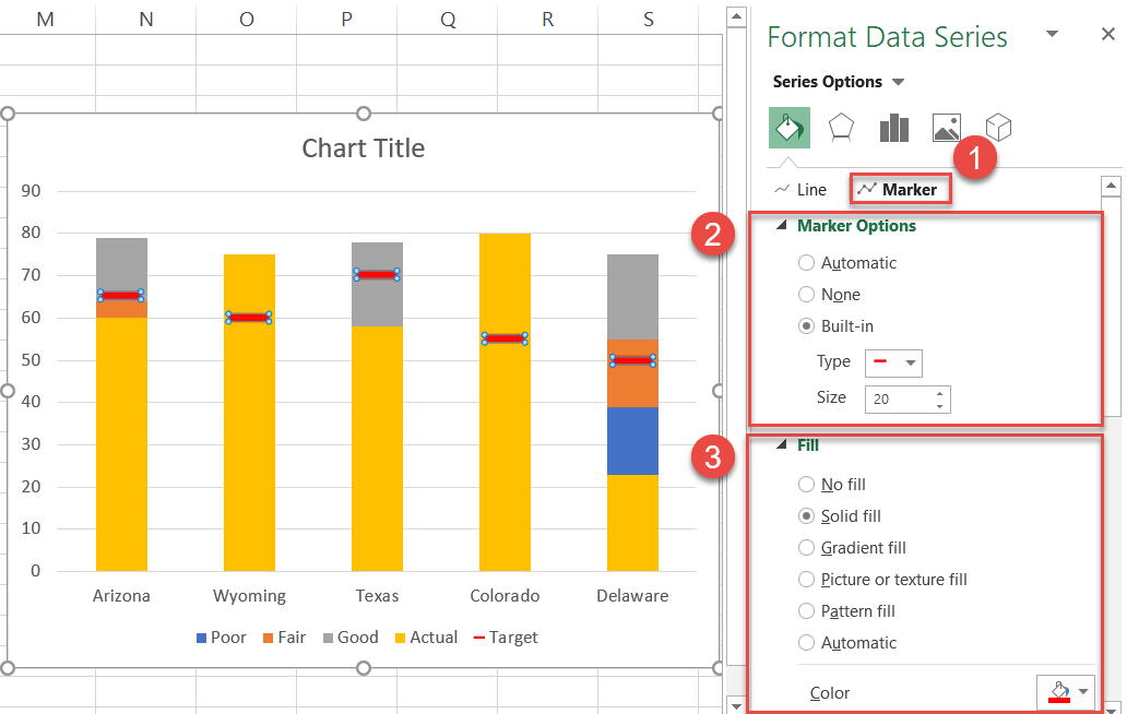
Without closing the task pane, do the following to design the horizontal bars:
- Switch over to the Marker tab.
- Under Marker Options:
- Select “Built-in.”
- From the Type drop-down list, choose “Dash.”
- Set the marker size to “20.”
- Under Fill:
- Select “Solid fill.”
- Click the “Fill Color” icon to open the color palette and set the color to red.
- Scroll down to the Border section and set the border to “Solid Line” and the color to red as well.
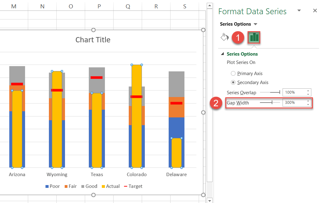
Step #6: Adjust the gap width for the “Actual” columns.
By convention, the “Target” bars should be slightly wider than the “Actual” columns.
Right-click on any of the columns representing Series “Actual” and choose “Format Data Series.”
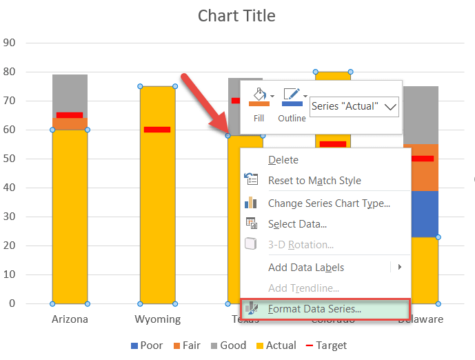
Now, slim the columns down:
- Switch to the Series Options tab.
- Adjust the Gap Width value based on your actual data (the higher the value, the narrower the columns). In this case, I recommend 300%.
Step #7: Recolor the “Actual” columns black.
Jump to the Fill & Line tab and, under Fill, select “Solid fill” and change the color of the columns to black.
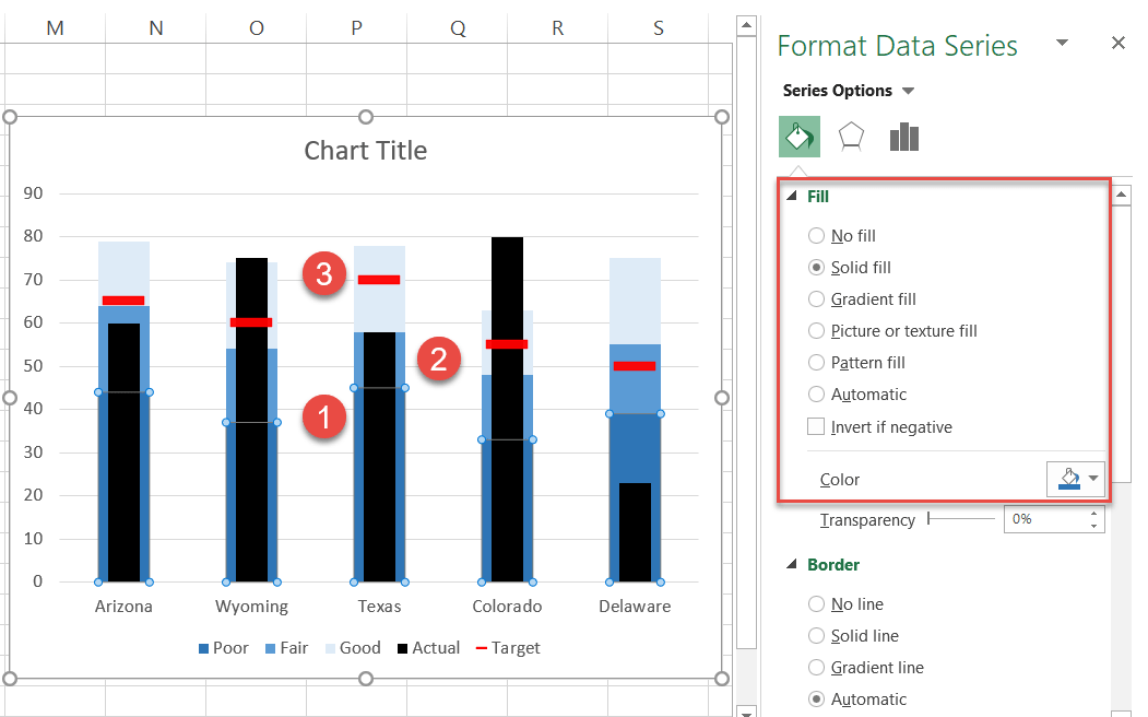
Step #8: Color the quantitative scale.
Next, color the quantitative scale to differentiate the qualitative ranges—it may be something as simple as traffic light colors.
However, Steven Few emphasized that using distinct hues would make it difficult for the colorblind (roughly 4.5% of the population) to interpret the nuances of the graph, meaning you’d be better off using different shades of a single color instead, going from dark to light.
While in the Format Data Series task pane, select each section of the quantitative scale and recolor accordingly (Series Options > Fill > Solid Fill > Color).
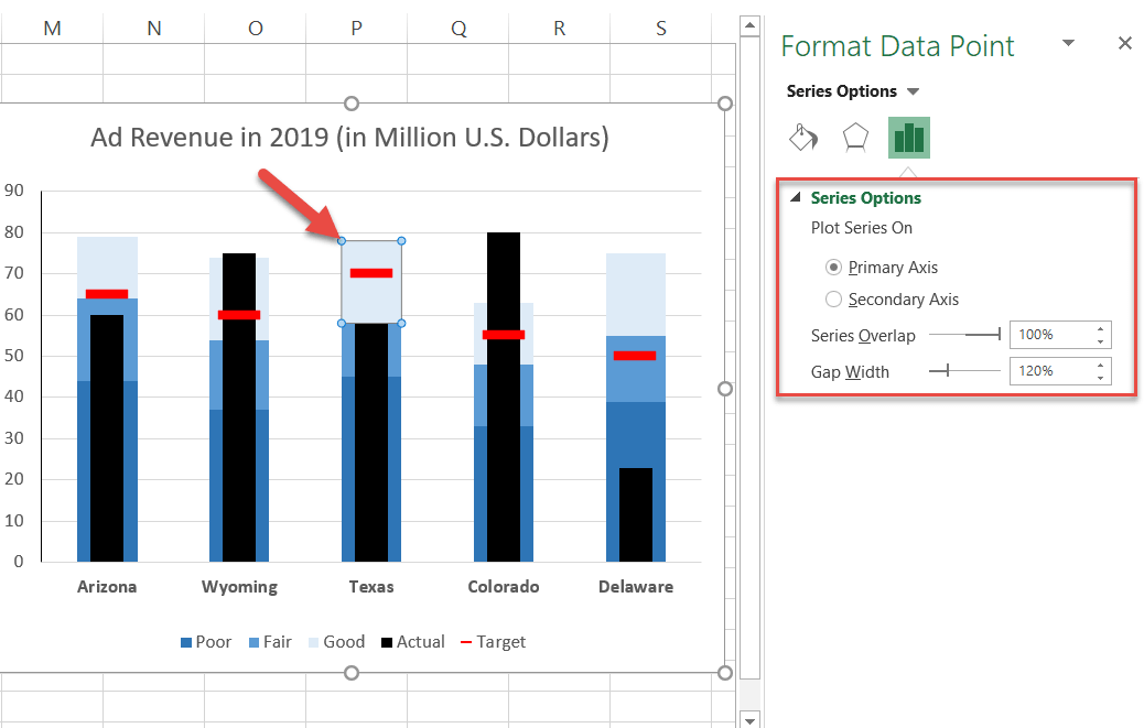
Step #9: Adjust the gap width between the chart columns.
If the columns look too skinny, you might want to increase the gap width between them to improve readability. To do that, repeat the process outlined in Step #6 (Format Data Series > Series Options > Gap Width).
Step #10: Add the data labels (optional).
As one final adjustment, add data labels showing the “Actual” values:
- Right-click on the “Actual” column.
- Choose “Add Data Labels.”
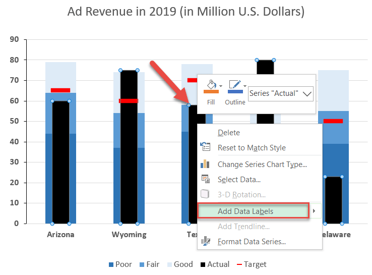
Change the color of the labels to white and make them bold (Home > Font) to help them stand out.
So that’s how it’s done! Gauges and meters no longer have you over a barrel, as bullet graphs empower you neatly display the same data using half the space.
