Excel Gauge Chart Template – Free Download – How to Create
Written by
Reviewed by
This tutorial will demonstrate how to create a gauge chart in all versions of Excel: 2007, 2010, 2013, 2016, and 2019.
Gauge Chart – Free Template Download
Download our free Gauge Chart Template for Excel.
…or
Learn about our Gauge Chart Excel Add-in
In this Article
- Gauge Chart – Free Template Download
- Step #1: Prepare a dataset for your gauge chart.
- Step #2: Create the doughnut chart.
- Step #3: Rotate the doughnut chart.
- Step #4: Remove the chart border.
- Step #5: Hide the biggest slice of the doughnut chart.
- Step #6: Change the colors of the remaining slices.
- Step #7: Add the pointer data into the equation by creating the pie chart.
- Step #8: Realign the two charts.
- Step #9: Align the pie chart with the doughnut chart.
- Step #10: Hide all the slices of the pie chart except the pointer and remove the chart border.
- Step #11: Add the chart title and labels.
- Bonus Step for the Tenacious: Add a text box with your actual data value.
- Gauge Chart – Free Template Download
Gauge Charts (also referred to as Speedometer or Dial Charts) save the day when it comes to comparing KPIs or business results against the stated goals. However, Excel’s massive bag of built-in visualization tools unfortunately has no ready-made solution to offer for such a chart.
But with a bit of spreadsheet magic, there is no obstacle you can’t surmount.
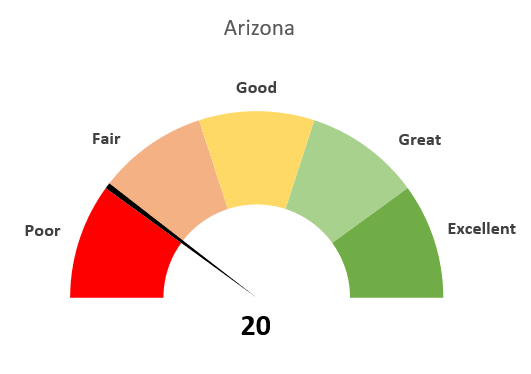
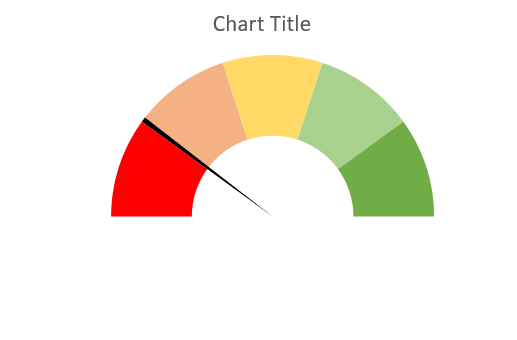
Here’s an example of the gauge chart you will learn to build from scratch:
Without further ado, let’s dive right in.
Step #1: Prepare a dataset for your gauge chart.
Technically, a gauge chart is a hybrid of a doughnut chart and a pie chart overlapping one another. The doughnut chart will become the speedometer while the pie chart will be transformed into the pointer.
Let’s start out our grand adventure by creating a dataset for both charts. Prepare your spreadsheet as follows:
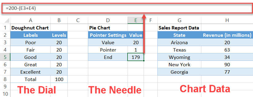
A few words about each element of the dataset:
- Labels: These determine the intervals of the gauge chart labels.
- Levels: These are the value ranges that will split the dial chart into multiple sections. The more detailed you want to display your data, the more value intervals you’ll need.
- Pointer: This determines the width of the needle (the pointer). You can change the width however you see fit, but we recommend making it smaller than five pixels.
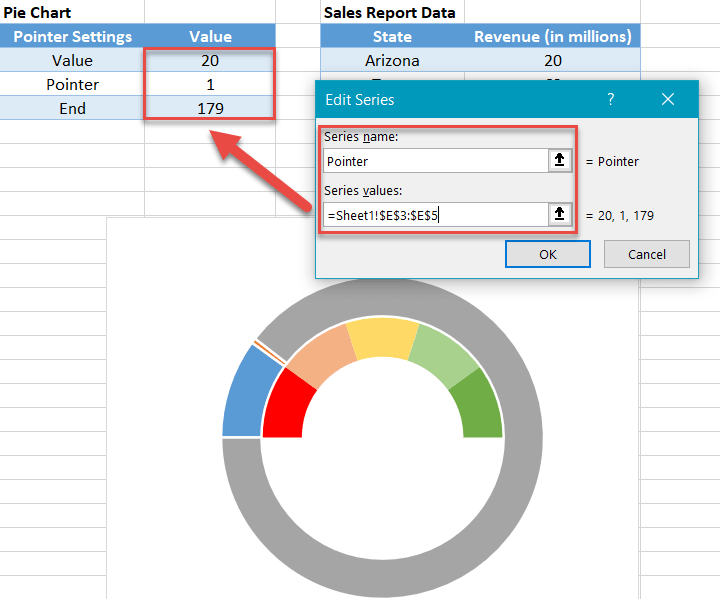
- Value: This is your actual data value. In our case, we will display how much money a fictitious company earned from its sales in Arizona.
- End: This special formula—=200-(E3+E4)— will help position the pointer properly by adding all the cells from the Value column (30+40+30+100) and subtracting from that sum (200) the pointer width (E4) and your actual data value (E3).
Step #2: Create the doughnut chart.
Once you have your dataset sorted out, do the following:
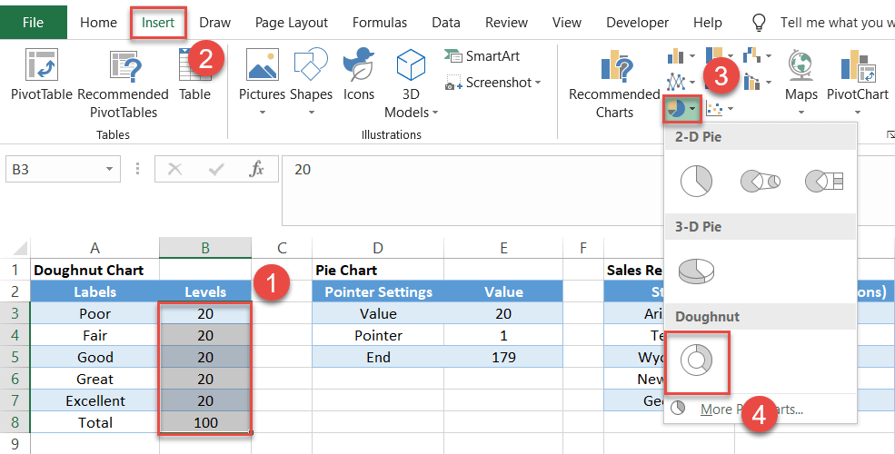
- Select the Speedometer column values.
- Go to the Insert tab.
- Click the Insert Pie or Doughnut Chart icon.
- Choose Doughnut.
Remove the legend.
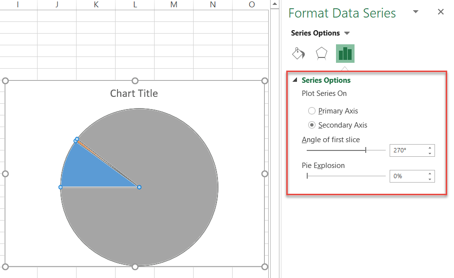
Step #3: Rotate the doughnut chart.
Next, you need to adjust the position of the chart to lay the groundwork for the future half-circle gauge.
- Right-click on the doughnut chart body and choose Format Data Series.
- In the pane that appears to the right, set the Angle of first slice to 270° and the Doughnut Hole Size value to 50%.
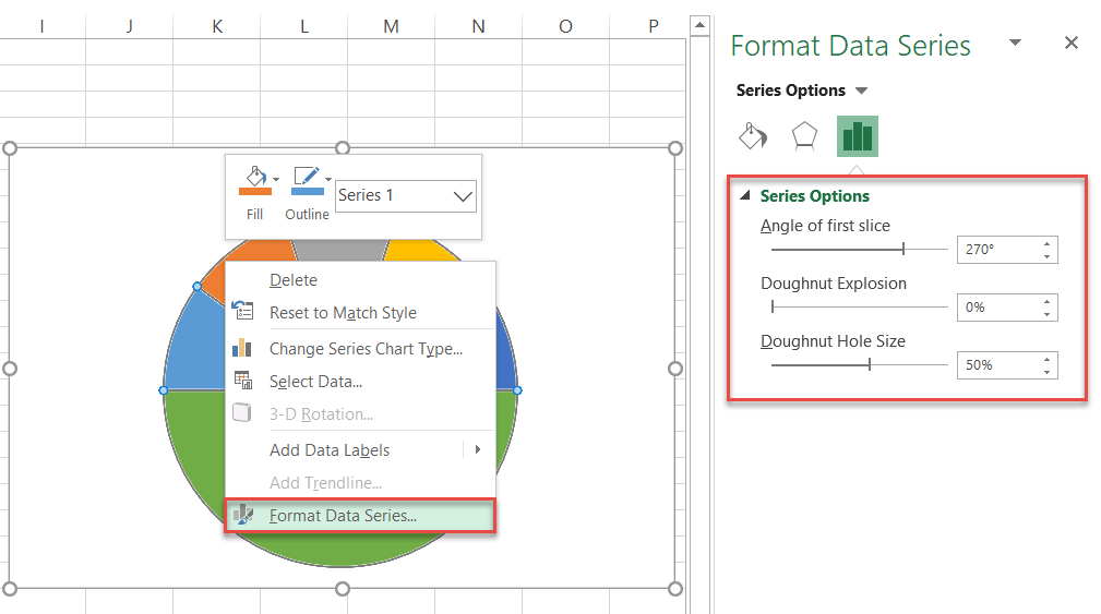
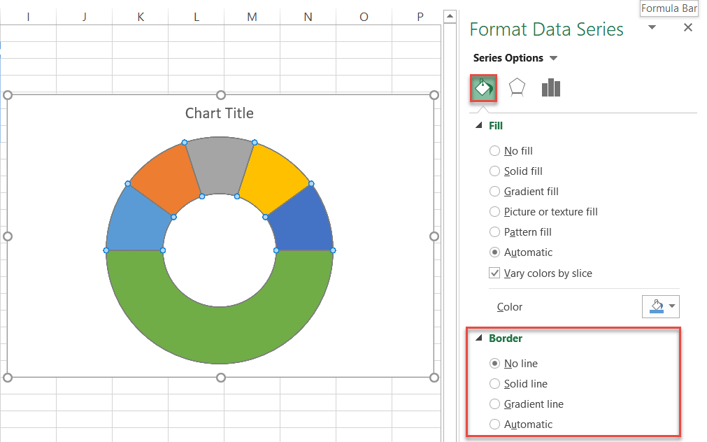
Step #4: Remove the chart border.
Once you’ve positioned the doughnut chart properly, click the Fill & Line icon in the pane, navigate to the Border section, and click the No line radio button to make the chart look nice and neat. You can now close the Format Data Series task pane.
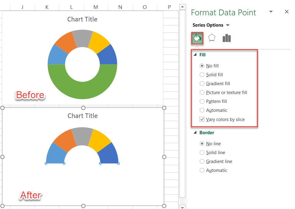
Step #5: Hide the biggest slice of the doughnut chart.
To turn the circle into a half-circle, you need to hide the bottom part of the chart. Think of the dial chart as the tip of an iceberg while the half-circle stays below the waterline, supporting the structure.
- Double-click on the bottom part of the chart to open the Format Data Point task pane.
- Again, go to the Fill & Line tab, and in the Fill section, choose No fill to make the bottom part disappear.
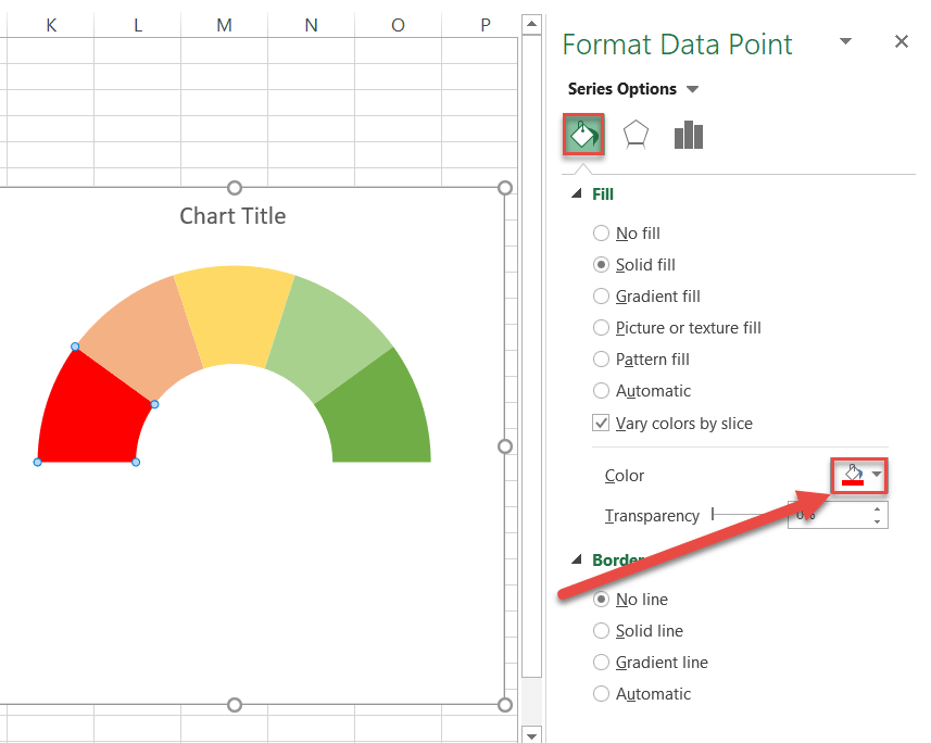
Step #6: Change the colors of the remaining slices.
We will use red, yellow, and green colors to represent how well the imaginary sales team did its job—let’s hope nobody gets fired!
Select any slice of the chart. In the Fill & Line section, click the Fill Color icon to open the color palette and pick your color for the slice. Select each slice individually and change the color of the corresponding slices.
Step #7: Add the pointer data into the equation by creating the pie chart.
It’s time for the pointer to come into play. Right-click the lovely half-gauge you’ve just created and choose Select Data.
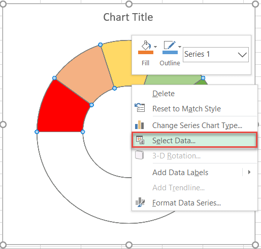
Once there, click the Add button, and do the following:
- Type “Pointer” into the Series Name field.
- Delete the default value {1} from the Series value field, leaving only “=” in that field.
- Select your pie chat data.
- Click OK.
- Click OK one more time to close the dialog box.
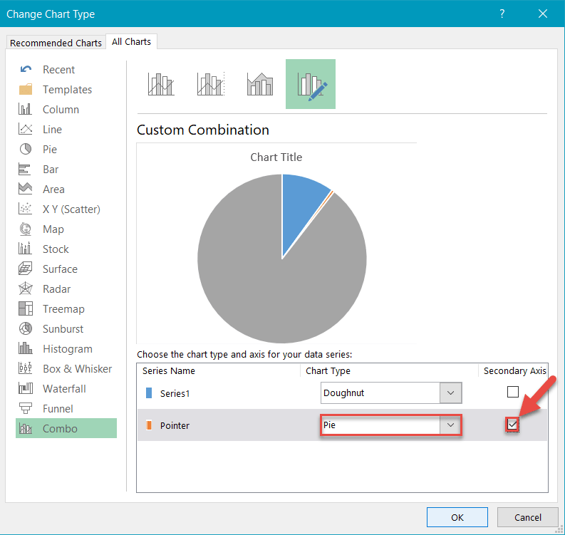
Step #8: Realign the two charts.
You need to realign the charts so that the pointer can work the way it should. First, right-click on the newly created outer chart and select Change Series Chart Type.
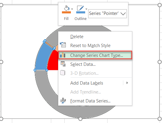
Now, down to the nitty-gritty:
- In the Chart Type dropdown menu next to Series “Pointer” (the outer circle), choose Pie.
- Check the Secondary Axis box next to Series “Pointer” and click OK.
Step #9: Align the pie chart with the doughnut chart.
To make the doughnut and pie charts work together, you need to rotate the newly-created pie chart by 270 degrees by repeating Step #3 outlined above (Format Data Series -> Angle of first slice -> 270°).
Step #10: Hide all the slices of the pie chart except the pointer and remove the chart border.
Well done! You’re almost at the finish line.
To make the pointer, hide the pie chart’s value and end slices so that only the pointer slice is left. Do this by following the same process showed in Step #4 (Format Data Series -> Fill & Line -> Border -> No line) to remove the pie chart border and Step #5 (Format Data Point -> Fill & Line -> Fill -> No fill) to make the unwanted slices invisible.
Also, you can change the pointer color to black to fix up the needle a bit (Format Data Point -> Fill & Line -> Color). At this point, here’s how the speedometer should look:
Step #11: Add the chart title and labels.
You’ve finally made it to the last step. A gas gauge chart without any labels has no practical value, so let’s change that. Follow the steps below:
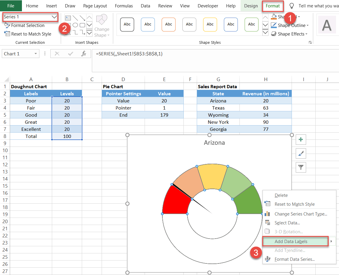
- Go to the Format tab.
- In the Current Selection group, click the dropdown menu and choose Series 1.
- This step is key! Tap the menu key on your keyboard or use the shortcut Shift + F10 (for PC)—or press and hold down the Control key and click once (for Mac)—to control-click the underlying doughnut chart. Why? Because you need to add the labels to the doughnut chart which was completely eclipsed by the pie chart.
- Choose Add Data Labels.
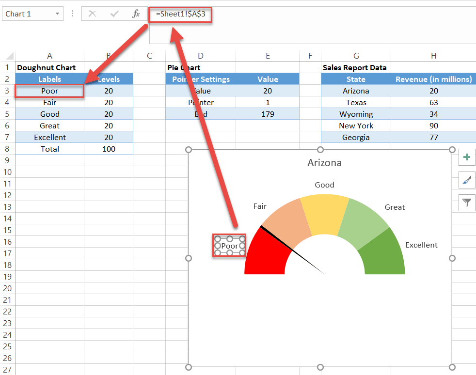
Next, make the labels match the intervals they represent:
- Remove the label for the hidden bottom section.
- Double-click on any label, enter “=” into the Formula bar, and select the corresponding value from the Meter Labels column.
- Move the labels to the appropriate places above the gauge chart.
- Change the chart title.
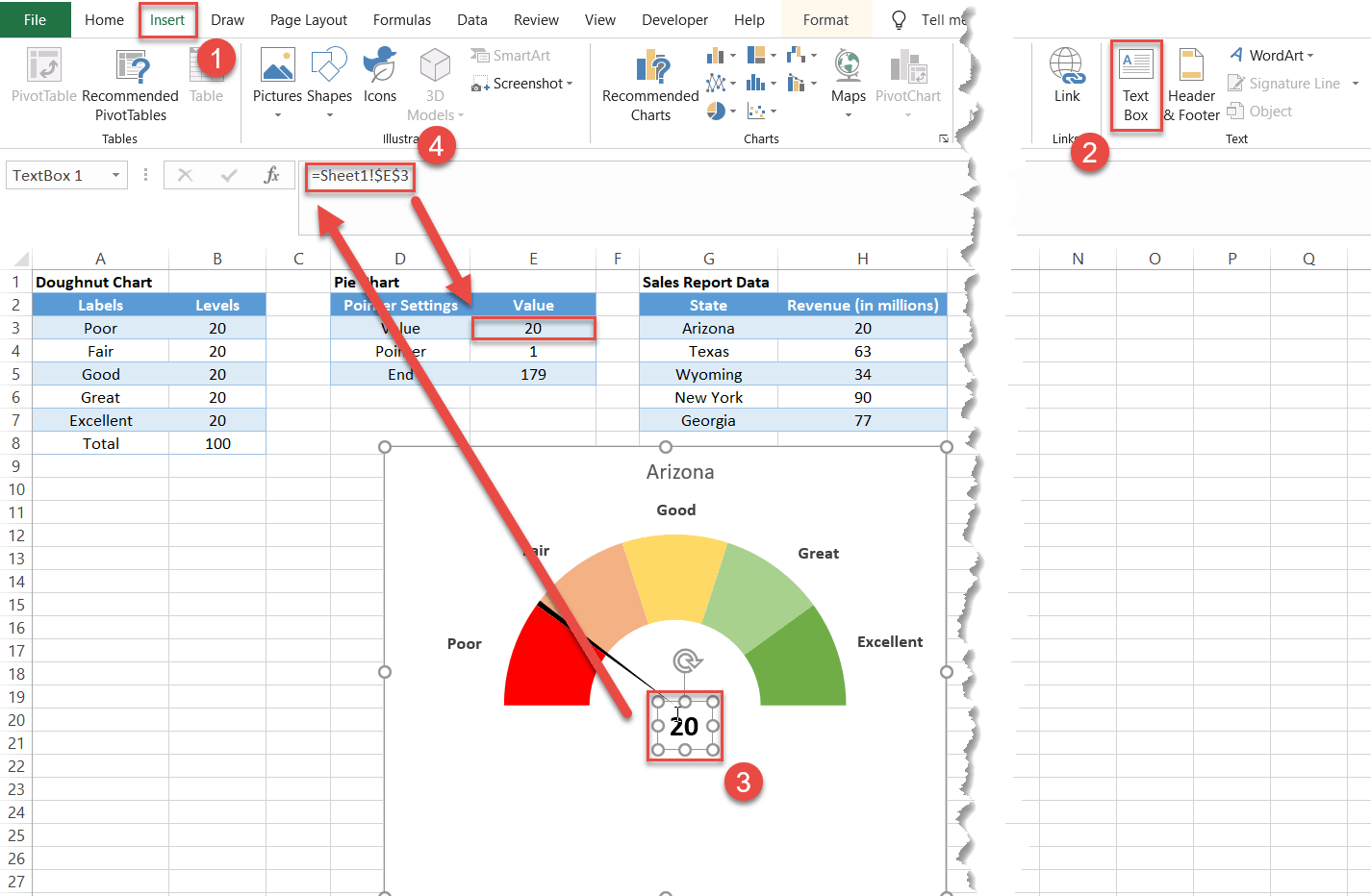
Bonus Step for the Tenacious: Add a text box with your actual data value.
Here is a quick and dirty tip on making the speedometer chart more informative as well as pleasing to the eye. Let’s add a text box that will display the actual value of the pointer.
- Go to the Insert tab.
- In the Text group, choose Text Box.
- Create a text field for your data.
- Type “=” in the Formula bar and select the cell containing the pointer value.
So there you have it! You now possess all the knowledge you need to create a simple gauge chart in Excel and take your data visualizations to the next level.
Gauge Chart – Free Template Download
Download our free Gauge Chart Template for Excel.
…or
Learn about our Gauge Chart Excel Add-in
