Excel Column Charts – Clustered, Stacked – Template
Written by
Reviewed by
This tutorial will demonstrate how to create and edit Column Charts in Excel.
Column Chart – Free Template Download
Download our free Column Chart Template for Excel.
Column charts are a popular option for presentations. They get their point across without a lot of explanation. But they are also used incorrectly by those who don’t understand their use.
Another similar chart is bar charts, which are essentially column charts turned on their sides. They serve a similar purpose but work better in some instances than others. Bar charts will be covered in another tutorial.
The following shows the different types of charts for both column and bar:
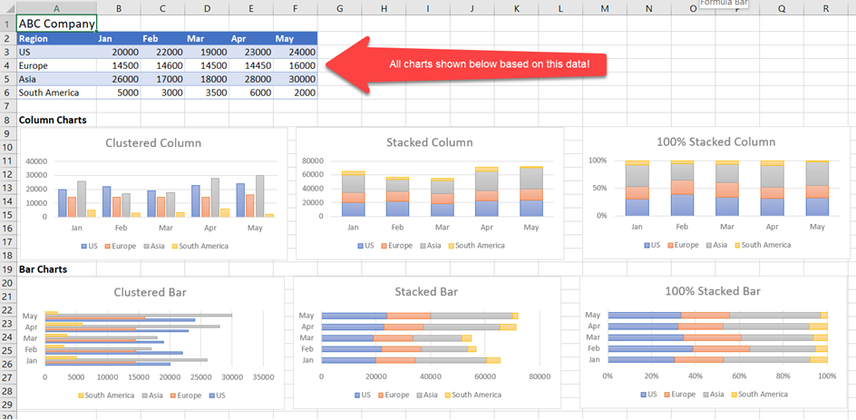
The three different types of column charts are:
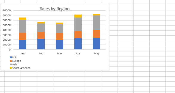
- Clustered – each data item is placed side-by-side. It shows a comparison of grouped items within a category. For the above data, this category is sales by region. Each bar in a cluster represents the region. Each cluster is grouped by the month.
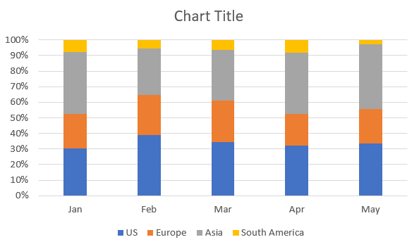
- Stacked – the data is the same, but each item is stacked. The overall column represents the total sales for that column. Each item (region) represents the contribution of the item to the overall total.
- 100% Stacked – this type of chart is meant to be an improvement over pie charts. It shows the proportion of each data component, much like a pie chart. However, comparisons can be made easier from one column to the next.
With Excel, you can create these charts with just a few clicks of a button.
Clustered Column Charts
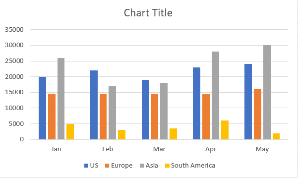
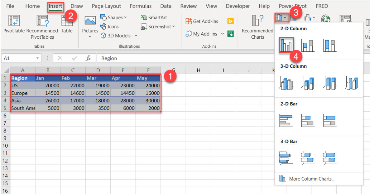
To create a clustered column chart, follow these steps:
- Select the data to include for your chart.
- Select the Insert menu option.
- Click the “Insert Column or Bar Chart” icon.
- Choose “Clustered Column.”
Note: These steps may vary slightly depending on your Excel version. This may be the case for each section in this tutorial.
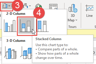
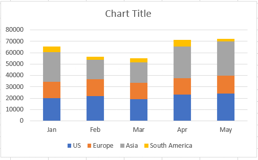
Stacked Column Charts
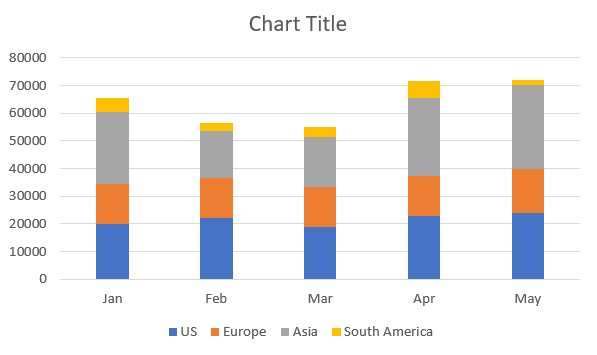
To create a stacked column chart, click this option instead:
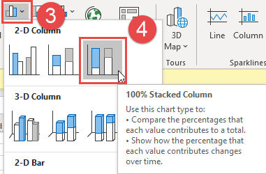
100% Stacked Column Chart
This style of chart is similar to the stacked column chart. The difference is that the component parts usually add up to 100%. To create this style of chart, select this option instead:
Changing Chart Types
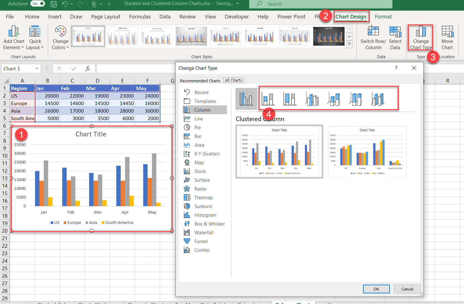
After you create a chart, it’s easy to switch to a different chart type:
- Select the chart you want to change.
- The chart will make the Chart Design menu option appear. Click on this item.
- Click on Change Chart Type.
- The current style that you initially chose will be selected. Click on any of the other options.
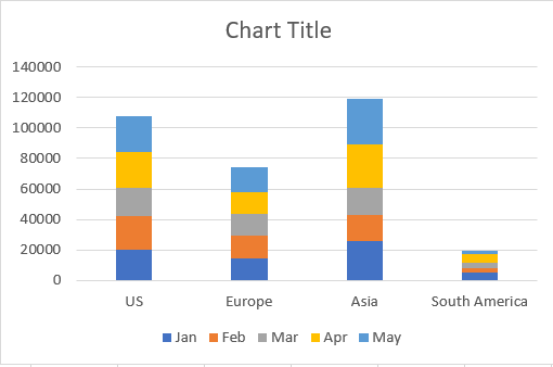
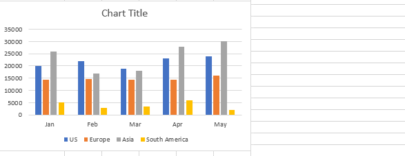
Swap Rows and Columns
You also have the option of swapping the rows and columns to change the x-axis values:
- Select the chart (if it isn’t already selected.)
- Choose the “Chart Design” menu option.
- Click on the Switch Row/Column
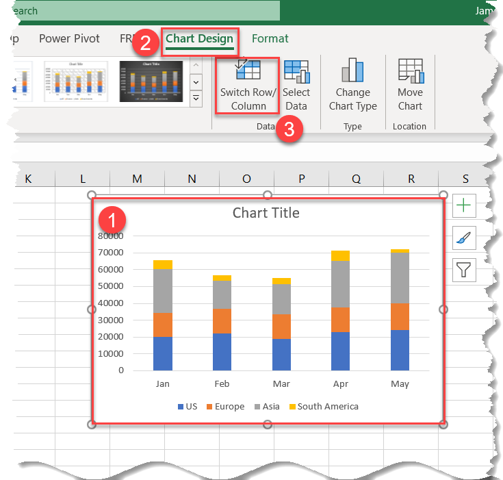
Now the graphed data is swapped:
Editing Options for Column Charts
Excel allows you to customize basically every aspect of charts. Below we’ll walk through a few customization options.
Edit Chart Title
First we will change the chart title to something descriptive.
- Click on the Chart Title
- Highlight the text
- Change the text to “Sales by Region” – or whatever you like.
Move & Resize Chart Objects
Next we will move the Chart Area and move and resize the Chart Legend. To move chart objects, select and drag them to their desired location:
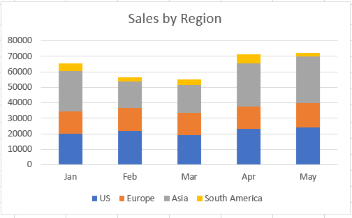
Chart Elements
The Chart Elements selector allows you to quickly change common settings for Chart Elements.
- Click on the Chart
- Press the green arrow
You can see that you can quickly make changes to various chart elements and see your changes in real-time.
You can access more options by clicking the black arrow to the right of a chart element:
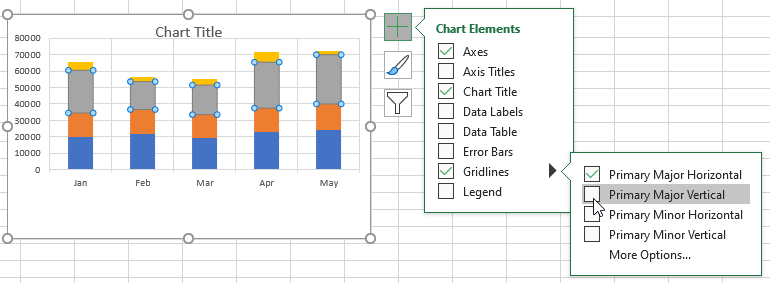
Chart Elements – Advanced
When working with data series, the Chart Elements selector can adjust all data series at once or individual series.
Let’s add data labels to only the US (Blue) data series.
- Select the Data Series
- Click the Green Arrow
- Click Data Labels
Instead, if you repeat the process without selecting an individual Data Series you’ll apply Data Labels to all Data Series.
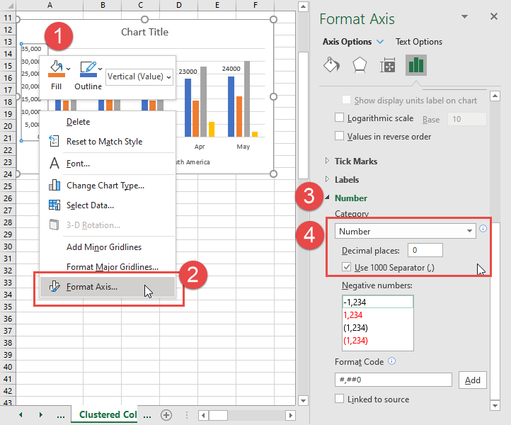
Chart Elements – Right-Click
Right-clicking on Chart Elements gives you the most customization options. Let’s format the chart y-axis.
- Right-click on the y-axis
- Select Format Axis
- Click the Number option
- Change the Number Formatting from General to Number
- Set Decimal Places to 0
Considerations with Column Charts
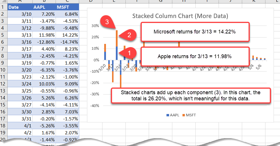
Column charts of any variety are a popular choice for data visualization. However, they aren’t always the right choice. For instance, stacked column charts are good for data points that contribute to the overall total. If you try to compare two data points that are not similar, the stacked columns will still get added.
For instance, suppose you are comparing the returns of two stocks, Apple and Microsoft. If the returns on a given day for Apple are 11.98% and for Microsoft are 14.22%, the stacked column for that day will show the total of 11.98% + 14.22% for a total of 26.20%. This total doesn’t represent anything meaningful. If you were comparing the industry of operating system development companies, then the percentages would represent the contribution of each data point to the total 26.20%.
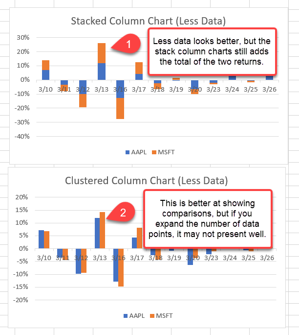
A clustered column chart is an improvement, but you’ll notice that the charting adds missing date points. Stocks in the United States don’t trade on weekends. These weekends are included in the chart, even if there are no data points. Even if you adjusted the chart to take those missing items out, the message you want to convey may get clouded:
Proportional Problems
When the differences for stacked columns charts are large, data is either distorted or values get lost. For instance, Google is the recognized leader in the search engine space, with a market share well in excess of 86%. It’s losing a bit of its market share to Bing/Yahoo and other smaller players, but showing this on a stacked column chart doesn’t depict the meaning properly. Take a look at the following chart:
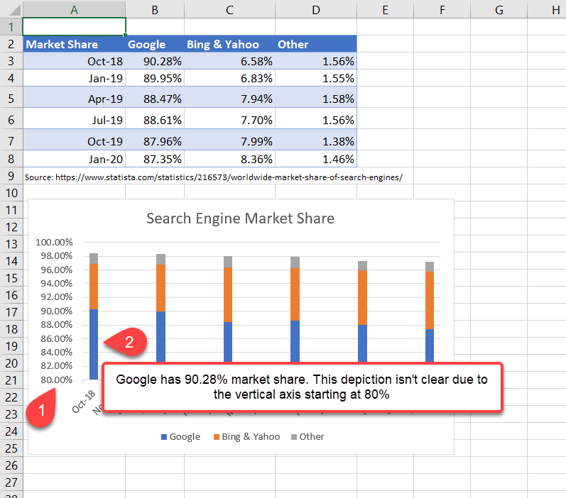
When you create a stacked column chart with the default settings, it will scale the display starting with the vertical axis starting at 80%. When comparing the columns visually, it doesn’t appear that Google has 90.28% of the market share and Bing/Yahoo only have 6.58%.
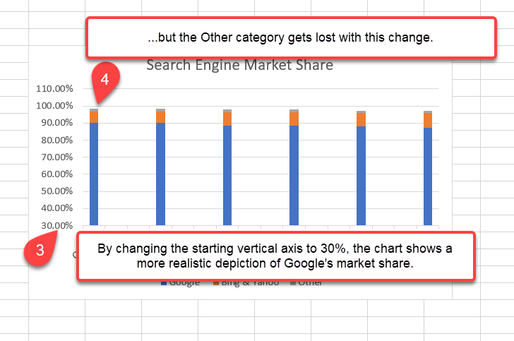
This option can be adjusted to lower the starting value for the vertical axis. For instance, when you change it from 80% to 30%, the depiction of Google’s dominance is more pronounced. But the values for the Other category get completely lost:
Alternative Chart Options than Column Charts
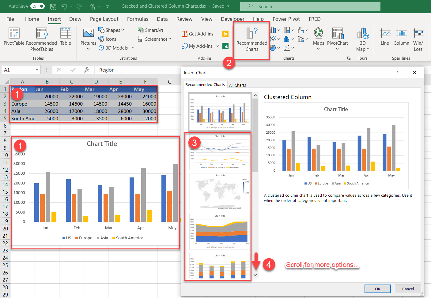
Column charts are a popular choice, but they aren’t the only ones available. Excel has a feature that recommends charts based on the data you have highlighted. This feature doesn’t always recommend the best choice, but it’s a good starting point.
To access, follow the steps below:
- Select the data or an existing chart created from the data.
- Select the Recommended Charts
- Choose from the list of recommended charts.
- Scroll down for more option.
Selecting the right chart options takes practice. It’s helpful to view attractive visualizations from presentations you see on the web or are contained in documents and spreadsheet on your computer. Take a critical look at charts that you see to determine if they make sense for the data. Is the message clear from the chart alone? If the viewers of your charts must rely on the text to explain the charts, you may want to try a different chart type. Feedback from your viewers will be your biggest ally.
