Add Error Bars to Charts – Excel & Google Sheets
Written by
Reviewed by
Last updated on October 30, 2023
This tutorial demonstrates how to add error bars to charts in Excel and Google Sheets.
Add Error Bars to Charts – Excel
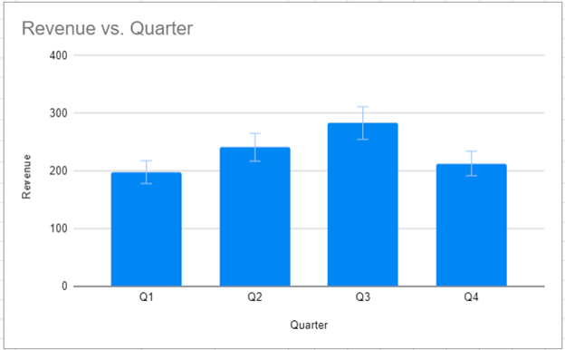
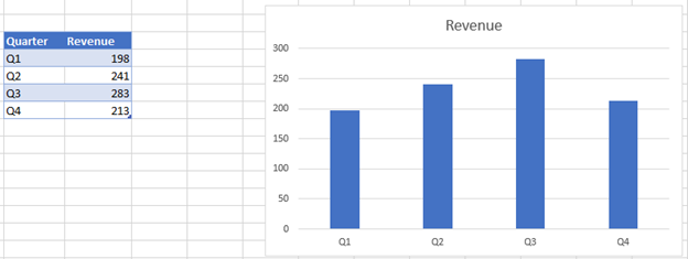
We will add error bars to the chart below.
- Click on the + Sign in the top right of the graph
- Select the arrow next to Error Bars
- Select what type of error bars to create (see below for descriptions)
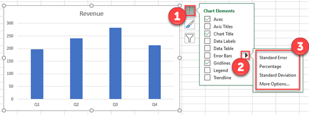
Standard Error – Shows the standard error of the mean (average) for all values
Percentage – Adds error bars based on a percentage (default = 5%)
Standard Deviation – Shows error bars based on the number of standard deviations (default = 1) away from the average.
More Options – Customize Error Bars
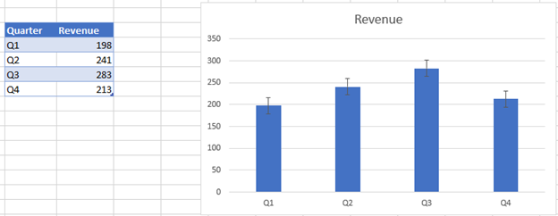
Final Graph with Error Bars
After applying the error bars, your charts will look like this:
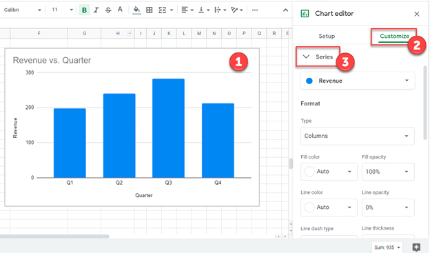
Add Error Bars to Charts – Google Sheets
Using the same data as above, we will add error bars to a chart in Google Sheets:
- Double click graph
- Select Customize
- Click Series
4. Select Error Bars
5. Customize how you would like under Type
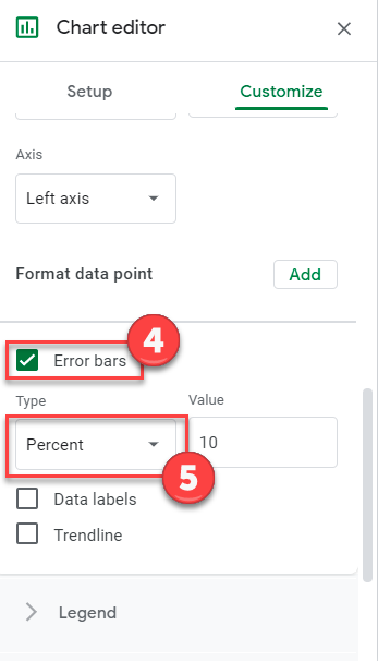
And the final graph with error bars will look something like this: