Frequency Polygon – Excel & Google Sheets
Written by
Reviewed by
Last updated on February 8, 2023
This tutorial will demonstrate how to create a Frequency Polygon in Excel & Google Sheets.
Create a Frequency Polygon in Excel
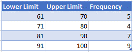
We’ll start with the frequency distribution table below:
Find the Midpoint
First, find the midpoint of the lower and upper limits with the formula:
=AVERAGE(B6,C6)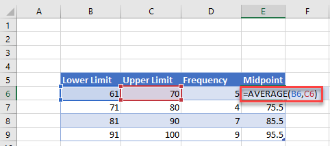
Create the Graph
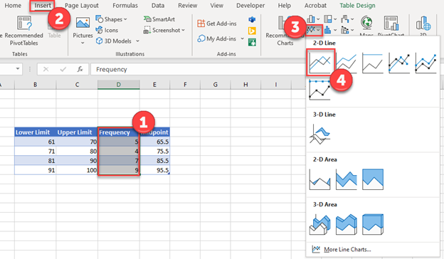
- Select the Frequency Column
- Select Insert
- Click on the Line Graph Icon
- Select the first Line Graph
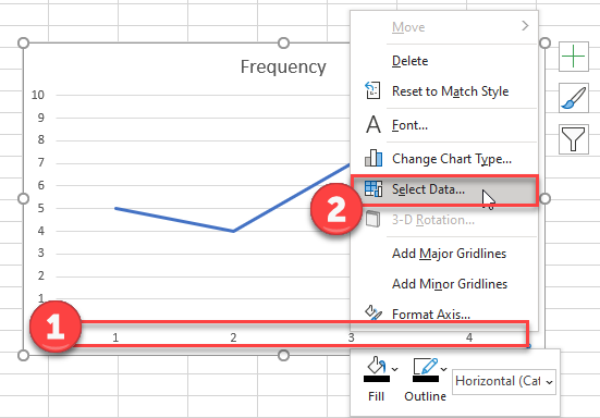
Update X Axis
- Click on the X Axis
- Click Select Data
3. Select Edit
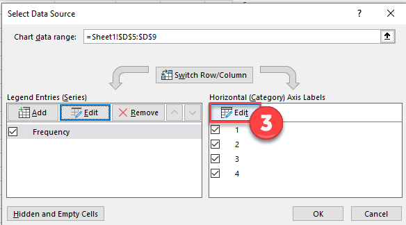
4. Highlight Midpoint Data points
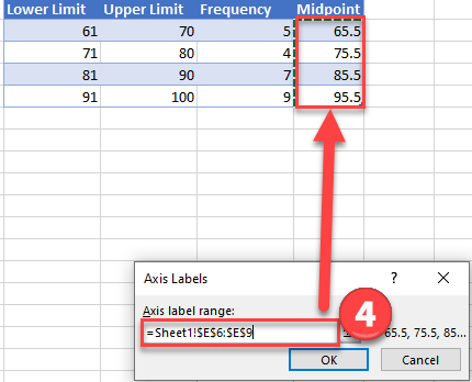
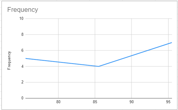
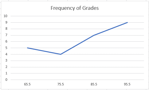
5. Click OK and your graph will look like this:
Create Frequency Polygon in Google Sheets
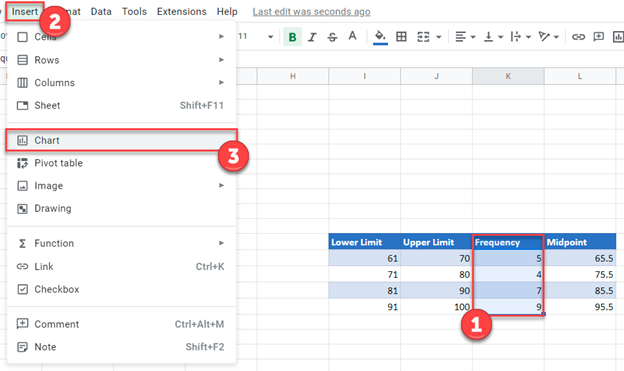
- Click on Frequency Column
- Select Insert
- Click Chart
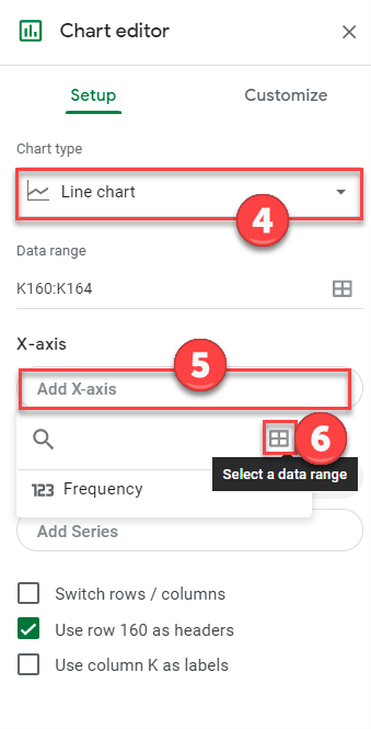
4. Change Chart Type to Line Chart
5. Select X-Axis
6. Click on box that shows Select a Data Range
7. Select Midpoint Data for Data Range
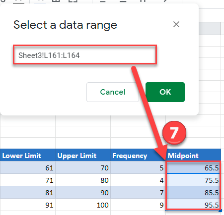
8. Click OK and your final graph will look like this: