Normal Probability Plot – Excel & Google Sheets
Written by
Reviewed by
Last updated on February 8, 2023
This tutorial demonstrates how to create a Normal Probability Plot in Excel & Google Sheets.
Normal Probability Plot – Excel
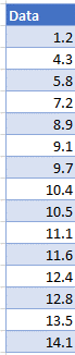
Starting with your Data
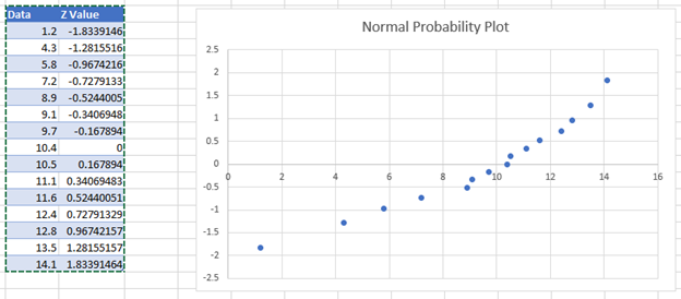
We’ll start with this dataset of 15 values.
Calculate the Z Values
In the next column, create a formula with the NORM.S.INV, RANK, and COUNT Functions:
=NORM.S.INV((RANK(D5,$D$5:$D$19,1)-0.5)/COUNT(D:D))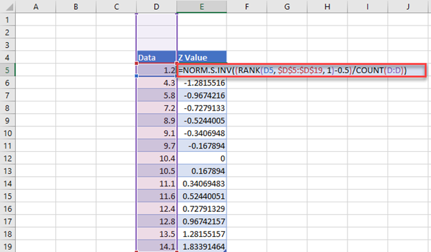
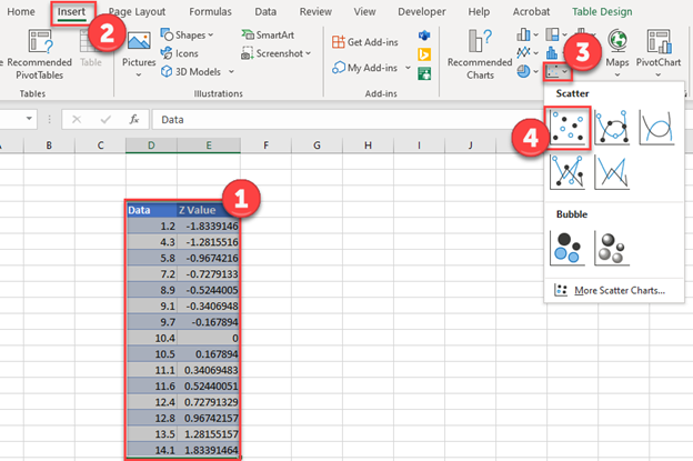
Create Probability Graph
- Highlight Data
- Select Insert
- Click Scatter
- Select first Scatterplot
Final Normal Probability Plot
Below, you can see the final normal probability plot.
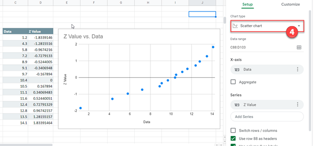
Normal Probability Plot – Google Sheets
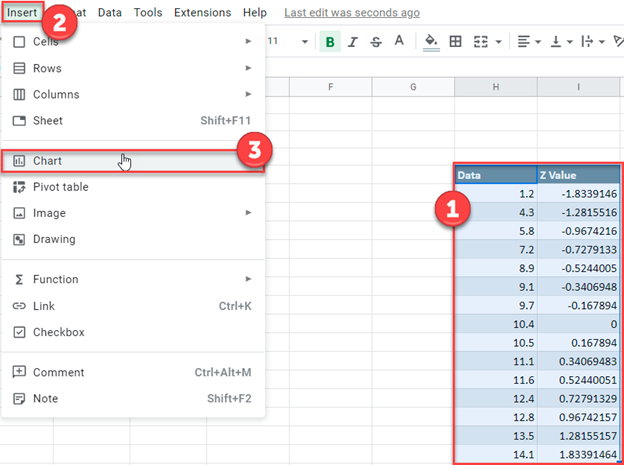
- Highlight the data
- Select Insert
- Click Chart
4. After changing the Chart Type to Scatter Chart, your graph should look similar to the one below.