Excel Population Pyramid
Written by
Reviewed by
This tutorial will demonstrate how to create a Population Pyramid in Excel.
Population Pyramid – Free Template Download
Download our free Population Pyramid Template for Excel.
How to Create a Population Pyramid Chart in Excel
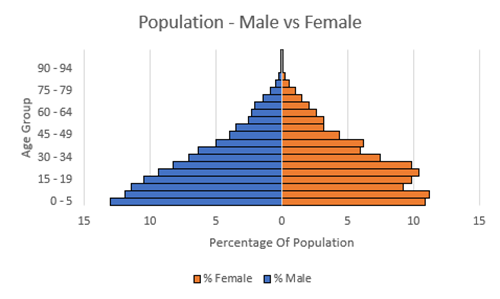
A Population Pyramid Chart is useful when visually showing subsets within a population for specific groups. In this case, we want to show the % of the population that is Male and Female for specific age groups.
Creating your Data
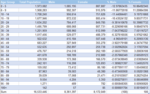
We’ll start with a dataset that gives information about a population. As discussed, we’ll be working with data that shows the population of males vs females in age groups as seen below. You can also follow along with data I’m using in this example by downloading the report: Population Pyramid Download
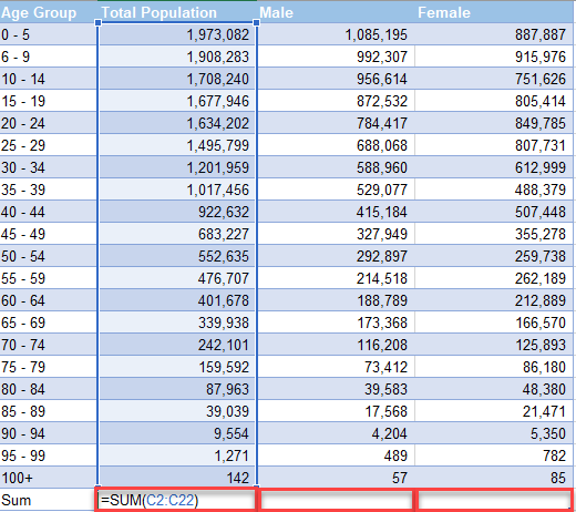
Sum the Total
Create a Total Row to Sum the Total Population, Total Males, and Total Females by using the formula:
=SUM(), where the numbers in the parenthesis are the first and last number in the series
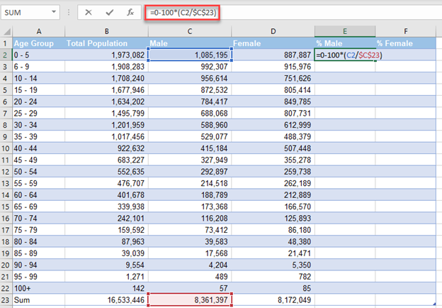
Calculate Percentage that is Male & Female
- To Calculate % Male, insert formula =0-100*(C10/$C$31)
2. To Calculate % Female, insert formula =100*(D10/$D$31)
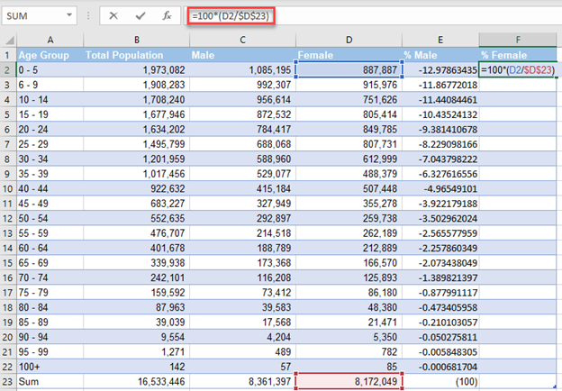
3. Drag these formulas down and you’ll see the results similar to below.
Copying Information to New Worksheet
- Copy (Ctrl + C) the Age Group and paste (Ctrl + V) to another tab
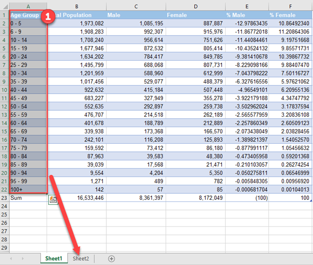
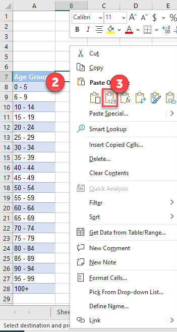
Copy (Ctrl + C) % Male and % Female and go to new tab.
2. Right Click
3. Select Paste Values
Create Horizonal Bar Graph
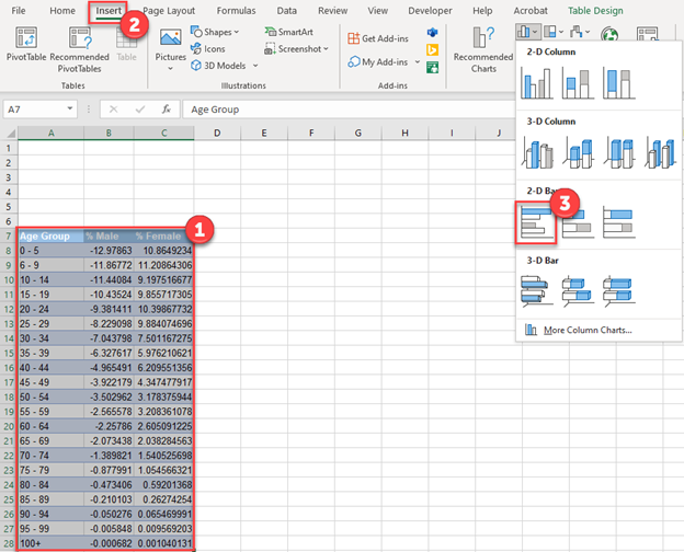
- Highlight table
- Click Insert in ribbon
- Click Horizontal 2D Bar
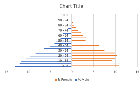
You should see a graph that looks like below. But we still need to clean up some formatting.
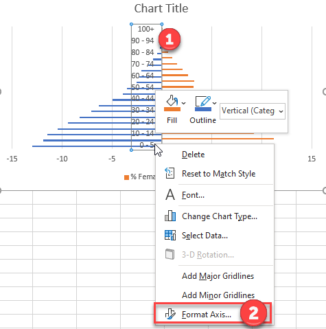
Moving Axis
- Right Click on Y Axis (Age Groups)
- Click on Format Axis
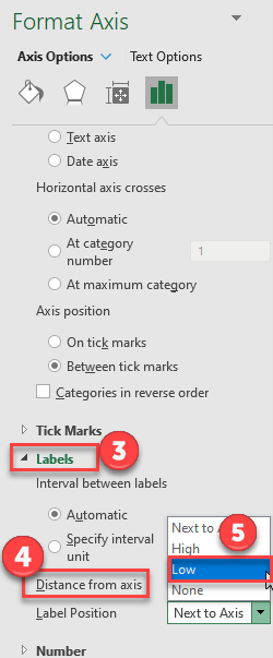
3. Click on Labels
4. Select Distance from Axis
5. Select Low
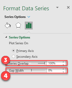
Adjust Gaps
- Right Click on one of the Series
- Select Format Data Series
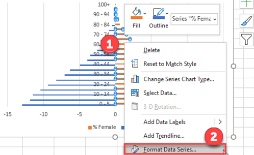
3. Change the Series Overlap to 100%
4. Change the Gap Width to 0%
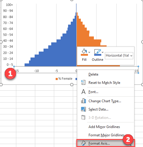
Update X Axis
- Right Click on the X Axis
- Select Format Axis
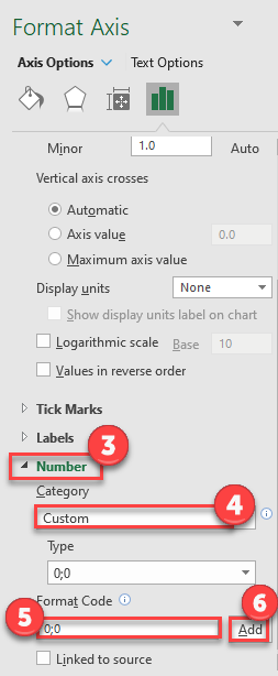
3. Click on Number
4. Select Custom
5. Under Format Code type 0;0
6 Click Add
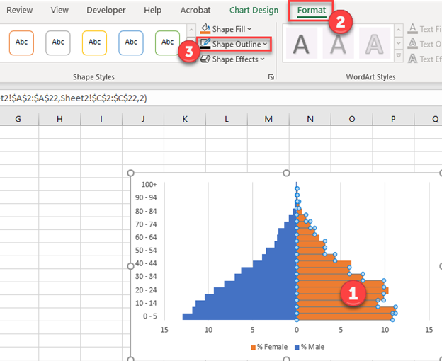
Adding an Outline to the Bars (Optional)
- Select Data Series
- Click Format
- Select Shape Outline and pick the color of your outline.
Use this method for both sets of data to make it look more visually pleasing.
Final Population Pyramid Chart
After adding Axis Titles (How to add Axis Labels) we now have a finished pyramid chart that shows the population of female vs male.

Population Pyramid – Free Template Download
Download our free Population Pyramid Template for Excel.
