Excel Thermometer Chart – Free Download & How to Create
Written by
Reviewed by
This tutorial will demonstrate how to create a thermometer chart in all versions of Excel: 2007, 2010, 2013, 2016, and 2019.
Thermometer Chart – Free Template Download
Download our free Thermometer Chart Template for Excel.
In this Article
- Thermometer Chart – Free Template Download
- Getting started
- Step #1: Set up the helper table.
- Step #2: Create a stacked column chart.
- Step #3: Stack the data series on top of each other.
- Step #4: Change the data marker colors.
- Step #5: Add the data label to the chart.
- Step #6: Change the data label value.
- Step #7: Reposition the data label.
- Step #8: Move Series 1 “Target Revenue” to the secondary axis.
- Step #9: Remove the secondary axis.
- Step #10: Modify the primary axis scale ranges.
- Step #11: Change the number format of the primary axis scale and add tick marks.
- Step #12: Remove the chart title, gridlines, and horizontal axis.
- Step #13: Change the gap width of the data series on the secondary axis.
- Step #14: Change the gap width of the data series on the primary axis.
- Step #15: Add the thermometer bulb to the chart.
- Download Thermometer Chart Template
A thermometer chart is a special modification of a stacked column chart. The columns are placed on top of each other and visually resemble a thermometer, which fills up as you progress towards your goal.
Any time you need to track progress towards a goal—be it funding, sales, revenue, or other relevant metrics—this chart provides a simple and effective way to visualize that data.
But a simple thermometer chart just doesn’t cut the mustard anymore (come on, this is 2020!).
In this in-depth, step-by-step tutorial, you will learn how to plot a remarkably versatile thermometer goal chart with a fancy label that works even when your results exceed a stated goal.
Just check it out:
As you will see shortly, building an impressive thermometer chart takes tons of effort. That’s why we designed the Chart Creator Add-In, a tool for building advanced Excel charts in just a few clicks.
So, let’s get down to the nitty-gritty.
Getting started
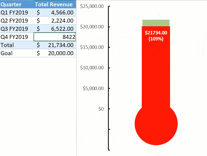
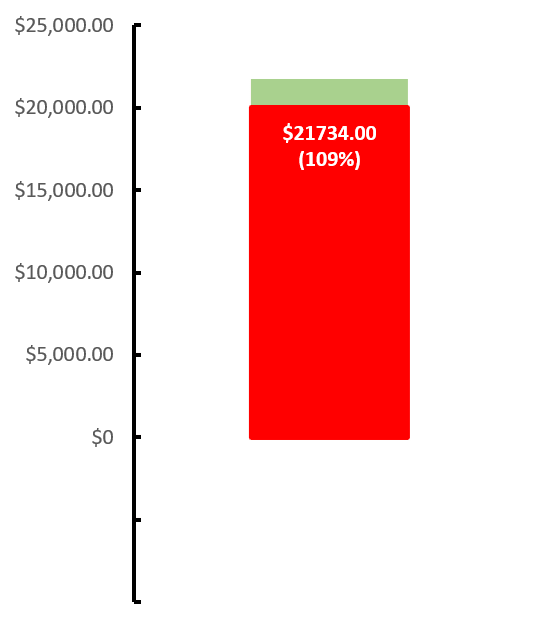
For illustration purposes, imagine you launched an e-commerce store as a side hustle and want to build a thermometer chart to keep track of the store’s performance against your stated revenue goal. In 2019, you had a pretty good run.
The store generated $21,734 in revenue, slightly exceeding your initial goal (you can pop a bottle of champagne later).
That being said, take a look at the dataset for the chart:
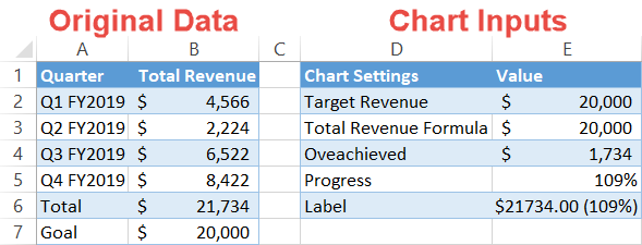
Before we move on to building the chart, we need to break down each data point so that you can easily retrace the steps using your data.
The data set has two columns:
- Original Data: This column represents your actual data, whatever it may be. Just leave it as it is.
- Chart Inputs: This is where all the magic happens. The table contains all the special values you will use for building the chart. Also, an important note: the categories must be ordered in the exact same way as shown on the screenshot above!
You might be wondering where all the values in the second table come from. Well, you will actually have to calculate them yourself using the special Excel formulas listed below (surprise, surprise).
Unfortunately, there is no other way around it—but the instructions below should make it fairly easy to follow.
So the journey begins!
Step #1: Set up the helper table.
As the linchpin holding it all together, each of the elements in the second table have their purpose. Let’s cover these bad boys more in detail.
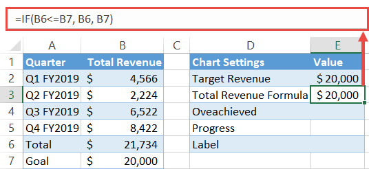
Target Revenue: This data point should match the goal value (B7). As simple as that.
Total Revenue Formula: This IF function prevents the data markers from stacking on top of each other the wrong way in case the result exceeds the goal:
=IF(B6<=B7, B6, B7)Here is the decoded version based on the original data:
=IF({Total}<={Goal}, {Total}, {Goal})Translation into basic human language: if the result (B6) is less than or equal to the goal (B7), the formula returns the result value (B6)—in our case, anything that falls below the $20K mark. Conversely, if the result (B6) exceeds the goal (B7), the formula returns the goal value (B7).
Quick tip: click the “Accounting Number Format” button (Home tab > Number group) to display the function output as currency.
Overachieved: This IF function calculates whether or not your target is overachieved. Whenever that takes place, the formula subtracts the goal (B7) from the result (B6) and returns what is left over. Otherwise, the formula simply shows zero:
=IF(B7<=B6, B6-B7, 0)The decoded version:
=IF({Goal}<={Total}, {Total}-{Goal}, 0)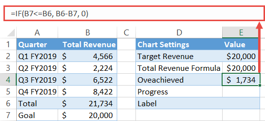
Progress: This one is pretty self-explanatory. We need to measure the progress as a percentage of the goal for our ultra-fancy label. Simply divide the result (B6) by the goal (B7) and format the output as a percentage—click the “Percent Style” button (Home tab > Number group).
=B6/B7Decoded version:
={Total}/{Goal}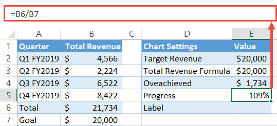
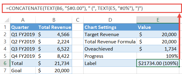
Label: The icing on the cake. This one combines the numeric and percentage values representing the progress towards your goal and neatly formats them. To pull it off, we will turn to the TEXT function (Excel newbies, brace for impact):
=TEXT(B6, "$#0.00") & " (" & TEXT(E5, "##0%") & ")"And the decoded version:
=TEXT({Total}, "{Format the value as currency}") & " (" & TEXT({Progress}, "{Format the value as percentages}") & ")"If that seems daunting, check out the article linked above covering the function.
Here is how it looks in practice:
Whew, the worst is behind us. To sum it all up, take a second glance at the formulas:
| Chart Setting | Formula |
| Total Revenue Formula | =IF(B6<=B7, B6, B7) |
| Overachieved | =IF(B7<=B6, B6-B7, 0) |
| Progress | =B6/B7 |
| Label | =TEXT(B6, “$#0.00″) & ” (” & TEXT(E5, “##0%”) & “)” |
Once there, move on to the next step.
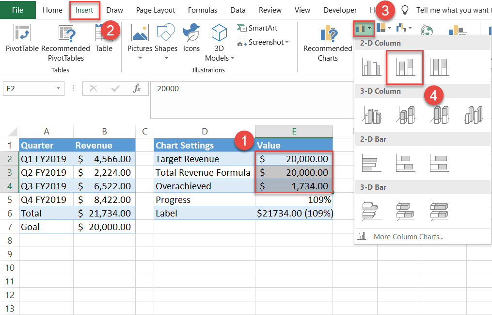
Step #2: Create a stacked column chart.
- Highlight the cell range E2:E4 in the Value
- Select the Insert
- Click the “Insert Column or Bar Chart” icon.
- Choose “Stacked Column.”
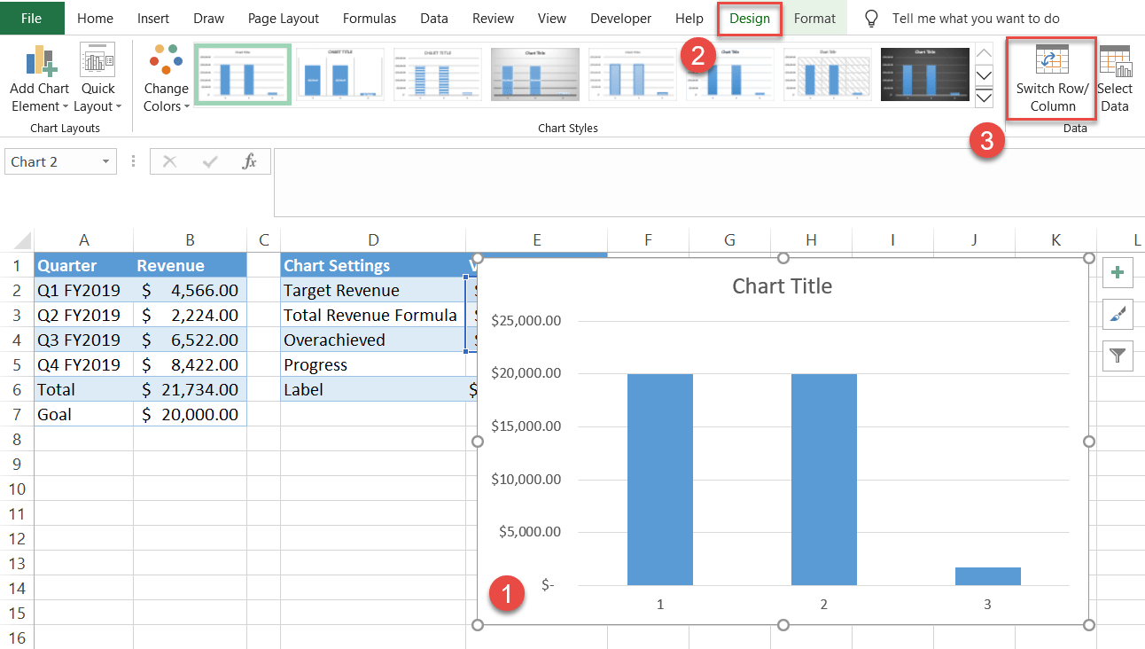
Step #3: Stack the data series on top of each other.
Once the chart appears, rearrange the data series:
- Click on the chart.
- Switch to the Design
- Choose “Switch Row/Column.”
Step #4: Change the data marker colors.
To turn the chart into something resembling a thermometer, start by changing the color of the data markers. First, make the data marker for Series 1 “Target Revenue” (E2) transparent and put border lines around it.
Right-click on the data marker representing the “Target Revenue” (E2—the bottom section of the chart) and select “Format Data Series.”
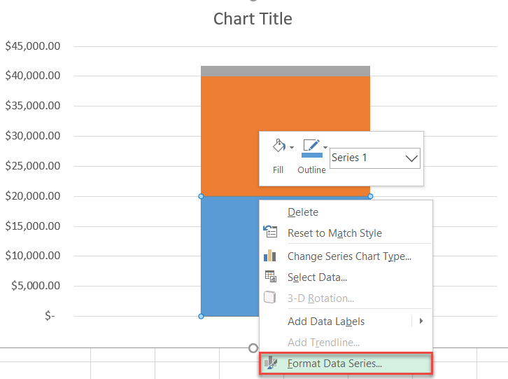
In the task pane that pops up, do the following:
- Navigate to the Fill & Line
- Under “Fill,” select “No fill.”
- Under “Border,” choose “Solid line.”
- Under “Border,” click the Fill Color icon to open the color palette and select red.
- Set the Width value to 2 pt.
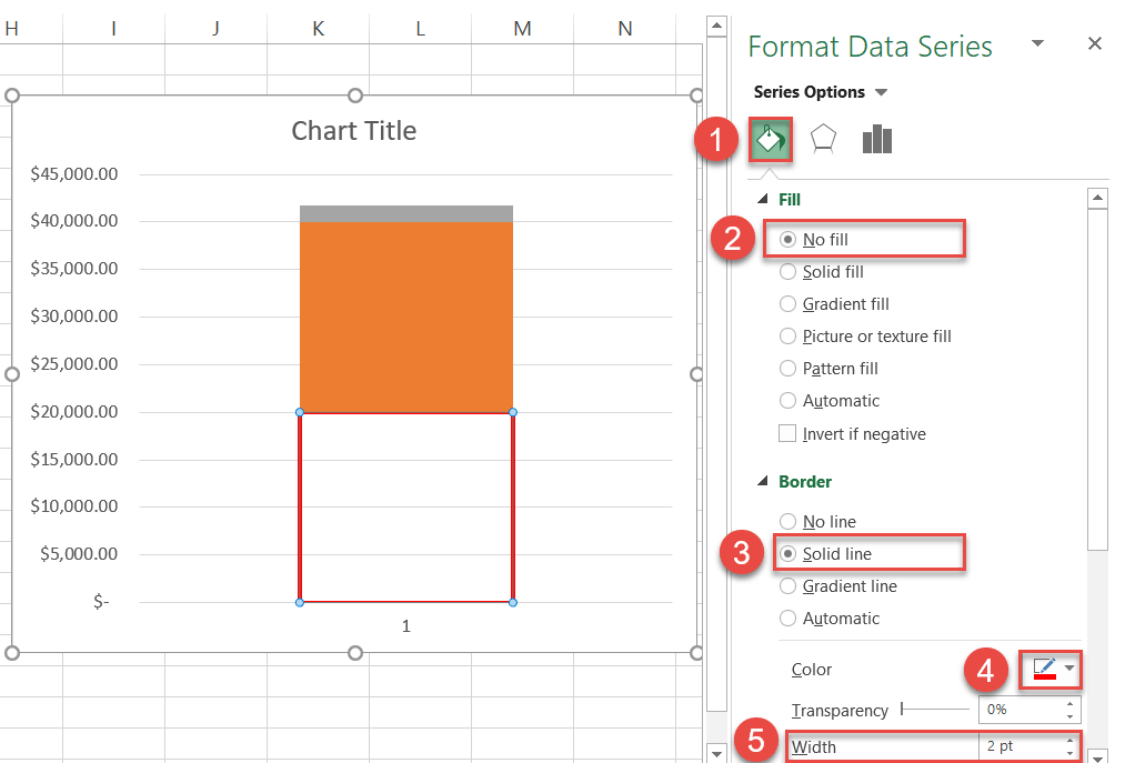
Color the other data markers as follows:
- For Series 2 “Total Revenue Formula” (E3):
- Select the data marker (E3) with the Format Data Series task pane still open.
- Under “Fill,” choose “Solid fill.”
- Click the Fill Color icon and select red.
- For Series 3 “Overachieved” (E4):
- Select the data marker (E4) with the Format Data Series task pane still open.
- Under “Fill,” choose “Solid fill.”
- Click the Fill Color icon and select light green.
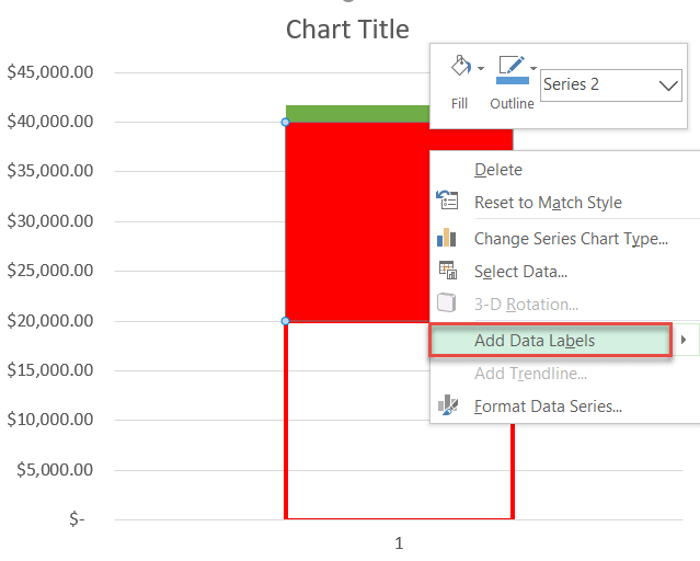
Step #5: Add the data label to the chart.
Now it’s time to insert the lovely data label (E6) that took us so much blood, sweat, and tears to put together.
Right-click on Series 2 “Total Revenue Formula” (the one with a red fill) and choose “Add Data Labels.”
Step #6: Change the data label value.
Link the label to the value in the second table.
- Double-click on the label.
- Type “=” into the Formula bar.
- Select the Label value (E6).
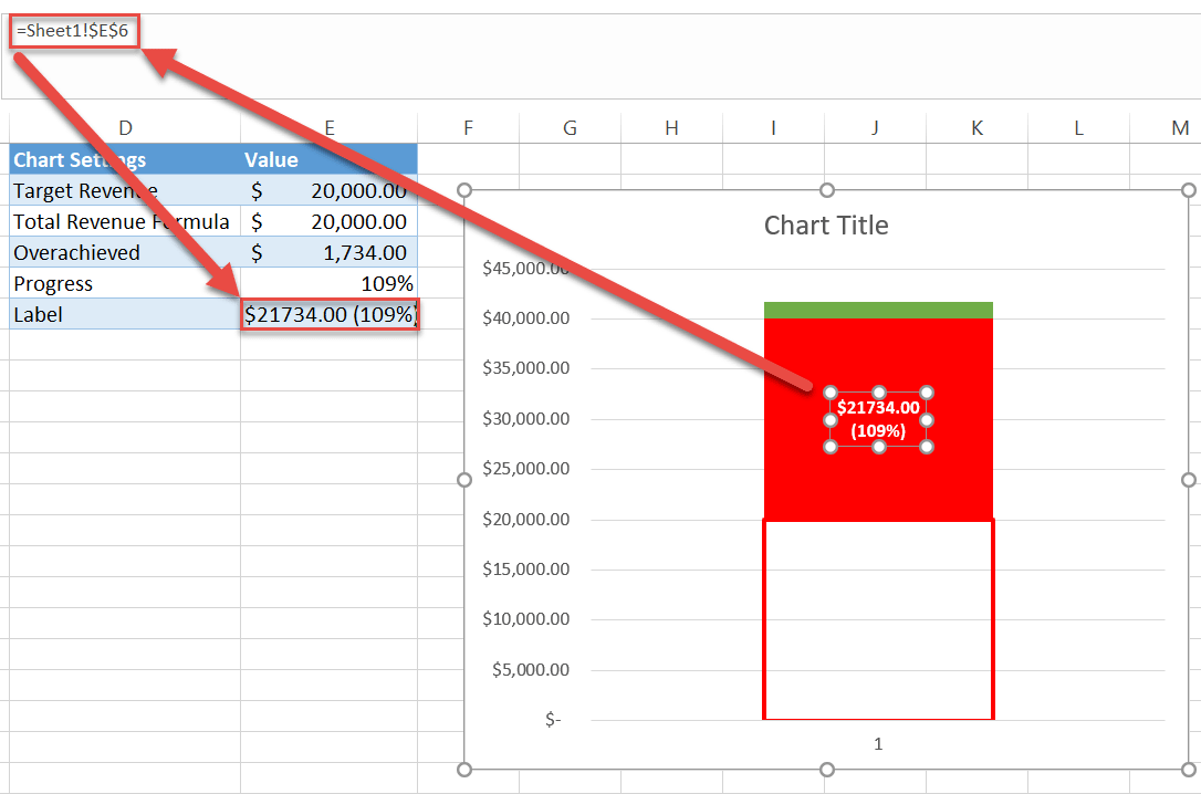
Now we need to spruce it up a bit. Make the label bold, color it in white, and change the font size to enhance the element aesthetically (Home tab > Font group).
Step #7: Reposition the data label.
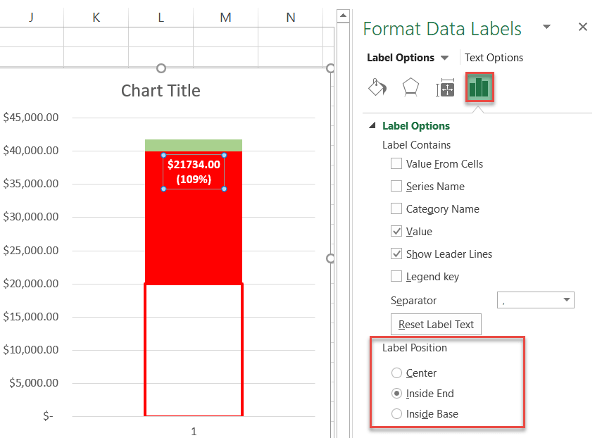
After you have set up the label, push it to the upper end of the related data marker. Right-click on the data label and choose “Format Data Labels.”
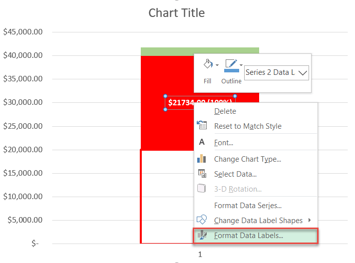
Then, in the Label Options tab, under Label Position, choose “Inside End.”
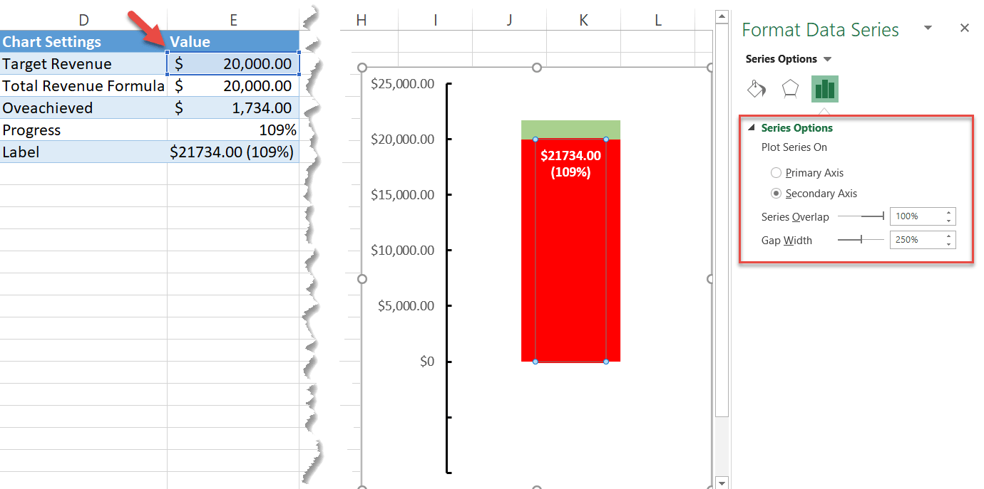
Step #8: Move Series 1 “Target Revenue” to the secondary axis.
To mold the chart into a thermometer shape, you need to get Series 1 “Target Revenue” (E2) in the right position.
- Right-click on Series 1 “Target Revenue” (the transparent one at the very bottom).
- Pick “Format Data Series.”
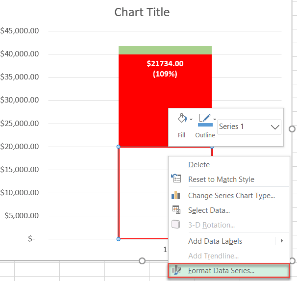
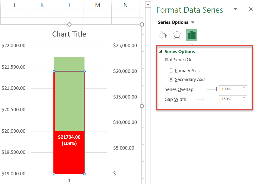
In the task pane that appears, under Plot Series On, choose “Secondary Axis.”
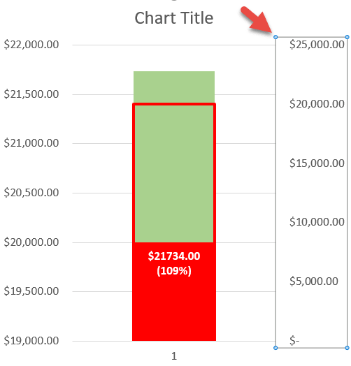
Step #9: Remove the secondary axis.
The secondary axis did its job, so we no longer need it.
Right-click on the secondary axis (the column of numbers on the right) and select “Delete.”
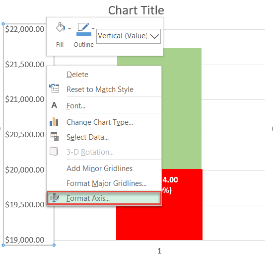
Step #10: Modify the primary axis scale ranges.
As you may have noticed, the primary axis scale looks a bit off. Let’s change that.
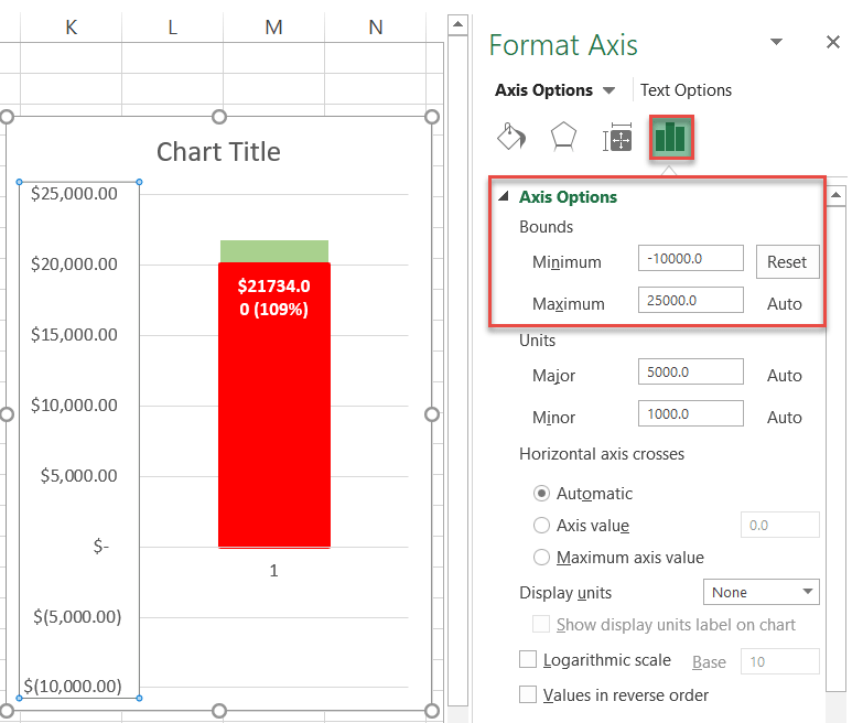
Right-click on the primary axis scale and choose “Format Axis.”
Set the Minimum Bounds value to -10000. Why? Doing so will free up some space below for the thermometer bulb.
This value differs based on your chart data. A good rule of thumb is to use your goal number and divide it by two.
For instance, suppose your revenue goal is $100,000. Then your Minimum Bounds value would be -50000.
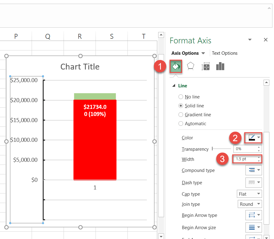
Step #11: Change the number format of the primary axis scale and add tick marks.
Those negative numbers do not help us here. Fortunately, we can easily get rid of them using the power of custom number formats.
With the Format Axis task pane still open, under Axis Options, navigate to the Numbers section and do the following:
- For “Category,” select “”
- Type “$#,##0.00;;$0” into the Format Code field and click Add.
Also, under Tick Marks, choose “Inside” from the “Major type” dropdown menu.
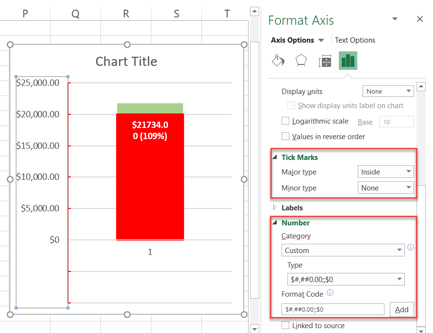
Now, switch to the Fill & Line tab. Change the color of the tick marks to black and set the Width value to 1.5 pt.
Step #12: Remove the chart title, gridlines, and horizontal axis.
Remove the chart elements that have no practical value: the chart title, gridlines, and horizontal axis. Right-click each element and select “Delete.”
Step #13: Change the gap width of the data series on the secondary axis.
As you are putting the final touches on your chart, slim down the thermometer tube. Start with the series placed on the secondary axis (Series 1 “Target Revenue”).
Right-click on Series 1 “Target Revenue” (E2), open the Format Data Series task pane, and set the Gap Width value to 250%. Increase the percentage if you want to slim it down more.
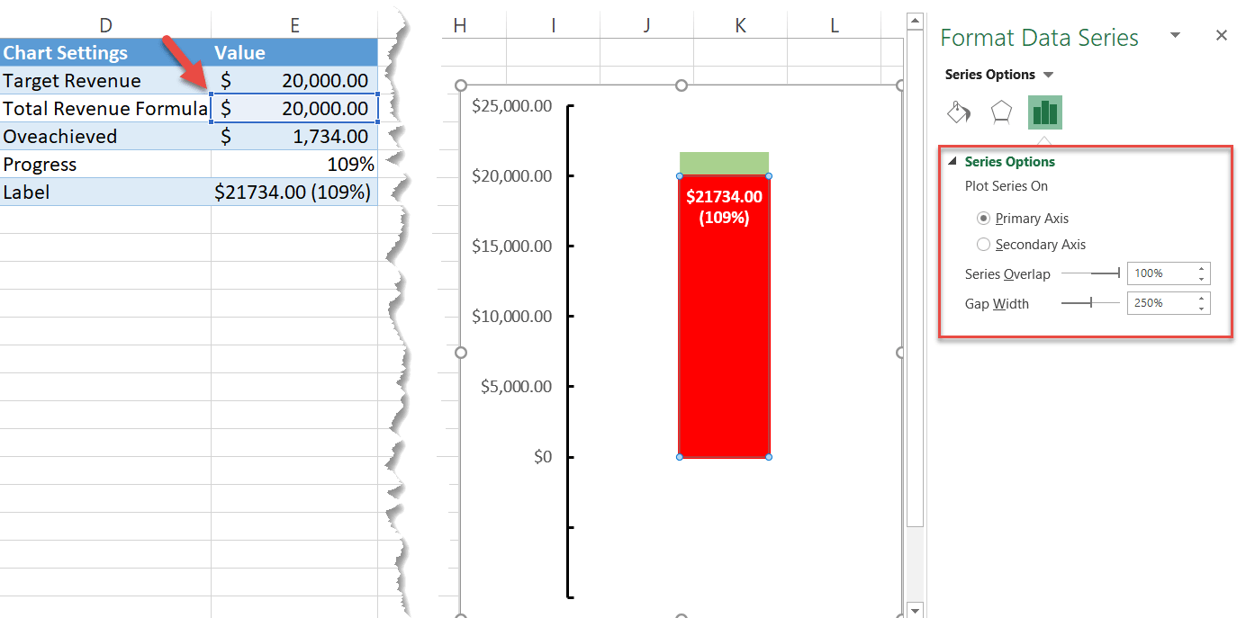
Step #14: Change the gap width of the data series on the primary axis.
After that, click the edge of the red tube once more to select Series 2 “Total Revenue Formula” (E3), placed on the primary axis. Set the same Gap Width value (250%).
Step #15: Add the thermometer bulb to the chart.
As a final adjustment, create and add the thermometer bulb to the chart.
- Switch to the Insert
- Choose the “Shapes” button.
- Pick “Oval.”
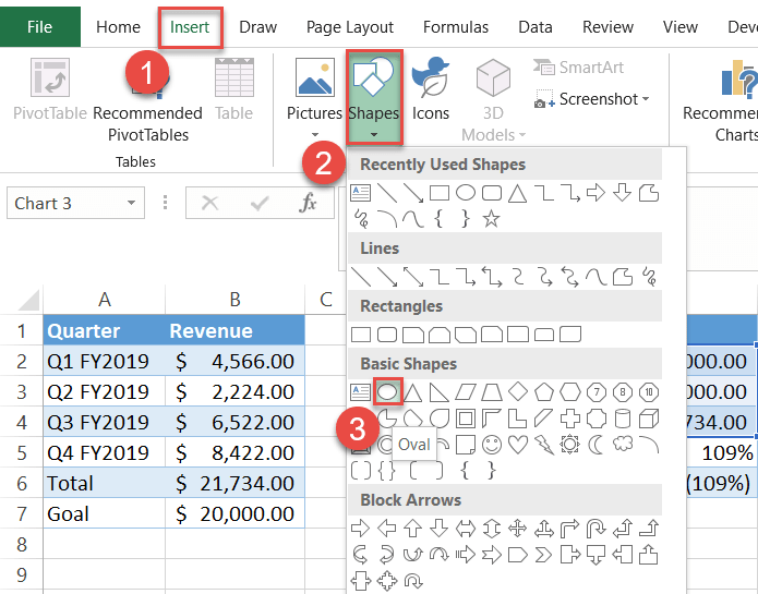
Hold down Shift while drawing to create a perfect circle. Then right-click on the circle, and in the menu that appears, change the Shape Outline and Shape Fill colors to red.
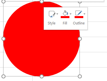
Just one last thing. Copy the circle by selecting it and pressing Ctrl + C. Then select the chart and press Ctrl + V to paste the circle into the thermometer chart. Finally, resize and adjust the position of the bulb to make it fit into the picture.
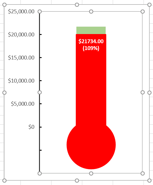
So, there you have it. You are now ready to create breathtaking thermometer charts in Excel!
Download Thermometer Chart Template
Download our free Thermometer Chart Template for Excel.
