How to Create a Dynamic Chart Range in Excel
Written by
Reviewed by
This tutorial will demonstrate how to create a dynamic chart range in all versions of Excel: 2007, 2010, 2013, 2016, and 2019.
In this Article
- Dynamic Chart Range – Free Template Download
- Dynamic Chart Ranges – Intro
- The Table Method
- Step #1: Convert the data range into a table.
- Step #2: Create a chart based on the table.
- The Dynamic Named Range Method
- Step #1: Create the dynamic named ranges.
- Step #2: Create an empty chart.
- Step #3: Add the named range/ranges containing the actual values.
- Step #4: Insert the named range with the axis labels.
- Download Dynamic Chart Range Template
Dynamic Chart Range – Free Template Download
Download our free Dynamic Chart Range Template for Excel.
By default, when you expand or contract a data set used for plotting a chart in Excel, the underlying source data also has to be manually adjusted.
However, by creating dynamic chart ranges, you can avoid this hassle.
Dynamic chart ranges allow you to automatically update the source data every time you add or remove values from the data range, saving a great deal of time and effort.
In this tutorial, you will learn everything you need to know to unleash the power of Dynamic Chart Ranges.
Dynamic Chart Ranges – Intro
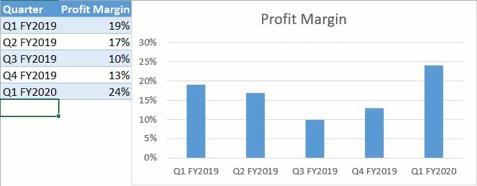
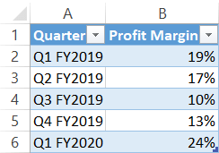
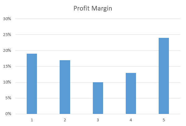
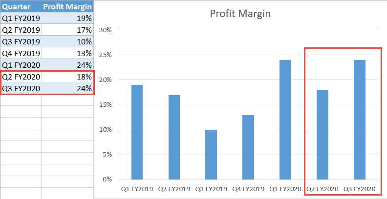
Consider the following sample data set analyzing profit margin fluctuations:
Basically, there are two ways to set up a dynamic chart range:
- Converting the data range into a table
- Using dynamic named ranges as the chart’s source data.
Both methods have their pros and cons, so we will talk about each of them in greater detail to help you determine which will work best for you.
Without further ado, let’s get started.
Download our free Dynamic Chart Range Template for Excel.
The Table Method
Let me start off by showing you the fastest and easiest way to accomplish the task at hand. So, here’s the drill: Turn the data range into a table, and you’re golden—easier than shelling peas.
That way, everything you type into the cells at the end of that table will automatically be included in the chart’s source data.
Here is how you can make that happen in just two simple steps.
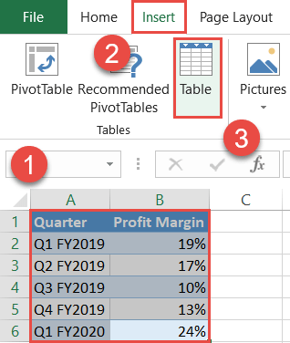
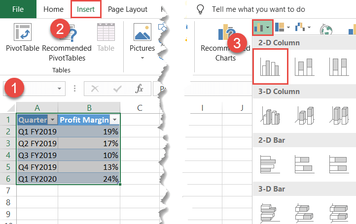
Step #1: Convert the data range into a table.
Right out of the gate, transform the cell range containing your chart data into a table.
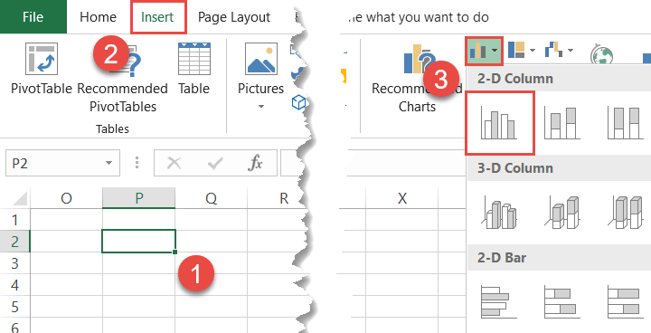
- Highlight the entire data range (A1:B6).
- Click the Insert tab.
- Hit the “Table” button.
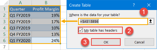
In the Create Table dialog box, do the following:
- Double-check that the highlighted cell range matches the entire data table.
- If your table contains no header row, uncheck the “My table has headers” box.
- Click “OK.“
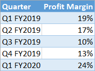
As a result, you should end up with this table:
Step #2: Create a chart based on the table.
The foundation has been laid, which means you can now set up a chart using the table.
- Highlight the entire table (A1:B6).
- Navigate to the Insert tab.
- Create any 2-D chart. For illustration purposes, let’s set up a simple column chart (Insert Column or Bar Chart > Clustered Column).
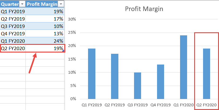
That’s it! To test the technique, try adding new data points at the bottom of the table to see them automatically charted on the plot. How much simpler can it get?
NOTE: With this approach, the data set should never contain empty cells in it—that will ruin the chart.
The Dynamic Named Range Method
Though easy to apply, the previously demonstrated, Table Method has some serious cons. For instance, the chart gets messed up whenever the fresh data set ends up being smaller than the initial data table—plus, sometimes you simply don’t want the data range to be converted into a table.
Opting for named ranges may take slightly more time and effort on your part, but the technique negates the cons of the table method and, on top of that, makes the dynamic range a lot more comfortable to work with in the long haul.
Step #1: Create the dynamic named ranges.
To start with, set up the named ranges that will eventually be used as the source data for your future chart.
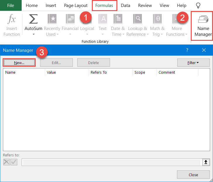
- Go to the Formulas tab.
- Click “Name Manager.”
- In the Name Manager dialog box that appears, select “New.”
In the New Name dialog box, create a brand new named range:
- Type “Quarter” next to the “Name” field. For your convenience, make the name of the dynamic range match the corresponding header row cell of column A (A1).
- In the “Scope” field, select the current worksheet. In our case, that’s Sheet1.
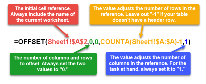
- Enter the following formula into the “Refers to” field: =OFFSET(Sheet1!$A$2,0,0,COUNTA(Sheet1!$A:$A)-1,1)
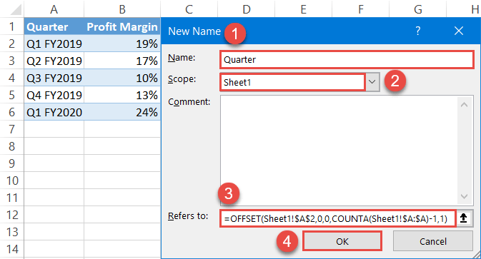
In plain English, every time you change any cell in the worksheet, the OFFSET function returns only the actual values in column A, leaving out the header row cell (A1), while the COUNTA function recalculates the number of the values in the column each time the worksheet is updated—effectively doing all the dirty work for you.
Let’s break down the formula in greater detail to help you understand how it works:
NOTE: The name of a named range must start with a letter or underscore and should contain no spaces.
By the same token, set up another named range based on column Profit Margin (column B) with the help of this formula and label it “Profit_Margin”:
=OFFSET(Sheet1!$B$2,0,0,COUNTA(Sheet1!$B:$B)-1,1)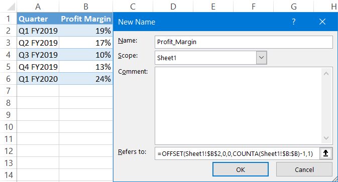
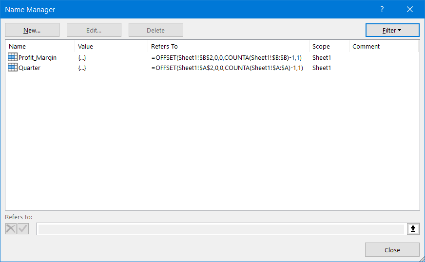
Repeat the same process if your data table contains multiple columns with actual values. In our case, as a result, you should have two named ranges ready for action:
Step #2: Create an empty chart.
We’ve made it through the trickiest part. Now, it’s time to set up an empty chart so that you can manually insert the dynamic named ranges into it.
- Select any empty cell in the current worksheet (Sheet1).
- Go back over to the Insert tab.
- Set up any 2-D chart you want. For our example, we will create a column chart (Insert Column or Bar Chart > Clustered Column).
Step #3: Add the named range/ranges containing the actual values.
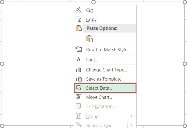
First, insert the named range (Profit_Margin) linked to the actual values (column B) into the chart.
Right-click on the empty chart and choose “Select Data” from the contextual menu.
In the Select Data Source dialog window, click “Add.”
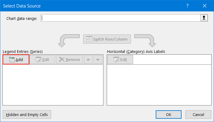
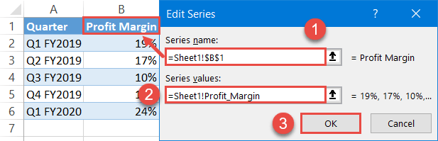
In the Edit Series box, create a new data series:
- Under “Series name,” highlight the corresponding header row cell (B1).
- Under “Series values,” specify the named range to be plotted on the chart by typing the following: “=Sheet1!Profit_Margin.” The reference is made up of two parts: the names of the current worksheet (=Sheet1) and the respective dynamic named range (Profit_Margin). The exclamation mark is used to bind the two variables together.
- Select “OK.”
Once there, Excel will automatically chart the values:
Step #4: Insert the named range with the axis labels.
Finally, replace the default category axis labels with the named range comprised of column A (Quarter).
In the Select Data Source dialog box, under “Horizontal (Category) Axis Labels,” select the “Edit” button.
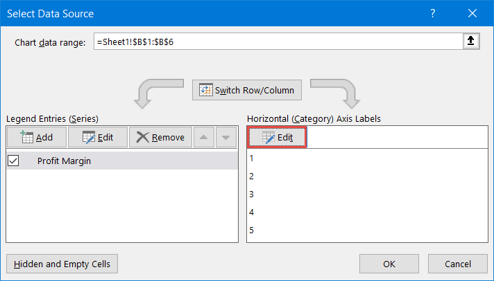
Then, insert the named range into the chart by entering the following reference under “Axis label range:”
=Sheet1!Quarter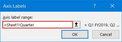
Finally, the column chart based on the dynamic chart range is ready:
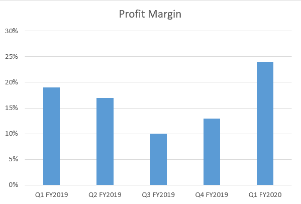
Check this out: The chart gets updated automatically whenever you add or remove data in the dynamic range.
Download Dynamic Chart Range Template
Download our free Dynamic Chart Range Template for Excel.
