Cumulative Frequency Distribution – Excel and Google Sheets
This tutorial will demonstrate how to create a cumulative frequency distribution in Excel and Google Sheets.
The Cumulative Frequency Distribution is calculated by adding each frequency from a frequency distribution to the sum of the frequencies before it (or after it). The cumulative frequency of the last class or event must be equal to the sample size (the total number of observations).
Cumulative Frequency Distribution Formula
The cumulative frequency distribution is calculated using the formula:
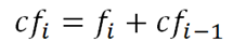
where cfi is the cumulative frequency of each event, value, or class;
fi is the number of occurrence (frequency) of the event, value, or class; and
cfi-1 is the cumulative frequency of the preceding event, value, or class.
How to Calculate Cumulative Frequency Distribution in Excel
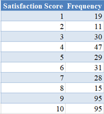
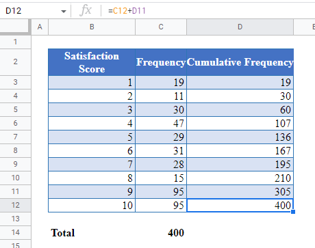
Background: An Internet Service Provider is conducting a customer satisfaction survey from a random sample of its users. They asked each surveyed customer to rate their services in the past 90 days on a scale of 1 to 10, where 10 represents excellent, and 1 represents miserable. The results from the survey are collated and presented in the table below. Calculate the cumulative frequency distribution of the result of the survey.
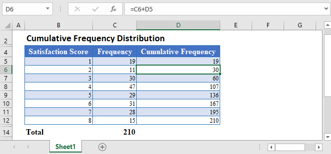
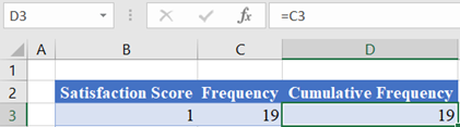
First, note that the cumulative frequency of the first event, value, or class is the same as the frequency of the event, value, or class. So, type in or reference the frequency of the first Score in the first row of the Cumulative Frequency column.
Then, calculate the succeeding Cumulative Frequency values by adding the current Frequency to the preceding Cumulative Frequency.
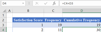
Here, cell C4 contains the frequency of the current event (Score 2) which is , and cell D3 contains the cumulative frequency of the preceding event (Score 1) which is . Thus, the current cumulative frequency (cell D4) is the sum of cells C4 and D3, that is .
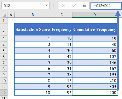
Note: Double-Click the bottom right corner of the cell to fill down the data to the rest of the column.
The complete Cumulative Frequency column is shown below.
Note: The last value of the Cumulative Frequency column must be equal to the sum of all frequencies. To confirm this, calculate the sum of the Frequency column.
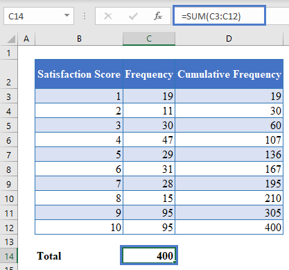
As you can see, the sum of all frequencies is equal to the last cumulative frequency.
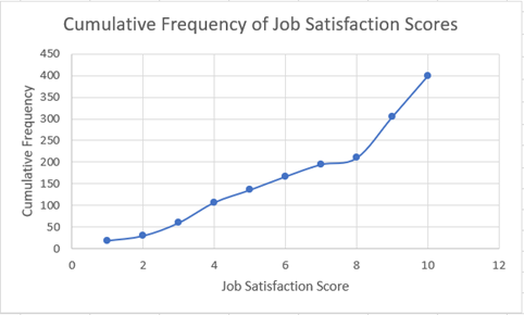
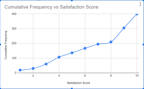
To visualize the cumulative frequency distribution, you can create a cumulative frequency distribution curve (ogive) following the steps shown below.
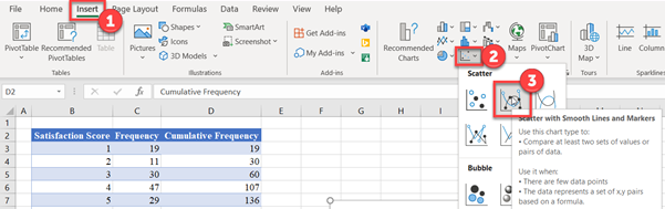
Hold down the CTRL key and select the Satisfaction Score and the Cumulative Frequency columns.
Then, click on the Scatter with Smooth Lines and Markers chart in the Insert Scatter (X, Y) or Bubble Chart chart type on the Charts group of the Insert tab.
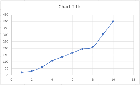
The resulting scatter (ogive) chart is shown below.
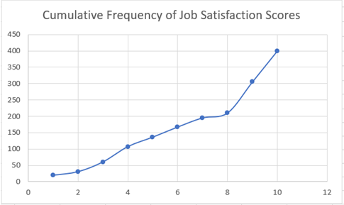
Edit the chart title by clicking on the Chart Title in the chart and typing your desired title.
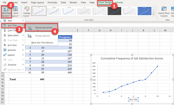
Add the horizontal and the vertical axis titles by selecting the chart, then click on the Chart Design tab, then on the Add Chart Element button, then on Axis Title, and then on Primary Horizontal for the horizontal axis title or on Primary Vertical for the vertical axis title.
Then, edit the titles as required.
Cumulative Frequency Distribution in Google Sheets
The Cumulative Frequency Distribution can be calculated in Google Sheets in a similar way as it is calculated in Excel.
First, follow the method described in the Excel section to obtain the Cumulative Frequency Distribution table.
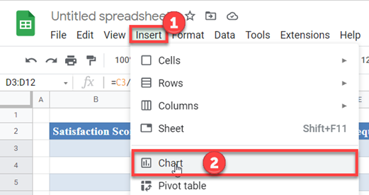
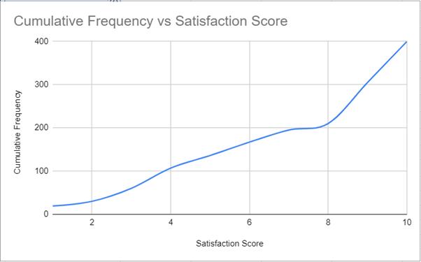
To create the cumulative frequency distribution curve (ogive) in Google Sheet, first, highlight the Satisfaction Score and the Relative Frequency column, and then click the Chart option from the Insert tab.
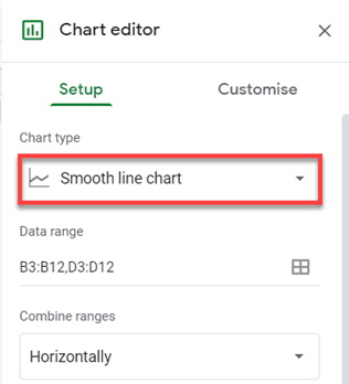
On the Chart editor, change the Chart type to Smooth line chart in the Setup option.
The resulting graph is shown below.
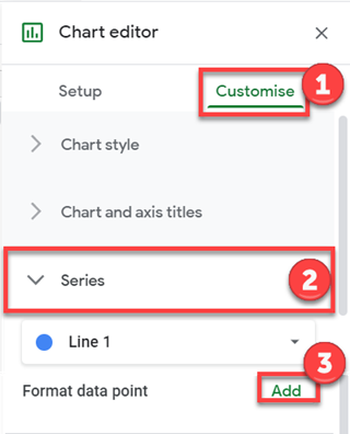
To add the data point markers, click on the Customise option, then on the Series dropdown, click on Add in the Format data point section.
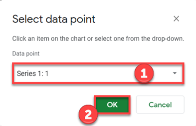
On the Select data point pop-up, select a data point and click OK.
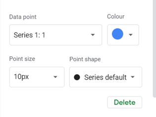
Set the Colour, the Point size, and the Point shape as required.
Repeat the above process until you have added all the data points.
The resulting chart is shown below.
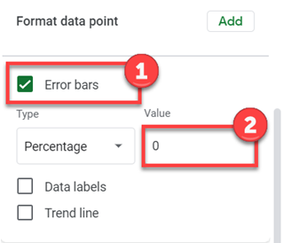
An alternate way and yet, an easier hack to add the data point markers is to check the Error bars checkbox in the Format data point section and then set the Value to .