Q-Q Plot – Excel and Google Sheets
Written by
Reviewed by
This tutorial will demonstrate how to create a Q-Q Plot in Excel and Google Sheets.
A Q–Q plot (short for a quantile–quantile plot) is a graph used to determine whether or not a given dataset fits a specific theoretical probability distribution. In most cases, due to many statistical tests requiring that datasets come from a normally distributed population, the Normal Q–Q Plot is used to determine whether the dataset follows the normal distribution.It plots the quantiles of the distributions of the two datasets against each other. If the two datasets come from a similar dataset, the Q-Q Plot fits approximately in the line, y=x, that is, the line that makes a 45o angle with the positive axis.
Quantiles are points in a distribution that divide the ranked values of the distribution into continuous intervals with equal probabilities. Quantiles can be quartiles (a division of the distribution into 4 intervals with equal probabilities), deciles (10 intervals), percentiles (100 intervals), or any number of intervals that suit your specific case.
The Q-Q Plot does not provide a foolproof conclusion whether the two distributions are similar or not since the determination of the extent to which the points departs from the line of reference may be subjective. However, it provides a quick visual glance of the extent to which the data points deviate from the intended probability distribution and which points contribute to the deviation.
In addition to determining whether two datasets come from a similar probability distribution, the Q-Q Plot can also be used to determine if two datasets have a similar location and scale, similar shapes of distribution, it can also determine the presence of outliers.
f the Q-Q Plot is arced (“S” shaped), this indicates that one of the distributions is more skewed than the other.
How to Plot the Q-Q Plot in Excel
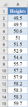
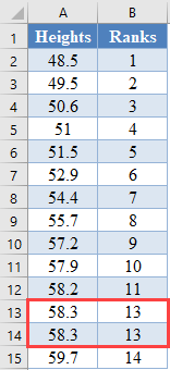
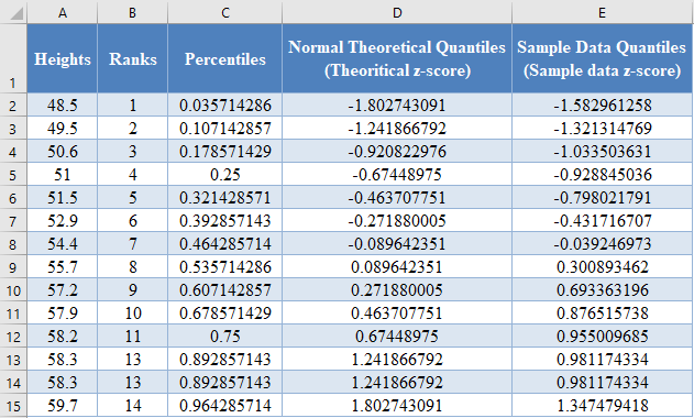
Background: A sample of the heights, in inches, of 14 ten years old boys are presented in the table below. Plot the Q-Q Plot, and hence determine whether (or not) the data obtained from the sample can be modeled using a normal distribution.
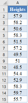
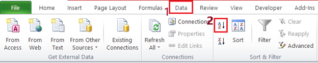
First, select the values in the dataset and use the Data > Sort (Sort Smallest to Largest) feature to arrange the values in ascending order as shown below:
And the arranged values are as follows:
Next, use the RANK.EQ Function to calculate the ranks of the values in the dataset as follows.
=RANK.EQ(A2,$A$2:$A$15,1)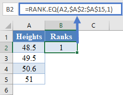
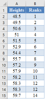
Calculate the ranks of other values in the dataset.
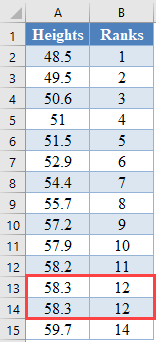
The RANK.EQ Function returns the top rank of a set of values that has the same rank; however, for this plot, we will need the bottom ranks instead. So, we will manually change the ranks of the set of values having the same rank. Thus, we change the following ranks:
to:
Next, calculate the cumulative probability (Percentile) of the ranks of the dataset. We will use the formula:
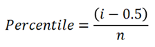
where i is the rank and n is the size (count) of the dataset. Thus, we have:
=(B2-0.5)/COUNT($B$2:$B$17)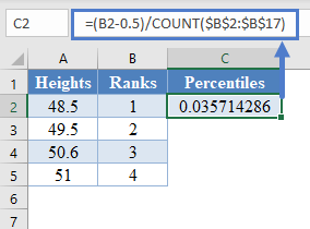
Complete the rest of the assigned cumulative probability as shown below:
Next, calculate the normal theoretical quantiles represented by the z-score of each of the percentile using the NORM.S.INV Function. Thus, we have:
=NORM.S.INV(C2)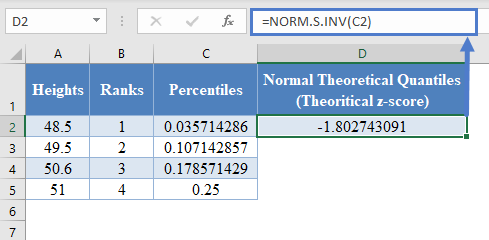
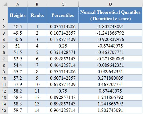
Complete the rest of the assigned z-scores column as shown below:
Next, calculate the sample data quantiles which are represented as the z-scores of the data values assuming that the dataset is normally distributed. This can be calculated using the formula:
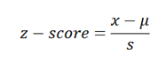
where x is the value from the dataset, μ is the average of the dataset, and s is the standard deviation of the dataset.
You can also achieve this using the STANDARDIZE Function in Excel. Thus, we have:
=STANDARDIZE(A2,AVERAGE($A$2:$A$17),STDEV.S($A$2:$A$17))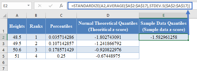
Complete the rest of the sample data quantiles as shown below:
Next, plot a scatter plot with the Normal Theoretical Quantiles on the x-axis and the Sample Data Quantiles on the y-axis. Select the two columns with the labels and click Insert > Scatter > Scatter with only Markers as shown below:
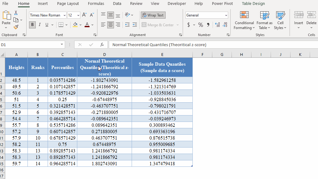
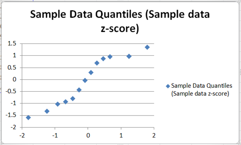
And we get the following graph:
Next, adjust the axes by right-clicking on the vertical axis and selecting the Format Axis option from the pop-up box as shown in the picture below:
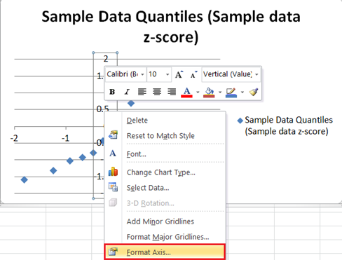
On the Format Axis box, on the Axis Options option, select and type in the left-most value from the graph which is in our case in the Axis value: box in the Horizontal axis crosses: section.
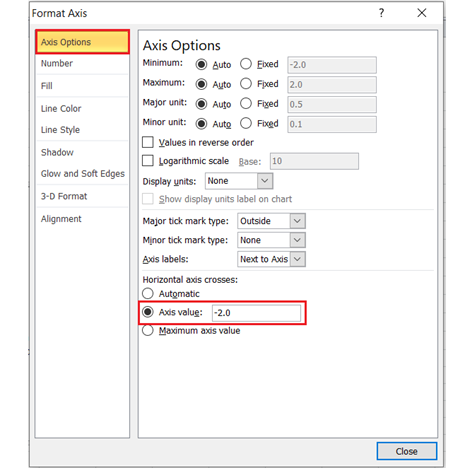
Repeat the process for the vertical axis by right-clicking on the horizontal axis and selecting the Format Axis option, then type in the bottom-most value from the graph which is also in our case in the Axis value: box in the Horizontal axis crosses: section of the Axis Options option of the Format Axis box. The graph now looks like this:
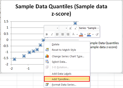
Next, add the 45 degrees reference line to the graph by right-clicking on any of the data points on the graph and selecting Add Trendline.
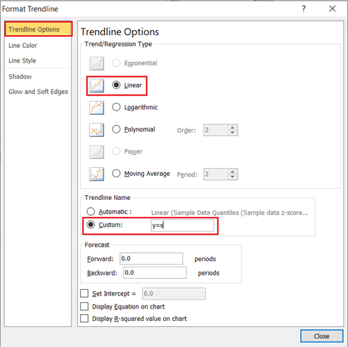
On the Trendline Options, make sure that the Trend/Regression Type is set as Linear, on the Trend Name section, choose Custom and type y=x in the box, then close the box.
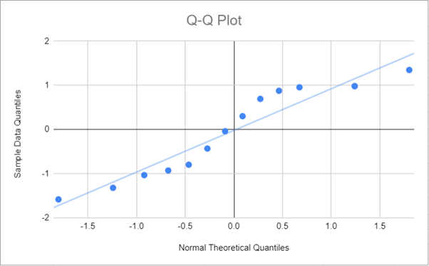
The graph now looks like this:
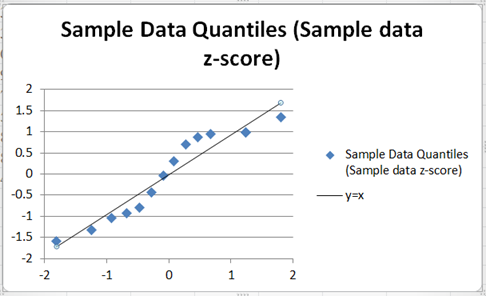
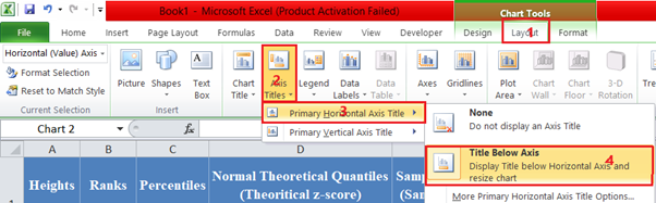
Finally, add the axis titles and rename the chart title, you can also remove the keys at the right-hand side. The process to add the horizontal axis title is shown in the picture below:
Repeat the process for the vertical axis. Click on the chart title, delete the previous title and replace it with the new title, and also click on and delete the key on the right-hand side of the graph. The graph now looks like this:
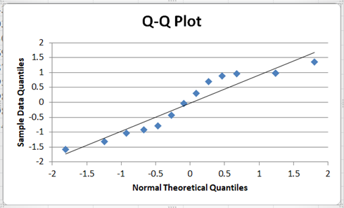
From the Q-Q Plot, it can be seen that though some of the points deviate a bit from the line, there are a good number of the points which are very close to the line, and hence we may need to conduct another test to confirm whether or not the dataset can be said to be normally distributed.
Q-Q Plot in Google Sheets
The Q-Q plot can be constructed in Google Sheets in a similar way as it is constructed in Excel. To construct the Q-Q plots in Google Sheets, use the same methods as explained above to obtain the values to be used to construct the plot.
Next, highlight the Normal Theoretical Quantiles and the Sample Data Quantiles columns and click Insert > Chart.
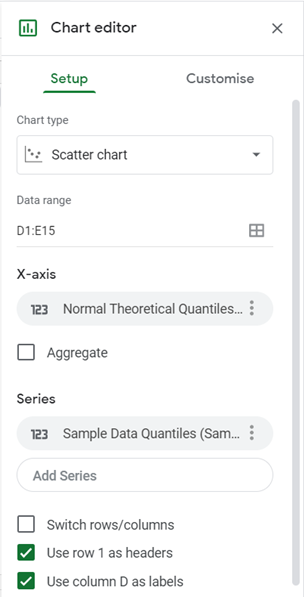
On the Chart Editor, in the Setup tab, set the Chart type to Scatter chart. Google Sheets will usually plot the two columns as two independent plots, so to change this, select the correct x-axis column in the X-axis option and remove the x-axis column from the Series options. So, in our case, set the X-axis to “Normal Theoretical Quantiles…” and then remove it from Series, by clicking three dots at the side and clicking Remove. The settings for the Q-Q plot are shown in the picture below:
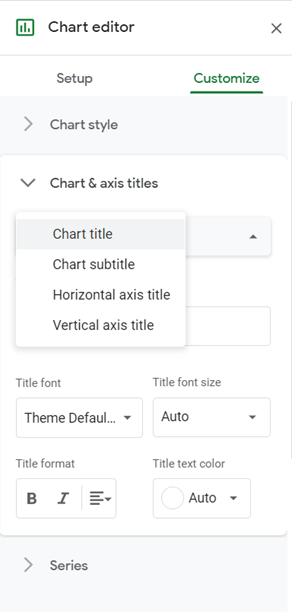
In the Customise tab, set the Chart title, the Horizontal axis title, and the Vertical axis title in the Chart & axis titles option:
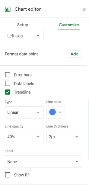
Check the Trendline checkbox in the Series option:
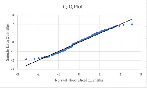
And we have the following output: