How to Create a Stem-and-Leaf Plot in Excel
Written by
Reviewed by
This tutorial demonstrates how to create a stem-and-leaf plot in all versions of Excel: 2007, 2010, 2013, 2016, and 2019.
Stem-and-Leaf Plot – Free Template Download
Download our free Stem-and-Leaf Plot Template for Excel.
In this Article
- Stem-and-Leaf Plot – Free Template Download
- Getting Started
- Step #1: Sort the values in ascending order.
- Step #2: Set up a helper table.
- Step #3: Find the “Stem” values.
- Step #4: Find the “Leaf” values.
- Step #5: Find the “Leaf Position” values.
- Step #6: Build a scatter XY plot.
- Step #7: Change the X and Y values.
- Step #8: Modify the vertical axis.
- Step #9: Add and modify the axis tick marks.
- Step #10: Add data labels.
- Step #11: Customize data labels.
- Step #12: Hide the data markers.
- Step #13: Add the axis titles.
- Step #14: Add a textbox.
- Download Stemplot Template
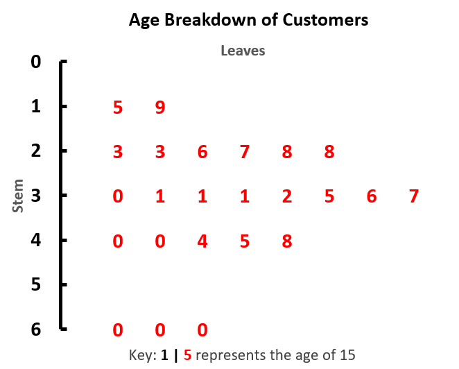
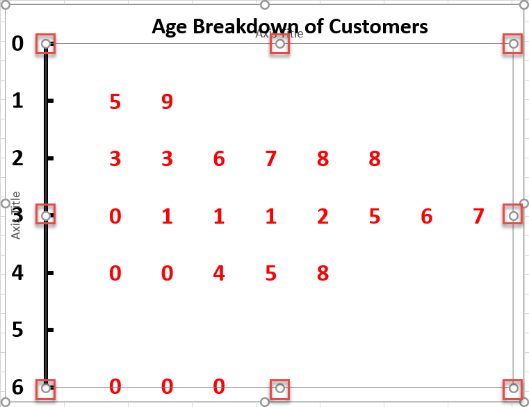
A stem-and-leaf display (also known as a stemplot) is a diagram designed to allow you to quickly assess the distribution of a given dataset. Basically, the plot splits two-digit numbers in half:
- Stems – The first digit
- Leaves – The second digit
As an example, look at the chart below. The chart displays the age breakdown of a small population. The stem (black, y-axis) shows the first digit of the age, while the red data points show the second digit.
You can quickly see that there are 6 people in their 20s, which is the second most populous age group.
Stemplots are not supported in Excel, so you have to manually build one from the ground up. Check out PineBI, our charting add-in that allows you to put together impressive advanced Excel charts in just a few clicks.
In this step-by-step tutorial, you will learn how to create a dynamic stem-and-leaf plot in Excel from scratch.
Getting Started
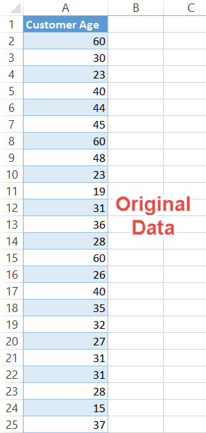
For illustration purposes, suppose you have 24 data points containing the ages of your customers. To visualize which age groups stand out from the crowd, you set out to build a stemplot:
The technique you are about to learn is viable even if your dataset has hundreds of values in it. But to pull it off, you need to lay the groundwork first.
So, let’s dive right in.
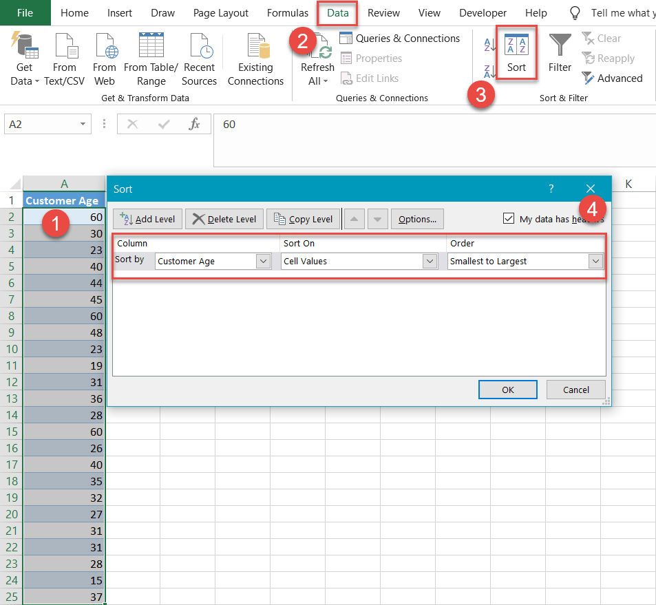
Step #1: Sort the values in ascending order.
To start with, sort your actual data in ascending order.
- Select any cell within the dataset range (A2:A25).
- Go to the Data tab.
- Click the Sort button.
- For each drop-down menu:
- For Column, use Customer Age (Column A).
- For Sort On, choose Values / Cell Values.
- For Order, choose to sort Smallest to Largest.
Step #2: Set up a helper table.
Once the column of data has been sorted, set up a separate helper table for storing all the chart data. It should look like the picture below.
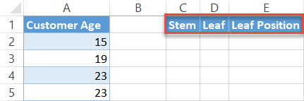
A few notes on each element of the table:
- Stem (Column C) – This will contain the first digit of all of the ages.
- Leaf (Column D) –This will contain the second digit of all the ages.
- Leaf Position (Column E) –This helper column will help position the leaves on the chart.
Step #3: Find the “Stem” values.
First, compute the Stem values (Column C) using the LEFT and VALUE Functions. The LEFT Function—which returns the specified number of characters from the start of a cell—extracts the first digit from each value, and the VALUE Function formats the formula output as a number (this part’s crucial).
Enter this formula into cell C2:
=VALUE(LEFT(A2,1))
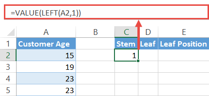
Once you have found your first Stem value, drag the fill handle to the bottom of the column to execute the formula for the remaining cells (C3:C25).
Step #4: Find the “Leaf” values.
The next step is finding the values for the Leaf column (Column D) by pulling the last digit of every number from the original data column (Column A). Fortunately, the RIGHT Function can do the dirty work for you.
Type the following formula into cell D2:
=RIGHT(A2,1)
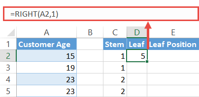
Once you have the formula in the cell, drag it across the rest of the cells (D3:D25).
Step #5: Find the “Leaf Position” values.
To be able to use a scatter plot to build the stem-and-leaf display (in Step 6) – and have everything fall in its place – you need to assign to each leaf a number signifying its position on the chart with the help of the COUNTIF Function.
Input this formula into cell E2:
=COUNTIF($C$2:C2,C2)
In plain English, the formula compares every single value in the Stem column (Column C) with each other to spot and mark duplicate occurrences, effectively attributing unique identifiers to the leaves that share a common stem.
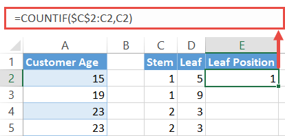
Again, copy the formula into the rest of the cells (E3:E25).
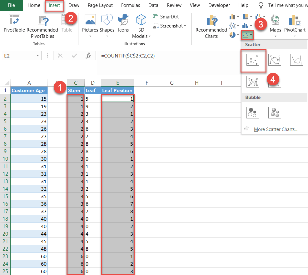
Step #6: Build a scatter XY plot.
You have now gathered all the puzzle pieces needed to create a scatter plot. Let’s put them together.
- Highlight all the values in Columns C and E (Stem and Leaf Position) by selecting the data cells from Column C then holding down the CTRL key as you select the data cells from Column E, leaving out the header row cells (C2:C25 and E2:E25).
Note: You are not selecting Column D at this time. - Go to the Insert tab.
- Click the Insert Scatter (X, Y) or Bubble Chart icon.
- Choose Scatter.
Step #7: Change the X and Y values.
Now, position the horizontal axis responsible for displaying the stems vertically. Right-click the chart plot and pick Select Data from the menu that appears.
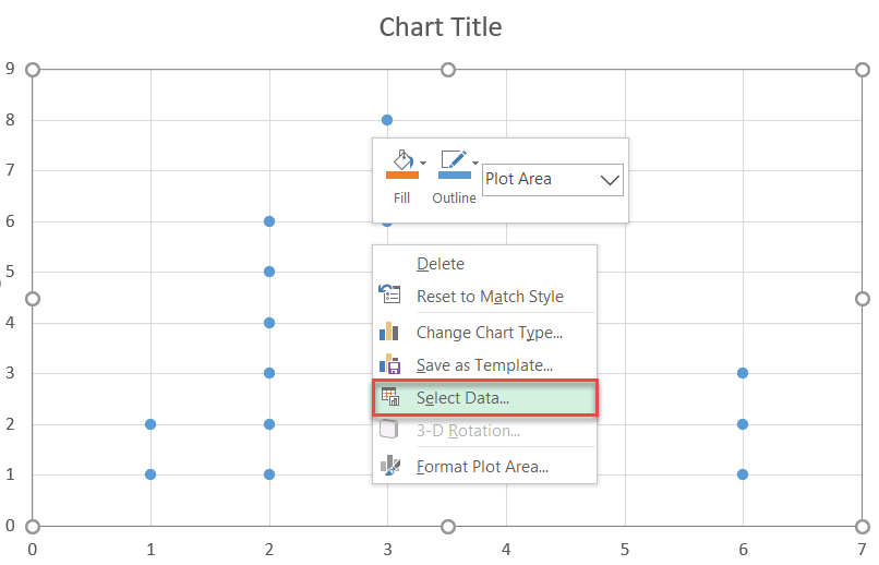
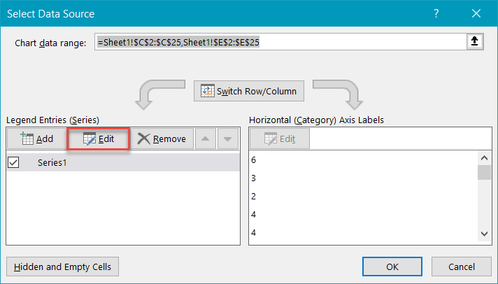
Next, click the Edit button.
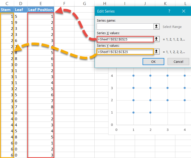
Once there, manually change the X and Y values:
- For Series X values, select all values from the Leaf Position column (E2:E25).
- For Series Y values, select all values from the Stem column (C2:C25).
- Click OK to close the Edit Series dialog box.
- Click OK to close the Select Data Source dialog box.
Step #8: Modify the vertical axis.
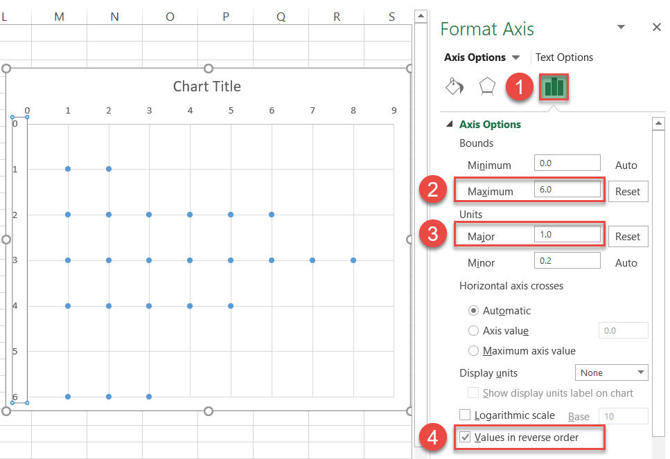
After you have rearranged the chart, flip it again to sort the stems in ascending order. Right-click on the vertical axis and choose Format Axis.

Once there, follow these simple steps:
- Navigate to the Axis Options tab.
- Change the Maximum Bounds value to 6 because the biggest number in the dataset is 60.
- Set the Major Units value to 1.
- Check the Values in reverse order box.
Step #9: Add and modify the axis tick marks.
The tick marks placed along the vertical axis serve as a separator between the stems and the leaves. Without closing the Format Axis task pane, scroll down to the Tick Marks section and next to Major type, choose Inside.
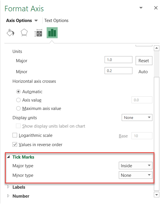
Make the tick marks stand out by changing their color and width.
- Navigate to the Fill & Line tab.
- Under Line, click the Fill Color icon to open the color palette and choose black.
- Set the Width to 3 pt.
- Now remove the horizontal axis and gridlines. Just right-click each element and choose Delete.
- Increase the font of the stem numbers and make them bold so they are easier to see. Select the vertical axis and navigate to Home > Font.
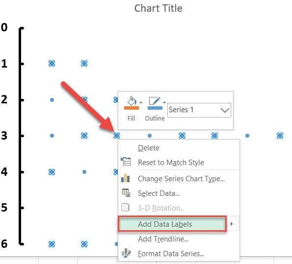
Step #10: Add data labels.
As you inch toward the finish line, let’s add the leaves to the chart. To do that, right-click on any dot representing Series 1 and choose Add Data Labels.
Step #11: Customize data labels.
Once there, get rid of the default labels and add the values from the Leaf column (Column D) instead. Right-click on any data label and go to Format Data Labels.
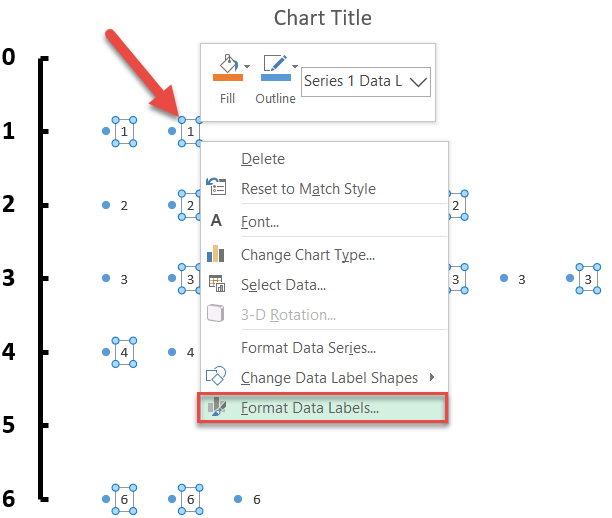
When the task pane appears, follow a few simple steps:
- Switch to the Label Options tab.
- Check the Value From Cells box.
- Highlight all the values in the Leaf column (D2:D25).
- Click OK.
- Uncheck the Y value box.
- Uncheck the Show Leader Lines box.
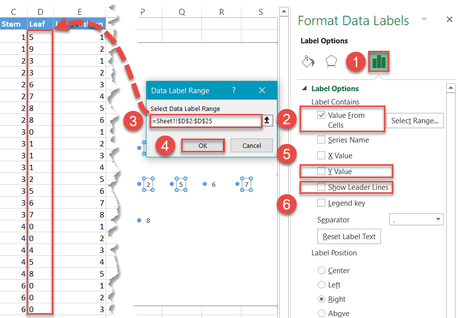
Change the color and font size of the leaves to differentiate them from the stems—and don’t forget to make them bold as well (Home > Font).
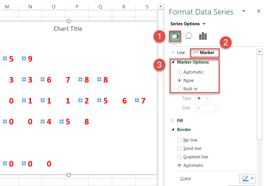
Step #12: Hide the data markers.
The data markers (the dots) have served you well, but you no longer need them, except as a means to position the data labels. So make them transparent.
Right-click on any dot illustrating Series 1 and go to Format Data Series.
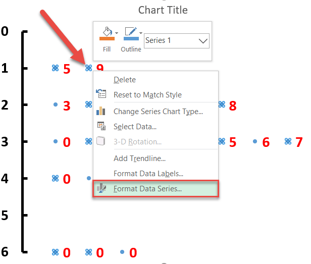
Once the task pane pops up, do the following:
- Click the Fill & Line icon.
- Switch to the Marker tab.
- Under Marker Options, choose None.
And don’t forget to change the chart title.
Step #13: Add the axis titles.
Use the axis titles to label both elements of the chart.
- Select the chart plot.
- Go to the Design tab.
- Click Add Chart Element.
- Select Axis Titles.
- Choose Primary Horizontal and Primary Vertical.
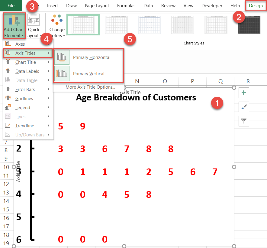
As you can see below, the axis titles might overlap with the chart plot. To fix the issue, select the chart plot and adjust the handles to resize the plot area. You can now change the axis titles.
Step #14: Add a textbox.
Finally, add a text box with a key to make it easier to read the stemplot.
- Select the chart plot.
- Go to the Insert tab.
- In the Text group, choose Text Box.
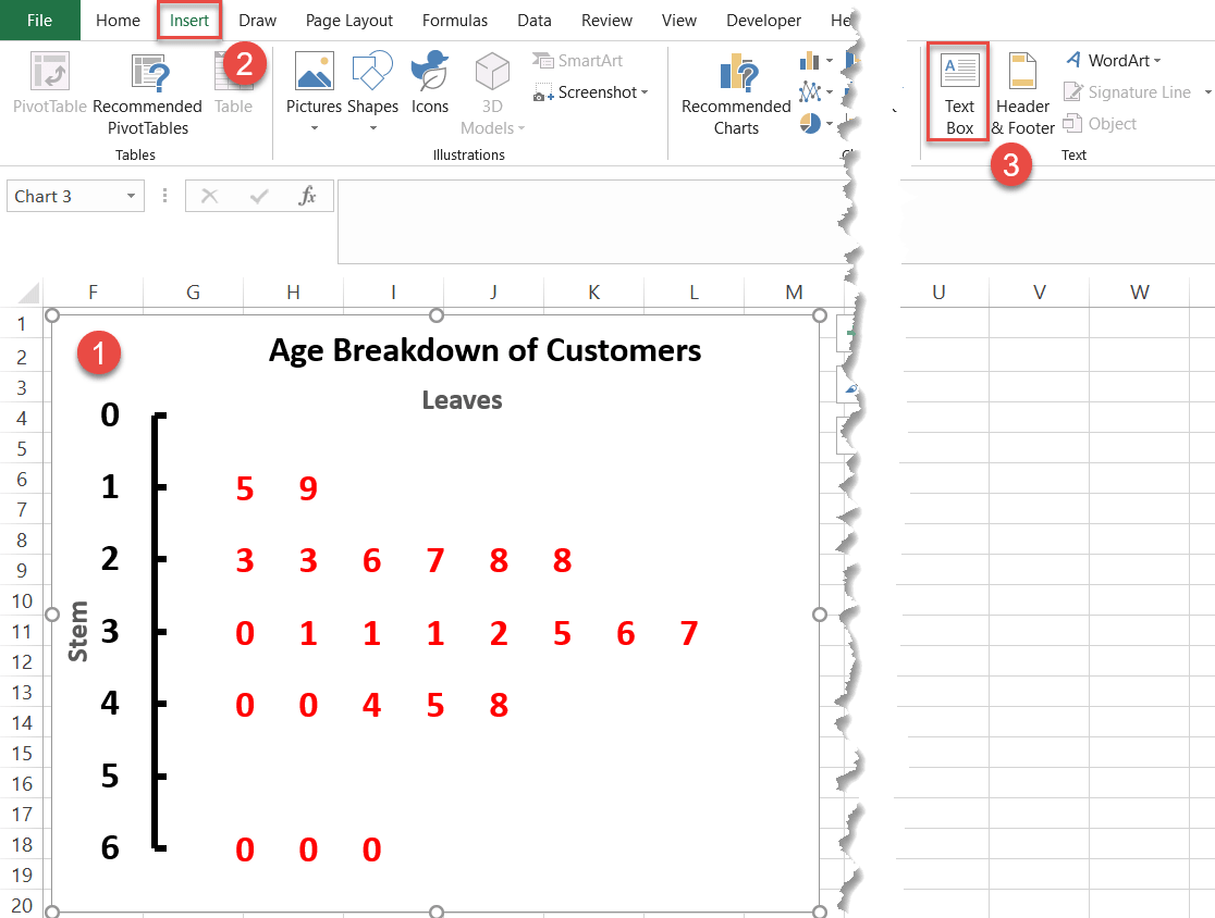
In the textbox, give an example from your data explaining how the graph works, and you’re all set!
