How to Use the Quick Analysis Tool in Excel
Written by
Reviewed by
This tutorial will demonstrate how to use the Quick Analysis tool in Excel.
The Quick Analysis tool in Excel gives you options to help understand your data, right from a range selection. These options are available through the Ribbon, but Quick Analysis lets you see them all in one place, and you can preview each transformation by hovering over it.
If the Quick Analysis smart tag doesn’t appear when you hover, see Enable Smart Tags.
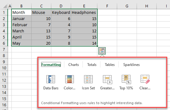
There are five main categories: Formatting, Charts, Totals, Tables, and Sparklines.
Quick Analysis Formatting
You can easily visualize values in the range of cells by using color scales, data bars, icon sets, and others. To quickly do that with the Quick Analysis Tool, just follow these steps:
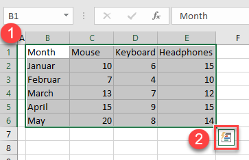
- First, select the data range.
- Click on the Quick Analysis tool button.
- In the menu that appears, click on Formatting.
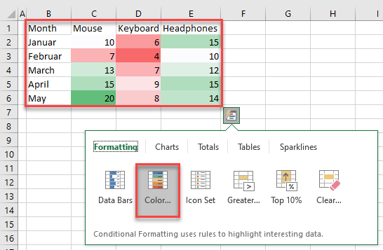
- Then choose the best visual option for the given data set. In this example, the best solution was Color Scales. It’s easy to try out a few options if you’re not sure what fits.
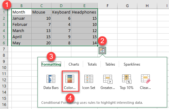
You can hover over each option to see how it would affect your data. When you decide on a particular option, click on it.
Quick Analysis Charts
With the Quick Analysis tool, you can also make charts.
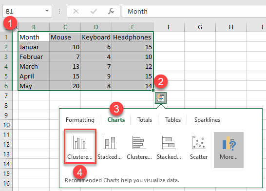
- Select the data range.
- Click on the Quick Analysis button.
- Then click on Charts.
- Choose the chart that best represents your data (here, Cluster chart).
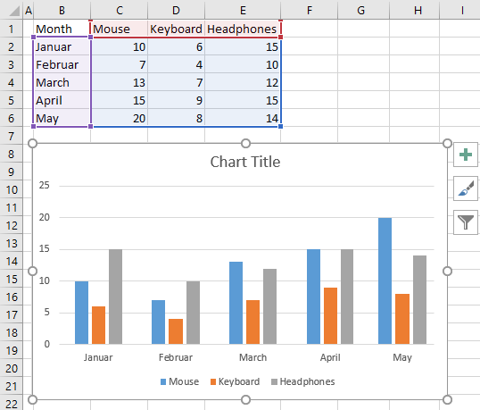
After clicking on it, the chart is added to your sheet.
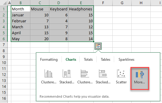
- If the charts from the list don’t fit your needs, you can find more options by clicking on the More button.
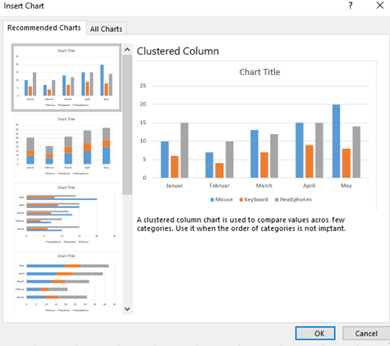
This opens the Insert Chart window and in it, you can find the list of all charts.
Quick Analysis Totals
You can use the Quick Analysis tool to quickly calculate totals.
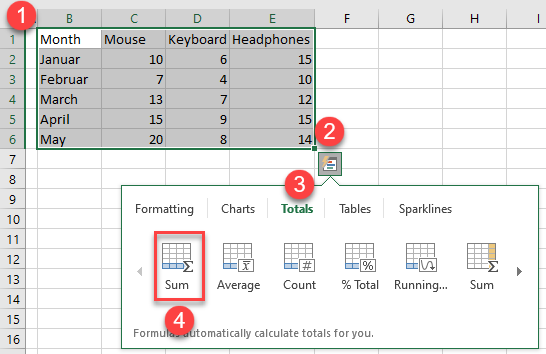
- First, select the data range.
- Then click on the Quick Analysis button.
- In the menu, click on Totals.
- Choose the appropriate options for your data range. In this example, the Sum option totals the numbers in each column.
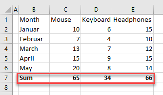
After this, the row with sums is added.
Quick Analysis Tables
- Using the Quick Analysis tool, you can make tables to sort and filter data. To do that select the data range and press the Quick Analysis button.
- In the Menu, click on Tables and choose one from the list (here, Table).
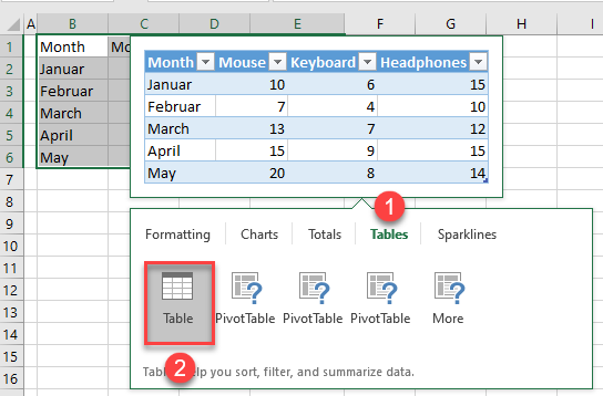
Now, your data is formatted as a table and has all the functionality of an Excel table.
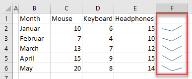
Quick Analysis Sparklines
Sparklines are great for representing trends within a cell, and you can easily add them by using the Quick Analysis tool.
- First, select the data.
- Click on the Quick Analysis button.
- Click Sparklines.
- Then choose one of three options (here, Line).
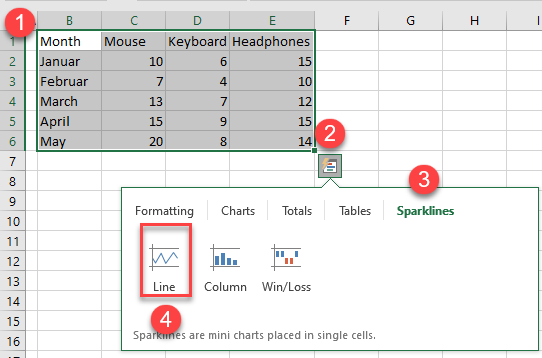
Sparklines are added to the adjacent cells.